Ink Swatch Wednesday: Van Dieman's Graceful Pirouette and Pilot Medium Nibs
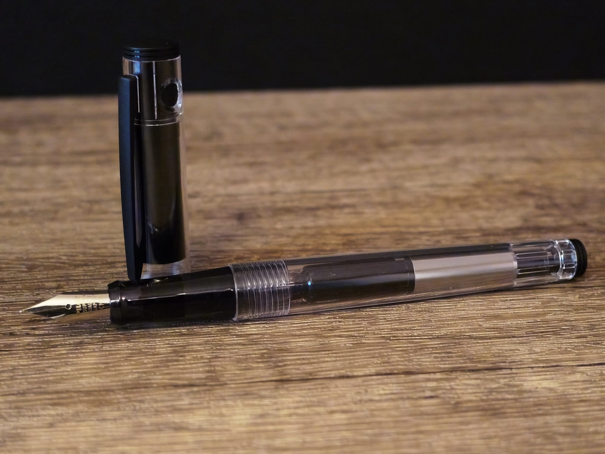
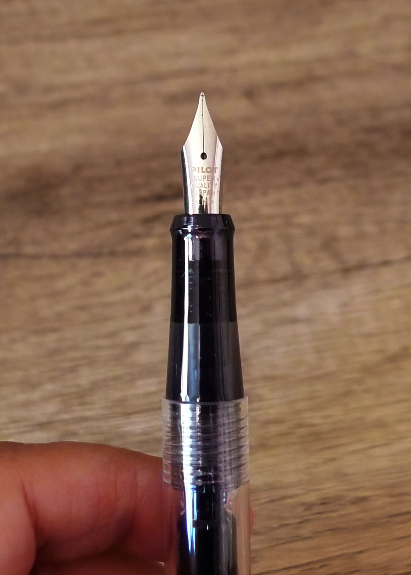
This Ink Swatch Wednesday (ISW) is different, because I'm not actually doing ink swatches. I featured Van Dieman's Graceful Pirouette in a previous ISW post, so you can check it out there. Today I'm looking at this ink in a new pen I got, a Pilot Lightive, and doing a Pilot steel vs. gold medium nib comparison.
On Mastodon, I'd asked if anyone knew whether Pilot's M steel nibs were as broad as the gold M nibs, which is not what I wanted. Luckily I got enough info to assure me that the M steel nib on something like a Pilot Lightive would not be as broad, so I went ahead and ordered a clear Lightive.
If you're not aware, Pilot has several lower-end to mid-range pens which use the same steel nib and feed assembly. So I could take this medium nib and swap it into a Pilot Kakuno or Prera body. I currently have a Kakuno with an EF, a Prera with a CM (calligraphy/italic nib), and now a Lightive with a M. I will probably get a clear Kakuno with a F nib sometime later so I have the full range of nib sizes available to swap into whichever pen I feel like using.
The Lightive is a solid, utilitarian pen. It joins my "workhorse" fountain pens, like the Pilot Kakuno, Jinhaos (X159 and 9019), Lamys (Safari and Lx), and TWSBIs (ECO, Swipe, and GO).
I decided to fill this new pen with one of my newer ink samples, Van Dieman's Graceful Pirouette, a light berry pink (or maybe a mauve?). I was at first kind of annoyed at how light the ink is, as it borders on illegibility, but I'm getting used to its shade. It's at least a departure from the many brown inks I have in my currently inked flock, and the darker blues, greens, purples, and berries.
I dipped my Pilot E95s with a gold M nib, and my Pilot Falcon with a gold SM (soft medium) nib into the same ink, and wrote some samples to show off the difference in line widths.
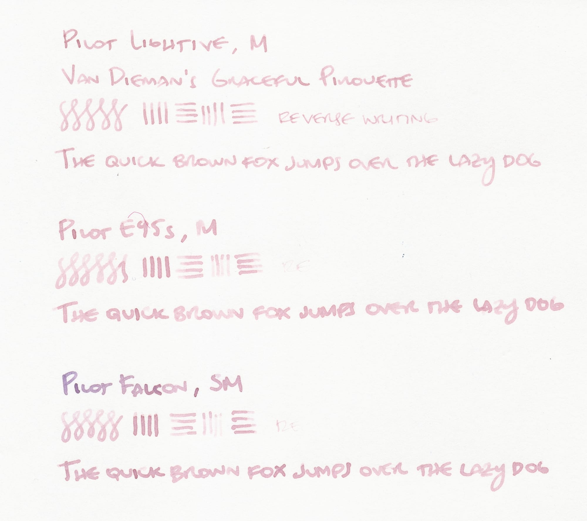
First on Kakuno Business paper, you can definitely see the Lightive's M nib has a narrower line width than the other two. You can also see that even though I flushed my Falcon's nib, and it seemed clean before dipping into the ink sample, some remnant of a bluish ink mixed in with the Van Dieman's ink at the beginning of the writing sample. 🤦♀️ Tangentially, neither of the gold nibs are tuned to enable reverse writing. You can sort of do it on the Lightive, but it's scratchy and fades out after a short while.
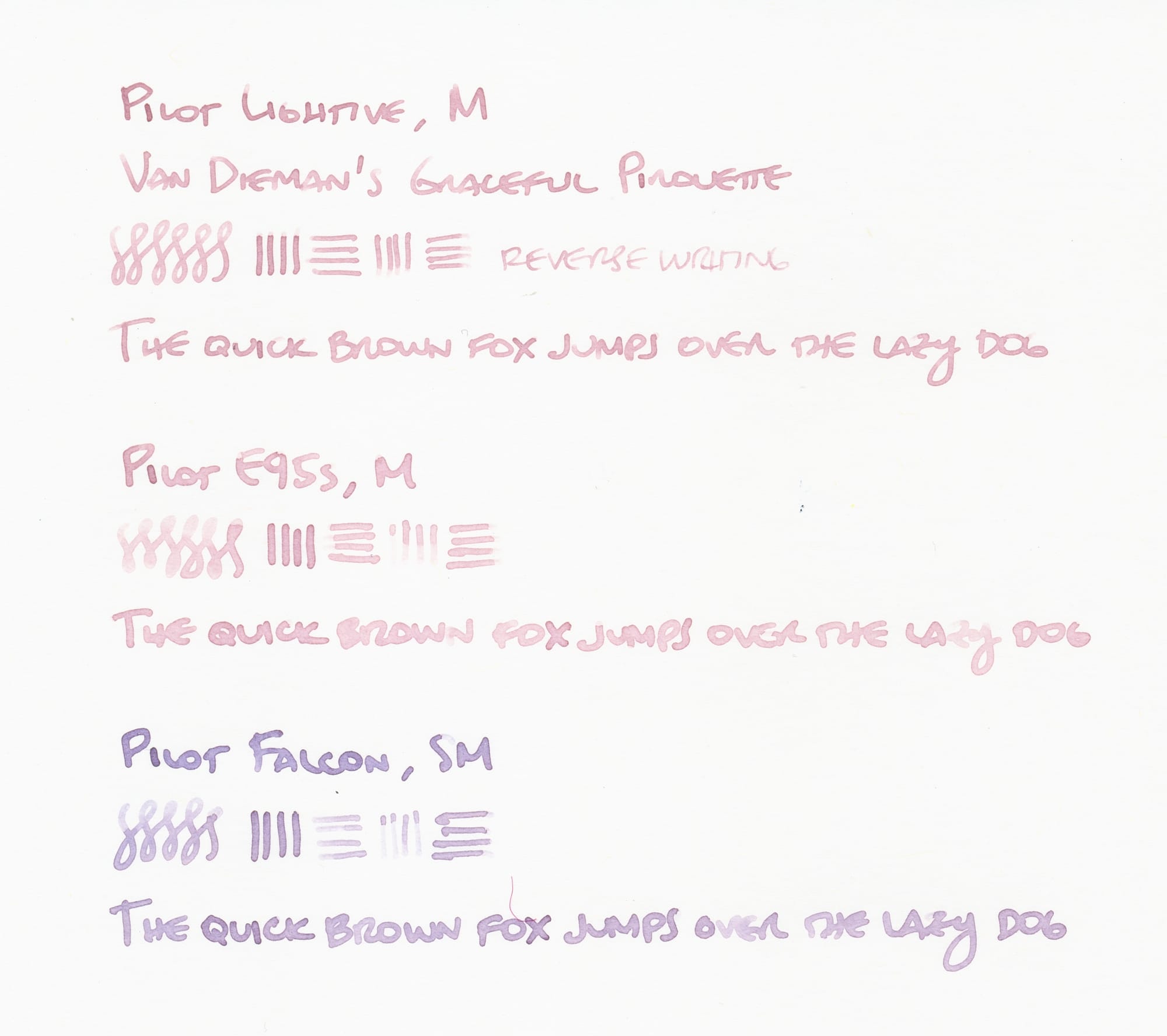
Similarly on Iroful paper, the Lightive's nib is still narrower than the other two, but all nibs write a bit wider on this paper, showing it's more absorbent than the Kakuno Business paper. Also, the remaining blue ink in the Falcon's nib has further mixed with the Van Dieman's ink, making a lovely light purple or lavender shade...I'll have to see if I can replicate this officially!
So, if you were ever kind of baffled at how broad Pilot's gold medium nibs are, you could try a steel medium nib for a line width closer to what some people typically think of as a medium line width, or maybe even a medium-fine.