Vinta Inks' A Holiday Feast: Tsokolate
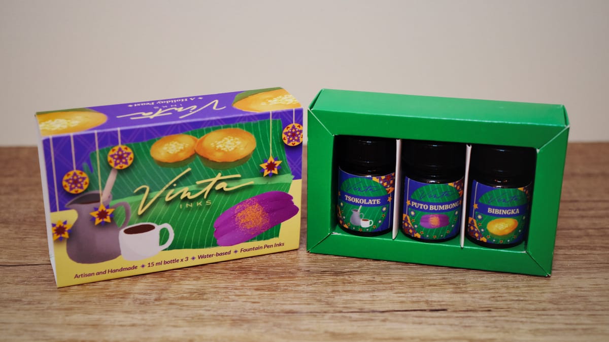
Today I'll be looking at the last ink in the Holiday Feast set, Tsokolate (pronounciation). This is the Filipino/Tagalog word for chocolate (not too hard to make that leap!), but specifically hot chocolate, as evident from the box art. Filipino hot chocolate is made from tablets of ground cacao, some with added sugar, some without. You basically boil water, drop the cacao tablets in, and stir until dissolved, and whisk to froth it before pouring into your mug.
Tsokolate the ink is a medium-dark brown with some yellow undertones, and dark brown or black sheen where very heavily pooled (you may not see the sheen in your writing).
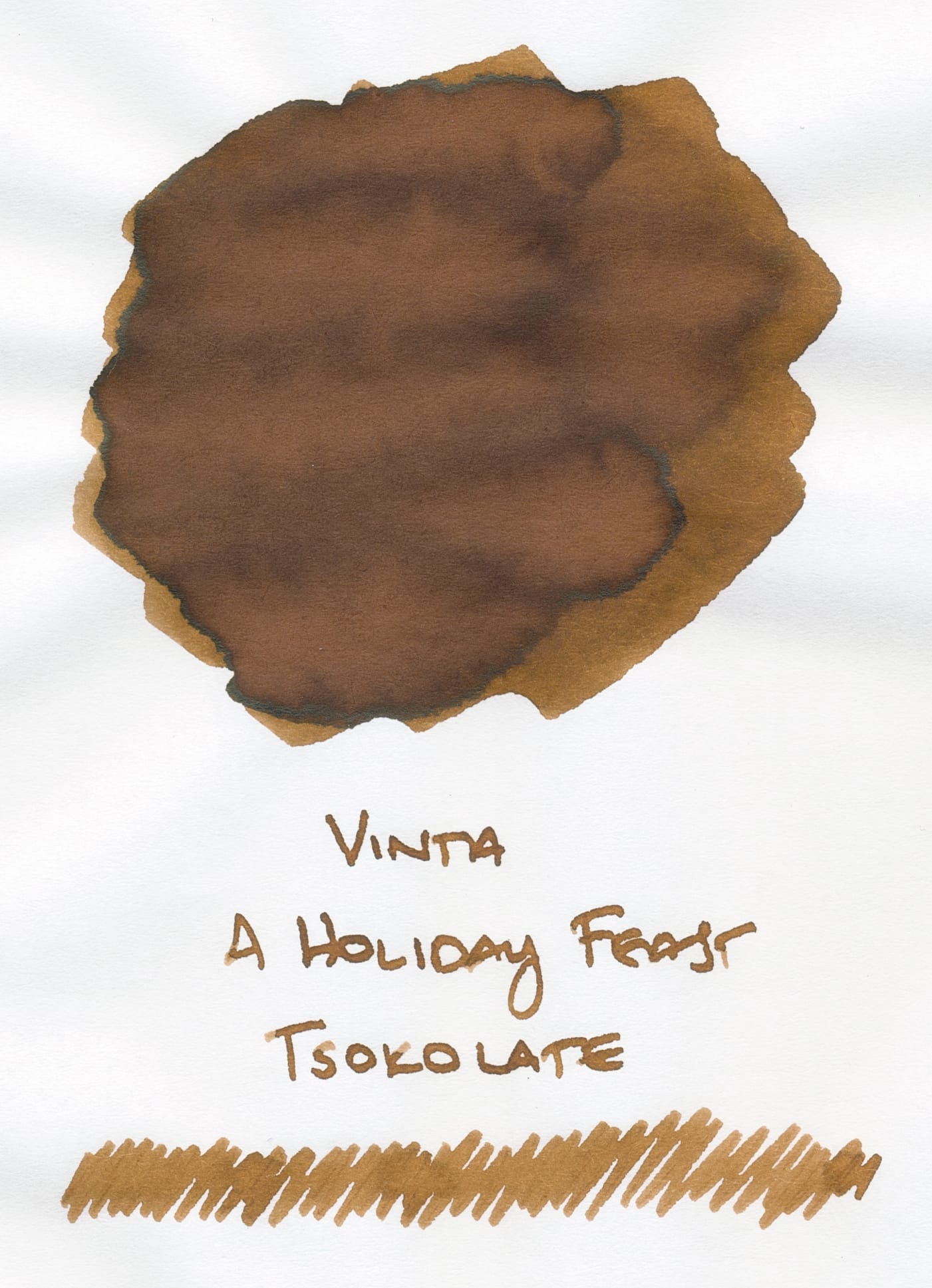
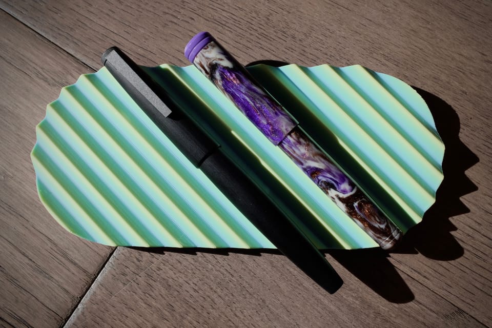
Of the three inks in the set (see previous posts for Puto Bumbong and Bibingka), I would use Tsokolate the most, at least currently, due to my semi-obsession with brown inks, and because it's a non-shimmer, which also fits my current mood. By December, however, I may shift a bit more towards shimmers, if history is any indicator.
Comparisons
Because of my aforementioned semi-obsession with brown inks, I have plenty to put up for comparison here. 😅
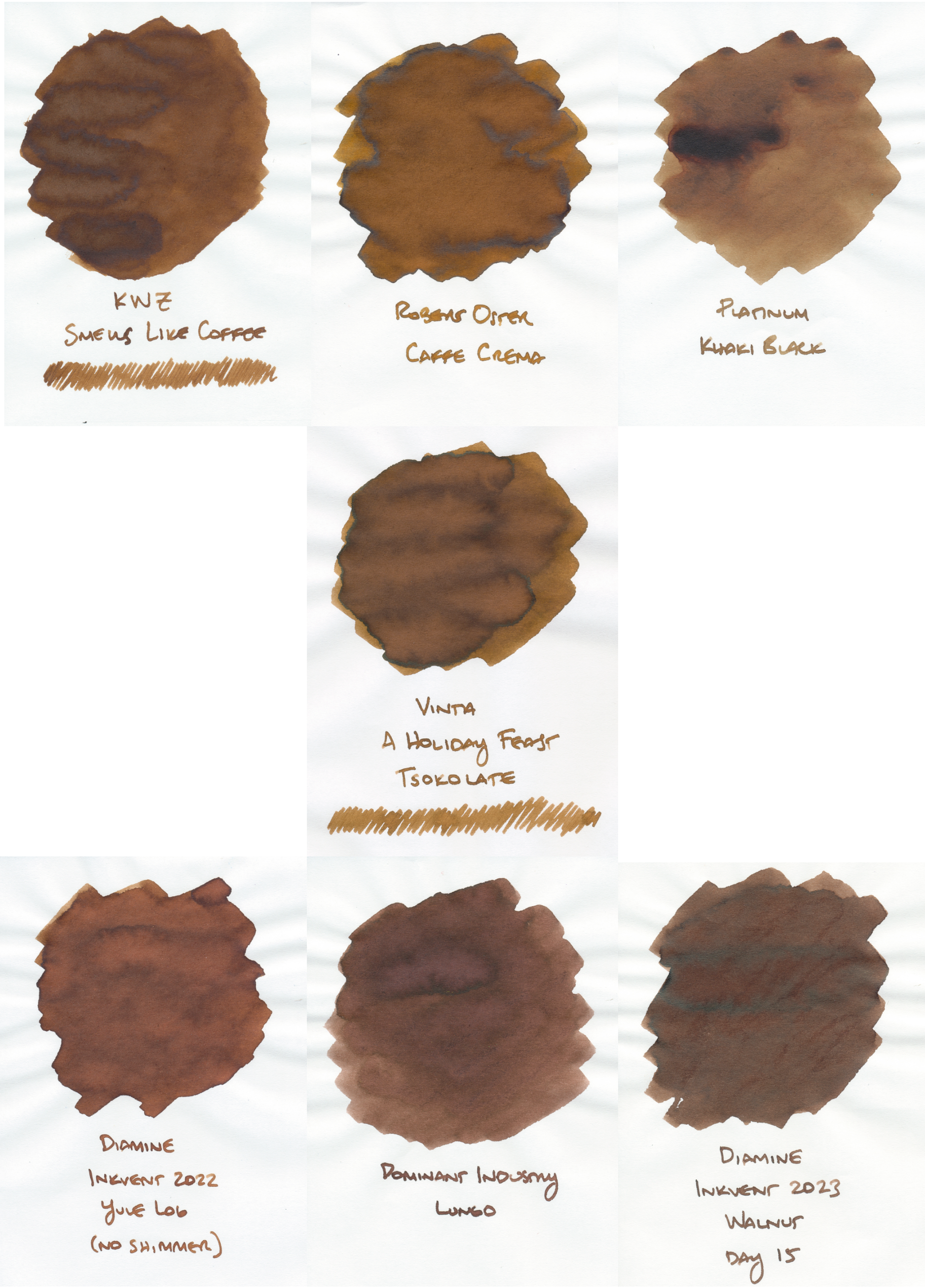
I did something a little different here to help you see the differences among the comparable inks. It's really useful to stare at ink swatches side-by-side to recognize the subtle and not-so-subtle color and saturation differences.
The closest swatch I have to Tsokolate is Robert Oster Caffe Crema (top row, middle). Though the swatch here looks warmer and more yellow than Tsokolate, in reality they're much closer in color, with the Robert Oster having the tiniest bit more of the yellow and/or yellow-green tones in some places (curse you, screen calibration).
KWZ Smells Like Coffee (top row, left) and Platinum Khaki Black (top row, right) are the two other closest inks, with the Khaki Black being a little less saturated, and a more tannish version of Tsokolate.
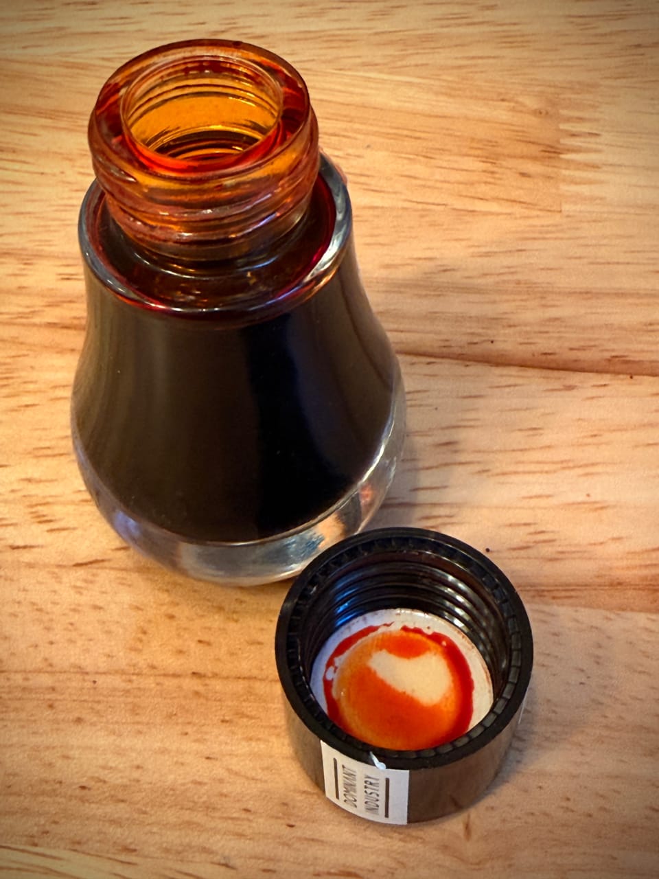
The three inks at the bottom veer far enough away from the first 3 comparison inks that I grouped them together. Diamine Yule Log's base color (no shimmer) (bottom row, left) and Dominant Industry Lungo (bottom row, middle) are similar in saturation and shading, but have underlying reddish tones. Diamine Walnut (bottom row, right) seems a bit more saturated and a noticeably cooler brown overall.
Overall Set Thoughts
I like Tsokolate and Puto Bumbong a lot, but Bibingka seems too light for writing, unless maybe I use it with a pretty wet nib? Bibingka might look a bit more saturated on a different paper, like Iroful.
While 15ml seems like a small amount for the bottles in this set, I think they're probably a good size that I might actually finish, as opposed to the humungous 60ml bottles I have for some inks (😬). None of the colors, despite being nice, are so unique that I feel compelled to hoard more sets to make sure I don't run out, which feels healthy for a change.
Well, that's it for Vinta's A Holiday Feast ink capsule. What did you think? Are you curious to get the set? And more importantly, do you want to try out the namesake Filipino treats? 😄🤤
If you're interested in seeing more of my fountain pen and ink posts, you can find them under the "Fountain Pens" tag at the top, or right here.