Vinta Inks' A Holiday Feast: Puto Bumbong
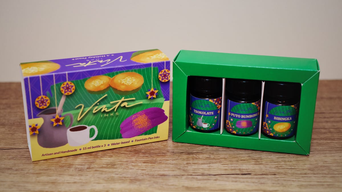
When I saw Vinta Inks post teasers on Instagram about this 3-ink capsule called "A Holiday Feast", I was so excited to order it! As soon as Vanness notified me it was available (I had added it to my wishlist a day or two before), I bought it so fast. 😀 I mainly wanted it because the art they made using the inks looked good, and they were Filipino Christmas food-themed inks. They definitely knew how to get me.
I got the set late last week, but amazingly waited until yesterday to swatch them. Since I usually post comparison swatches from my library, I decided to post about the inks individually to keep the post length reasonable. 😛 Today we're looking at Puto Bumbong (audio pronounciation), named after a purple steamed rice cake topped with shaved coconut, butter, and brown sugar.
As such, the ink itself is a deep violet (steamed rice cake) with lots of gold shimmer (brown sugar) and some green sheen (maybe referring to the bamboo leaves used during steaming/serving):
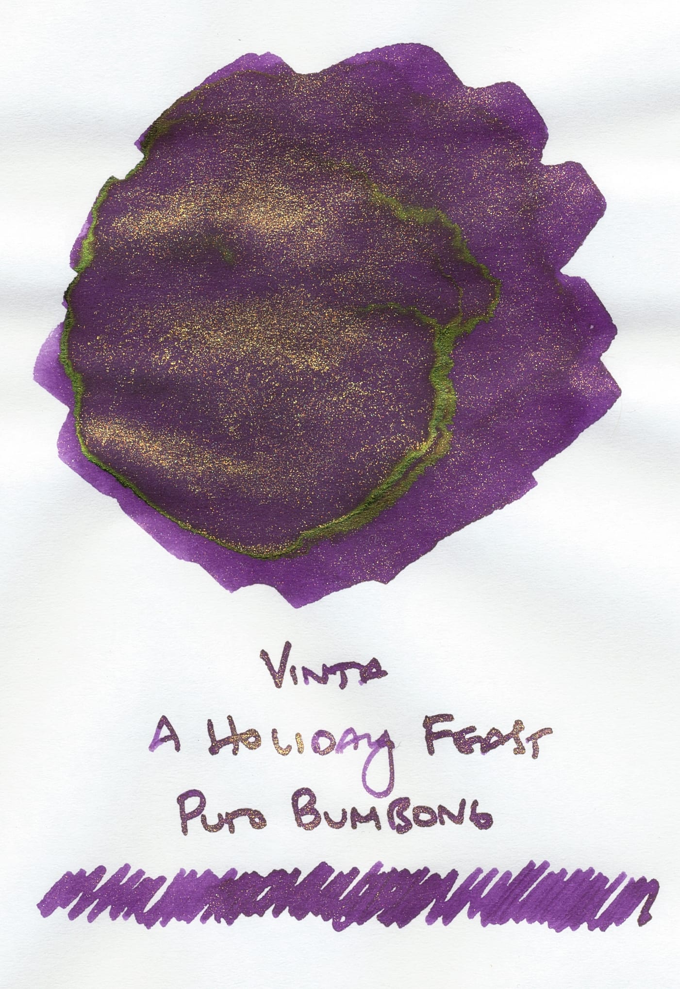
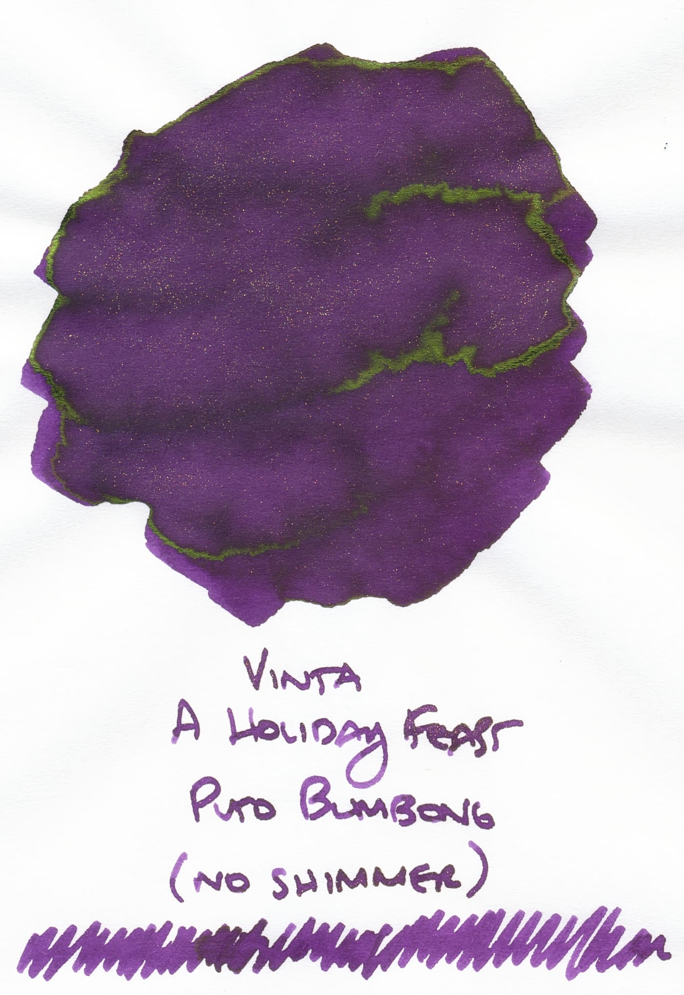
I tried to swatch the ink without shimmer, but shimmer particles were free floating even when not shaken, so the "no shimmer" is more like low-shimmer.
In either case, you can see that this is more on the violet spectrum rather than a blurple. Normally I prefer blurples, but this color is lovely. I also appreciate that in the writing, the sheen doesn't seem to overwhelm the base color. BTW, the gold shimmer is strong in the swatch, but as always, scans don't show the full majesty of shimmer inks. 😛
Comparisons
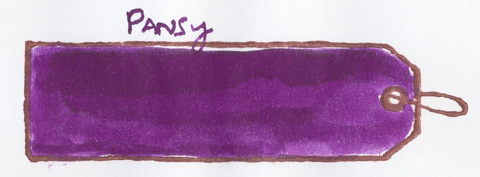
The closest ink I have would be Diamine Pansy, but it doesn't have shimmer or sheen. It's a dark violet, but not quite as dark as Puto Bumbong.
The next two seemed closer in shade when I looked at their swatches in real life, but their scans show they're cooler and more leaning toward blurple instead of violet. The first is Diamine Raise a Glass from last year's Inkvent.
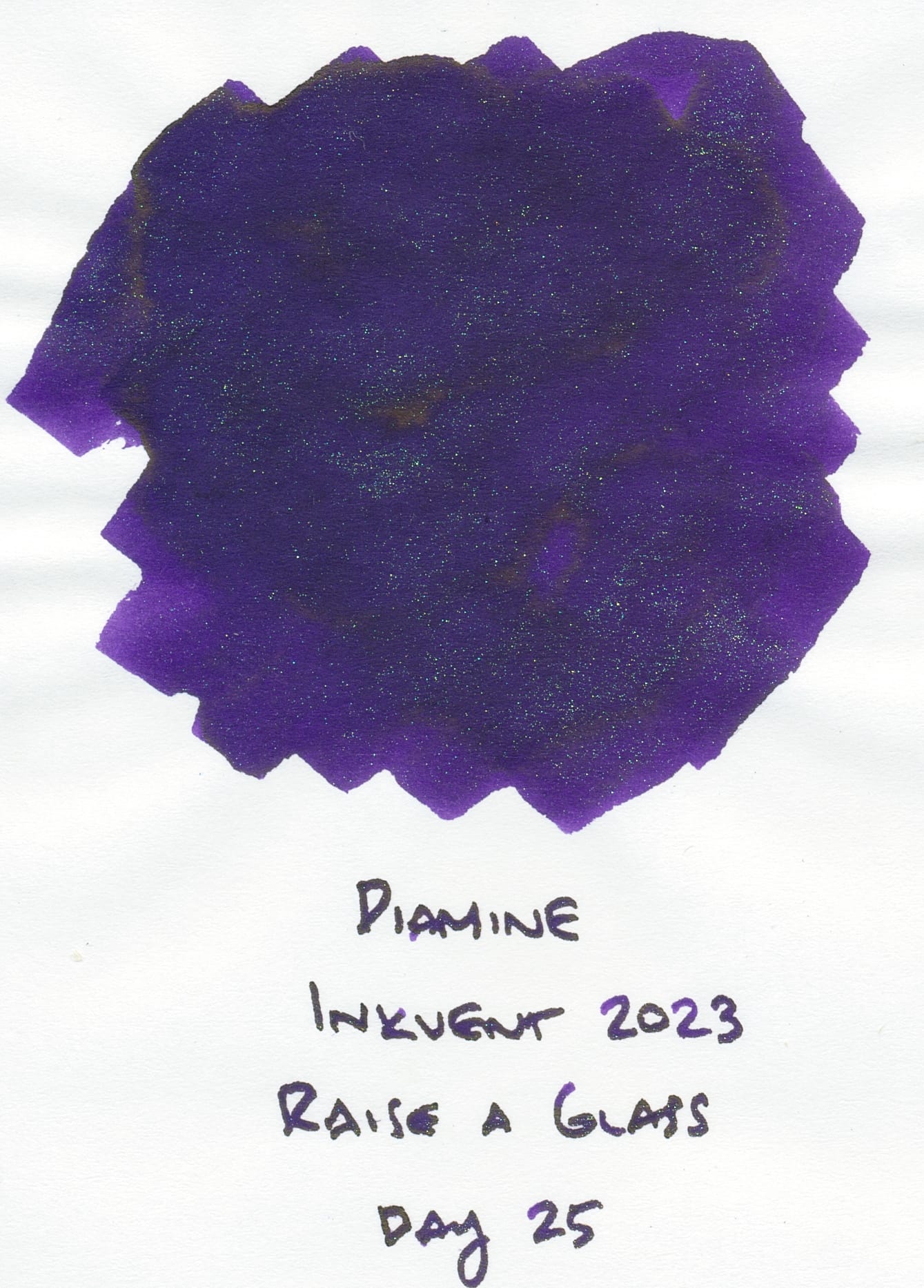
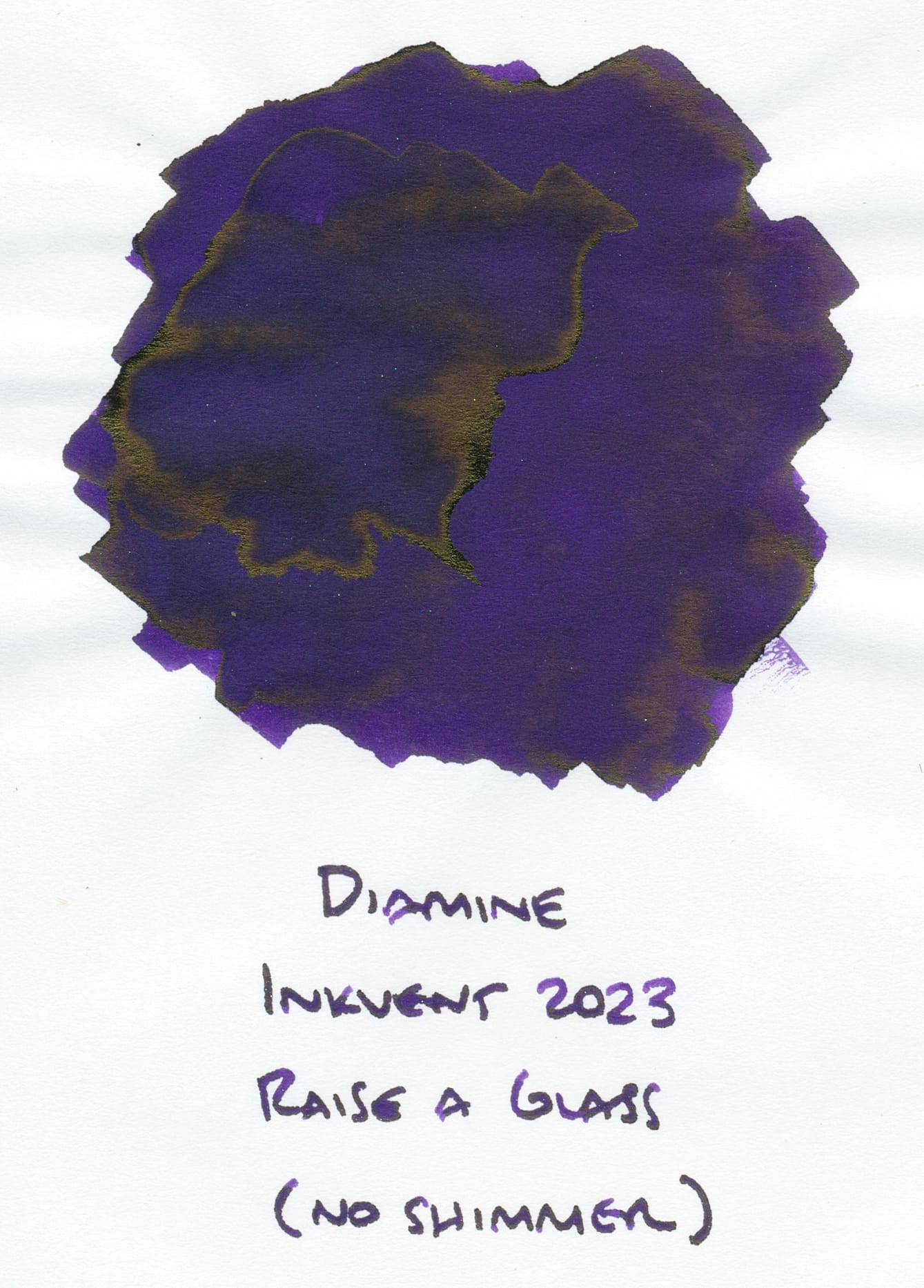
I know the sheen and shimmer are different. It's more in the ballpark rather than a close dupe. I haven't really used this ink much since it's so dark.
The next is another deep purple with sheen, but no shimmer, Troublemaker Lam-Ang:
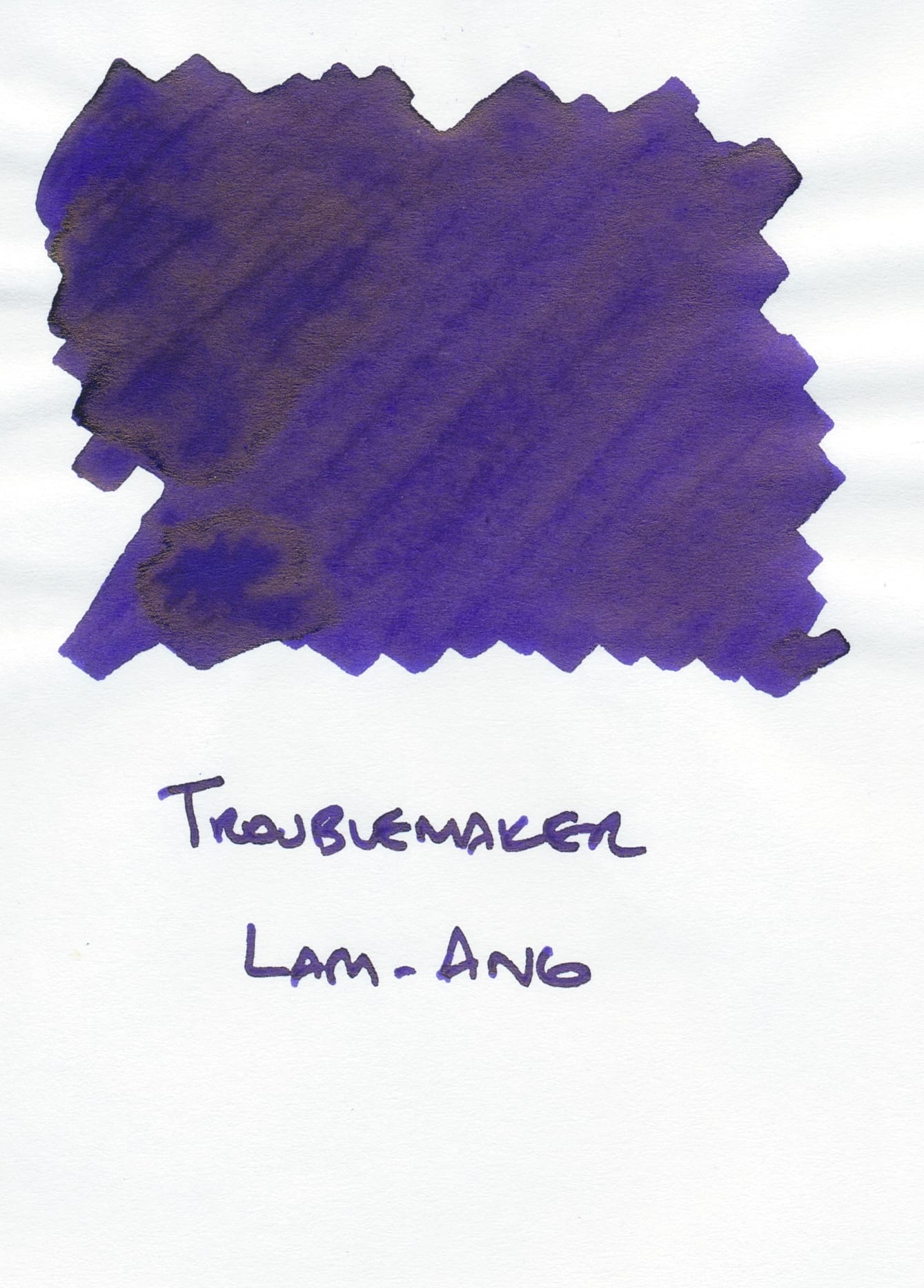
It's closer to Raise a Glass than Puto Bumbong. Additionally, I think the sheen is much stronger and can overwhelm the base color more.
I really like the combination of ink characteristics in Puto Bumbong, as it doesn't seem like any of them overwhelm the other. And I think it'll be light enough while writing to discern the base color. I'm not that big a fan of inks that are so dark they basically appear black. I'll probably wait to use this in a pen to keep it seasonal for Christmas, but it'll be hard to!
I'll write up Bibingka next, so stay tuned.

