Vinta Inks' A Holiday Feast: Bibingka
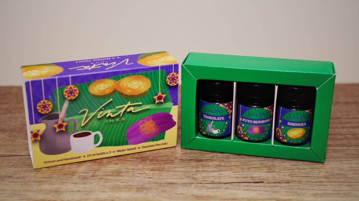
Yesterday I wrote about the purple and gold shimmer ink in this set, Puto Bumbong. Today I'm covering Bibingka (pronounciation), named for another yummy rice flour cake topped with butter and shaved coconut, hence the ink's colors: a yellow base (cake) and silver shimmer (shaved coconut).
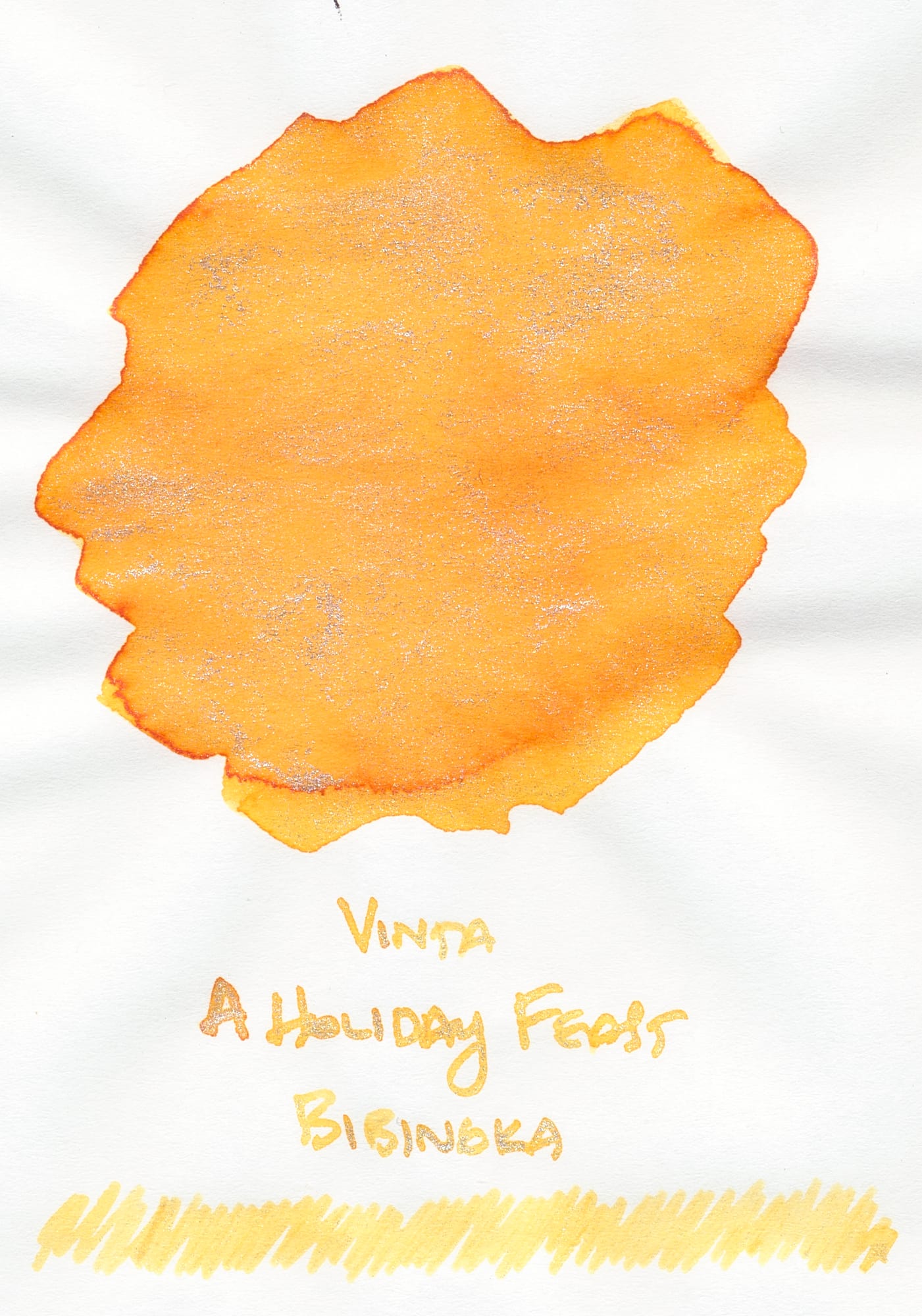
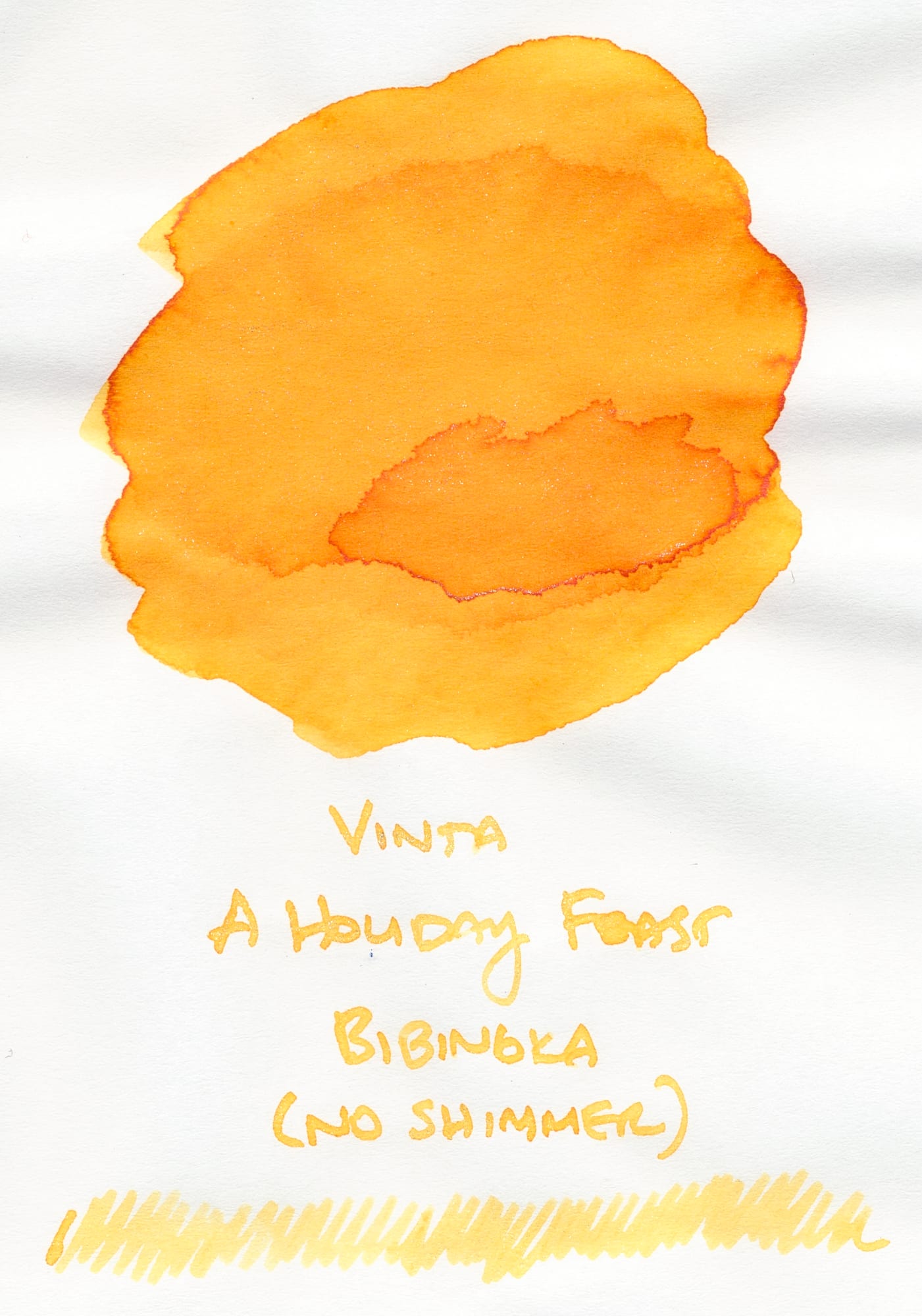
The "no shimmer" swatch was really "low shimmer" as the shimmer particles in this ink never fully settled.
I noticed with this ink (and with Puto Bumbong, but less so) that the shimmer particles are kind of clumpy in the ink. You can see in the scan that they aren't exactly well-distributed in the swatch. You can also see this in the swatch that Vinta provides for retailer product pages (Vanness, for example).
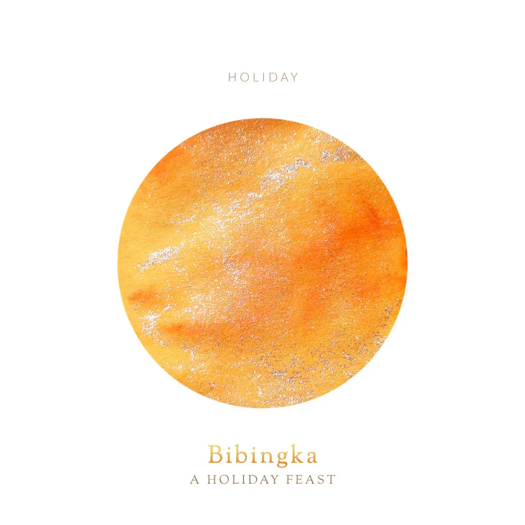
As an aside, I purchased some other Vinta ink samples a long while ago from Vanness and saw similar shimmer clumping. I wondered if the samples had somehow "gone bad" as I didn't remember the shimmer appearing so clumpy when I first got the samples, but I am not sure. Anyway, I guess this is a characteristic of Vinta inks and the shimmer additives they use. In practice, I don't think the shimmer appears out-of-the-ordinary in writing, so some people may find this point moot. 🤷♀️
Getting back to Bibingka, the swatch appears as a nice, sunny yellow with a touch of orange, quite reminiscent of the dessert. But as I was labeling the swatch, the ink appeared quite light, especially when shimmer wasn't so thick. You can see in the swatches above that in my "low shimmer" swatch, the writing and scribble appear light, so I not not sure how legible this ink would be, particularly if you used it with finer nibs. My ink swatches are labeled with a long blade nib in a nib holder, so it's on the medium-to-broad end of the spectrum, but there's no feed involved.
Comparisons
My closest similar ink would be Pelikan Edelstein Golden Beryl, but it has gold shimmer, and seems to have a lot more shimmer added.
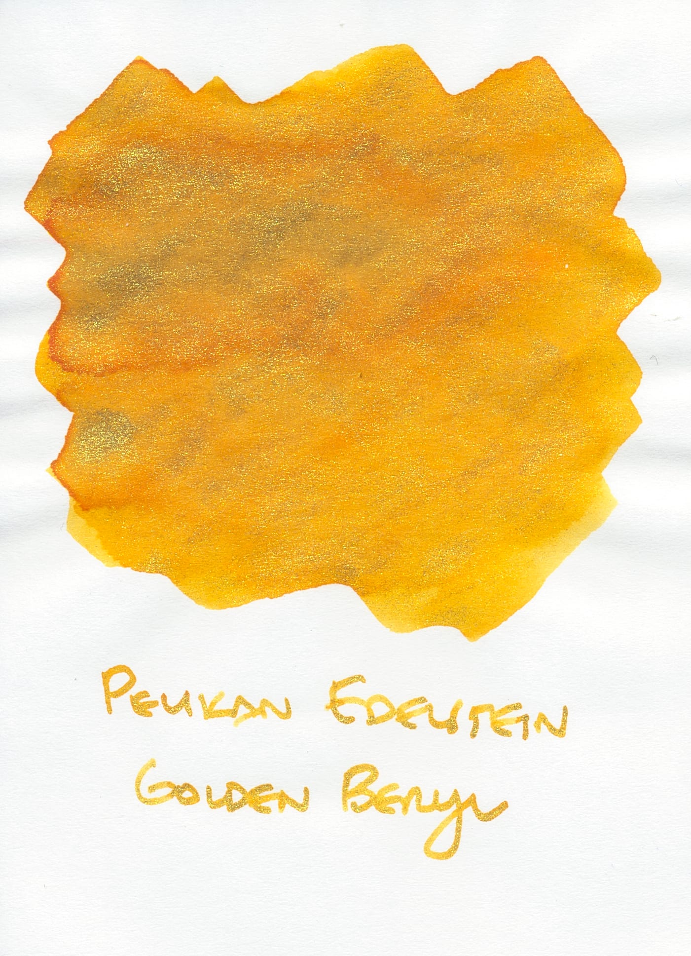
Golden Beryl was a limited edition ink no longer being sold, so you might consider Vinta Bibingka as a similar ink to try, but Bibingka is not as shimmery. I haven't used this ink too much as it has gummed up my fountain pens in the past. Next time I use it, I'd probably fill it most of the way without shaking the bottle, then do a final partial fill to pull in some shimmer (cartridge converters FTW).
If you want a similar base color, but no shimmer, you could try Ferris Wheel Press Buttered Popcorn.
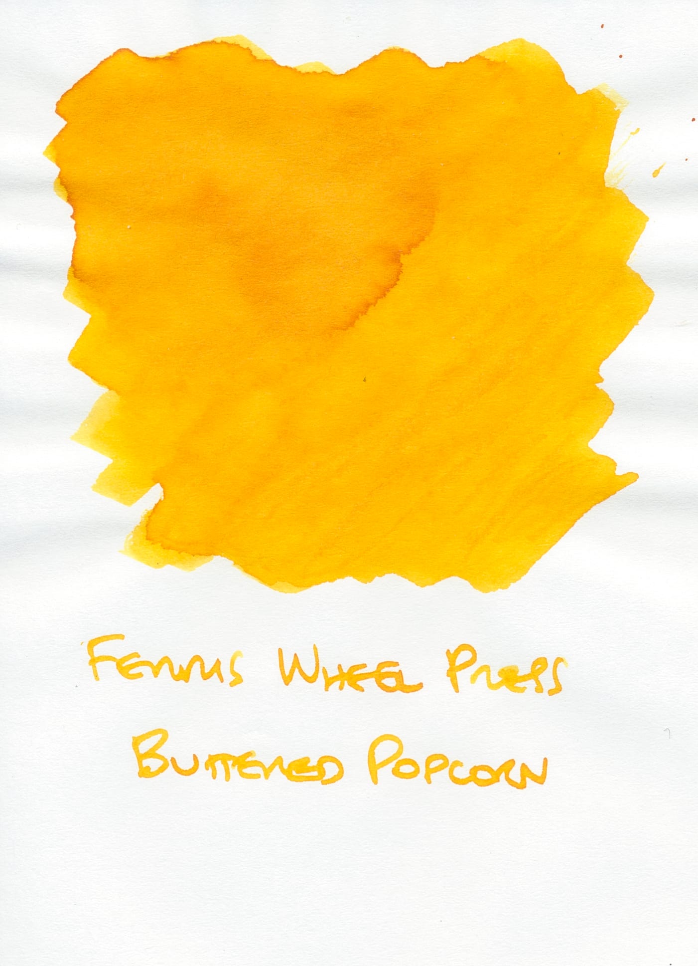
Drew Brown raved about this ink being an actual legible yellow ink, and I agree. It's likely more legible than Bibingka. I was somewhat surprised by this because other Ferris Wheel Press inks have been criticized for being illegible.
And finally, an ink that is more like an orange-yellow than a yellow-orange, Diamine Sunshine Yellow:
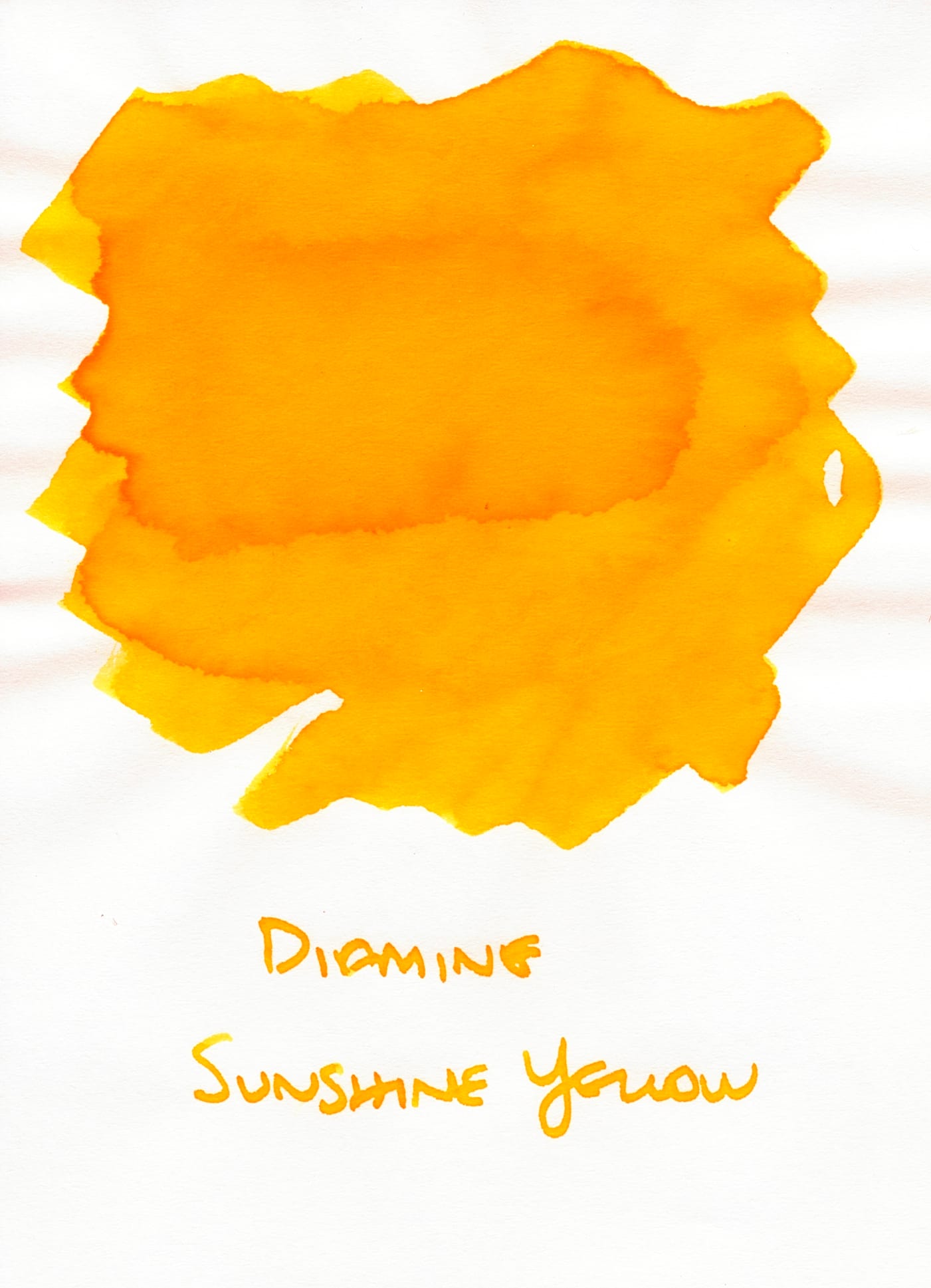
At the time I got this ink, I was looking for a nice sunny yellow with just a tiny touch of orange. This ink was a bit too orange for my liking in reality, though it is still a nice color. I'm keeping it around for the time that I'm in the mood for its shade. 😜
Bibingka is a nice ink, but I'm not sure how well I'd be able to read text written with it. I'll play around with it later in December and maybe report back if I have different findings. How are you liking the inks so far? Are you familiar with the Filipino desserts that these inks are named after (writing about these inks has been making me hungry 😅)?
The last holiday ink, Tsokolate, will be up next!

