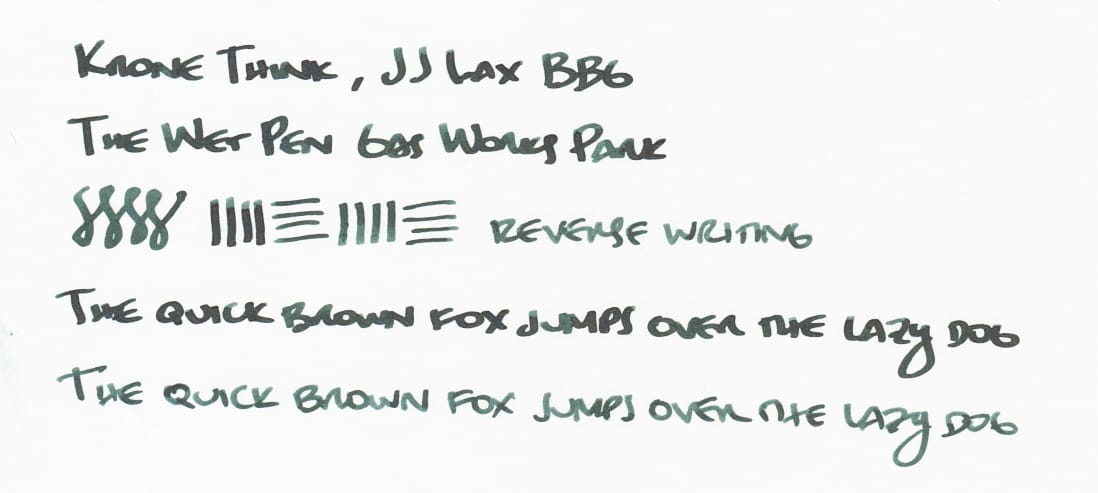
The Wet Pen Gas Works Park and Krone Think Classic Sahara
This week, I'm featuring The Wet Pen's Gas Works Park ink, and a pen I recently bought secondhand, primarily for its custom ground nib: the Krone Think Classic Sahara, with a "Big Bottom Girl" nib by Joshua Lax.
It's a cursive italic on the regular side, and a fine nib on the reverse side. I had no experience with the nib before picking up this pen, but I have gotten an architect grind from Joshua Lax that I like, so I figured the nib was worth exploring. Besides, for the price I paid, I essentially got the pen for free.
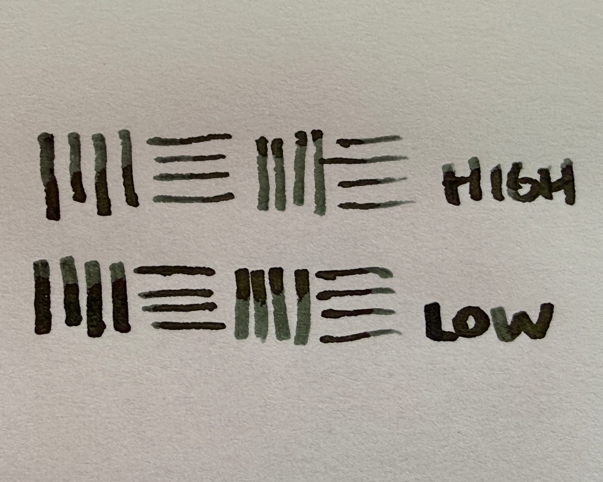
[Awkward edit to add info about the nib] I forgot to mention that the cursive italic side is variable with writing angle, so at higher angles, line widths are thinner and sharper, while at lower writing angles, line widths are a little thicker and rounder or smoother feeling (most visible in cross strokes).
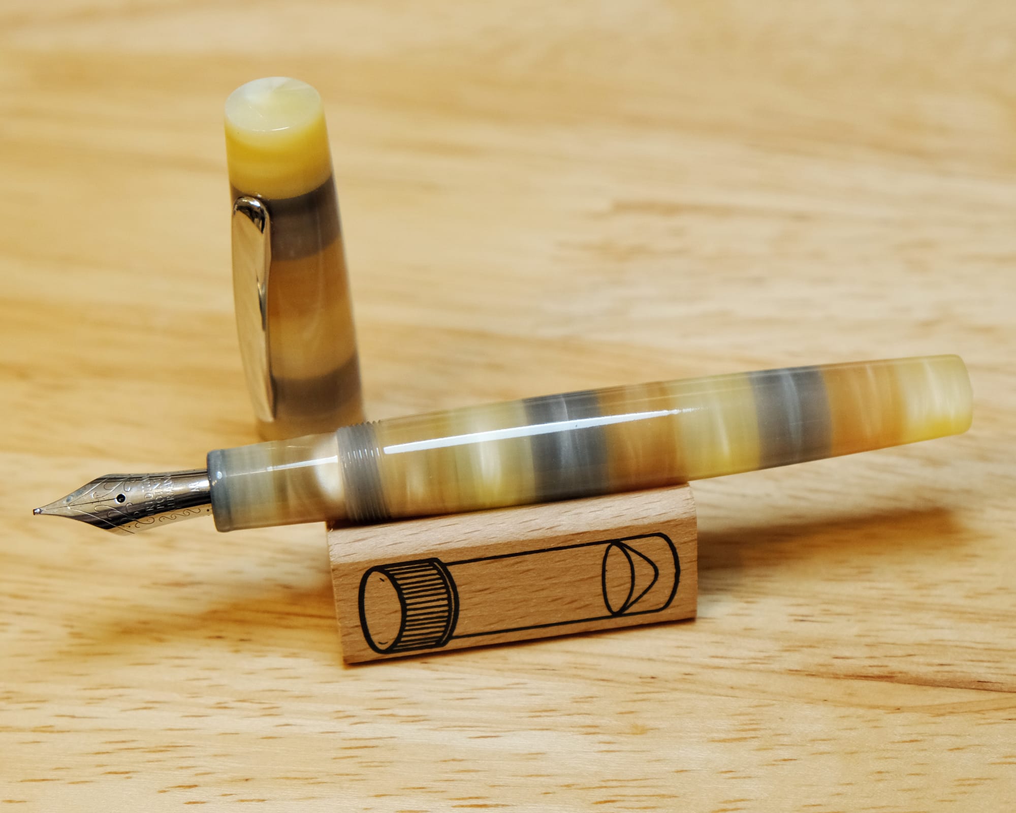
The Krone pen itself is kind of interesting, with its striped resin body. In the light you can see chatoyance as you rotate the pen body. I had never heard of this brand before I saw this pen show up for sale. The only page I could find specifically on this pen is from an Asian online shop. According to that page, the nib is a Bock #6, but the housing is different from the other Bock nibs I have, so it's not easily transferable to another pen without pulling the nib and feed. The style of the pen is alright, but it's not really my taste, at least currently. But anyway...
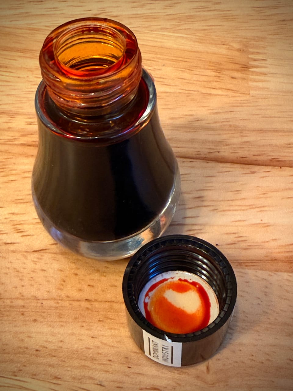
At first I was frustrated with the pen because the two different inks I tried in it – Dominant Industry Maple, and Herbin Ambre de Birmanie – didn't flow well. I realized it's a dry writer and tried to separate the tines a bit, but had no real success in doing that, so I used an ink I knew was very wet: The Wet Pen Gas Works Park.

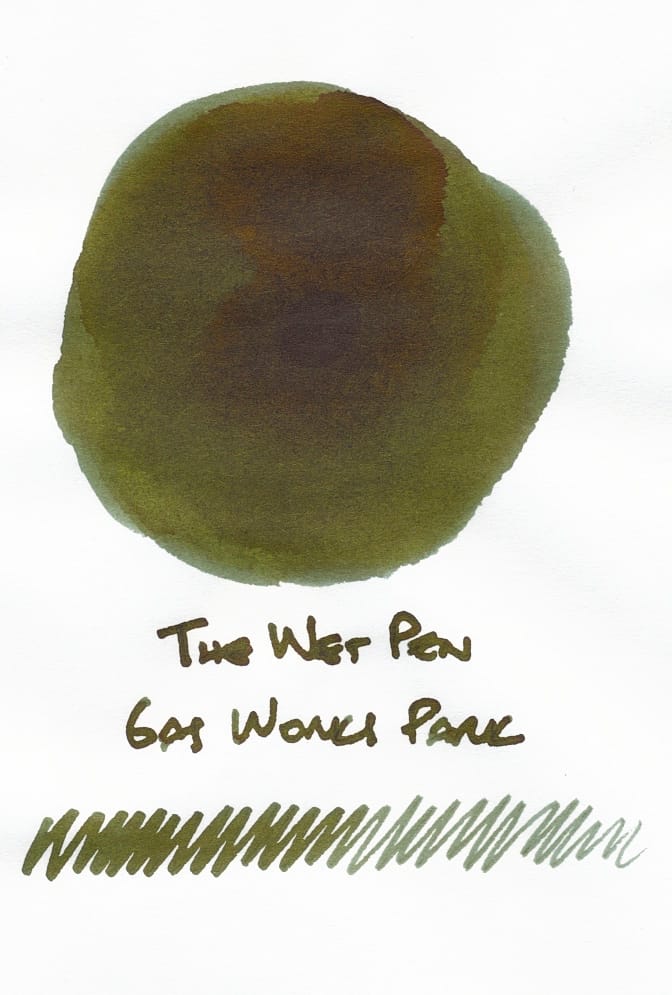
Gas Works Park is a dark green with kind of rusty brown tones or sheen. As you can tell from the writing sample, the ink flows so wet that the long blade nib I used wrote wider than it normally does.
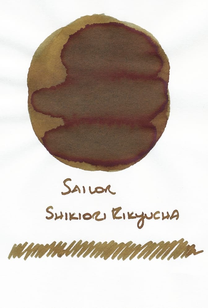
The only ink in my library that seems similar is Sailor Shikiori Rikyucha, but it's reversed – a primarily brown ink with greenish tones. It's one of my favorites.
Getting back to the pen, filling it with this wet ink got it performing as I expected. Phew! And its cursive italic shape seemed to tame the ink and show off more of its multi-shading that you wouldn't normally get from a regular nib because the ink flows so wet. Of course, the ink's appearance is dependent on the paper used.
I use Tomoe River Sanzen paper for my ink swatch library, so I consider it my benchmark.
You'll see the dark green and brown tones most distinctly on this paper, nice shading visible even in the darker writing with the cursive italic side.
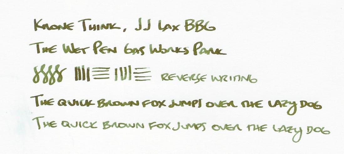
I also tested the pen-ink combo on Iroful:
Here the color looks completely different, a dark blue-green devoid of any brown tones to my eye. The line widths are thicker on this paper, too.
And finally on Cosmo Air Light paper:
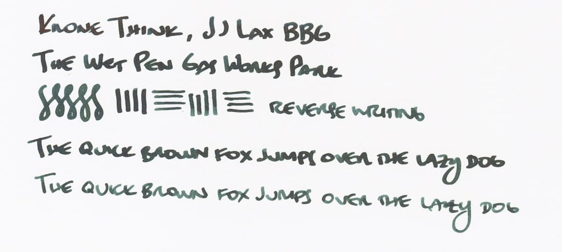
The ink shade is basically the same as on Iroful, but the line widths are ever so slightly thicker on Cosmo Air Light, most visible in the reverse writing samples.
While I'm not so keen on this nib being such a dry writer, the silver lining is that I might now be able to use these really wet inks in my collection that I haven't wanted to use because they're not as controllable in the pens I regularly use, and often appear too dark for my liking. Diamine Writer's Blood, Lamy Dark Lilac (2024), several inks from The Wet Pen, and others fall under this category. The problem is that there are so many of them, and only one of this pen. 😅
So, what do you think of either the ink or the pen? Anyone reading this have pens from Krone? It's probably not a brand for me, but in the case of this pen, I'm glad I got to add the JJ Lax BBG nib to the collection. I'll see if I end up transplanting it elsewhere.

Thanks for reading! If you like what I write and want to support me, you can "buy me a coffee". I'd appreciate it.