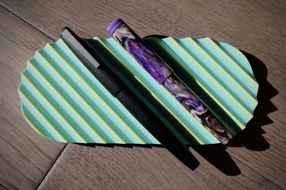
Inkvent 2025 - Week 1 Recap
We've seen days 1 - 7 for Diamine Inkvent, Colorverse Colorvent, and the Pen Addict "Slackvent" (🙂). Which inks were my favorites and are likely going to be used in a pen soon? If you read through my previous posts, I don't think you'll be surprised.
Top favorite
Slackvent, day 2, Colorverse New Mexico White Sands
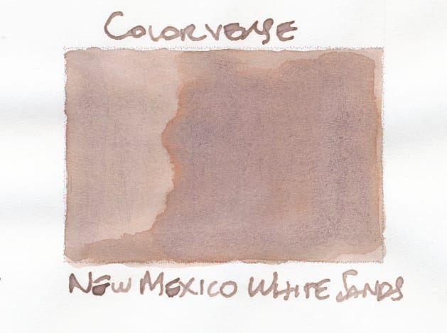
This is such an odd ink that's hard to categorize – a light, milky brown or beige with pink undertones and some light orange shading around really saturated areas. It's so different from all the other inks I've swatched this week. I'm glad I can buy a full bottle of it (I think). It was one of the Colorverse US-themed state inks.
Comparisons
The first ink I thought of as a lookalike was Sailor Kitsune Biyori, but in looking through my library of swatches, I also found Ferris Wheel Press Oyster Hour and Colorverse Arrokoth. None are fully similar, but have certain aspects that remind me of White Sands.
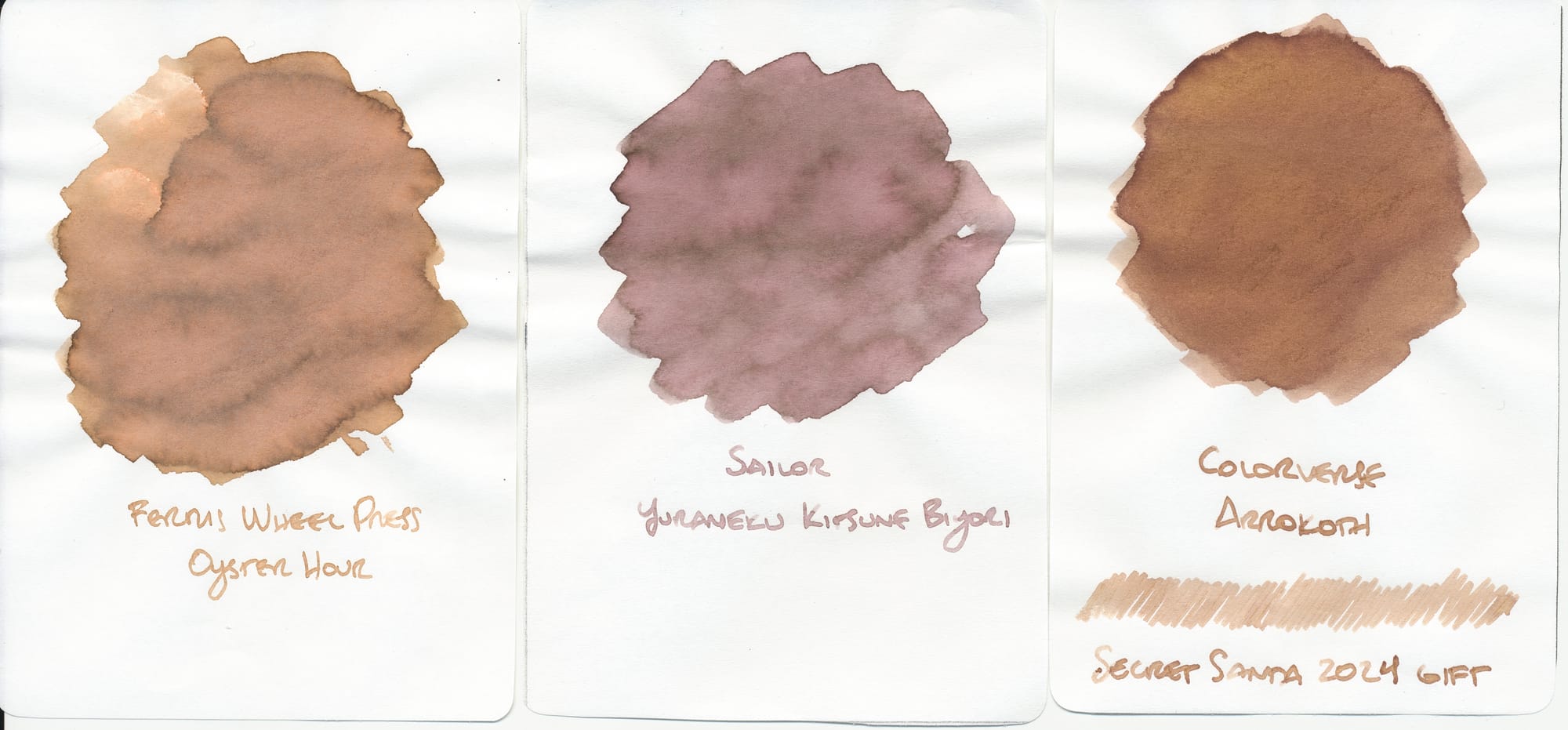
Kitsune Biyori is too pink/warm. Oyster Hour is beige, but darker and more orangey, probably similar to the orange shading bits you can see in White Sands's swatch. And Arrokoth is like Oyster Hour, but even warmer and more saturated.
Some other odd inks that reminded me of White Sands:
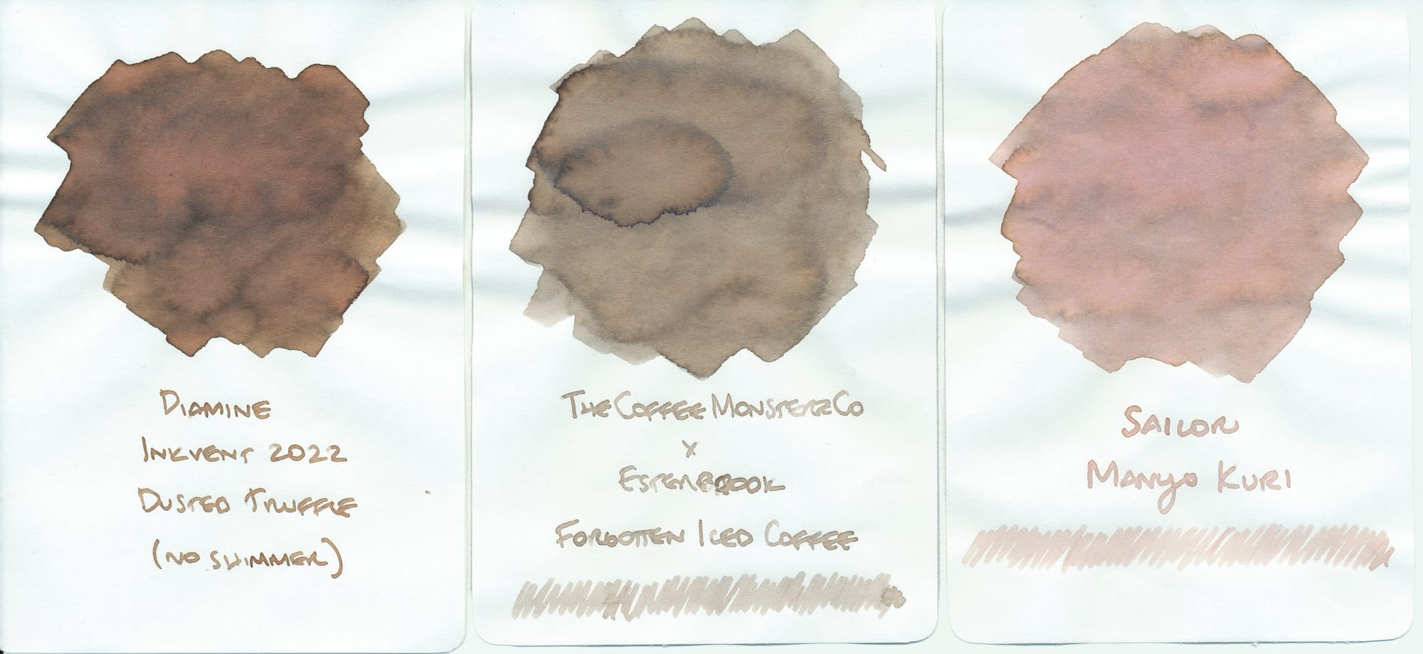
Dusted Truffle looks like a much more saturated version of White Sands, if a slight bit warmer than the original beige color. Forgotten Iced Coffee is like a much cooler White Sands with no orange tones. Kuri is way too pink and very light/illegible, but it gave me similar vibes to White Sands. I have not used Kuri in a pen yet.
Second favorite
Colorverse Colorvent, day 3, Erebus Crater
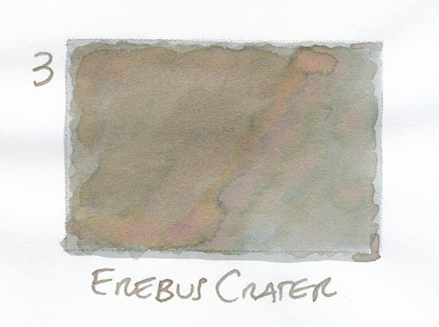
I'm not alone in thinking this ink is great with its variety of chromoshading colors: olivey, swampy greens; browns; pinks; oranges. It definitely evokes a crater on Mars. Even though the writing won't necessarily show all the different shades of the ink, the resulting odd green-brown-pink looks unique and interesting.
Comparisons
My first thought was, "this kinda looks like Troublemaker Kelp Tea to me," but when I found the swatch, I saw it was way too yellow and green and saturated.
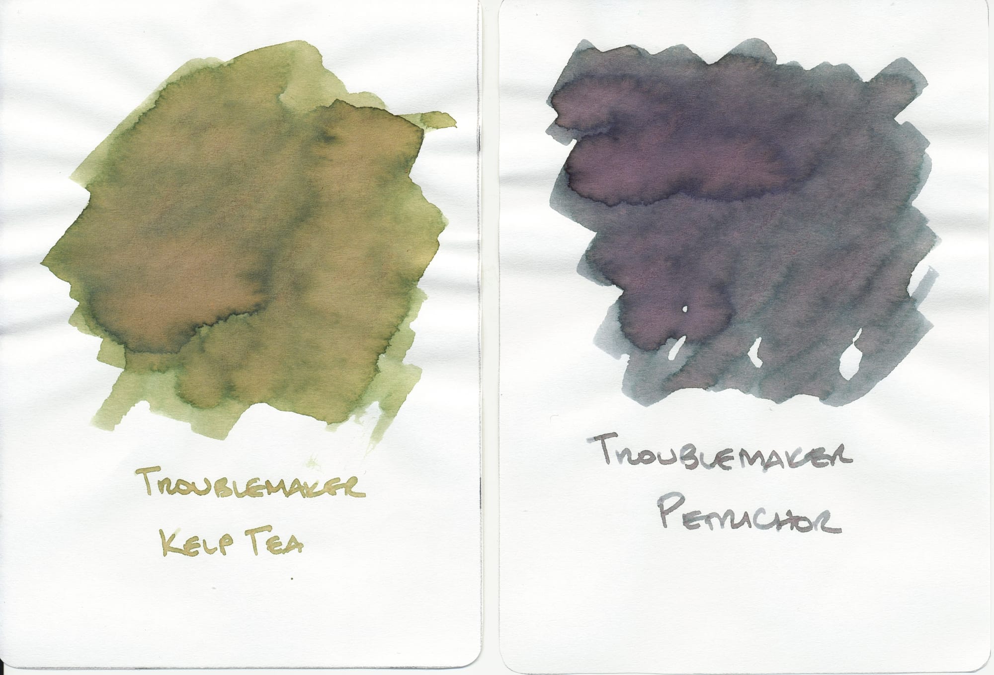
Then I thought of Petrichor, but that's on the other side of the spectrum, too blue-gray and saturated. Both of their chromoshading kind of look like Erebus Crater's chromoshading, but the base colors are off.
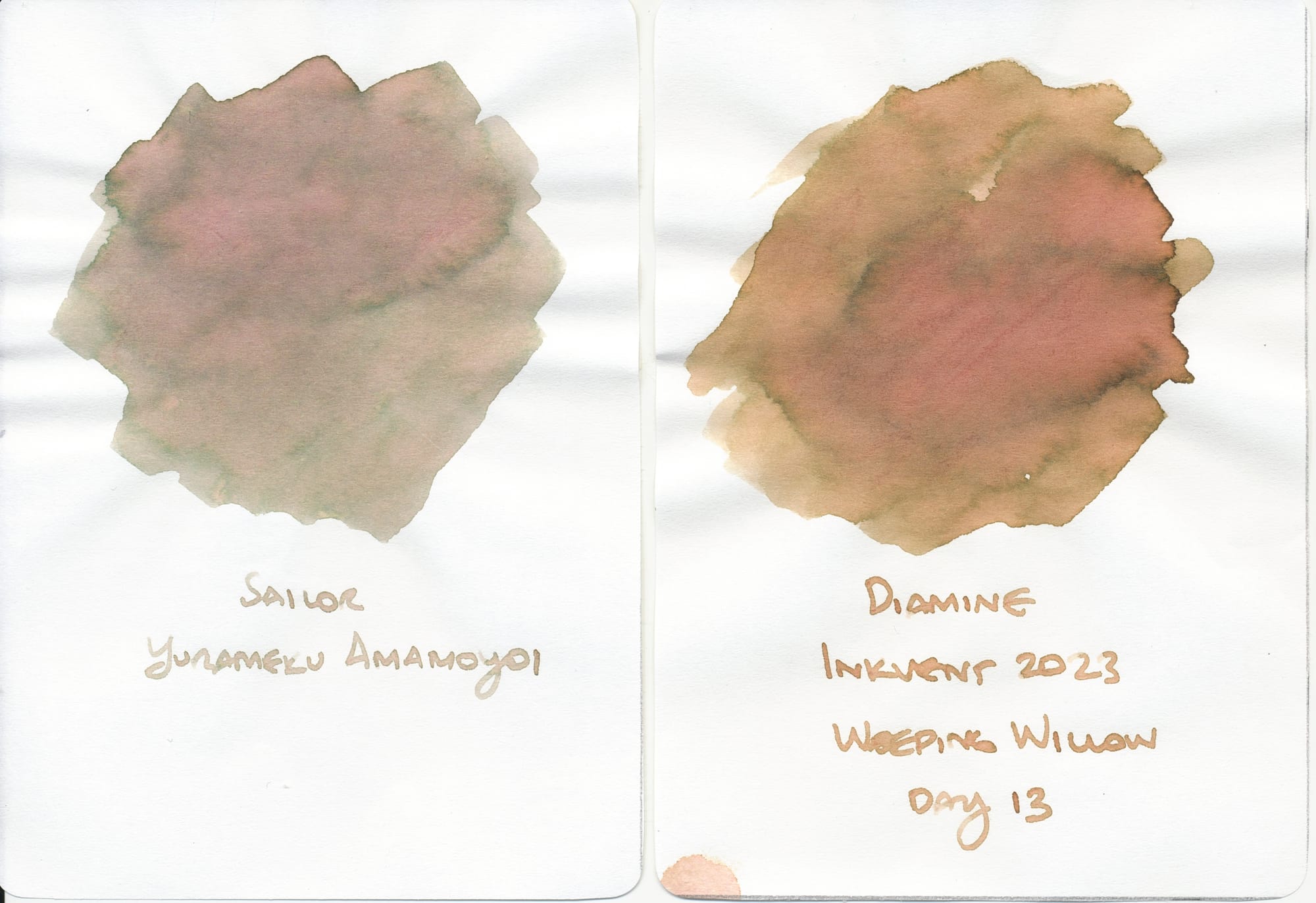
In reality I think Sailor Amamoyoi looks the closest, although it is less saturated. I think when I had tried this sample, it was too light to be easily legible, but I should revisit it, especially if Erebus Crater doesn't get voted on to become a full bottle. Diamine's Weeping Willow looks similar, but with more yellow and orangey tones. Could possibly add a drop or two of other inks to darken it up to be more like Erebus.
Third favorite
Diamine Inkvent, day 6, Fir & Fog
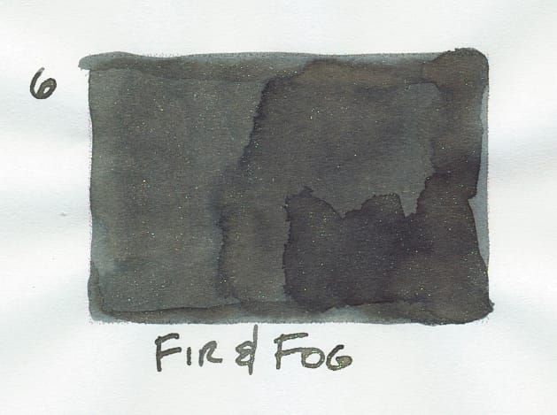
Diamine loves to go ham with its gimmicks for Inkvent, which is fine. I just don't happen to be in the mood for most of the gimmicks they throw at me, like sheen or this year's new gimmick, pigment inks. Fir & Fog isn't a total standard ink since it has chameleon shimmer, but I'm probably not going to shake it when I fill a pen with it so I can enjoy its base color like a standard ink. Plus, I really like its great name for the green and gray shades.
Comparisons
Finally, the first ink that came to mind was Herbin Vert de Gris. The name translated literally is "green of gray", but again, my memory kind of failed me, because my swatch is too blue, and barely even looks green or gray!
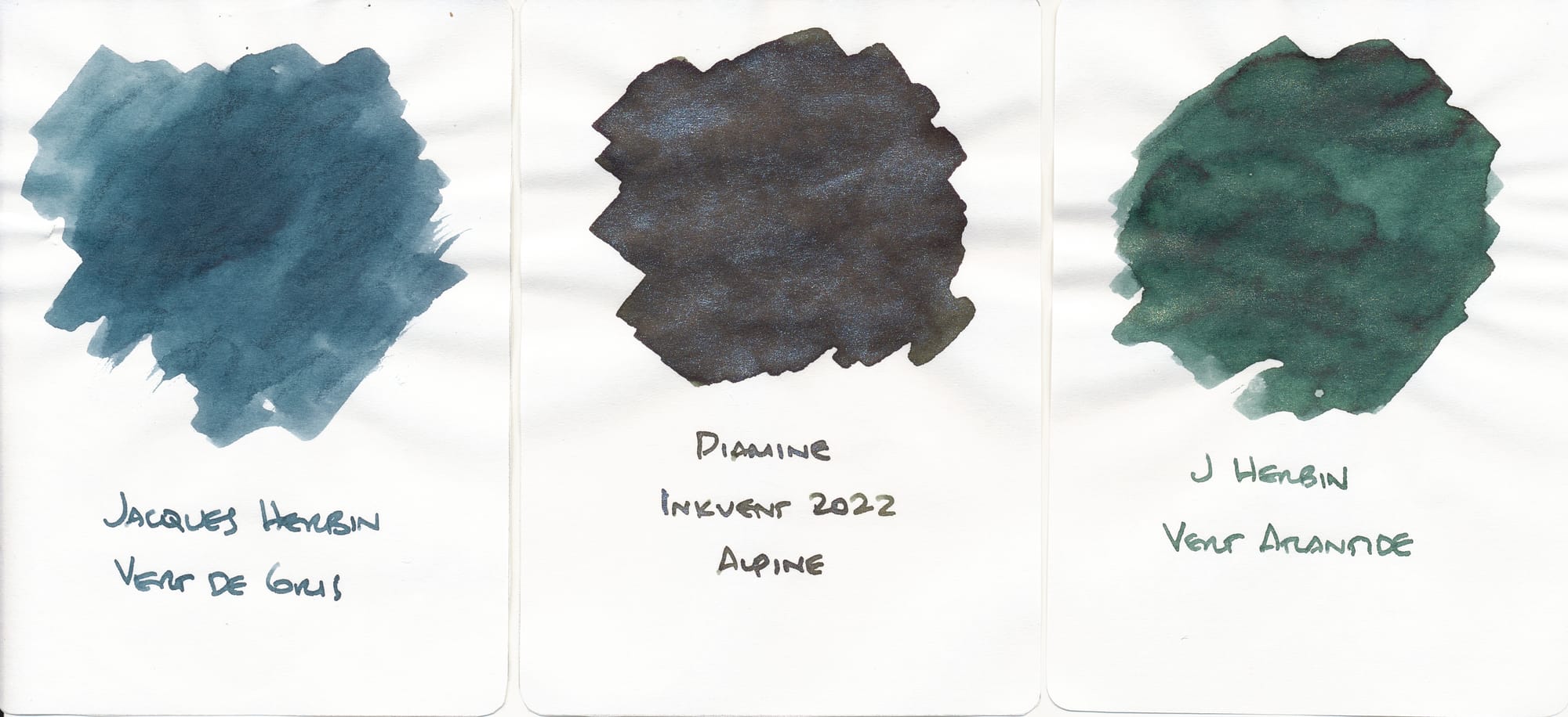
But I feel like when I've used this ink, it has looked more green-gray than my swatch appears, so I will have to revisit it. It was also in a bottle that had a terrible seal, so a lot of it evaporated before I could use it more than a few times. 😐
My next ink guess was Diamine Alpine from a few years ago, but it's much darker and saturated. I prefer Fir & Fog's saturation.
Herbin's Vert Atlantide is a pine green with gold shimmer, though too green and saturated, not nearly enough gray.
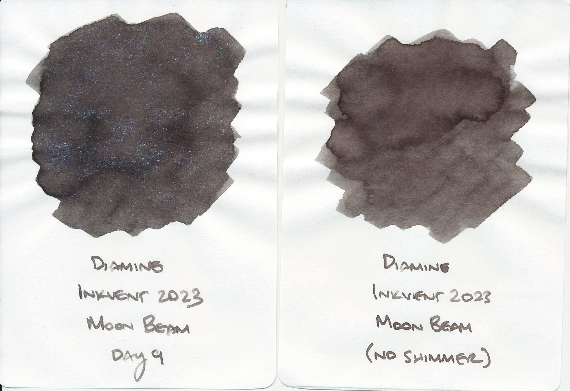
I thought that Diamine Moon Beam, a dark gray with green shimmer, looked somewhat similar, since the green shimmer made the gray base more green-gray looking (more apparent looking at the swatch in real life compared to the scan), but as you can see, the base color is just a cool temperature dark gray.
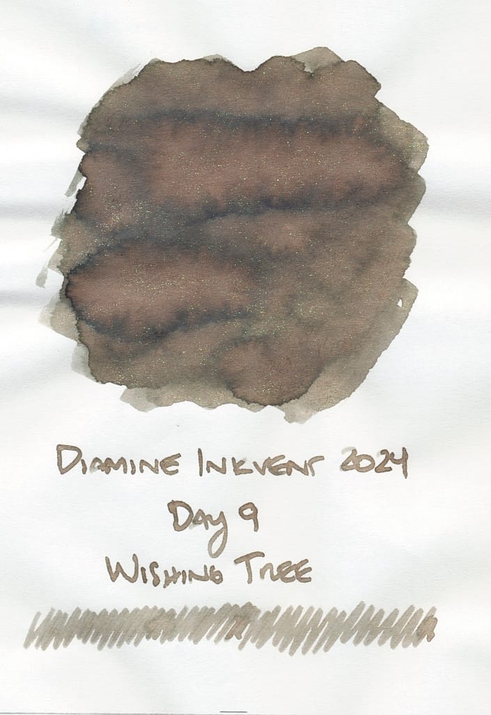
Finally, Diamine Wishing Tree from last year's Inkvent has a similar look, but its base color is a warmer green-gray with brown tones. It has a chameleon shimmer that appears to shift between pink and green like Fir & Fog's. So if you want a warmer version of Fir & Fog, maybe try Wishing Tree.
Phew! Not sure if I can keep doing all of these comparisons for the weekly recaps, but I'll see how I feel as I go. What do you think of the similar inks I picked out? Do you have recommendations that I missed? Let's discuss here, on Mastodon, or Bluesky.
Previously: Day 1, Day 2, Day 3, Day 4, Day 5, Day 6, Day 7
Thanks for reading. If you like what I write and want to support me, you can buy me a coffee...or tea! I'd appreciate it.