Inkvent 2025 - Day 9
Today we have an interesting-looking ink in the vial that turned out to be kind of a pain to swatch*, another ink that keyed into my love of mint chocolate, and a possible Lamy Dark Lilac dupe.
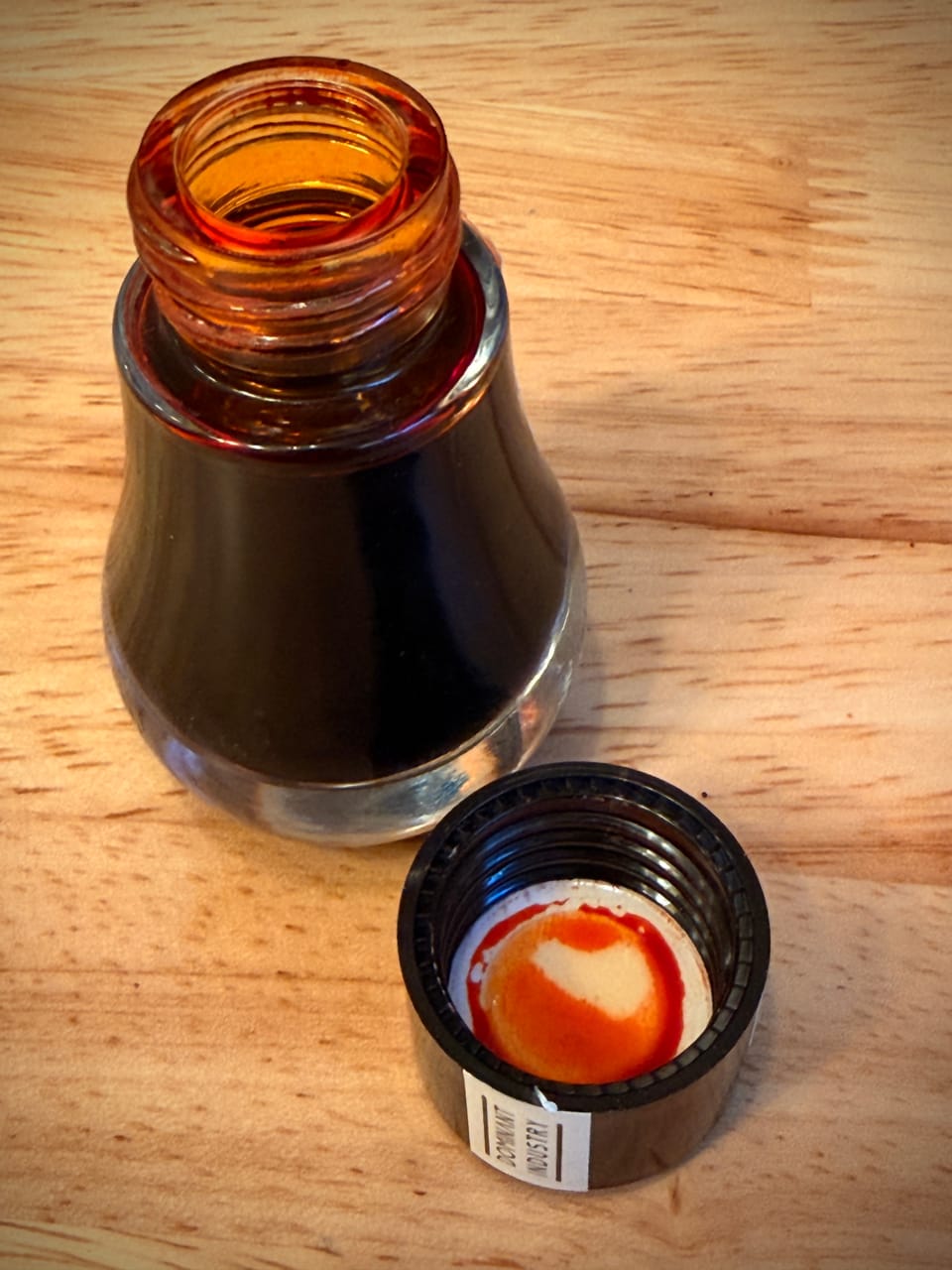
*Editor's note: I heard from someone and saw in a video that this "ink" is actually a shimmer additive to use with other inks! 🤦♀️ Not having the actual box is really throwing me off! Sheesh...
Colorverse
*Editor's note: As I said above, I found out that this is not an ink, but an additive to add champagne shimmer to other inks. So, disregard my comments about ink performance, I guess, and just look my video of how pretty it is when shaken up. 😆 🤦♀️
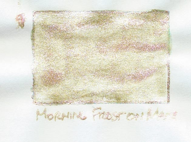
When I got this sample vial out, I was quite intrigued because it looked like a clear liquid with a ton of champagne shimmer settled at the bottom.
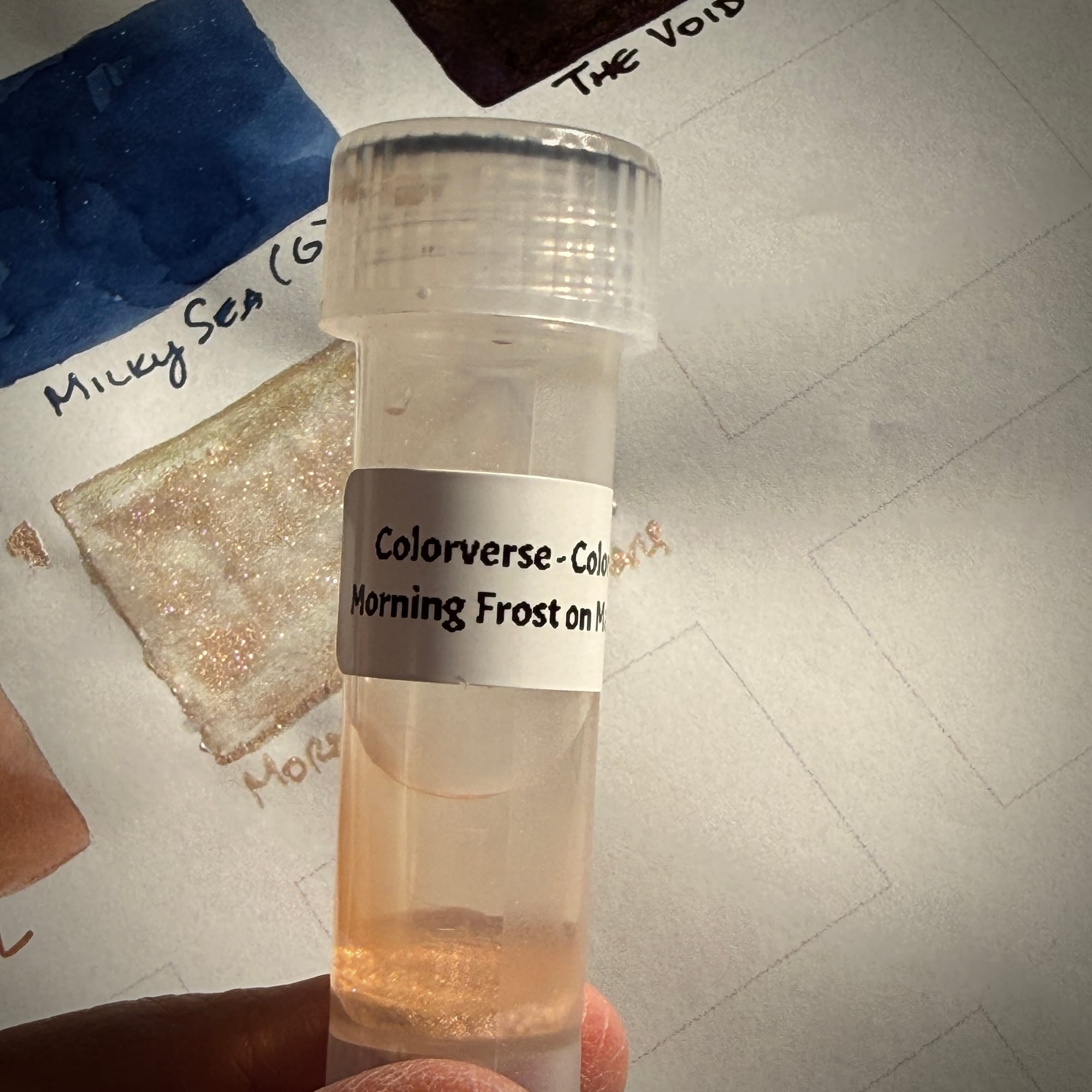
The label said Morning Frost on Mars, with "gleamix" in parentheses. I shook it up and was mesmerized at the shimmer flowing in the vial.
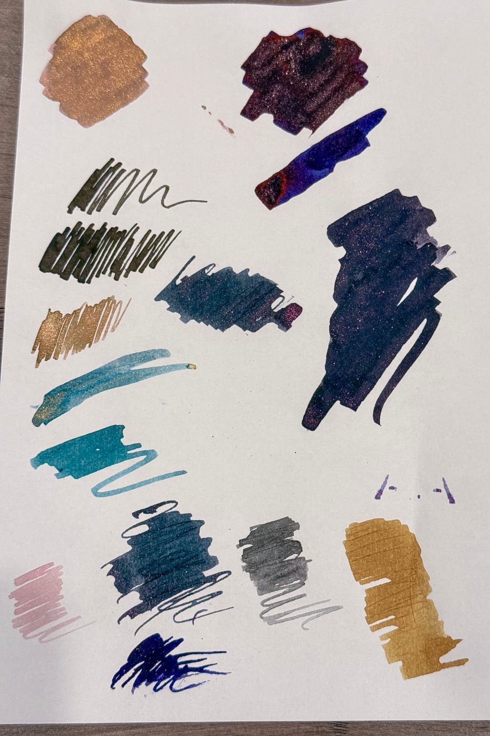
But when I swatched the ink, everything kinda went wrong. The ink looked like it clung well to the Kakimori glass nib I used, and the first couple strokes to outline the swatch rectangle went okay, but then it's like the ink had completely dried and the glass nib wouldn't write until I dipped again, which caused clumping. I tried to write "9" for the day number twice, but it just blobbed as soon as I touched the nib to the paper. I barely was able to write the ink name below the swatch rectangle. I was concerned that the ink was like a pigment ink that would aggressively cling to my swatching tools, so I rinsed off the glass nib immediately. Luckily the ink and shimmer cleaned off easily under running water. I used my folded nib to do the swatch, and you can see below that it didn't look that great.
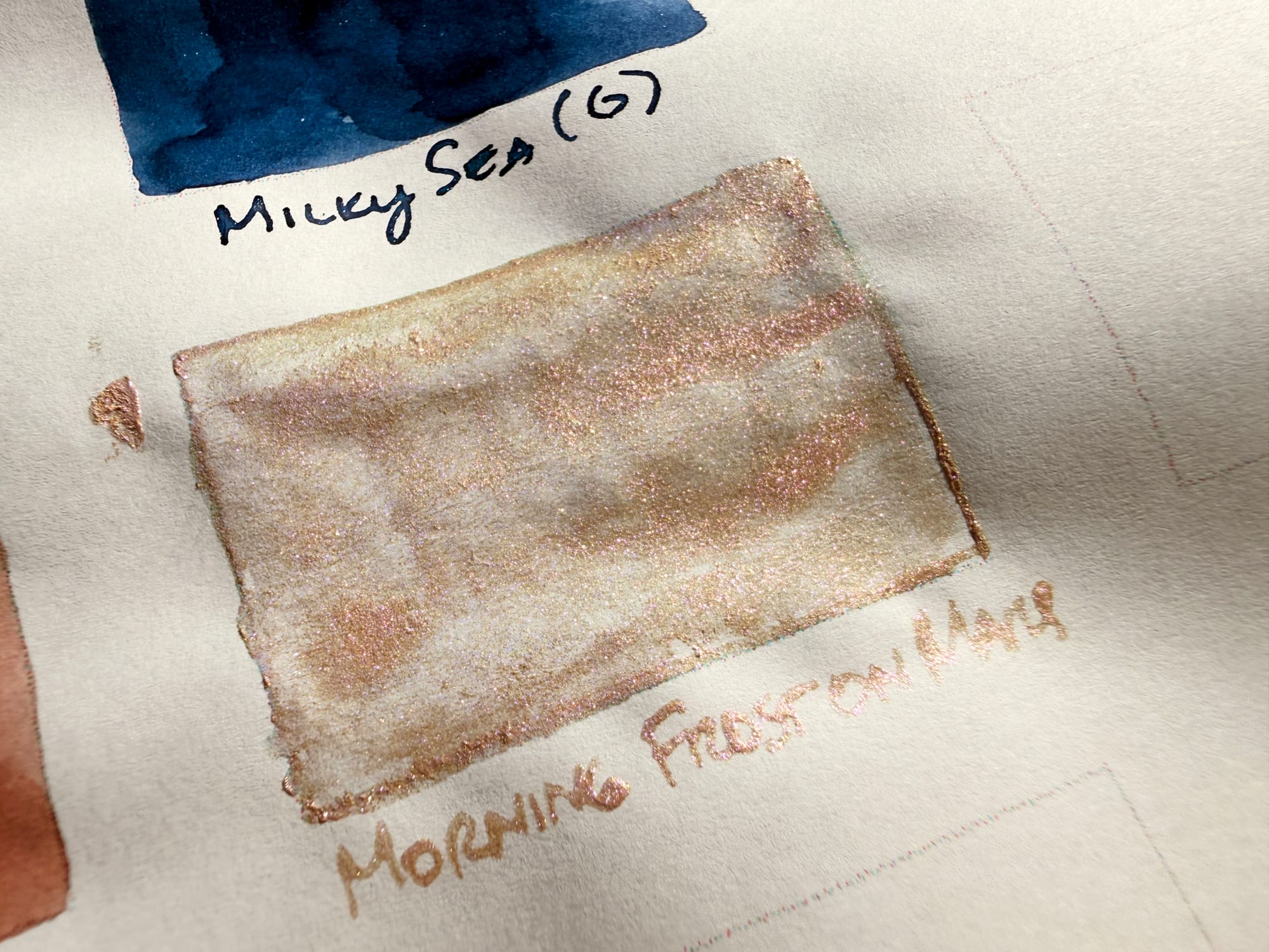
I give this ink 10/10 for looking like a cool, spacey lava lamp in the sample vial., but a 1/10 for actual usability. 😕
Diamine
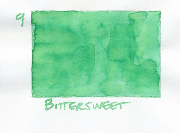
Bittersweet got me via its overall "branding". I normally don't like light greens like this, instead preferring pine-y, olive-y, or swampy greens. But the color and the name immediately evoked Andes mints, one of my favorite candies, in my head, and that totally won me over. 😀
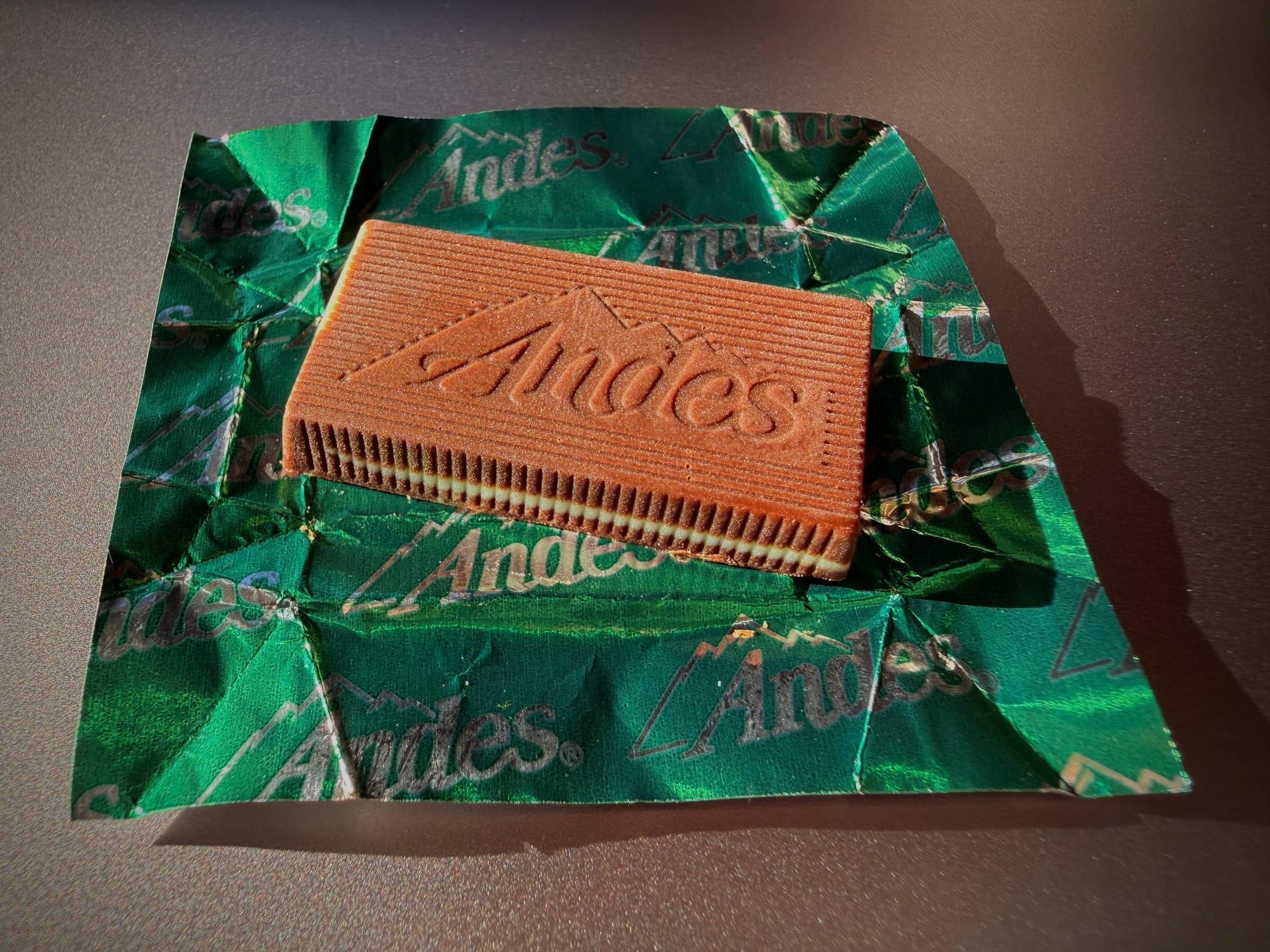
The translucence to the green also makes it more palatable to me, since it can show some nice shading. Off the top of my head, it reminds me of Ferris Wheel Press Morningside Mint, a random ink sample I bought a long time ago.
Slackvent
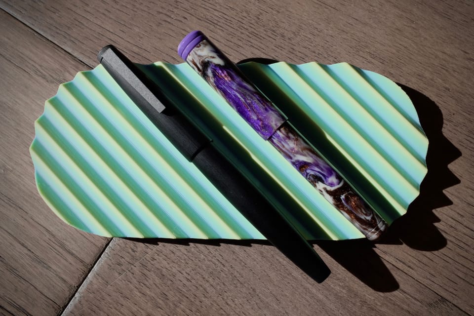
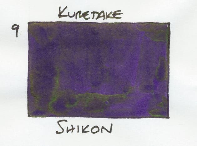
Kuretake Shikon is a very dark, grapey purple with green sheen. It immediately reminded me of Lamy Dark Lilac, but probably the new version; I think the original had golden sheen somehow? I have a sample of the new version but haven't played with it much since it's so dark and the sheen completely overwhelms the base. In the writing sample, the same thing happens with Shikon, unfortunately. Such a bummer that green is the typical sheening color seen with purple inks. They don't go well together as far as preserving or augmenting the base color. At the very least, I like that I'm experiencing more of a brand that's new to me. I'll have to look at the rest of Kuretake's line up sometime.
Were you as disappointed in the Colorverse ink today as I was? How do you feel about mint chocolate candies or desserts? I know a lot of people say it reminds them of toothpaste, the horror! 😆 Comment here, or chat with me on Mastodon, or Bluesky.
Previously: Day 1, Day 2, Day 3, Day 4, Day 5, Day 6, Day 7, Day 8
Thanks for reading. If you like what I write and want to support me, you can buy me a coffee...or tea! I'd appreciate it.