Ink Swatch Wednesday: The Wet Pen Blackberry and Gas Works Park
The host of The Wet Pen channel on YouTube recently posted a video about new inks he added to his store. I picked up four of them, but will talk about two today – Blackberry and Gas Works Park. They're the two inks he highlighted in his video, while the other two I got were from limited runs. I'll post their swatches next week.
Anyway, I swatched Blackberry and Gas Works Park on three different papers: Tomoe River 52gsm (the original), Iroful, and Rhodia blank pad paper.
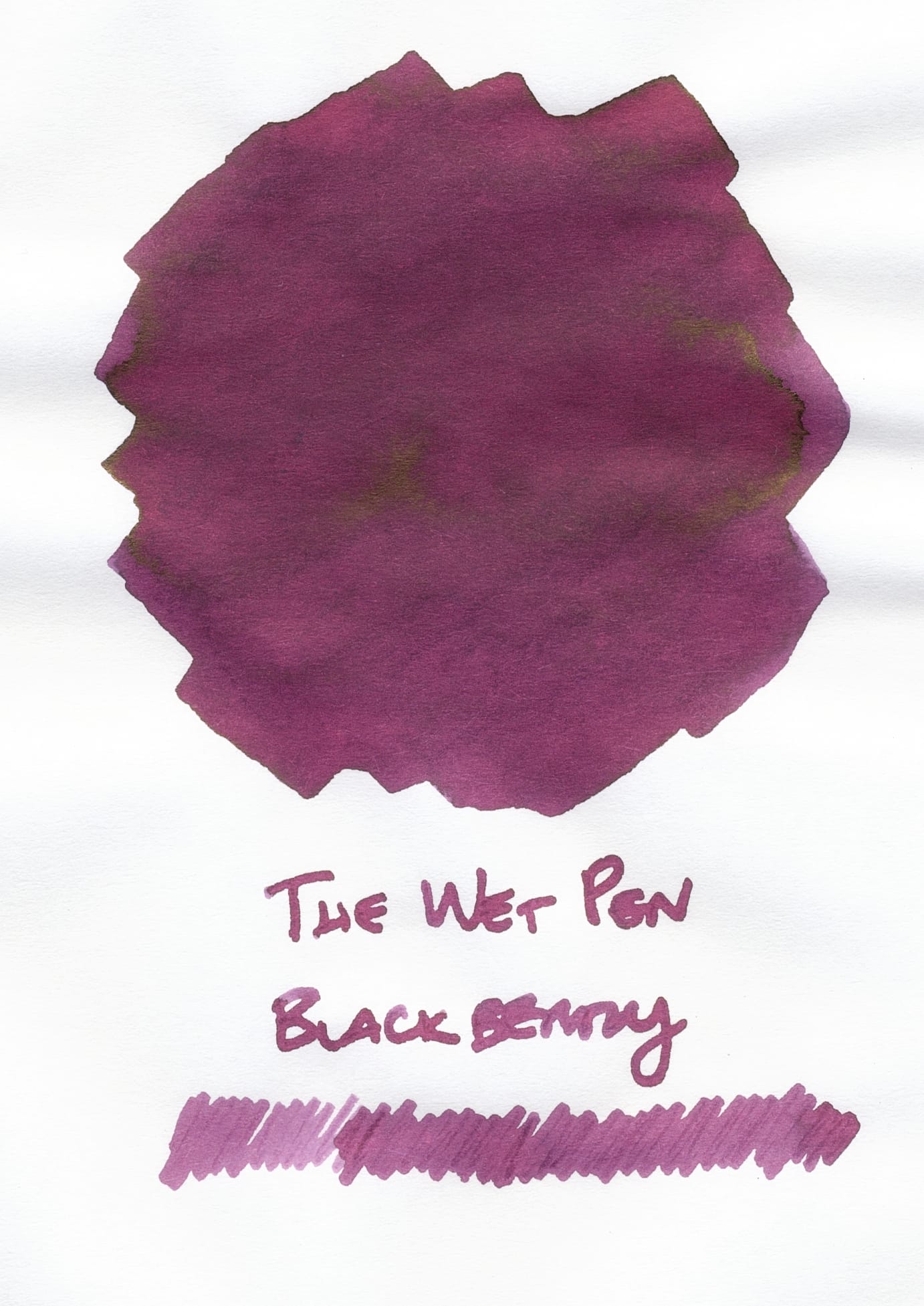
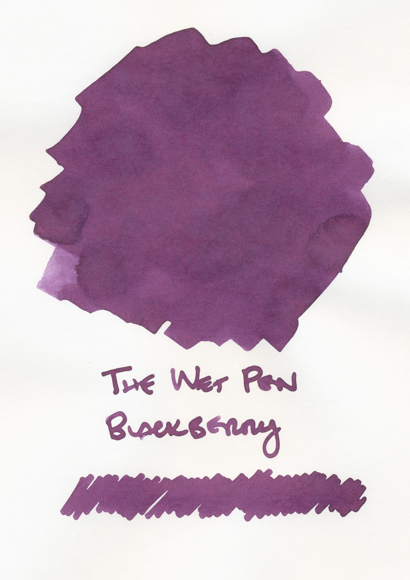
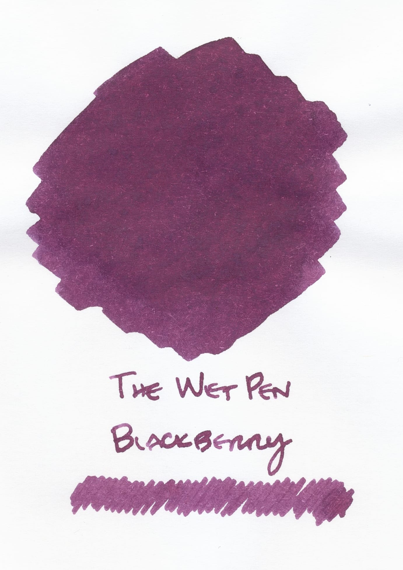
From left to right, Blackberry ink swatches on Tomoe River, Iroful, and Rhodia
Unsurprisingly, the shading and sheen show up most on the TRP swatch, while the ink on Iroful looks cooler, with less shading. Rhodia has the least shading (none?), but looks warmer than the Iroful swatch. The Wet Pen Blackberry is what I had hoped Lamy Blackberry would look like, but Lamy's ink is so dark it's basically black.
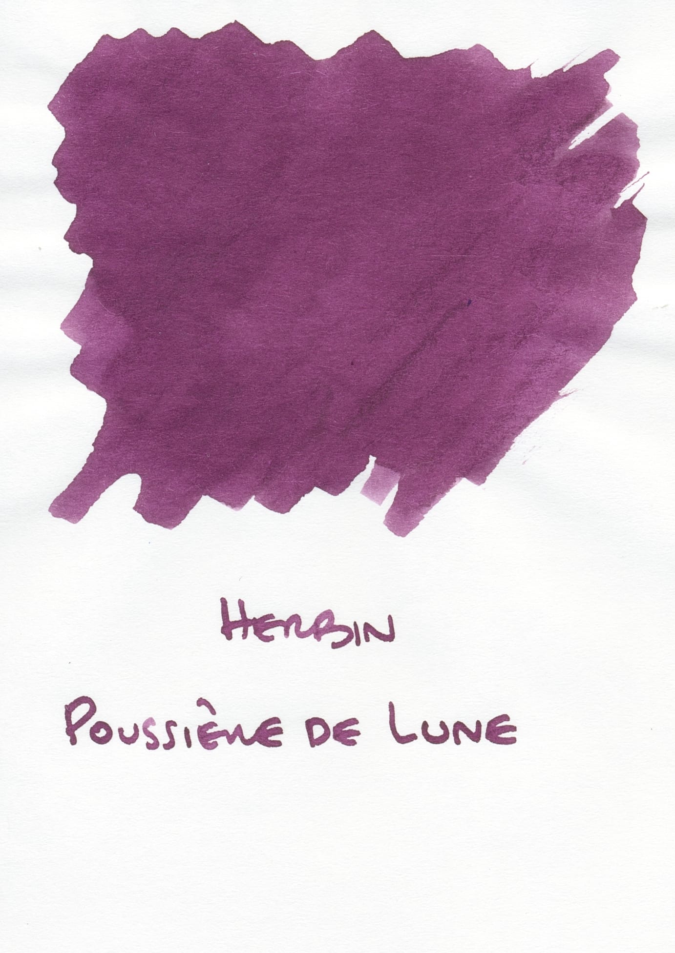
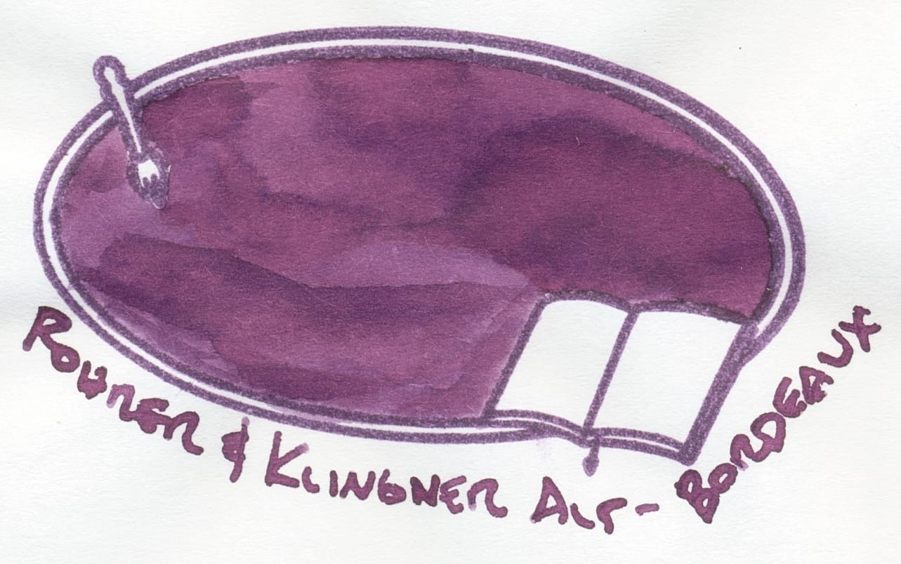
From my swatches, The Wet Pen's Blackberry looks similar to Herbin Poussière de Lune, or Rohrer & Klingner Alt-Bordeaux. Poussière de Lune edges out Alt-Bordeaux ever so slightly.
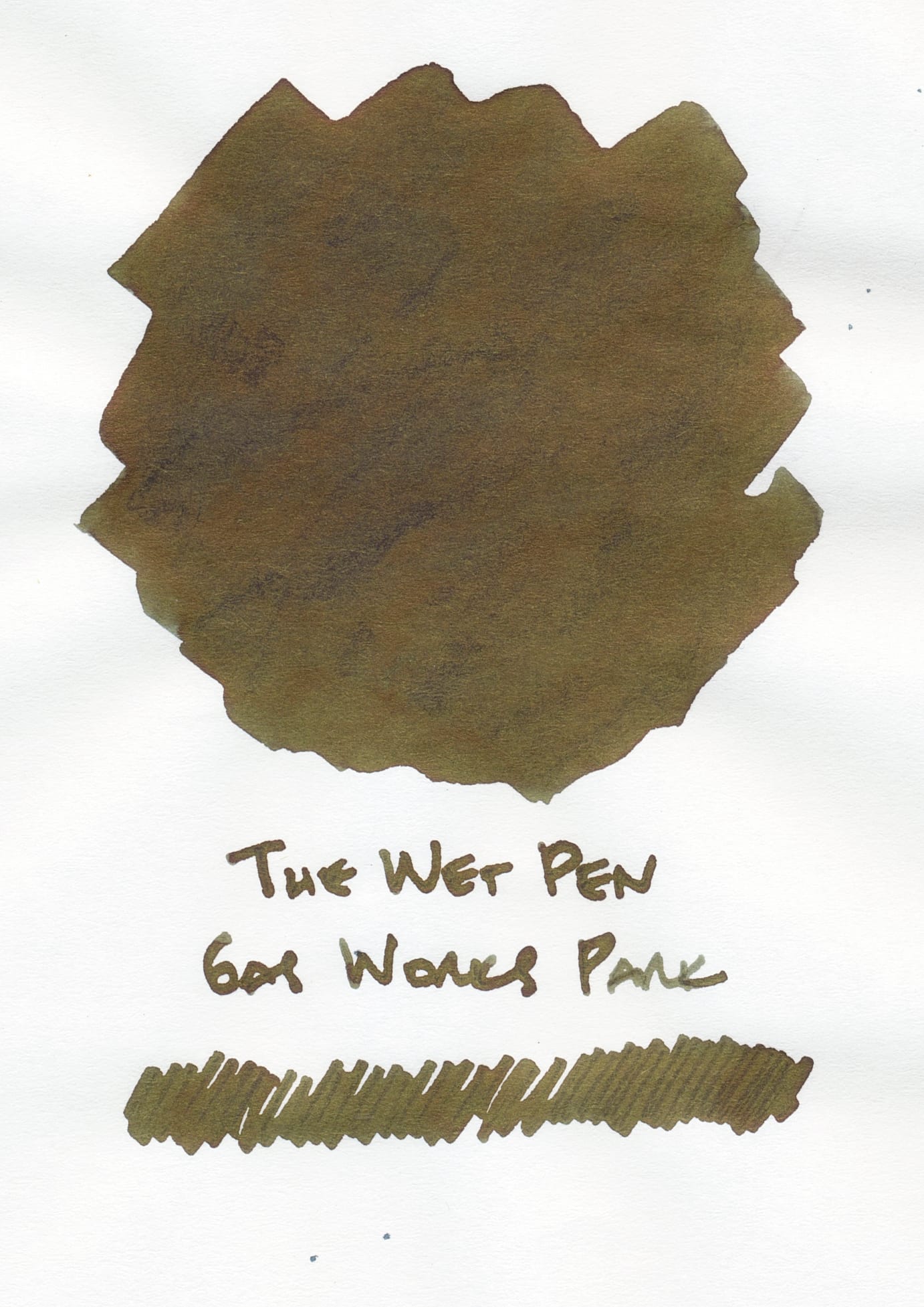
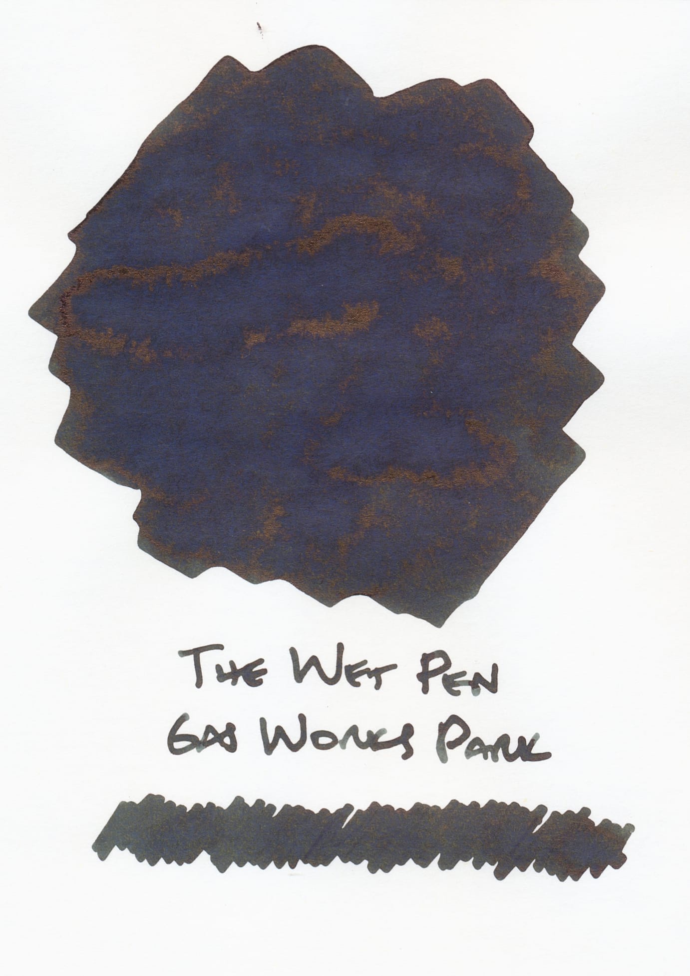
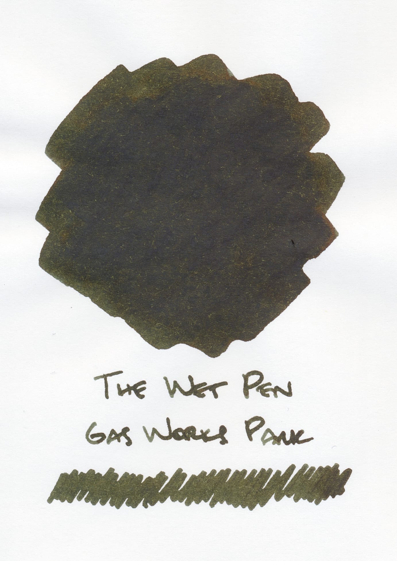
From left to right, swatches on Tomoe River, Iroful, and Rhodia
Gas Works Park is an interesting grungy green-brown. And it shows the most differences among the swatches, with Tomoe River showing the most of the yellow and brown tones/sheening consistently layered on top of the medium pine-y green base. Iroful's swatch is very dark green with strong cool tones, and patchy brown sheening. Rhodia's swatch kind of looks like a muddy, solid combination of the green and brown shades, no sheen, the tiniest bit of shading.
I don't have any inks that look that similar to Gas Works Park, but a couple of my other green or green-brown inks remind me of it:
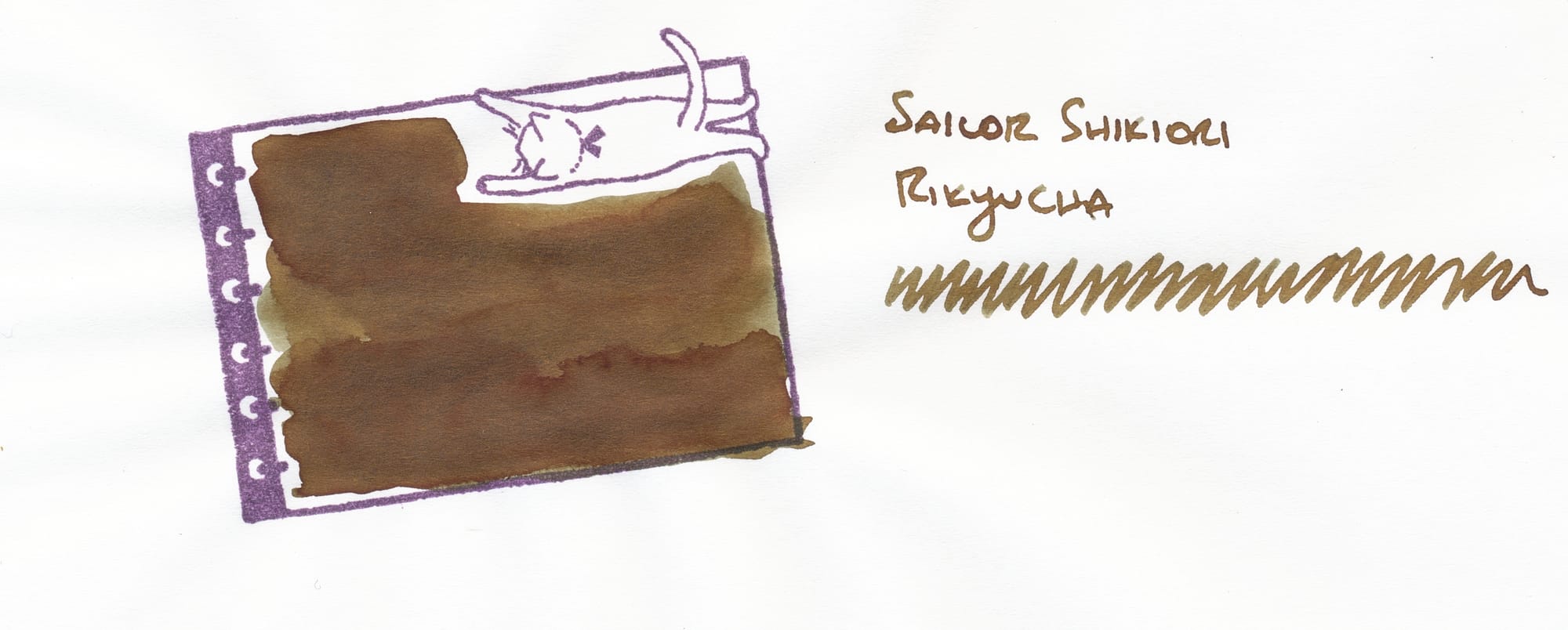
Rikyucha has a grungy ink vibe, but in reverse, where there are more brown than green tones.
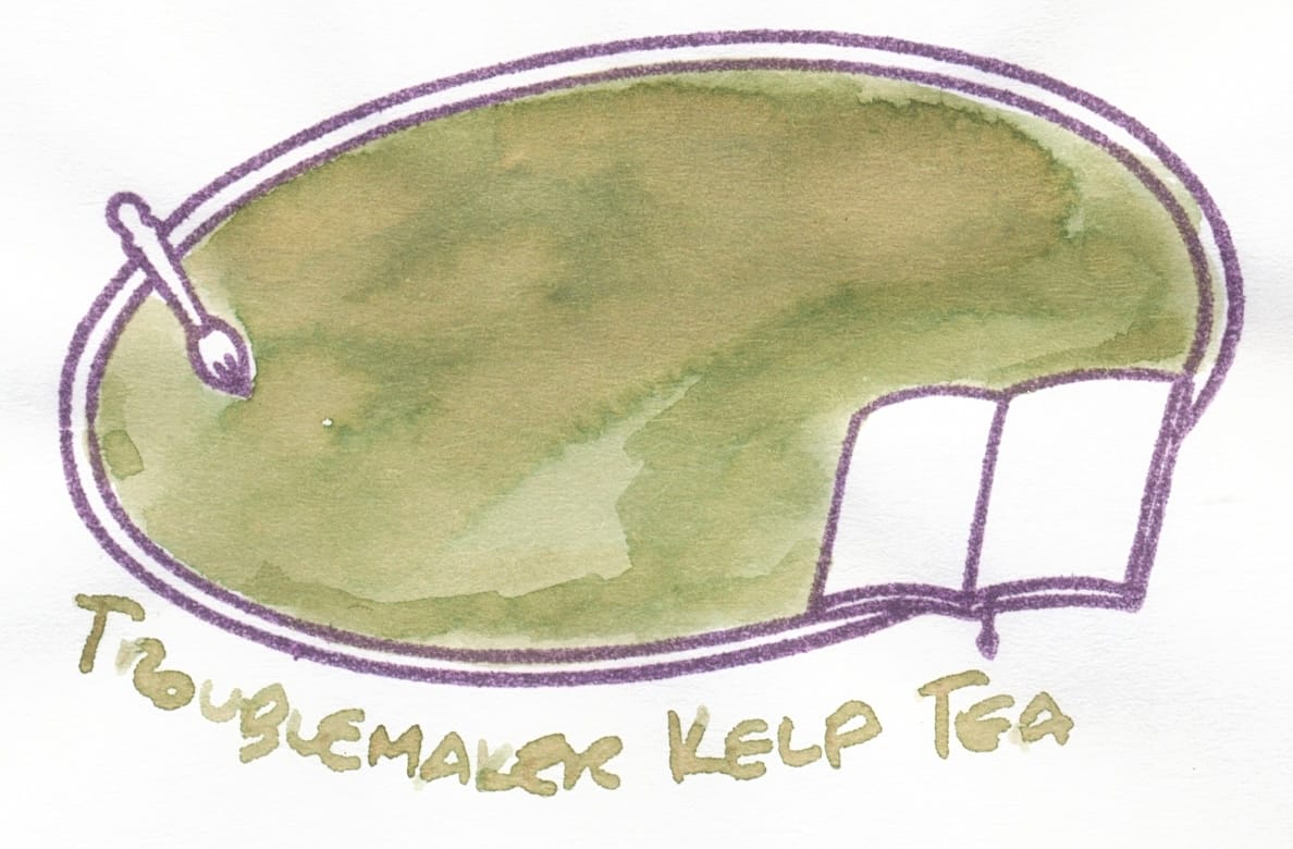
Kelp Tea looks like a very, very lightened up variation of Gas Works Park.
I filled my Lamy Lx Marron with Gas Works Park, so I have a couple writing samples below:
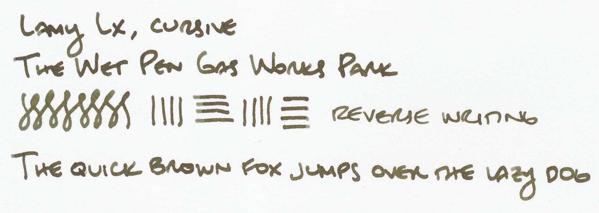
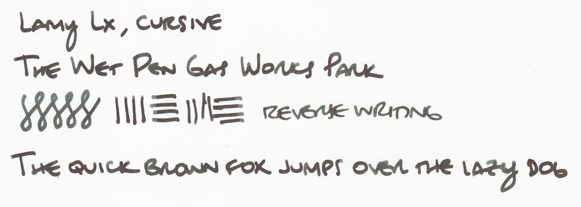
The dark green shades of Gas Works Park definitely feel more like a fall color to me, but I couldn't resist inking the Lamy with it. 😅
So what are your thoughts on Blackberry and Gas Works Park? Any recommendations for more "grungy", "swampy" inks? For some reason, they appeal and fascinate me.
The next two inks from The Wet Pen I'll be looking at are Diablo Lake and Western Trillium.

