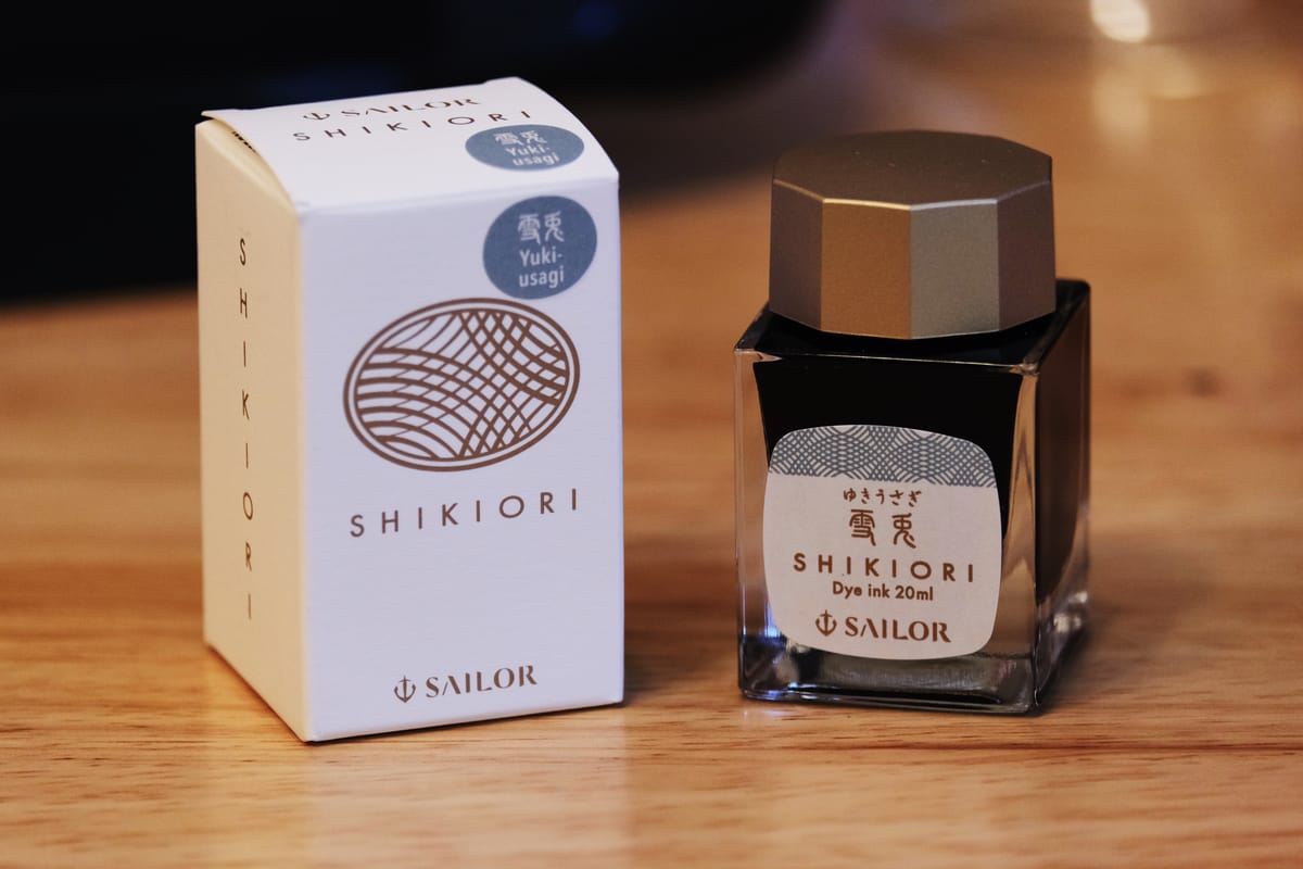
Ink Swatch Wednesday: Sailor Shikiori Yuki-usagi
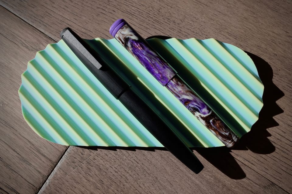
A couple weeks ago I did a "drive-by" ink swatching for a few inks because I felt too tired to go through the whole write up and comparison treatment that I usually do. Since then, I put Sailor Shikiori Yuki-usagi in my TWSBI Swipe with a B architect so that I could see as much of the cool chromoshading as possible. Wow, Y'all, it looks so great in writing!
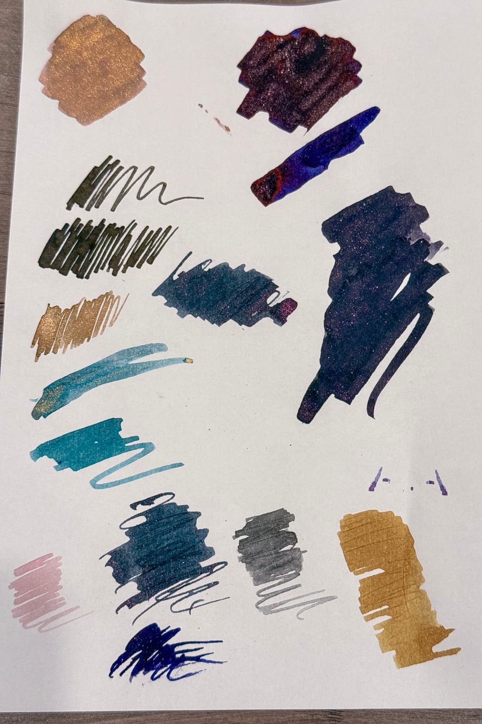
As a reminder, here's what the swatch looks like:
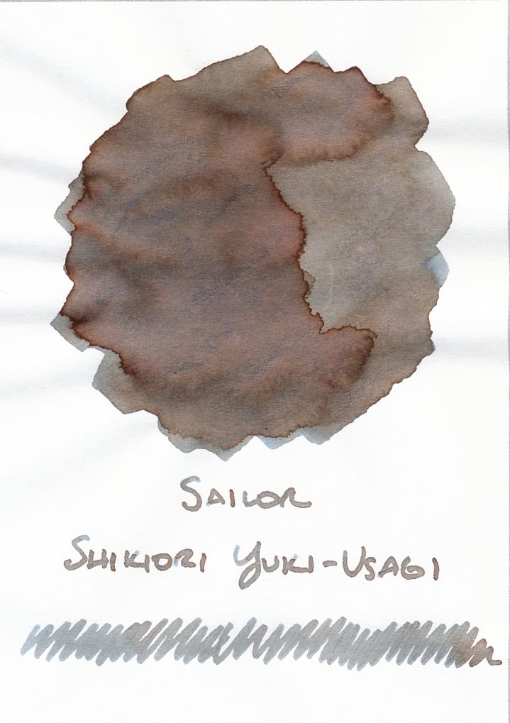
You can clearly see the mix of the translucent blue-gray base and warm-ish brown chromoshading. So very intriguing! Even in the squiggle at the bottom, you can see how at the end, the brown shading makes its presence known.
I wrote up a quote that is in the book Keep Going by Austin Kleon (highly recommended read) on both Tomoe River S and Iroful paper to show you how different the ink looks on different papers.
"None of us know what will happen. Don't spend time worrying about it. Make the most beautiful thing you can. Try to do that every day. That's it." - Laurie Anderson
Great reminder!
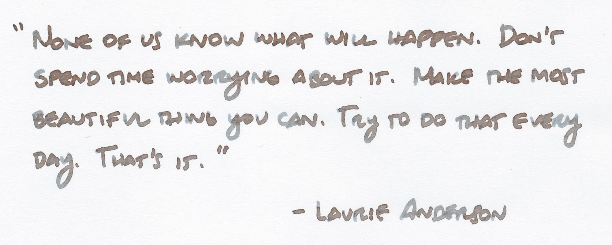
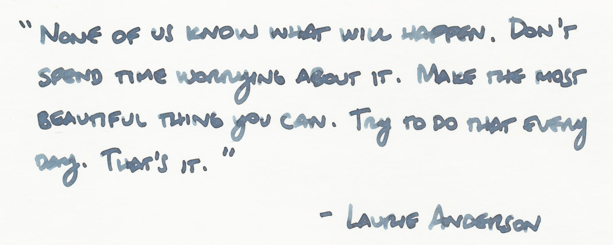
As you can see, it looks pretty different between the two papers, the Iroful not showing the chromoshading at all (and the line width is wider, since the paper is more absorbent). This is why I cannot tear myself away from Tomoe River paper, because I think it shows off ink characteristics, particularly of chromoshading inks, so well.
When the ink is wet on Tomoe River S paper, it looks like the darker blue-gray ink on the Iroful, but then dries and starts to split into the base color and shading. Maybe some of you prefer the straight blue-gray color, but I like the odd combination of a blue-gray and brown.
As a result, I found a few comparable inks for the blue-gray and for the brown in my ink library. Starting with the grays...
Because Yuki-usagi has a cool gray and a warm-ish brown tone, it reminded me of both of the Pilot grays I have, Fuyu-Syogun and Kiri-Same, one being a cooler gray, the other a warmer gray.


The scan for Kiri-Same is skewing a little bit pink on my screen, but in real life its brown tones look similar to Yuki-usagi's. Similarly, Fuyu-Syogun is looking more cool temperature in the scan, but there's a tiny corner of blue-gray on the right of the Yuki-usagi swatch that reminded me of Fuyu-Syogun.
The other similar grays I have are Vinta Pagtangi and Diamine Inkvent Ghost (2022).
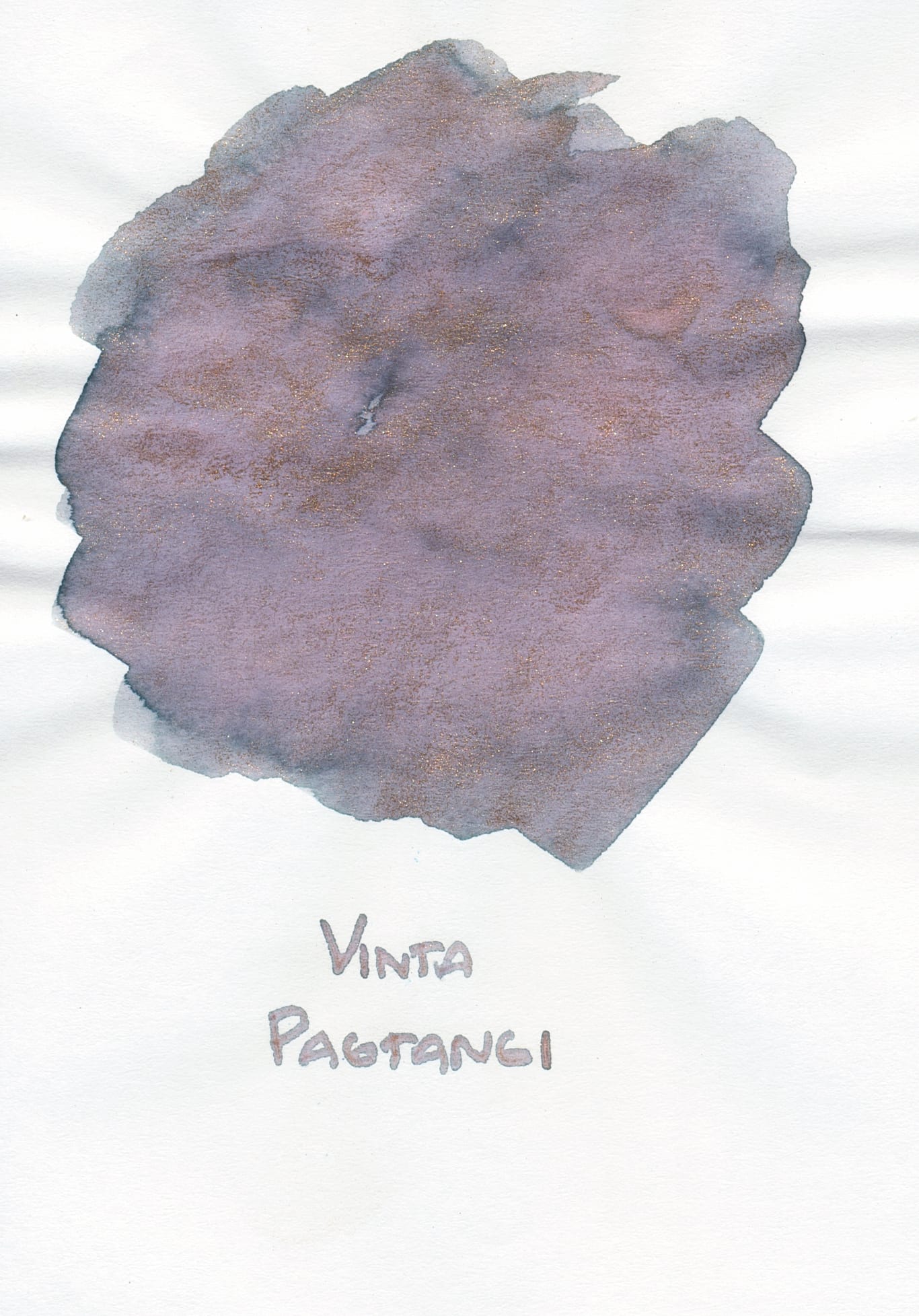


Both are also looking a bit pink-forward compared to IRL. Sorry, too tired to do color correction in post. 😅
Sailor has a couple Yurameku inks that are blue bases with the brown shading that reminded me of Yuki-usagi – Hana Gokoro and Zare Gokoro. The swatches I have are so heavy on the brownish shading that you might not be able to see the underlying blues, but try to focus on the writing:


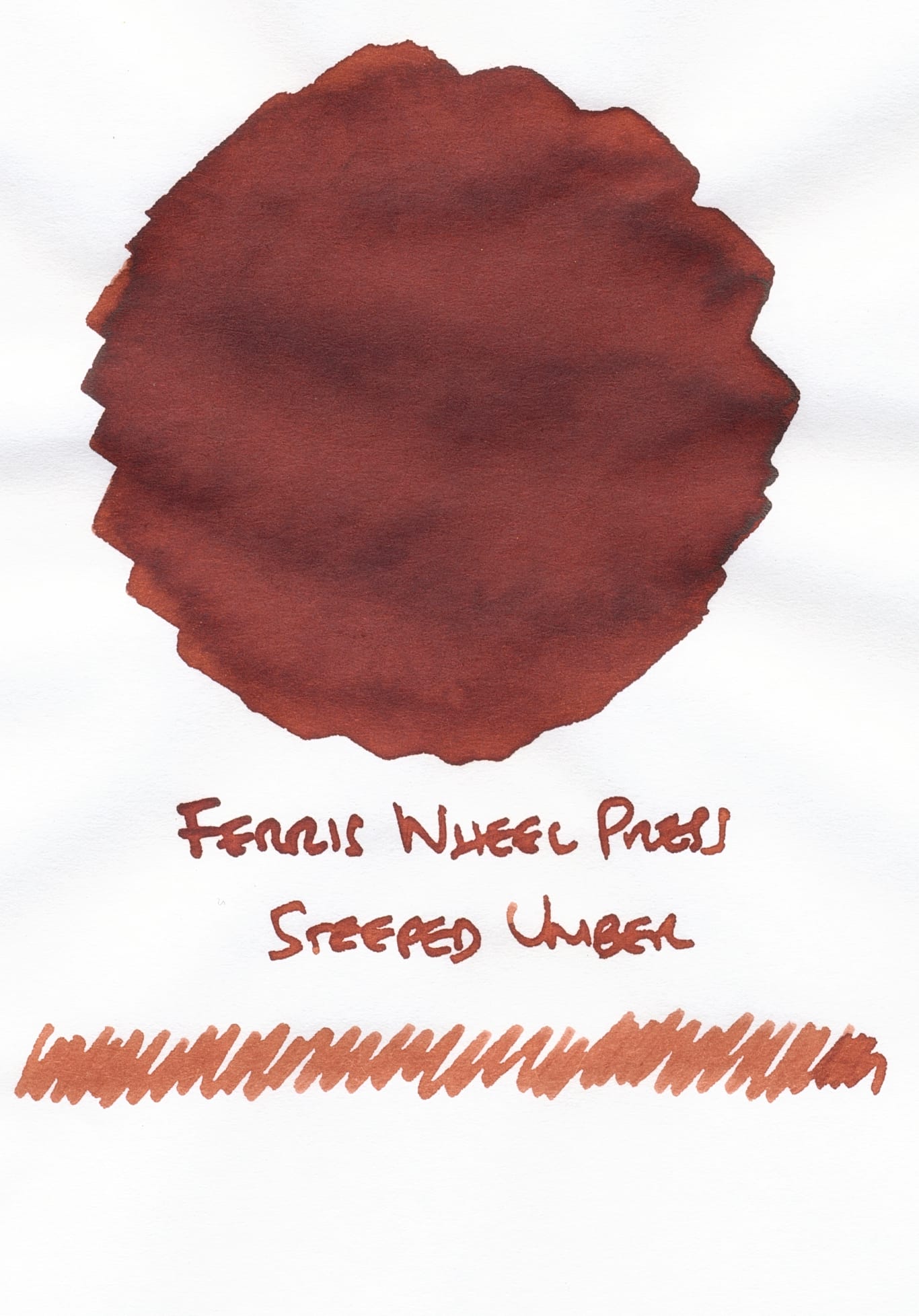
Now, looking at the reddish-brown edges of the Yuki-usagi swatch, I have a few reddish browns that look similar to me.


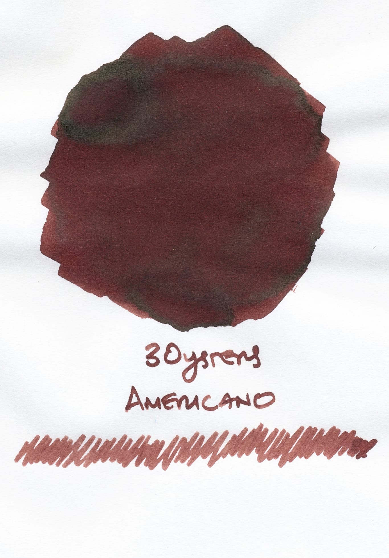
3 Oysters Americano might be a little bit cool compared to the other red-browns.
Isn't this combination of colors so unexpected and interesting? I was thinking that if I could only use one brand of inks, I wouldn't be mad if I had to stick with Sailor, because they have a huge library of colors, and their Shikiori and Yurameku lines are so cool with their chromoshading. But of course, I don't have to stick to one brand, and it's clear from my library that I don't! 😆
I'll be interested to see how much of the chromoshading shows up in a narrower nib size. This B architect is on the wider end of what I prefer for my smaller writing, but I really wanted to see the shading this time around, so I'm "putting up" with this broader nib for now. 🙂