Ink Swatch Wednesday: Sailor Manyo Aka-Mai
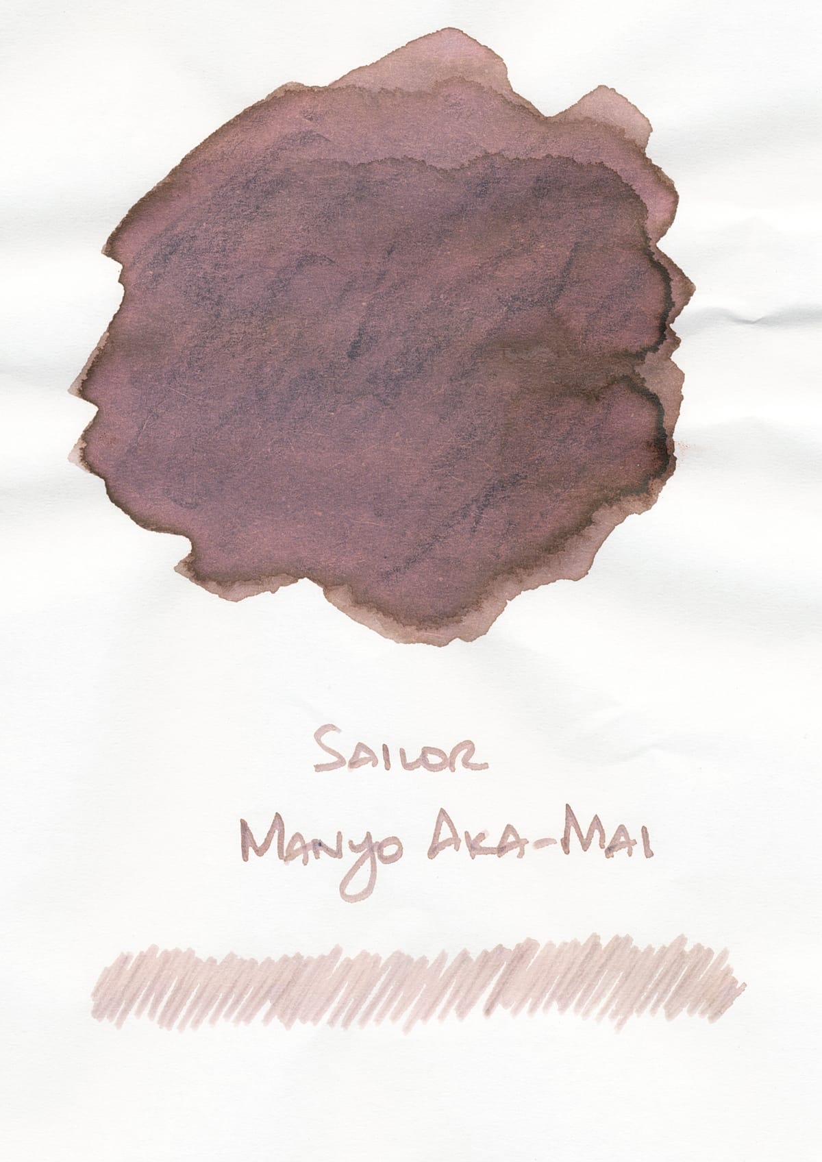
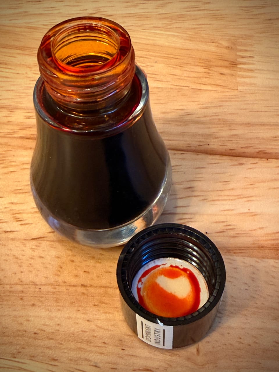
I mentioned in my post about Sailor Manyo Uri that I would post about Aka-Mai later... It's now later. 🙂 I've had the ink in my Kasama Una for a little while now and decided to write about it since I'm in the middle of this "odd neutrals" phase now, with Uri, Aka-Mai, and Sailor Yurameku Kitsune Biyori as some of the main inks as representation. It probably started a bit with my brown ink obsession and the various lighter beigey inks that I'd been using, Kitsune Biyori being one of them. Then Uri and Aka-Mai came out and got the ball rolling even more. There are some grays that kind of fall under this category, like Pilot Iroshizuku Kiri-Same or Fuyu-Syogun, but I decided to focus on the beiges with differing undertones of green, blue, or rose:
- Sailor Yurameku Kitsune Biyori
- Wearingeul Mason's Song
- Octopus Pebble Stone
- Birmingham Pen Co Ploughman's Pebble
- Birmingham Pen Co Saltmarsh
- Jacques Herbin Cacao du Brésil
- Diamine Inkvent Tundra
Cacao du Brésil and Tundra are somewhat outliers because they're more saturated and, depending on the paper, look more gray, but I still included them. These inks also look different on different papers, some very different.
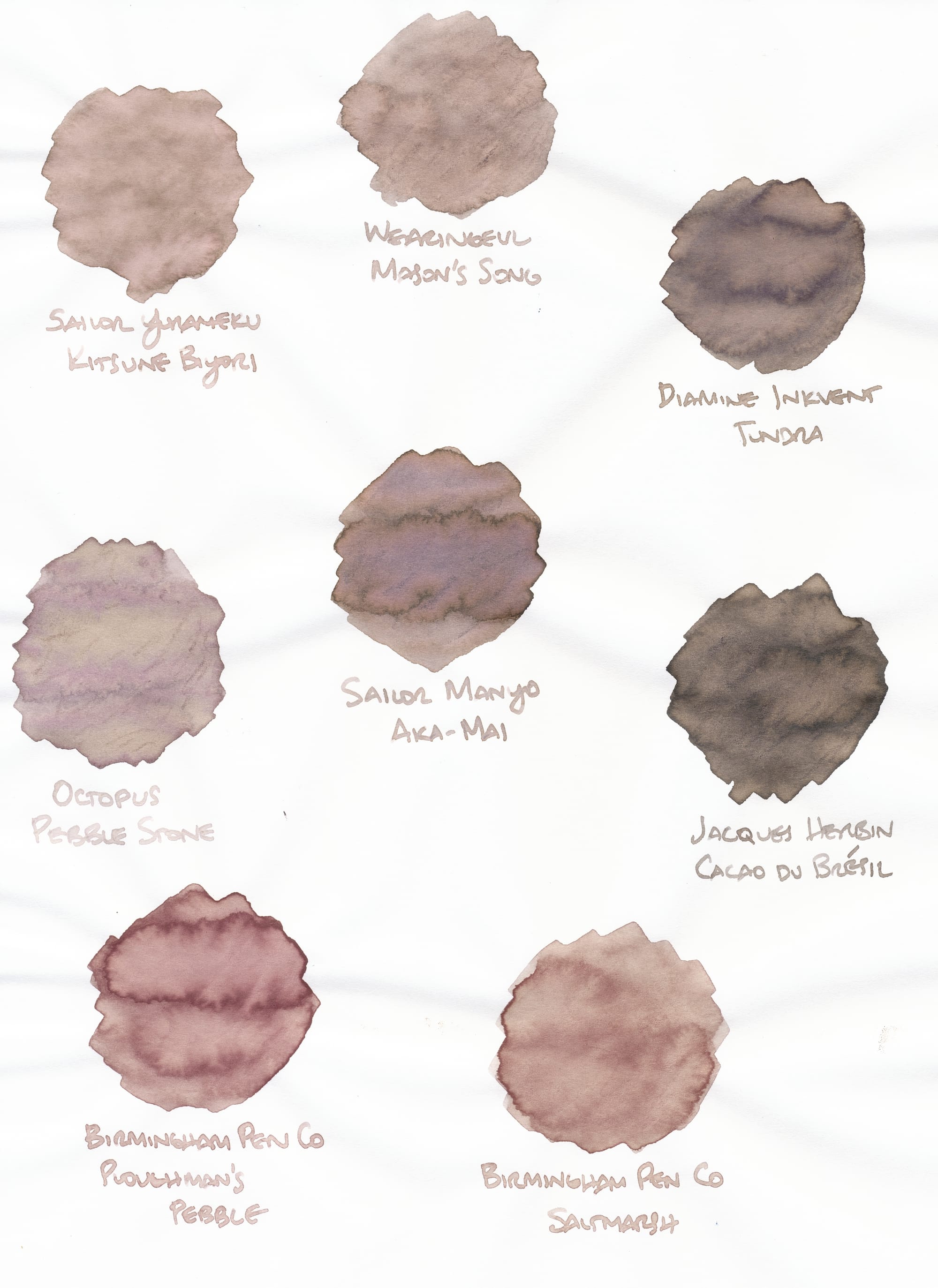
On this Tomoe River S paper, the inks look more as I expect them (since I primarily write on Tomoe River). They're all odd, beigey shades so the scanner has trouble with them, but I color-corrected as much as possible to resemble the colors IRL. I think some of the cooler, bluish tones in Saltmarsh, Pebble Stone, and Aka-Mai aren't fully visible in the scan, but it's close enough.
Kitsune Biyori (the OG beigey color I first really liked) is a paler beige with maybe a hint of some rose or pink. It's a chameleon that changes on Iroful paper (below). The swatches for Kitsune Biyori, Mason's Song, and Aka-Mai look different, but the writing samples look pretty similar, so you could potentially buy any one of them and feel satisfied you have a nice beigey ink if you're writing on Tomoe River paper.
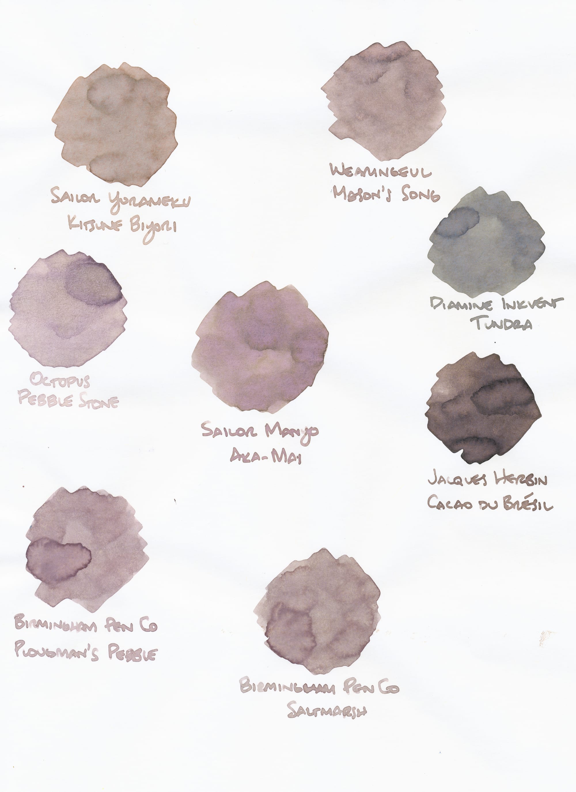
(Ugh, this scan needed a lot more color correction to match how the inks look IRL.)
Iroful renders all of these inks as cooler, and pushes some of them out of the "medium beige" group, like Cacao du Brésil and Tundra. Tundra's transformation into a green-gray on Iroful was particularly surprising. Kitsune Biyori, although still not completely accurate in this scan, has a cooler, more green tinge to it, but Aka-Mai and Mason's Song still look pretty similar, at least in the writing samples.
So what do you think of this palette of inks? Too bland? Too similar? For those who like this color palette, do you have any other similar inks to recommend? I think I'm finally moving beyond brown inks into this new phase of exploration and obsession. 😅 As always, feel free to comment here, or catch me on Mastodon or Bluesky. For more fountain pen posts, check out the "Fountain Pens" tag above.

