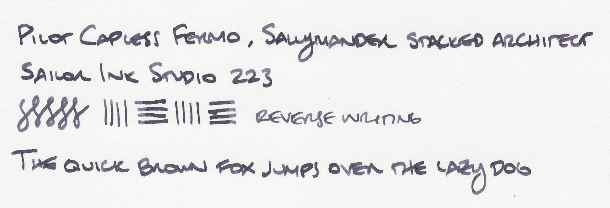
Ink Swatch Wednesday: Sailor Ink Studio 223 and Pilot Capless Fermo
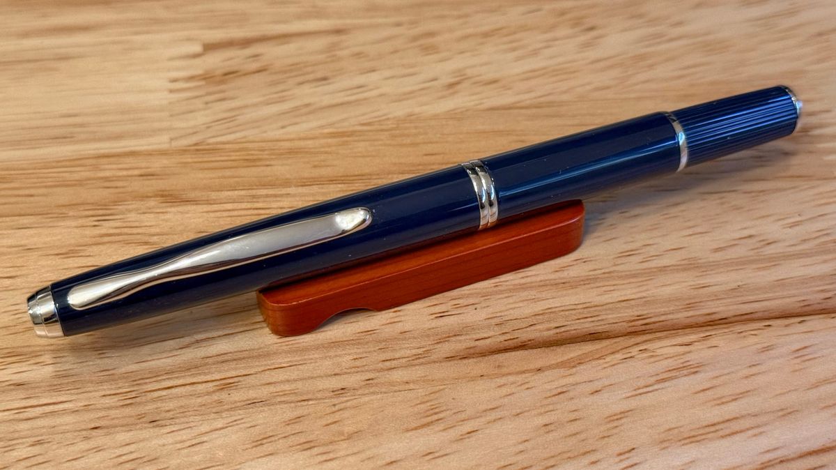
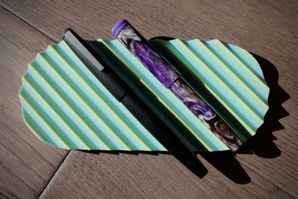
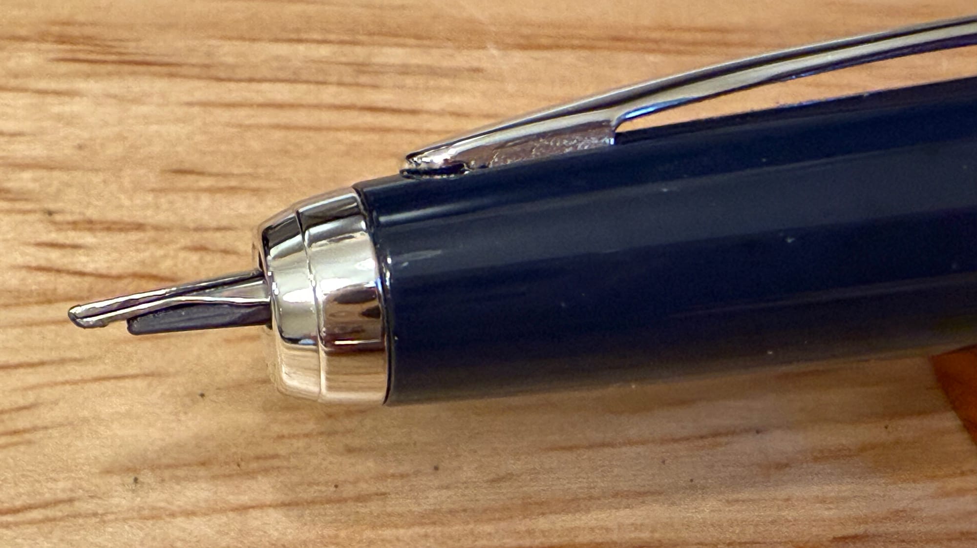
I've been enjoying Sailor Ink Studio 223 (from last December's "Slackvent" ink swap) in my Pilot Capless Fermo recently, so I thought I'd highlight it. But first let's admire the special nib in the Fermo!
At first, it looks like an unassuming Vanishing Point nib...
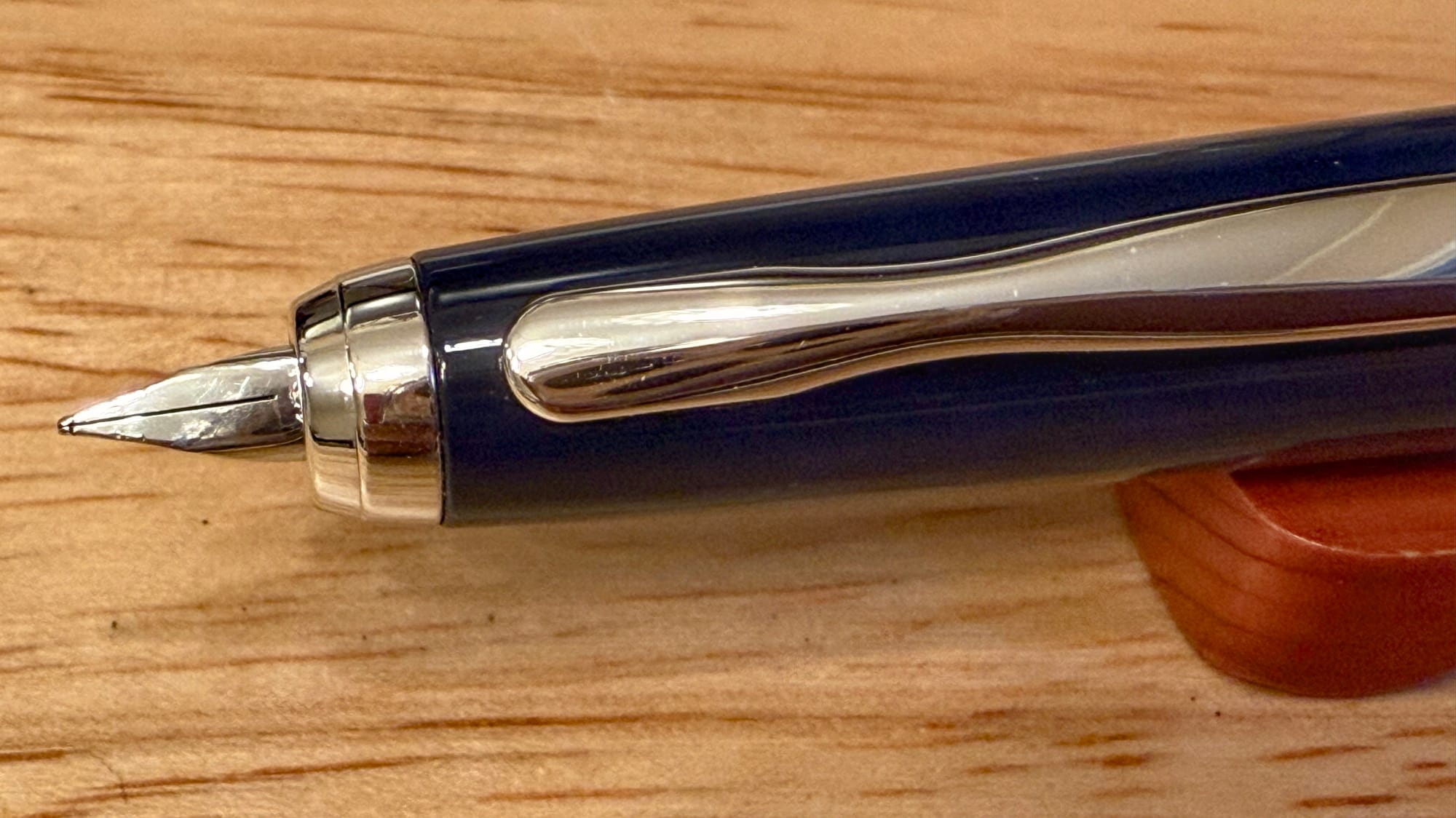
...and then, bam! Stacked architect grind from Sallymander Nibs. 😀
I love that I have a special nib for the Fermo. I had no idea someone could make such a tiny stacked nib, so cute! ☺️
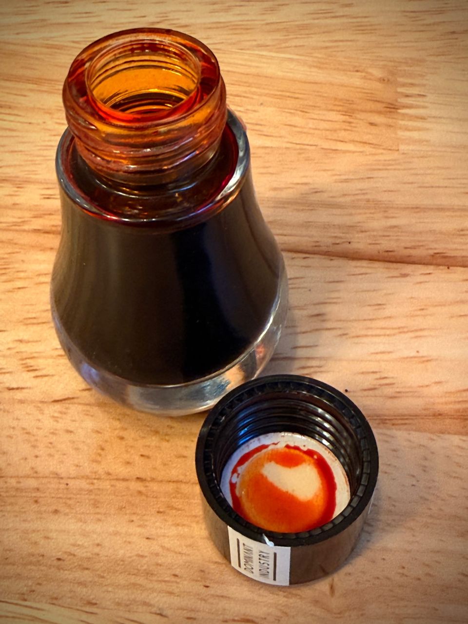
Now for the ink: Sailor Studio 223 looks like a medium blue-gray with hints of purple and pink, especially visible on Tomoe River paper.
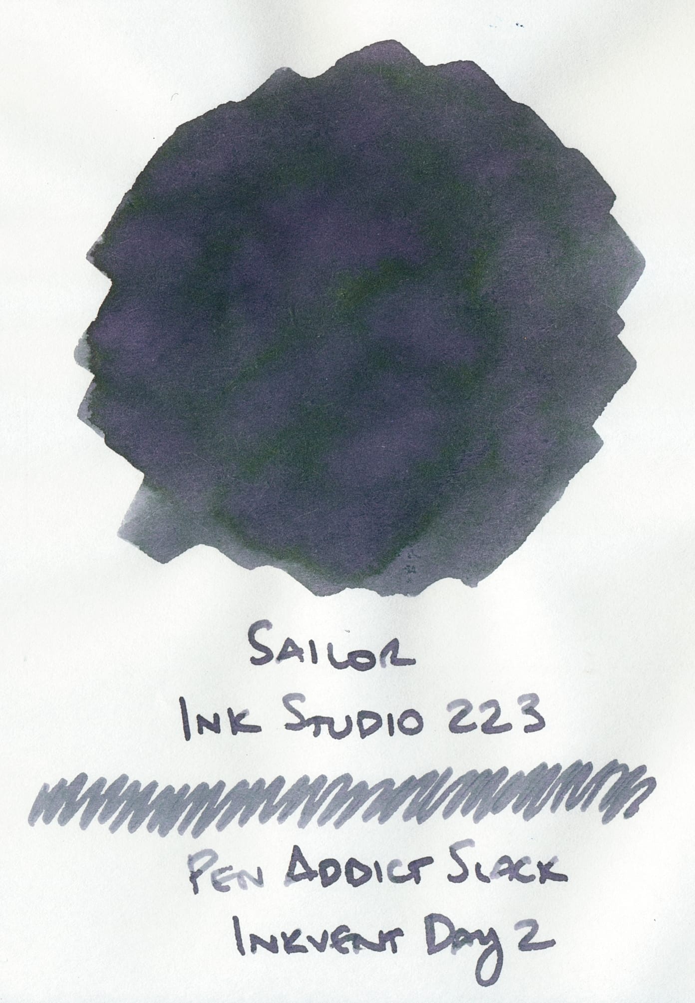
In this writing sample you don't really see the undertones too much, but in good sunlight, on Tomoe River paper, I was able to see some purple. I don't have a ton of direct experience with Montblanc Jane Austen ink, but I wonder if Sailor Ink Studio 223 could have a similar look?
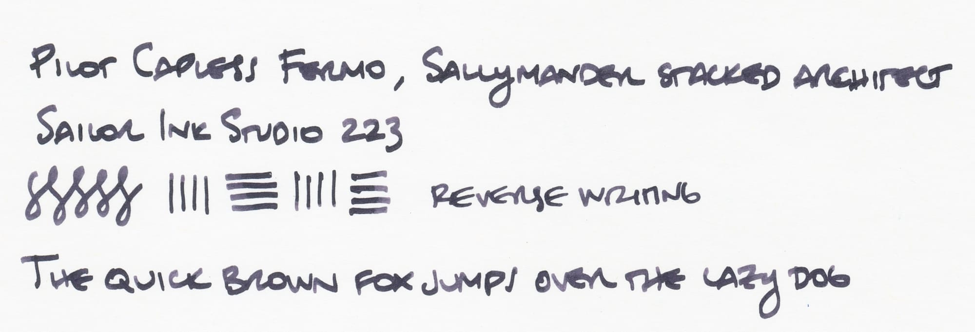
I happen to have a swatch of this on Iroful because I accidentally started swatching the Slackvent inks on a sheet of Iroful not realizing it wasn't my normal Tomoe River (I did suspect, but it didn't hit me at first 🤦♀️).
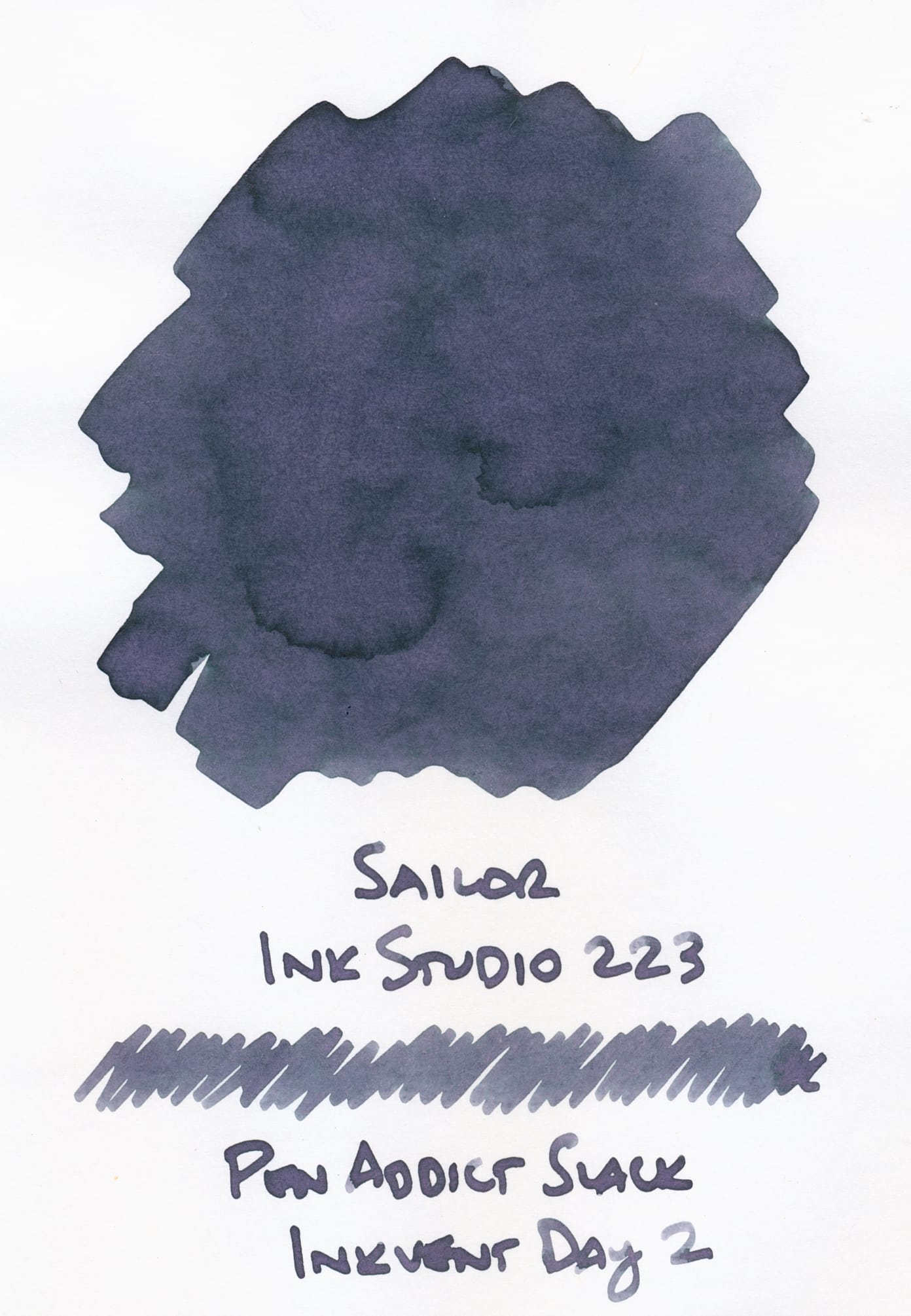
You can seem more of the purpley tones in the writing sample on Iroful, which is interesting because my past experience with Iroful has shown that it often mutes chromoshading due to its different absorbency.
The Fermo doesn't have the best seal, so after a short while, inks deepen in color from evaporation, as can be seen in these writing samples.
Comparisons
I don't really have any inks that are this kind of blue-gray with hints of purple shade. Weirdly, the closest ink I have may be this Franklin-Christoph Indigo:
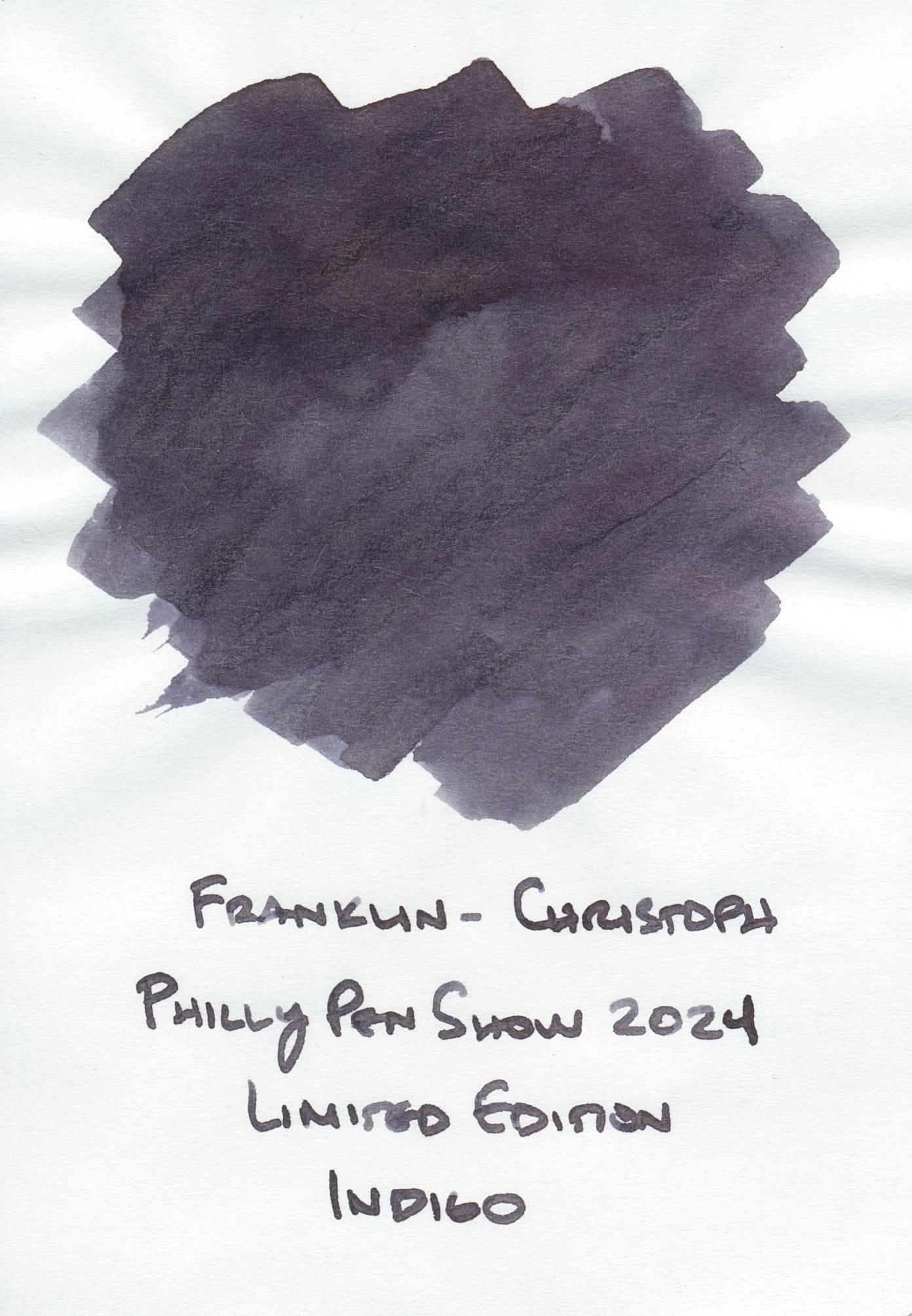
I say "weirdly" because when I first swatched this ink, it looked straight dark gray to me, which didn't really fit with the Indigo name, IMO. But comparing it to Sailor Ink Studio 223, I can perceive the purple undertones now. But Indigo doesn't have any chromoshading and feels flatter than the Sailor ink. You can see some shading, but perhaps in regular writing, it won't be as apparent since it's a dark ink.
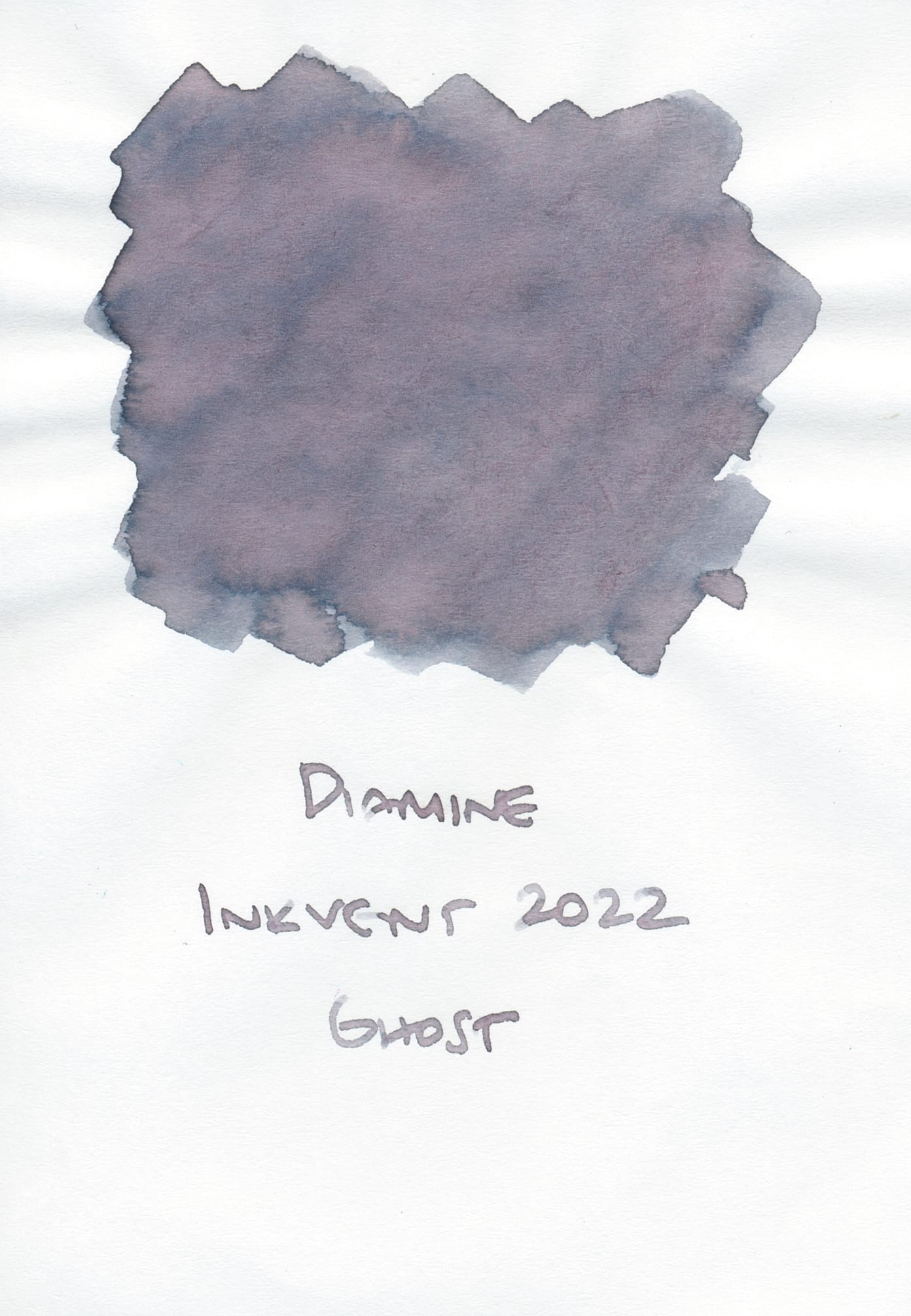
The next two inks are from different Diamine Inkvents, and neither is a close match. Diamine Ghost from 2022's Inkvent is more of a translucent gray that kind of gets overshadowed by the purple/pink tones. Maybe there's a hint of blue in the gray.
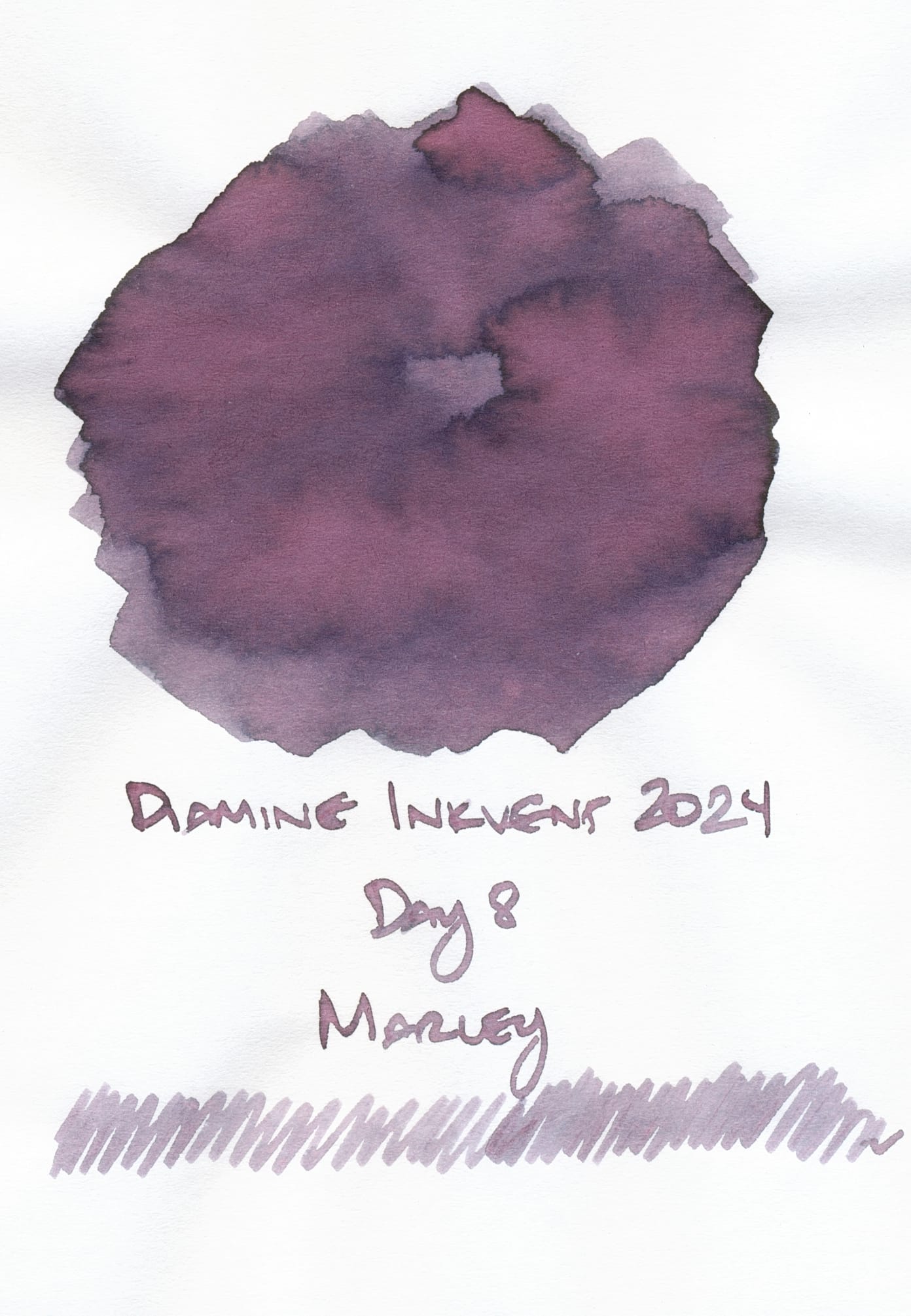
Diamine Marley from last year's Inkvent is even more purpley, like a purple-gray, no blue tones.
Sailor has so many great ink colors, I'm seriously surprised I don't have more bottles of their inks in my collection. Whenever I run out of this sample, I'm strongly considering picking up a bottle of Ink Studio 223. At the very least, it's a nice match for my Pilot Capless Fermo. 🙂