Ink Swatch Wednesday: Robert Oster Grey Seas
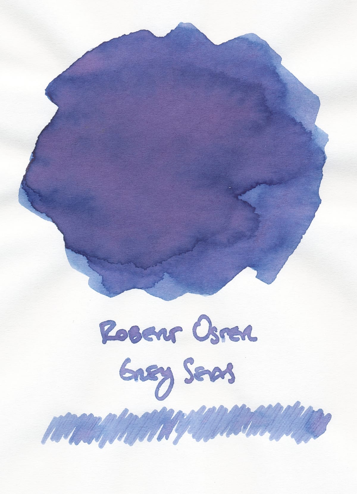
When I bought the Vinta Inks "A Holiday Feast" set (see previous posts 1, 2, and 3) from Vanness, I also picked out a few ink samples because I cannot help myself. 😆 One of those inks is Robert Oster Grey Seas because I'd heard from a few people on Mastodon that they really love the color.
I really like it, too. It's a lovely multishading ink with a base color of medium-light blue with a tiny bit of gray (or something to make it not a straight bright sky blue), and noticeable pink and purple shading. It totally fits in with my love of dusky colors and my love of chromoshaders.
Comparison
Because I do love inks in this color range and with these shading properties, I did find some inks in my library that are close in appearance in some different ways. Last time I did one of my ink comparison posts, I put all the swatches next to each other to make it easier to compare and contrast, so I'm doing it again:
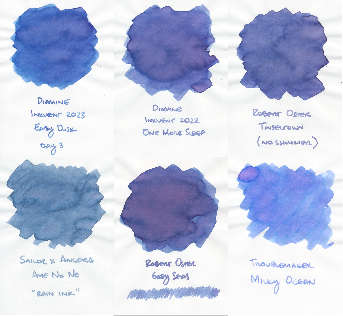
Grey Seas is in the bottom middle of the pack with a slight frame around it for easy differentiation. The ink that looks the closest is above it, Diamine Inkvent 2022 One More Sleep. To my eye, they practically look identical, except maybe for more purpley-pink shading in the Grey Seas swatch.
If you like the blue of Grey Seas but could do without the pink and purple shading, I think Diamine Early Dusk from last year's Inkvent looks pretty close.
Robert Oster Tinseltown's base color without the bronzey/gold shimmer also looks like Grey Seas – the blue with purple undertones – but not very much pink at all (perhaps none).
The last two inks are more of a stretch. Ancora's special seasonal ink, Ame No Ne, sold only on rainy days in Japan, has a light blue-gray color that looks like the lighter parts of the Grey Seas swatch without the purple and pink tones.
And finally, Troublemaker Milky Ocean, while it looks vastly different, seems to me like Grey Seas with the saturation of the blue-gray base color turned way down (and maybe the gray tones removed), allowing the purple and pink to somewhat overwhelm the blue.
What do you think of my comparison choices and assessments? Do you have other inks in this family to recommend?
If you're interested in my other posts about fountain pens and inks, you can see them here.