Ink Swatch Wednesday: Kyoto TAG Kyo-no-Oto Adzukiiro
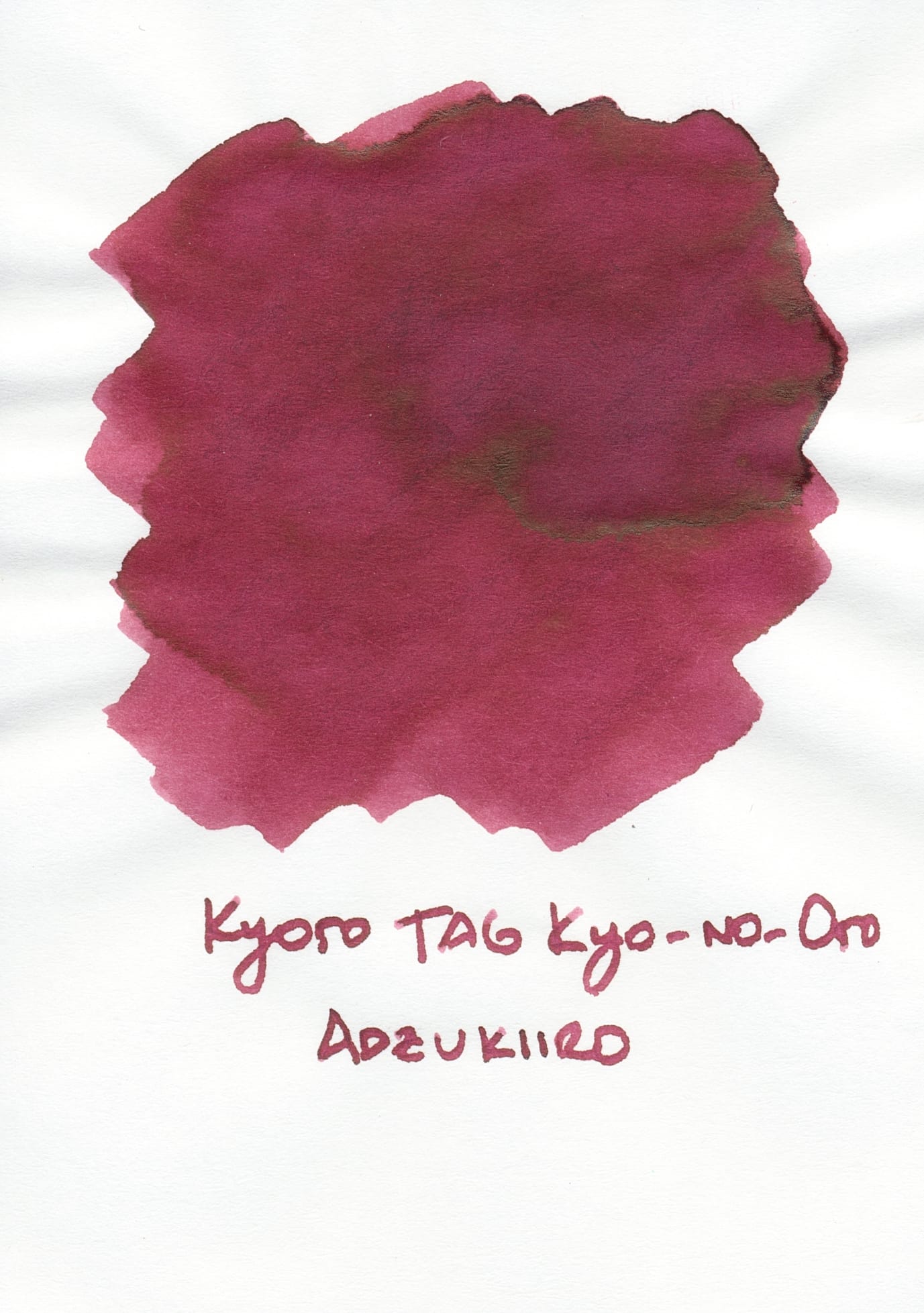
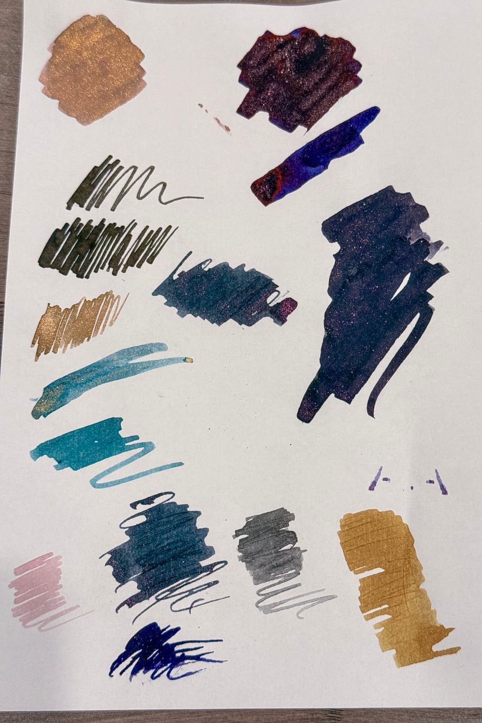
Two different ink swatches, the left on Tomoe River 52 gsm paper (original), using a folded nib pen, the right a painted swatch on Kokuyo Business paper
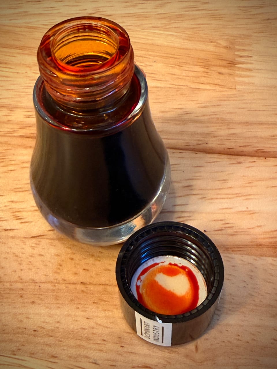
This is one of my newer ink samples from Vanness, Kyoto TAG Kyo-no-Oto No.6 Adzuki-iro (oops, missed the dashes above). It's a very pretty purpley, wine red that matches its namesake, adzuki, or "red beans" well. In some lighting it can look a bit more brown-red than purpley-red. There's also a brownish sheen where the ink pools heavily, but in practice I haven't seen it in my writing.
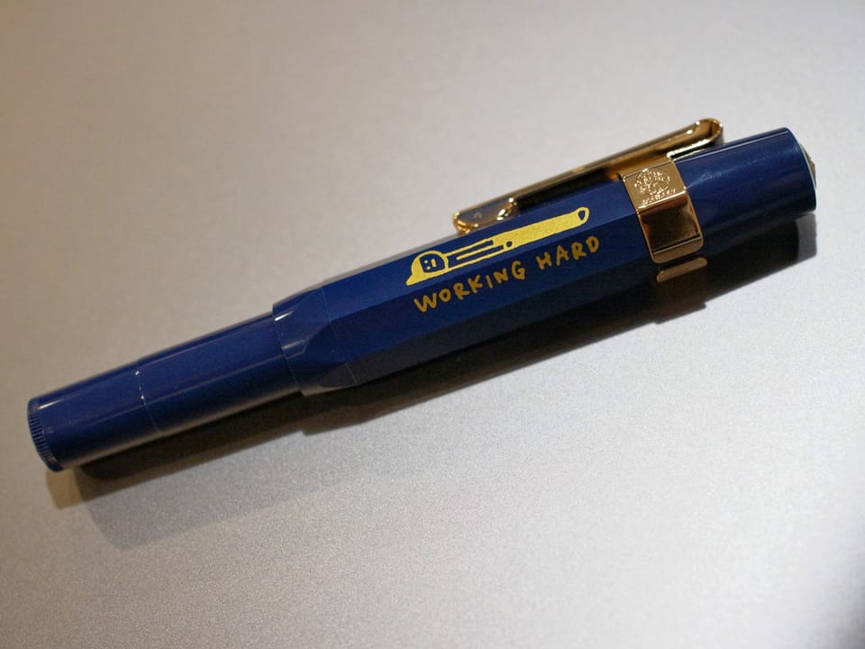
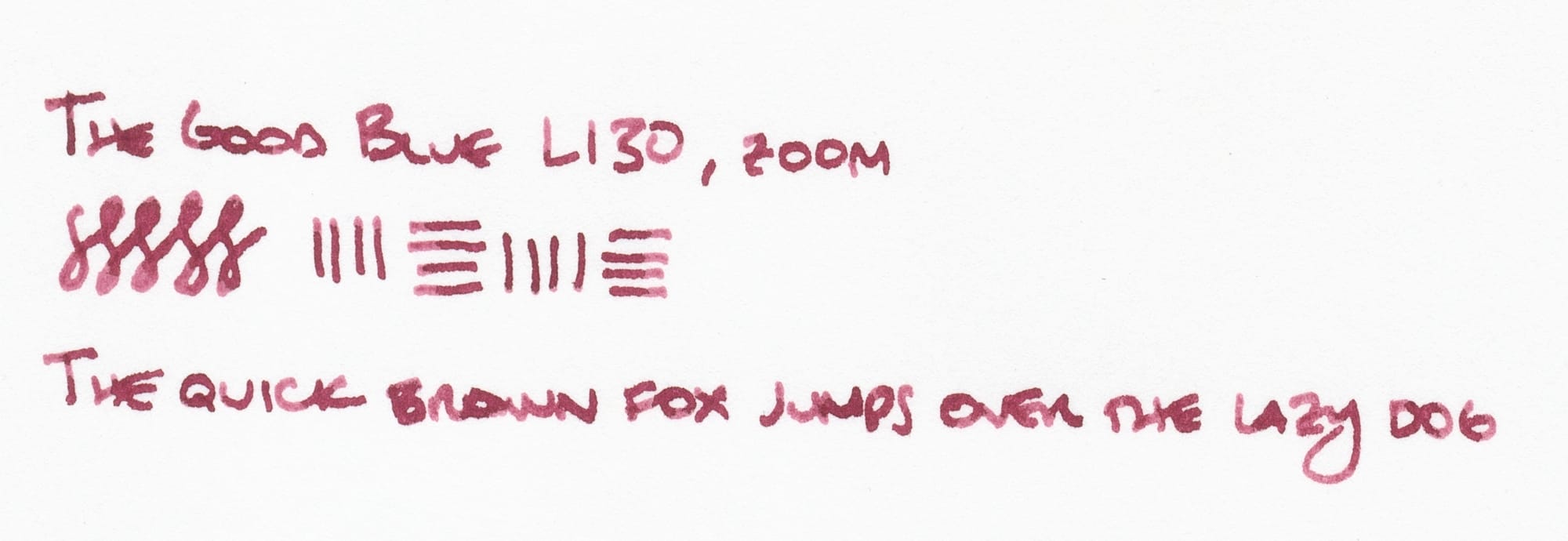
I filled my The Good Blue L130 pen to play around with the ink again. The first time I tried out the ink, I put it in my Lamy Lx with a cursive nib and really liked it in that pen. The zoom nib on the L130 has an architect-like line variation similar to the Lamy cursive nib.
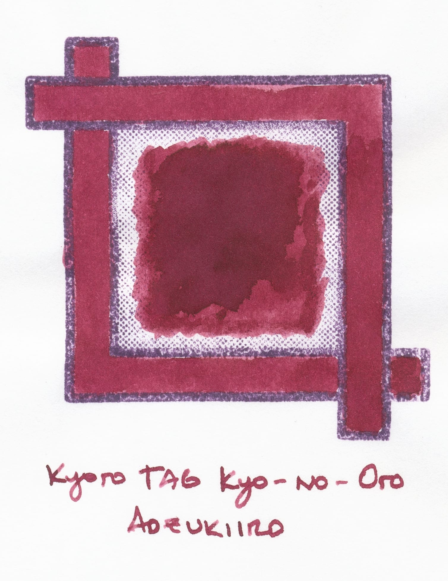
As you can see, there's a good amount of pretty shading with this ink.
The purpley-red color feels more appropriate for fall rather than spring/summer, but I don't mind using it in my currently-inked batch of pens for May. Red inks aren't usually my favorite; too many often look too bloody for my preference, so I venture to more burgundy-ish inks like this (or bright, candy-apple or Christmas reds).
What do you think? Any other purple-reds you think I might enjoy? Feel free to comment below or reply to me on Mastodon. And if you're interested in seeing my other fountain pen-related posts, you can click on "Fountain Pens" tag at the top, or here.