Ink Swatch Wednesday: KWZ Gummiberry and TWSBI ECO Espresso Bronze
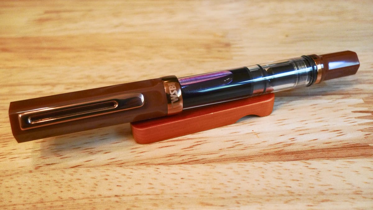
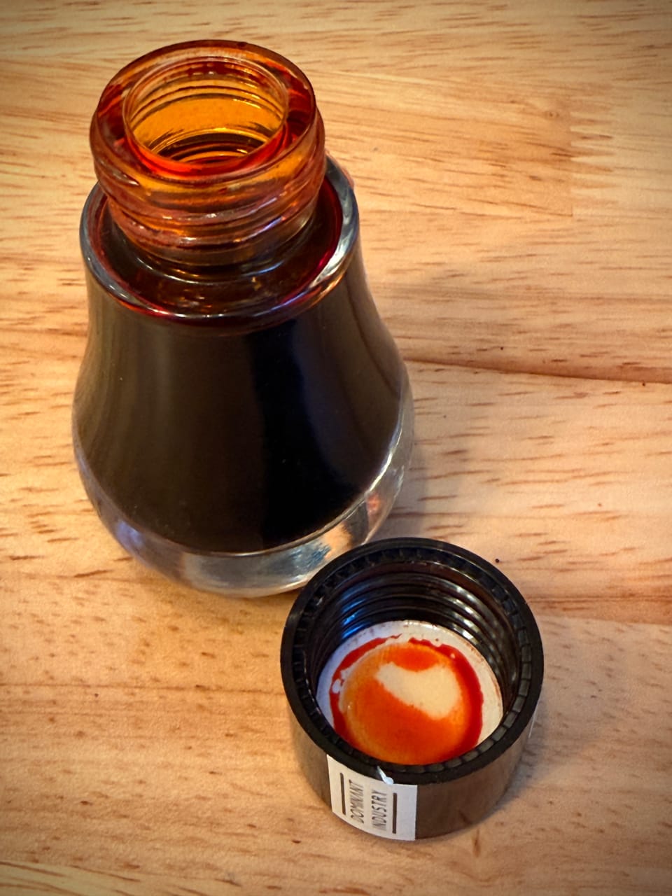
Amazingly I didn't fill the TWSBI ECO Espresso Bronze as soon as I received it. I had plenty of pens already inked and didn't want to add another until I removed a pen from the batch. I forgot which one bowed out, but I finally filled the ECO recently with a bright purple ink from KWZ called Gummiberry. I bought a sample late last year and had already used it in another pen and loved it. Now that it's spring, my ink preferences have finally shifted away from browns and darker winter colors to more translucent shaders. Gummiberry is a little bit darker than the pastel shaders I've been preferring lately, but it's still a lovely color I wanted to use.
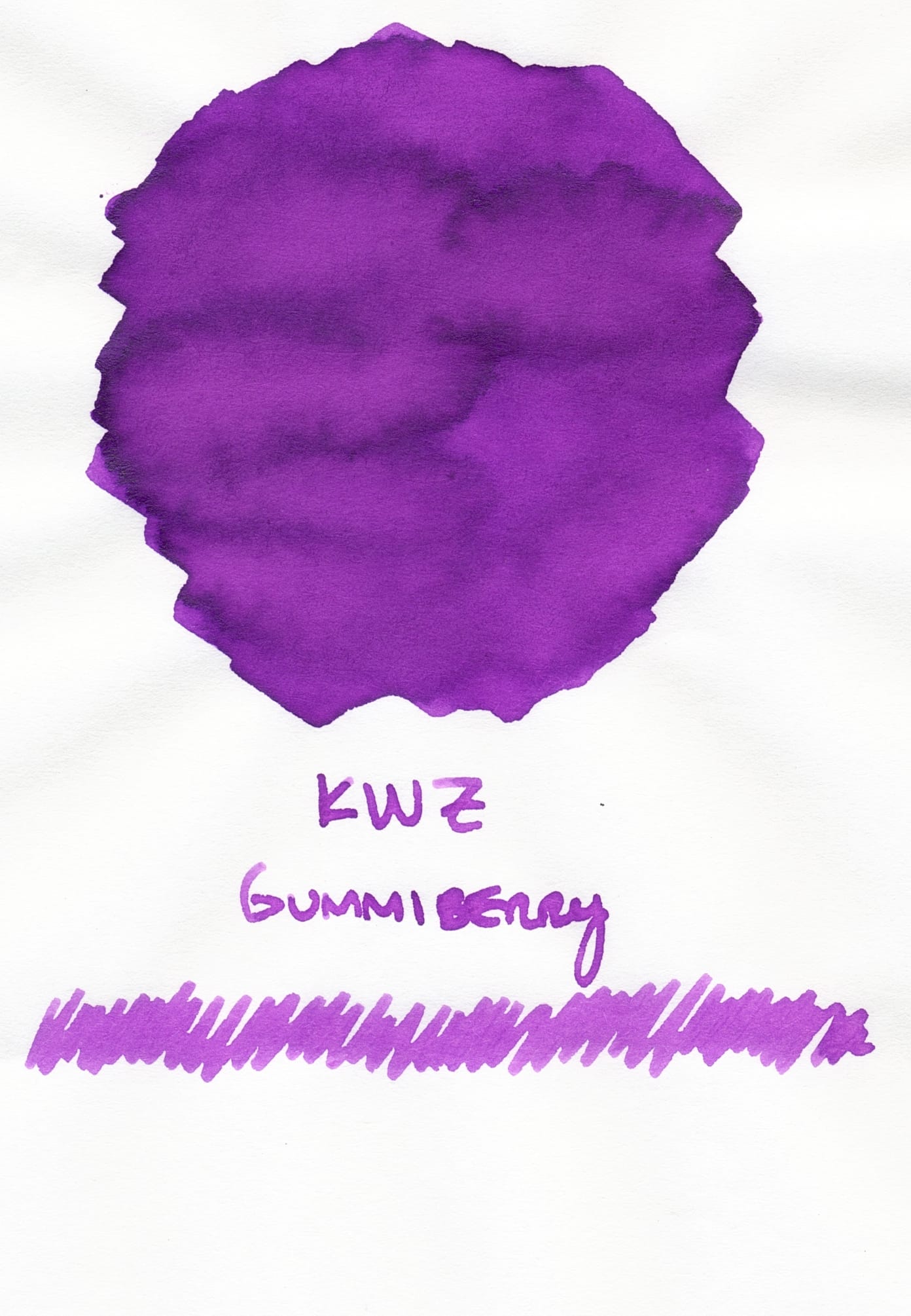
A little more recently I have been into bluer, cooler purples, so it's a little surprising to me that this violet, clearly leaning towards the pinky, magenta end of the spectrum caught my fancy. But it's cheerful and pretty, and thanks to the signature fungicide (?) additive that KWZ uses, it smells faintly of vanilla. Yes, I'm aware it doesn't even remotely match the color of the pen, but sometimes that's what I want.
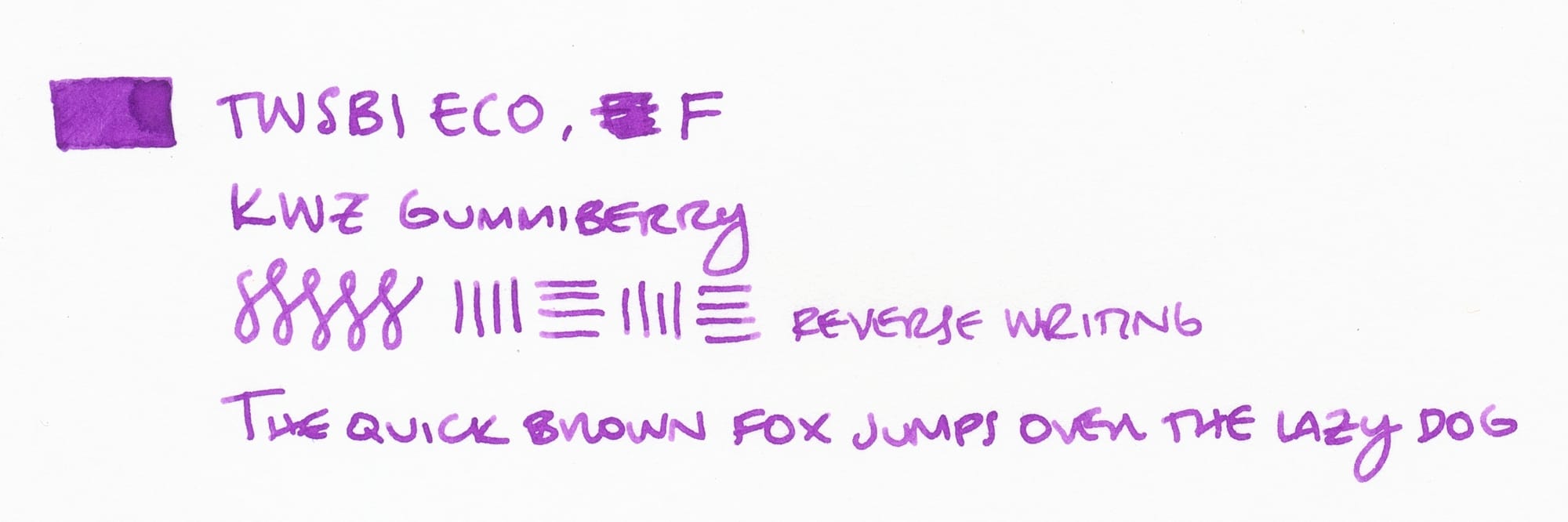
The ECO's fine nib writes wet, and I think KWZ's inks are somewhat wet in general, so this is a free-flowing combo. The shading here is subtle, but still visible enough to give the ink a little translucency. As I have said previously, I do not like fountain pen inks that are completely opaque, unless they have shimmer or sheen. Regular-colored inks that are opaque are not for me, because it doesn't look different enough from writing with a marker or something. I want to know that I'm writing with a fountain pen just by looking at the ink on the page.
I don't have any inks that are exactly like this (which means some day I will have to buy a bottle), but here are a few similar ones.
The closest in my library seems to be Waterman Tender Purple:
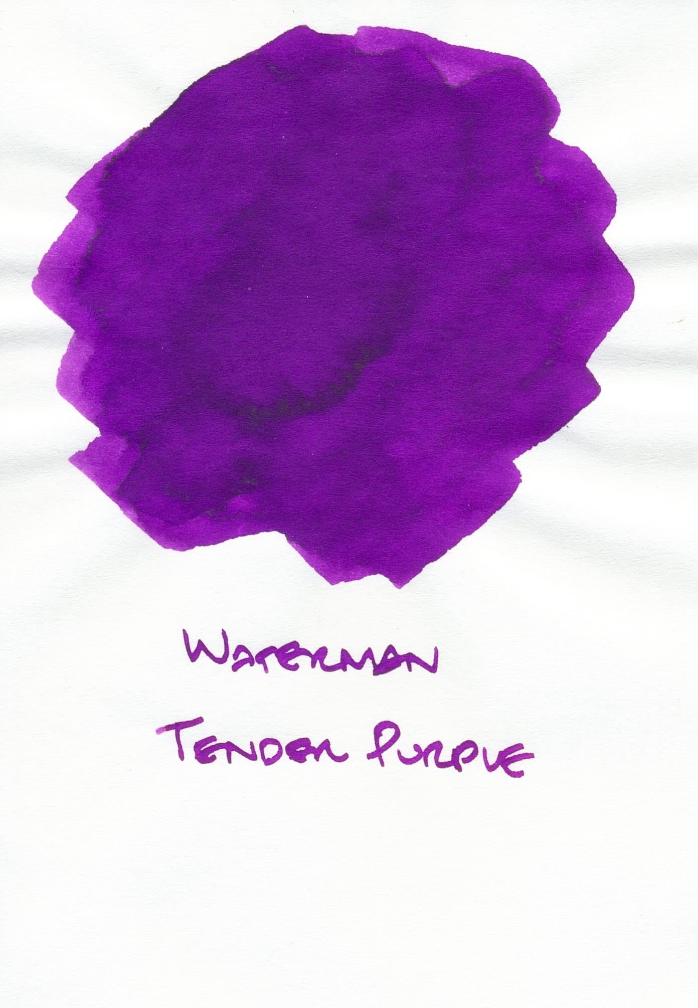
In reality, this swatch leans even more pinky magenta than it appears on my screen (could've done a little more color correcting on the scan 😛). I haven't used this ink too much, mainly because it seems to be more opaque. Also, in the past I wasn't in the mood for these pink-leaning purples. IIRC, this is also a fairly wet ink, so that contributes to its opaque appearance on the page.
This is another opaque violet ink that is very wet, but leans a lot bluer than Gummiberry and Tender Purple. This ink is specially formulated not to dry out even if you leave your fountain pen open/uncapped for a long time, like minutes to hours. I originally bought this to use with my Majohn Vanishing Point-alikes since their EF nibs got dried out pretty quickly, but again, I didn't like its opaque appearance, so this is gathering dust in my library.
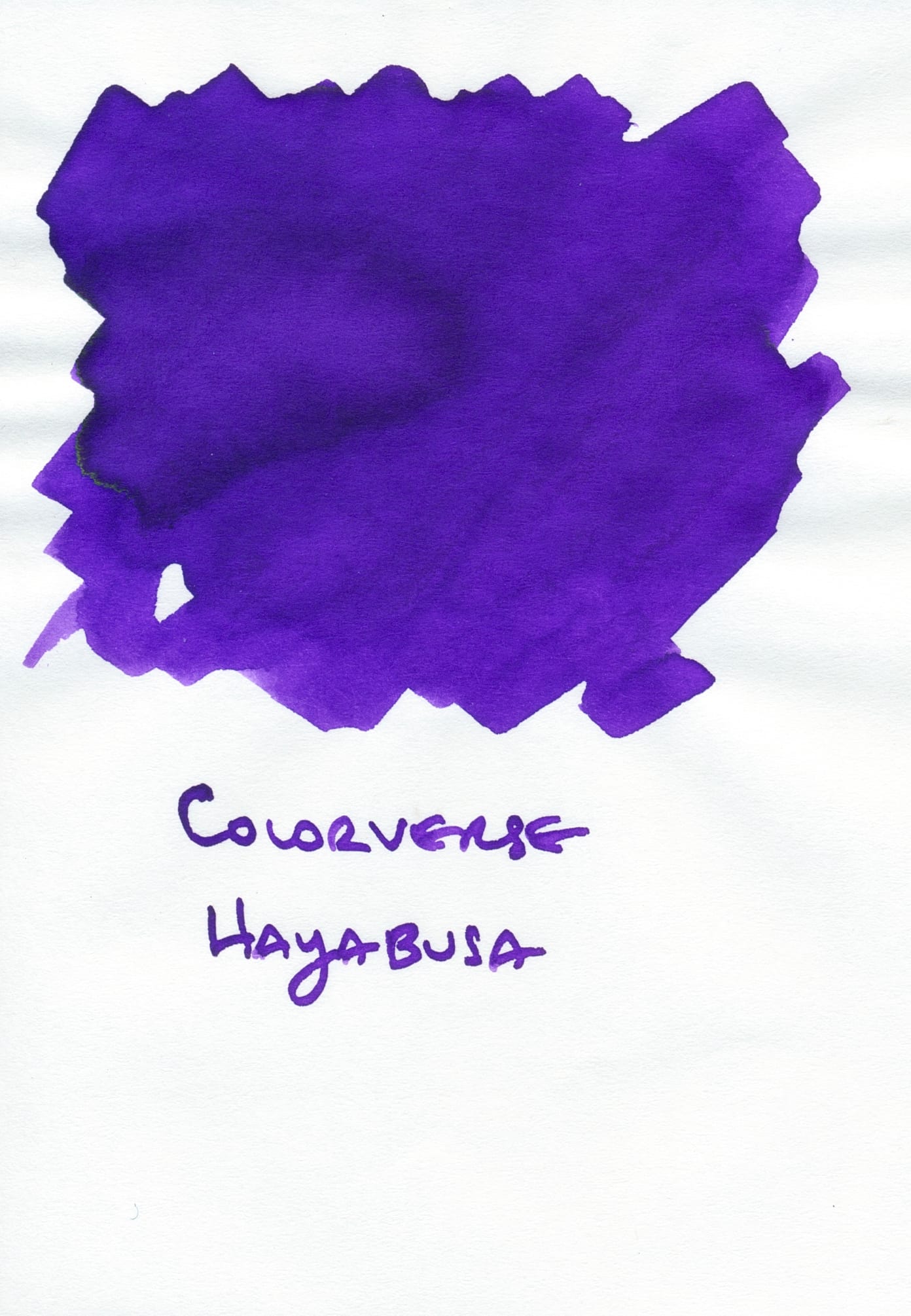
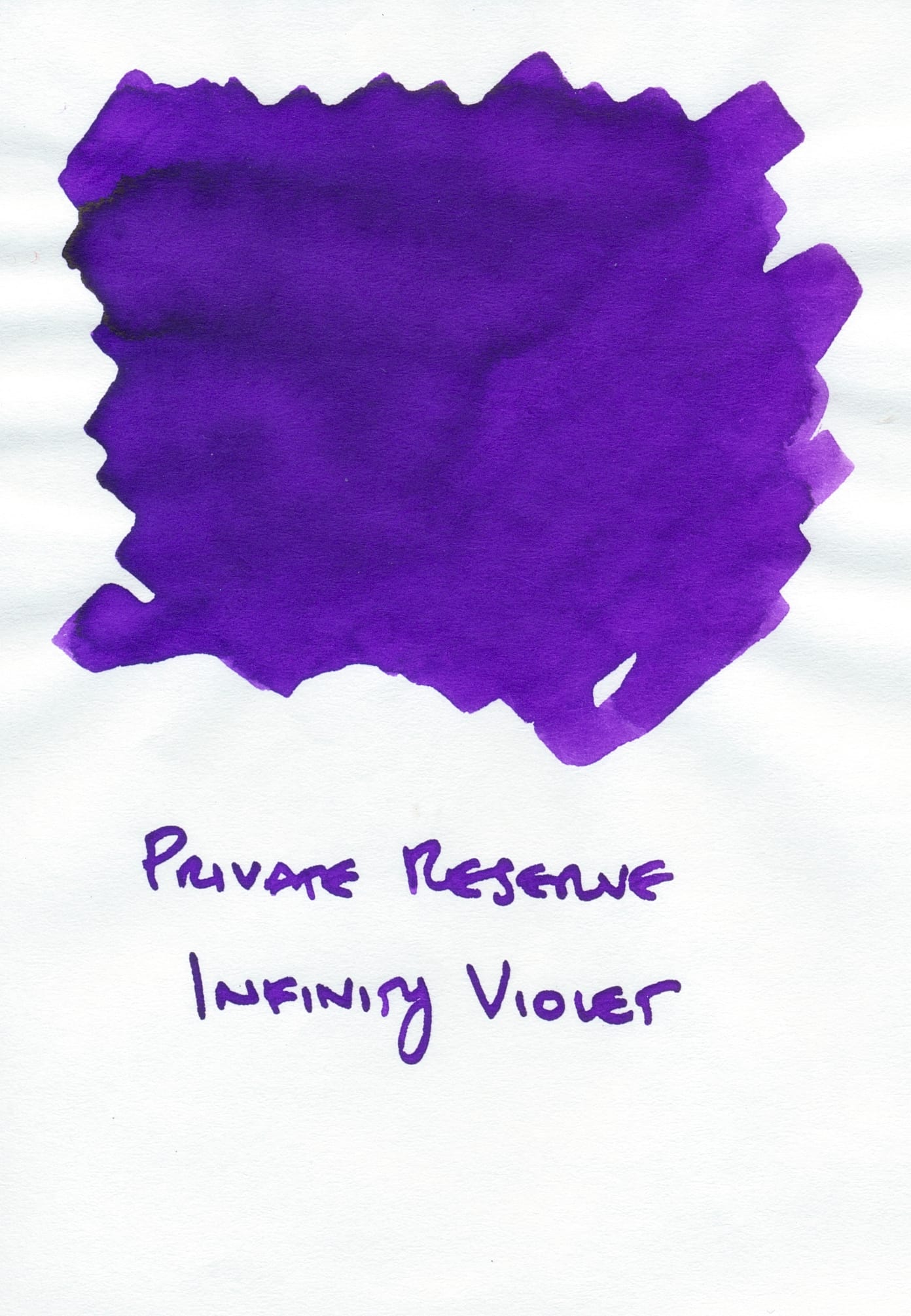
I feel like I always have to include Colorverse Hayabusa whenever I use Private Reserve Infinity Violet as a comparison ink because they look so similar that I thought they were essentially the same color, but when I looked at their swatches again today, I noticed that Hayabusa is ever so slightly bluer than Infinity Violet. It has the same opacity as Infinity Violet, though, so it is also languishing on my shelf.
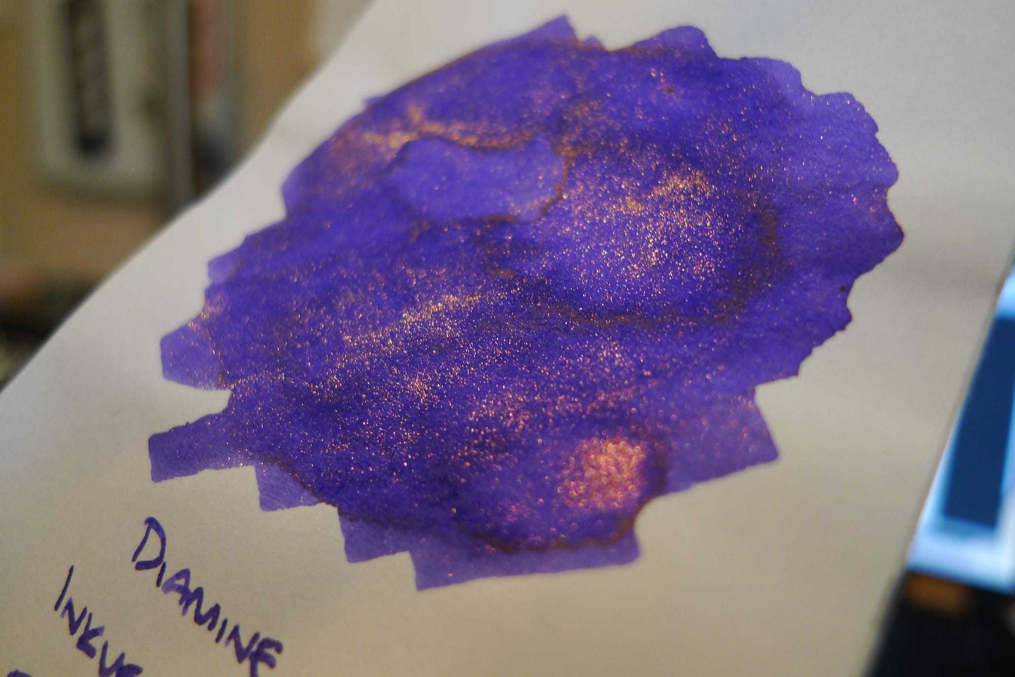
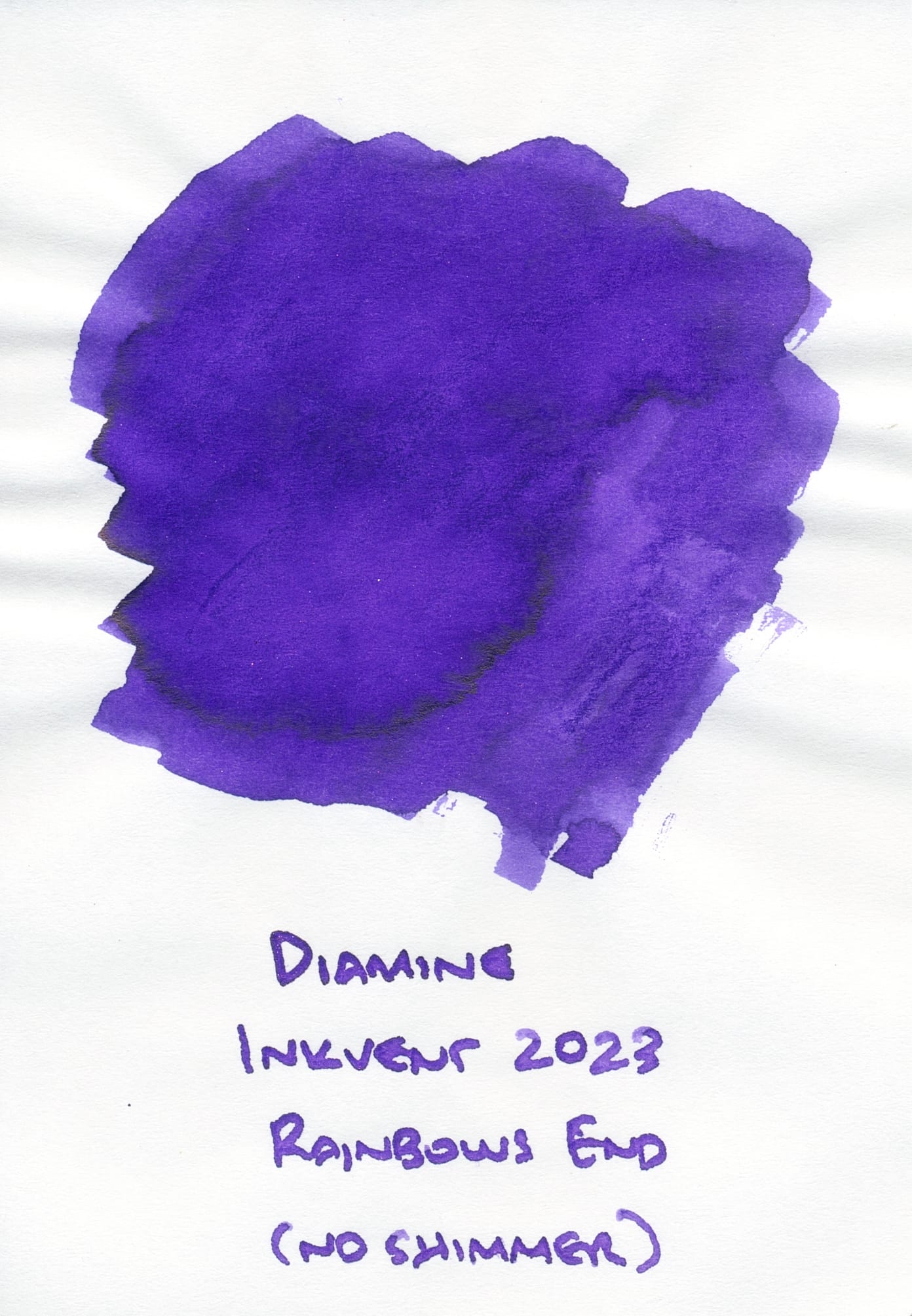
Finally, I picked Diamine Rainbows End from Inkvent a couple years ago, but it's also too cool/blue. Its bronzey rose shimmer can make it look a little bit warmer or closer to Gummiberry, so I included it.
But as you can see in the "no shimmer" scan below, this is a much cooler purple than Gummiberry.
While I'm still more partial to cooler purples, I can see why people like KWZ Gummiberry. For spring and summer, I'm really liking its vivid, cheerful color to help pull me out of my "let's use all the brown inks" obsession. I guess I still got my brown fix in by putting the ink into the TWSBI ECO Espresso Bronze, though. 😅