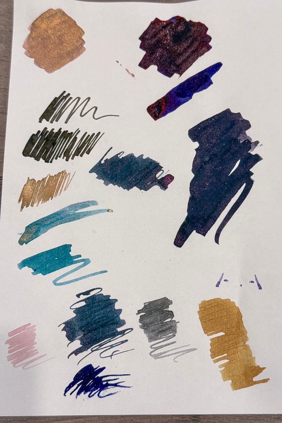
Ink Swatch Wednesday: June's Currently Inked Pens
I recently recorded my currently inked pens for the month on Kokuyo Business Paper, so I thought it'd be a good "show and tell" subject this week.
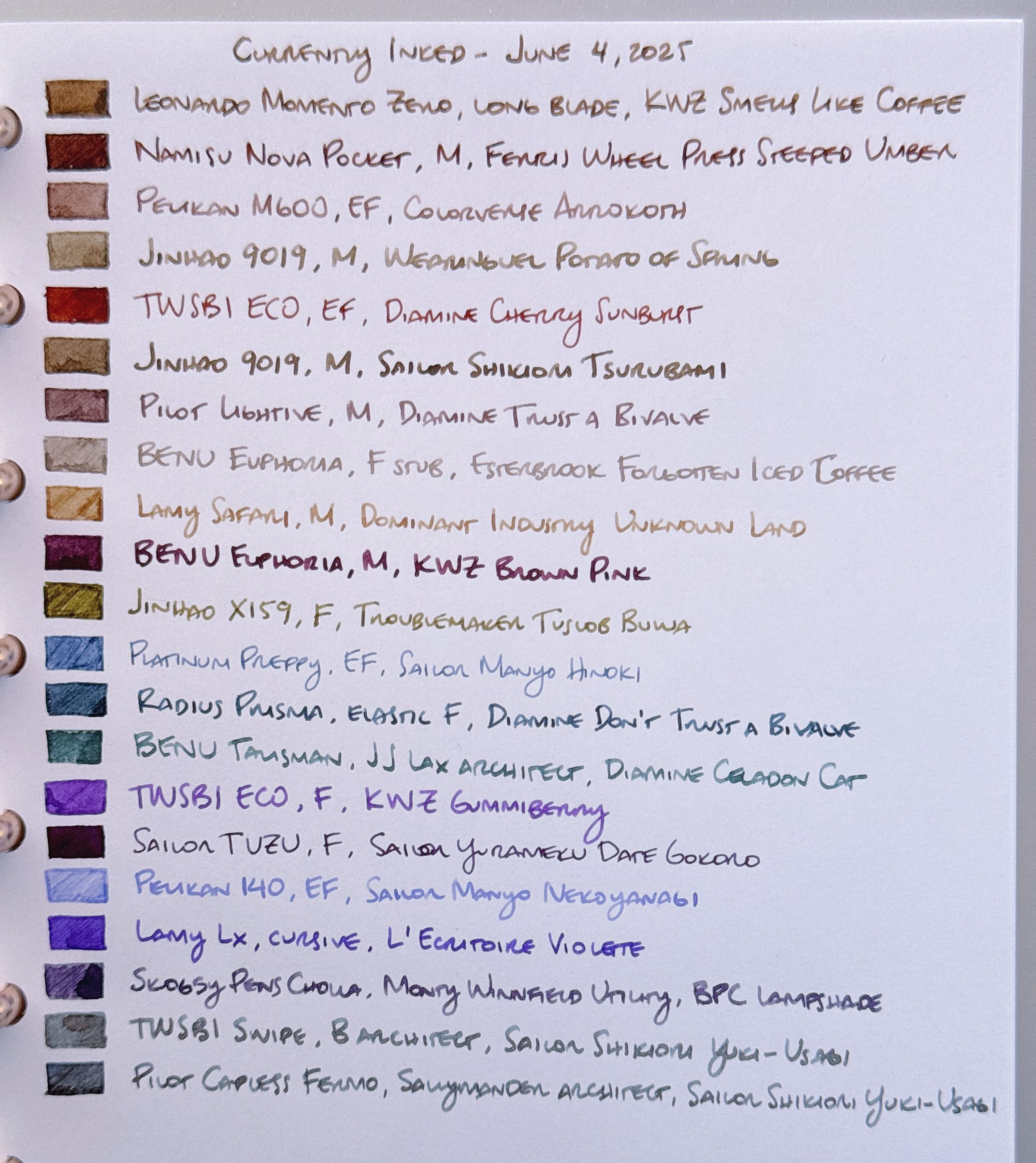
It's not a scan this time (going low effort today on the pictures), so apologies if it's a bit difficult to distinguish some colors. You get the gist. 😜
In case you can't read my handwriting, and for alt-text purposes, here is the list of the swatched inks in the picture above:
- Leonardo Momento Zero, long blade, KWZ Smells Like Coffee
- Namisu Nova Pocket, M, Ferris Wheel Press Steeped Umber
- Pelikan M600, EF, Colorverse Arrokoth
- Jinhao 9019, M, Wearingeul Potato of Spring (typo in the picture 🤦♀️)
- TWSBI ECO, EF, Diamine Cherry Sunburst
- Jinhao 9019, M, Sailor Shikiori Tsurubami
- Pilot Lightive, M, Diamine Trust a Bivalve
- BENU Euphoria, F stub, Esterbrook Forgotten Iced Coffee
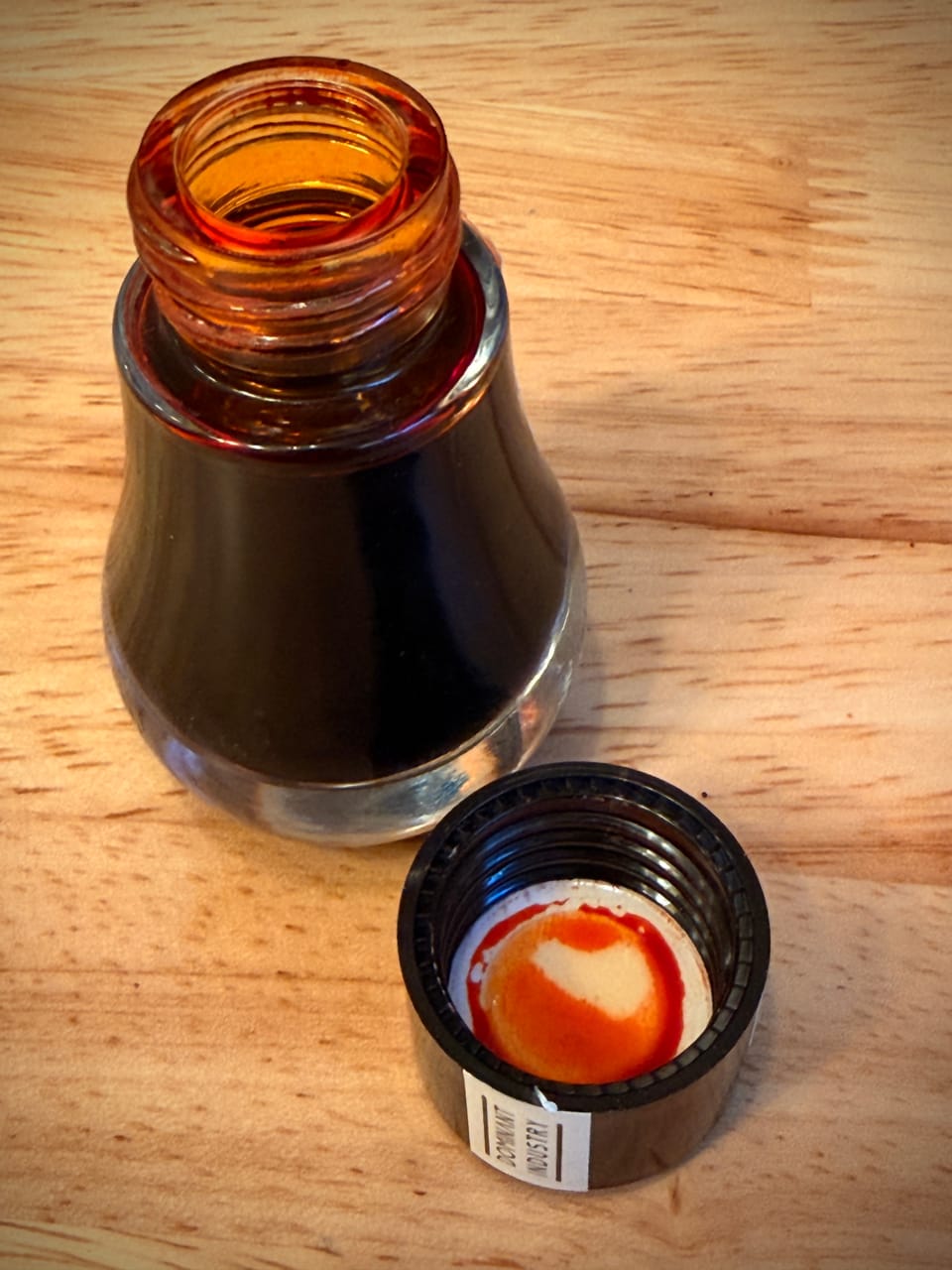
- Lamy Safari, M, Dominant Industry Unknown Land
- BENU Euphoria, M, KWZ Brown Pink
- Jinhao X159, F, Troublemaker Tuslob Buwa
- Platinum Preppy, EF, Sailor Manyo Hinoki
- Radius Prisma, elastic F, Diamine Don't Trust a Bivalve
- BENU Talisman, JJ Lax architect, Diamine Celadon Cat
- TWSBI ECO, F, KWZ Gummiberry
- Sailor TUZU, F, Sailor Yurameku Date Gokoro
- Pelikan 140, EF, Sailor Manyo Nekoyanagi
- Lamy Lx, cursive, L'Ecritoire Violette
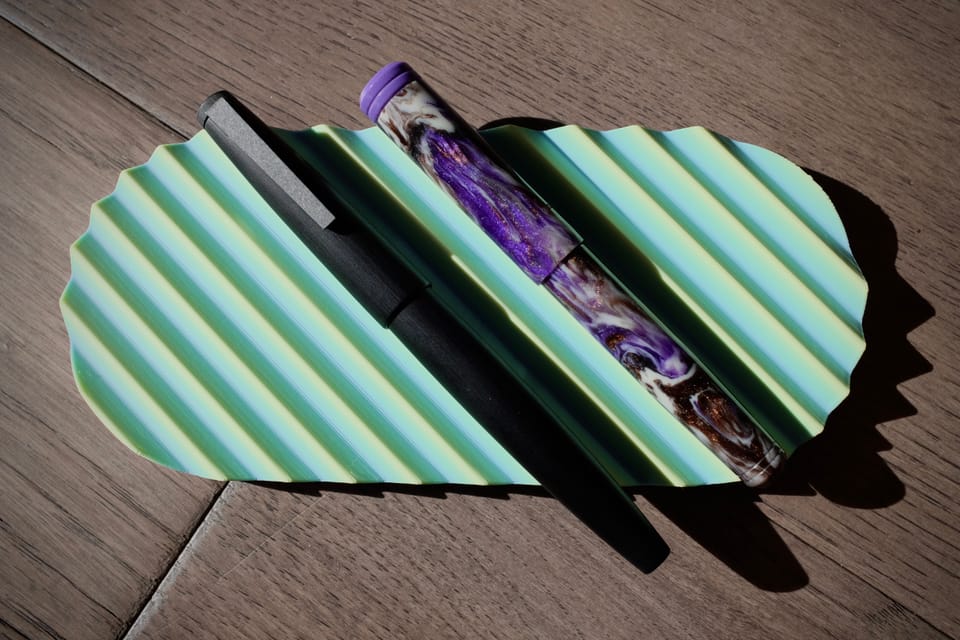
- Skogsy Pens Cholla, Monty Winnfield Utility, BPC (Birmingham Pen Co) Lampshade
- TWSBI Swipe, B architect, Sailor Shikiori Yuki-Usagi
- Pilot Capless Fermo, Sallymander architect, Sailor Shikiori Yuki-Usagi
Some Thoughts On the Inks
- I'm finally starting to peel myself away from browns, despite how many browns are in the batch; I am not feeling the darker browns now because seasonally they don't really go with the warm, summer weather. Of the browns I have inked, I prefer the lighter ones, like Colorverse Arrokoth, Wearingeul Potato of Spring, Diamine Trust a Bivalve (which is kinda more of a pinky-brown), and Esterbrook Forgotten Iced Coffee, even though it is pretty light and bordering on illegible. In the BENU pen I'm using, the ink shows up alright.
- Throughout the batch, if the ink is on the darker side, I probably don't like it right now because of seasonality. This goes for one of my favorite inks, Sailor Yurameku Date Gokoro. Also, in the Sailor TUZU F nib, you can't see the cool chromoshading of Date Gokoro as much, so I'm not really liking the pairing. This may get cleaned out early. KWZ Brown Pink is also too dark and too wet in the BENU Euphoria with the M nib. Way too much of a gusher for my tastes.
- Troublemaker Tuslob Buwa and Dominant Industry Unknown Land feel too dry in the pens they're in. I'm not much of a fan of the sickly green-yellow of Tuslob Buwa, either. I like the caramel color of Unknown Land, but I need to try it in a wetter-writing pen.
- Diamine Don't Trust a Bivalve is a really nice dusky blue. Recently someone was asking for inks that look like Montblanc Glacier, which I don't have direct experience using, but from the swatches they posted (not the same as the ones linked above, but I digress), Don't Trust a Bivalve looks pretty similar. So if you were looking for a dupe for Glacier, maybe you could try this ink.
- Besides the lighter browns I called out above, I am really loving Sailor Shikiori Yuki-Usagi, so much that I put it in two different pens in the same batch, which is not something I normally do. The B architect nib in the TWSBI Swipe is kind of "sloppy" for my tastes, but I knew it would show off Yuki-Usagi's awesome colors and shading. The Pilot Capless Fermo and its stacked architect nib from Sallymander Nibs also shows off Yuki-Usagi well, but with a more crisp, neat architect.
- I'm also liking most of the purples in the batch – KWZ Gummiberry, BPC Lampshade (which goes on as a straight gray and dries to a cool, gray-purple), and L'Ecritoire Violette, a generous ink sample gift from someone who went to L'Ecritoire in Paris (IIRC). I think I'll throw Sailor Manyo Nekoyanagi into the purples, even though with its chromoshading, it could be a blue/pink/purple depending on the nib and paper. In the Pelikan 140's flexy EF nib, I easily see all the shades on the page, which makes me think of a hydrangea with all those colors visible at once.
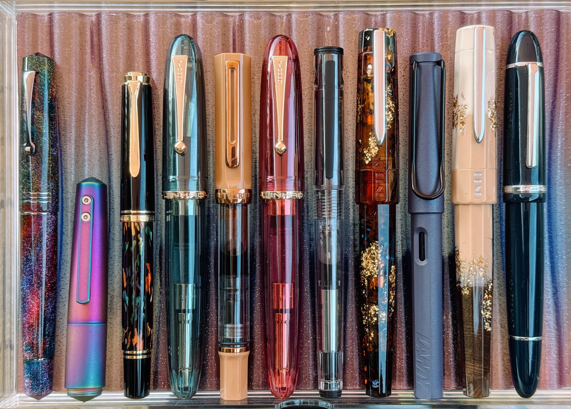
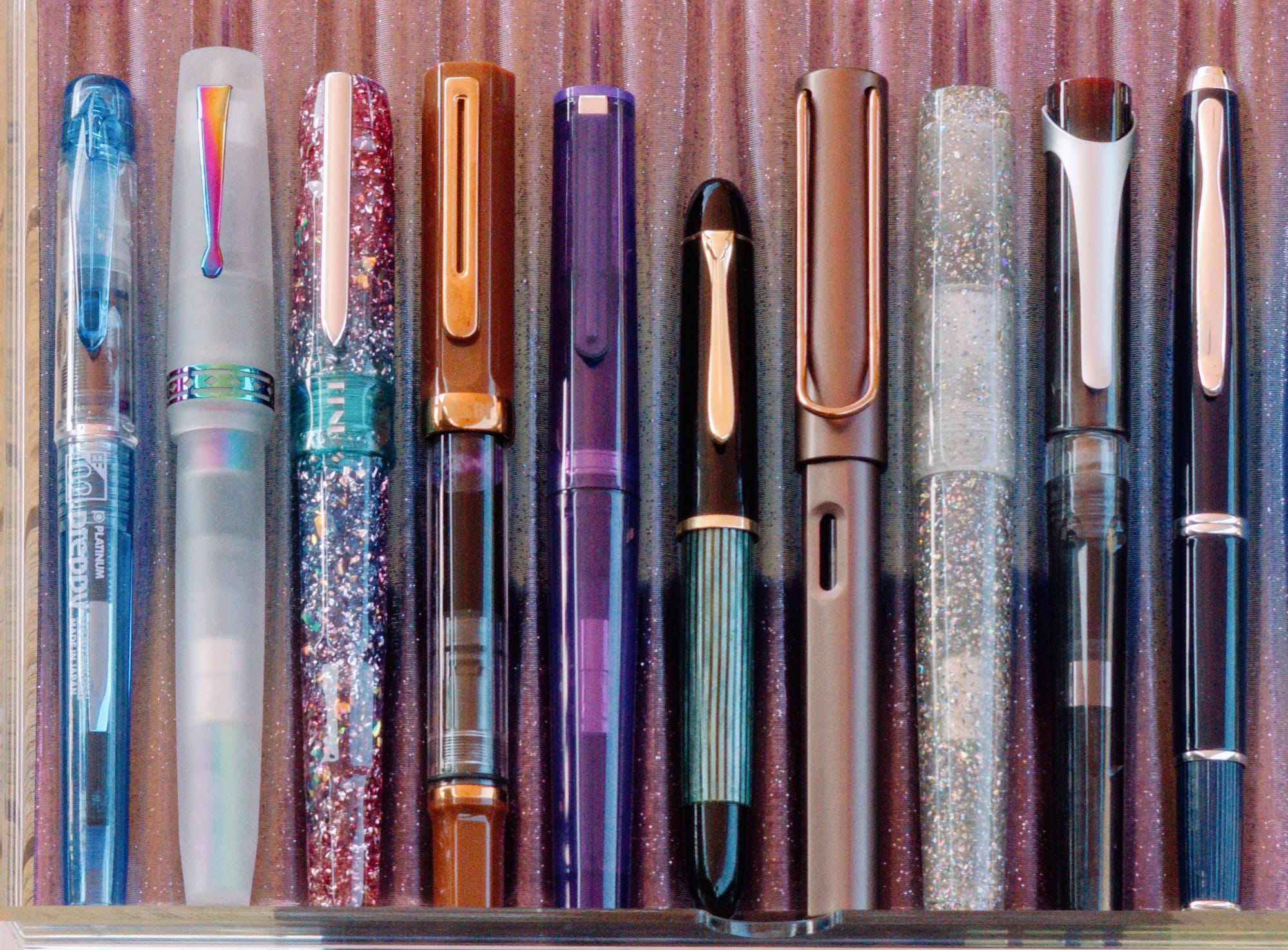
My currently inked pens, sitting in Muji acrylic drawers, in 3D-printed pen trays
Here are my currently inked pens, quite a varied bunch! I really don't use all of them equally, but I can't bear to clean out the ones that I use the least... On a whim I do pick from the lesser-used ones from time to time; I like having the choice to. But in reality, I could probably make do with maybe 4-6 inked pens at a time (it hasn't happened yet, though!).
Some Thoughts on the Pens
I won't write up thoughts on every pen, but I have a few callouts:
- I think I've mentioned in the past that I really like the Jinhao 9019s because of their large sections. They're very comfortable to write with. Their M nibs are also nice at showing off ink characteristics without being too broad for my tastes.
- I love the custom nibs I have in the Skogsy Pens Cholla and Pilot Capless Fermo. Both are great architect nibs (one is a reverse architect) and make both pens feel even more special.
- The Namisu Nova Pocket's brushed metal feels great, and the titanium M nib in it writes really well, with pleasant feedback. I'm just not a huge fan of the dark brown ink it in right now thanks to seasonality (FWP Steeped Umber).
- I really like Lamy's cursive nib in the Lx, and thought about picking up another one to put in the Safari, but it's nice to have a regular nib for variety.
- The F stub in one of my BENU Euphorias is a nice width for my small writing. It makes me want to get more nibs ground into similar width cursive smooth italics, or try the Journaler nib from Custom Nib Studio.
- The architect nib ground by JJ Lax on my BENU Talisman is very sharp compared to my other architects. I like it, but it means that I have to use wetter inks that kind of smooth out the feel of the sharp nib grind. Diamine Celadon Cat is not that great a match for this nib.
Well, despite my desire to make this a quick post, it kinda blew up. Thanks for reading through my off-the-cuff commentary. Let me know if you have any thoughts on my currently inked. Always happy to chat about these things.