Ink Swatch Wednesday: Colorverse San Francisco Bay
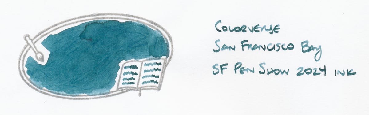
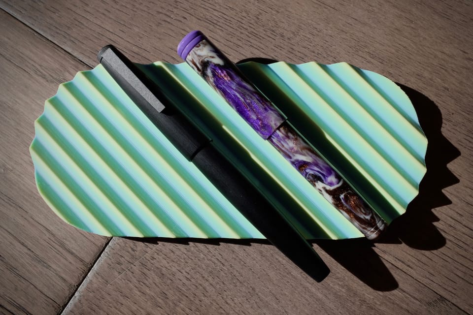
My San Francisco pen show budget was taken up by a vintage Pelikan, an architect nib grind, and some Mushroom Cat (and other cat) stationery from Paper Treats. Amazingly, I only bought one ink, the pen show ink by Colorverse called San Francisco Bay. It's a nice teal meant to mimic the Bay's water, a complement to last year's Colorverse pen show ink that was a red-orange to symbolize the Golden Gate Bridge.
Currently I'm mixed on teals. This color is nice, but I can't help wishing it were bluer, or just a different blue color entirely. And yet, I have a few inks in my collection that fall into a teal spectrum:
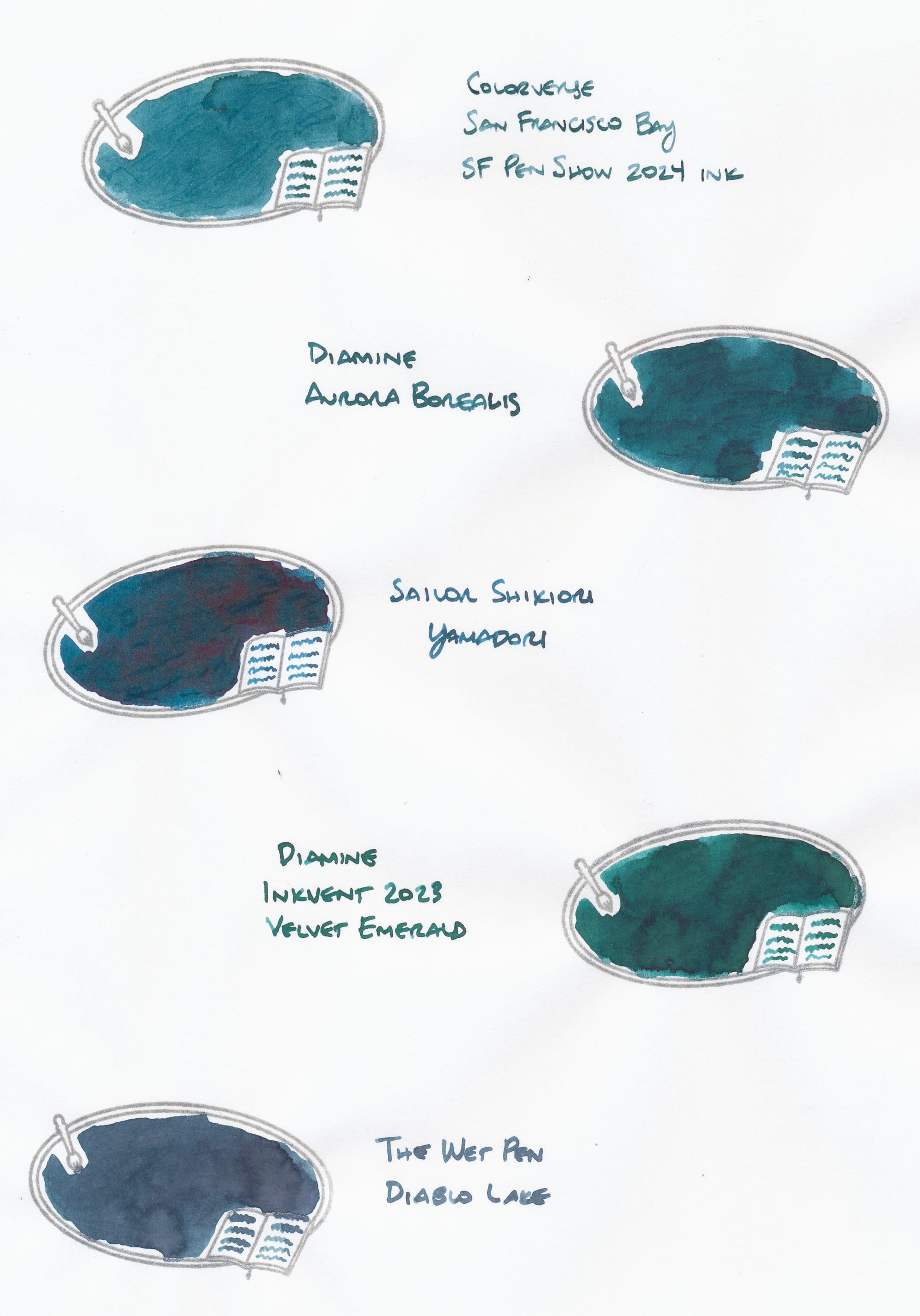
I would say that The Wet Pen's Diablo Lake and Sailor Shikiori Yamadori are my favorites of the bunch because they are bluer shades, with Diablo Lake not really being a teal, rather more like a blue-gray. Looking at another swatch of the ink, it seemed teal-ish, but relative to all these other shades, it seems like the odd one out.
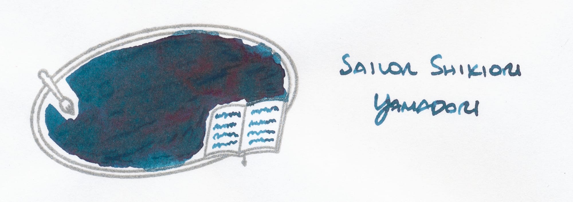
Yamadori is one of my first purchased inks, but I haven't used it in a while. I may have to rotate it into my currently inked sometime, as it looks like a nice fall/winter color and leans bluer than all the other teals here.
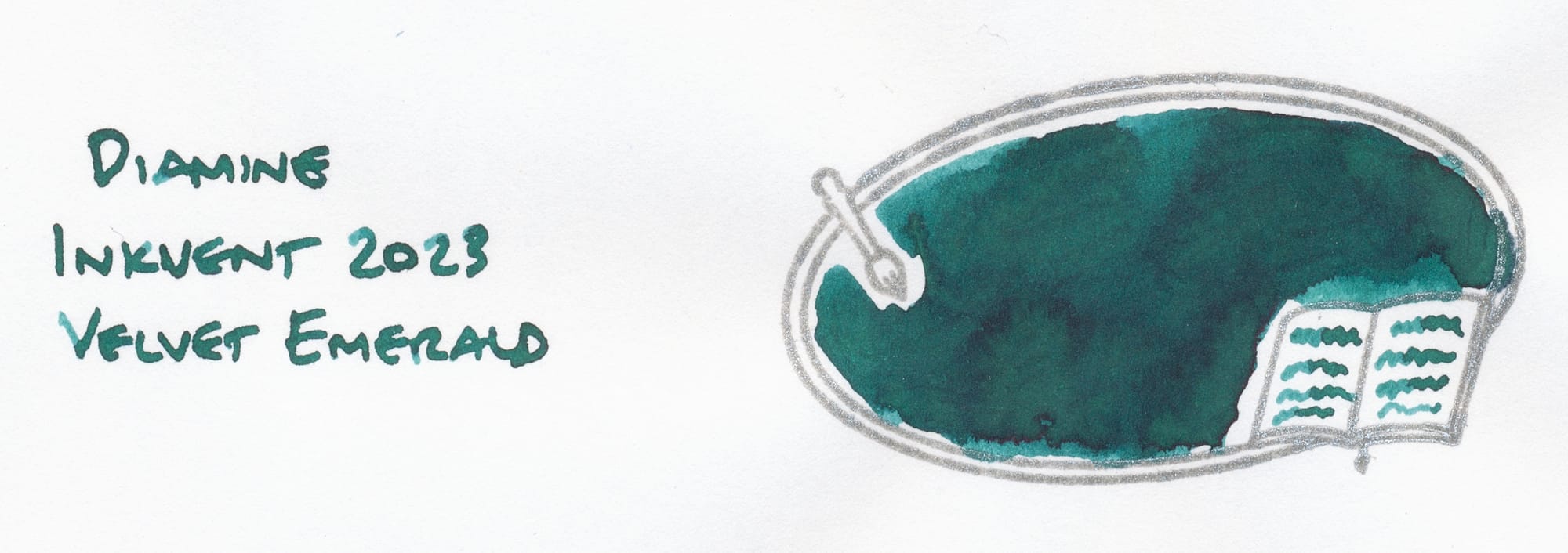
Velvet Emerald is the greenest out of the bunch. The bottle's label looked a bit more like bluish teal than this ink is on paper.
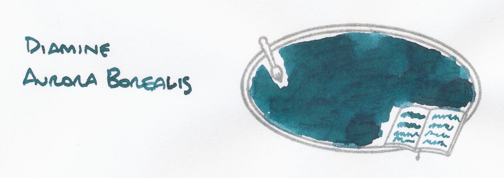
Aurora Borealis seems the closest to San Francisco Bay, but darker and more saturated, perhaps a tad greener.
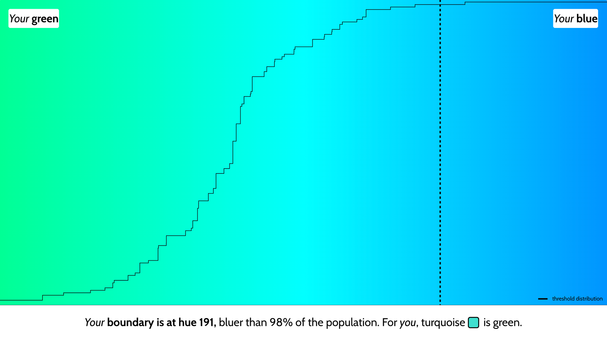
How do you all feel about teal? Also, have you taken that "is my blue your blue" quiz making the rounds on the internets? My blue is around 98% more blue than the quiz answerers, apparently.
Interested in my other posts about fountain pens and inks? Look no further.