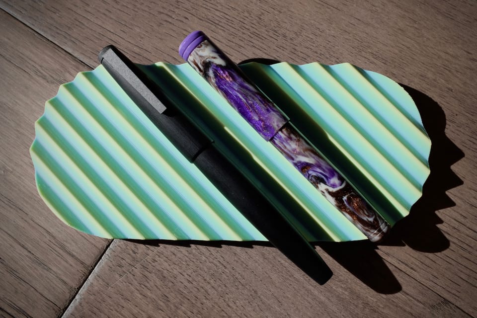
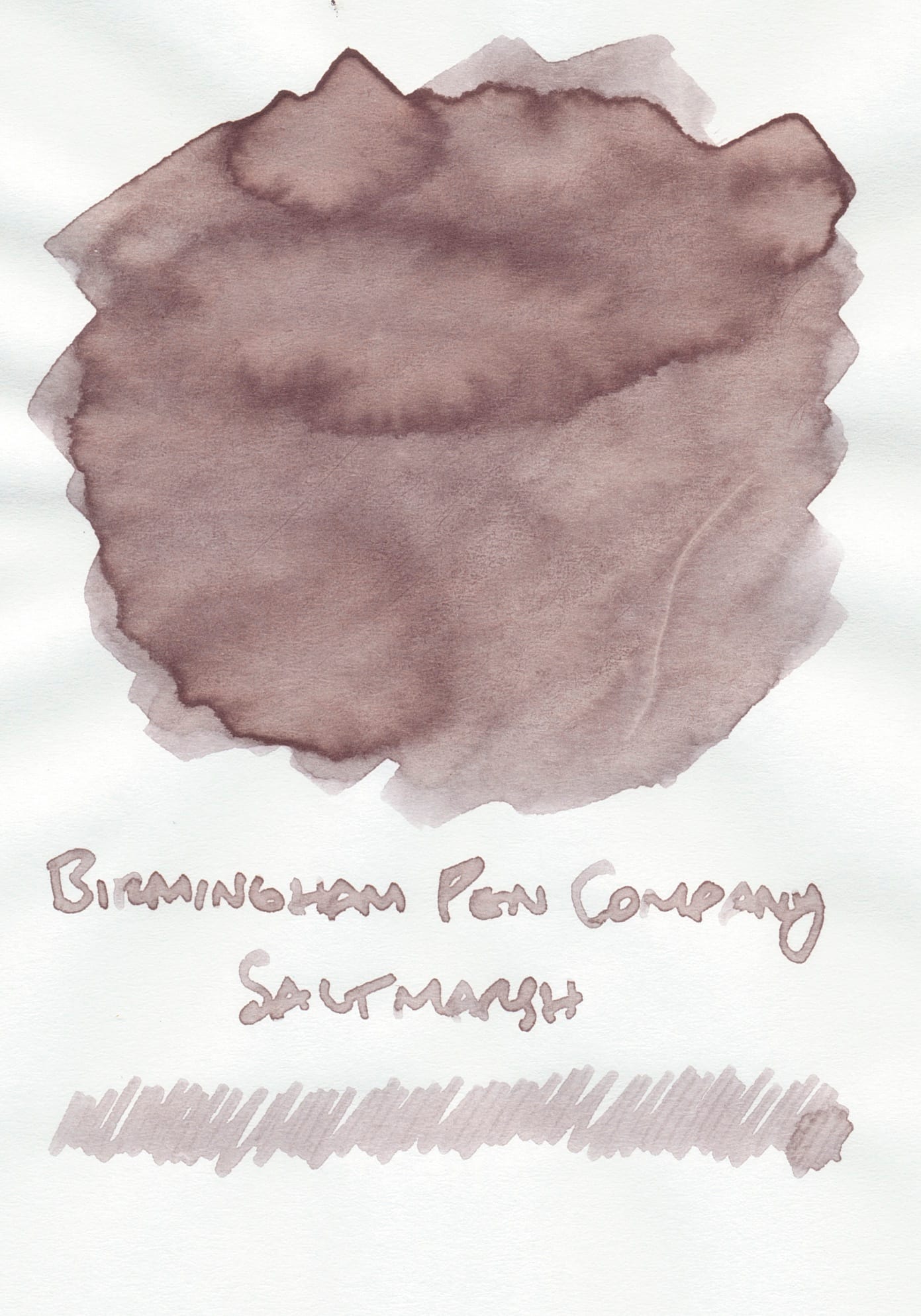
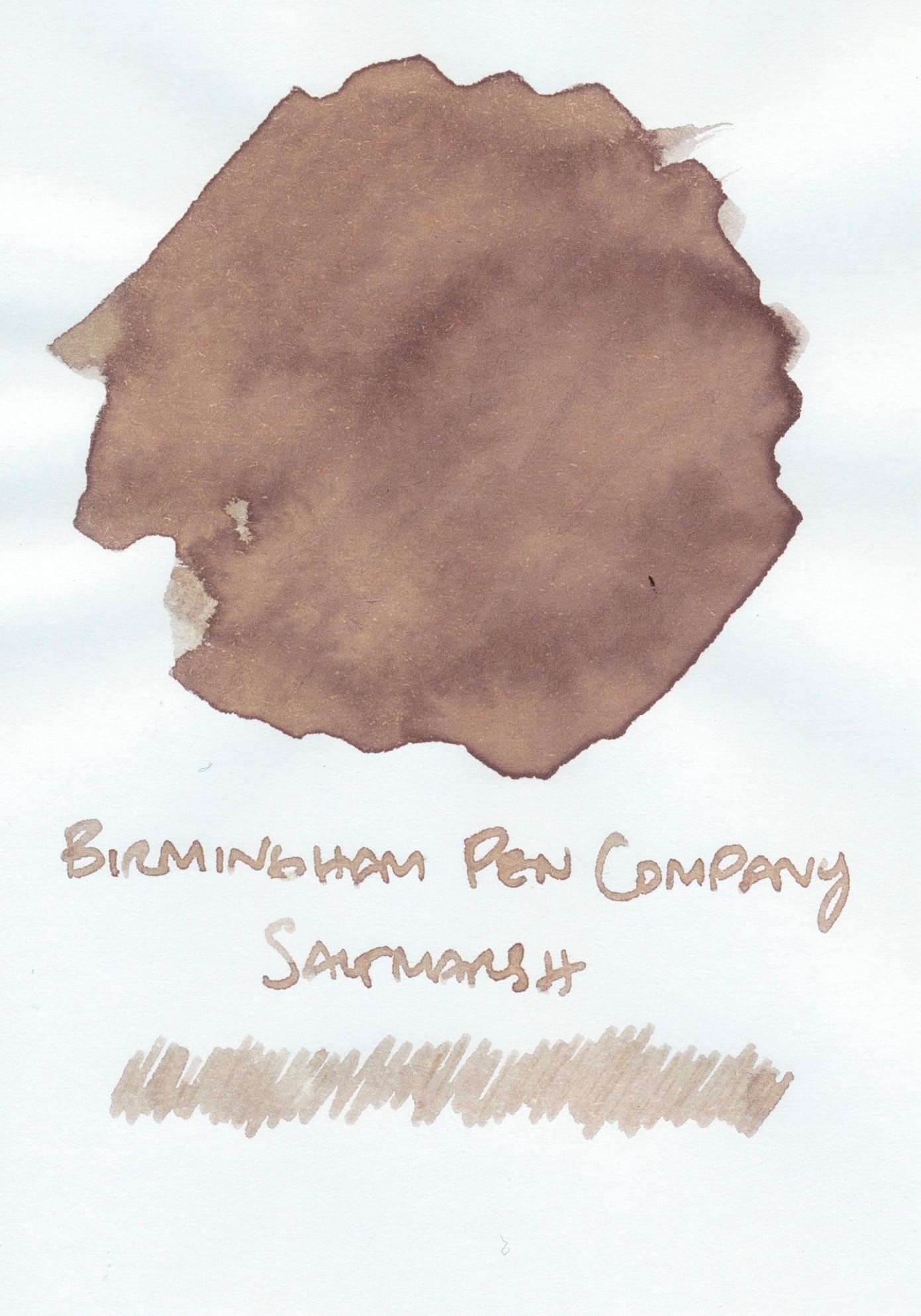
Ink Swatch Wednesday: Birmingham Pen Company
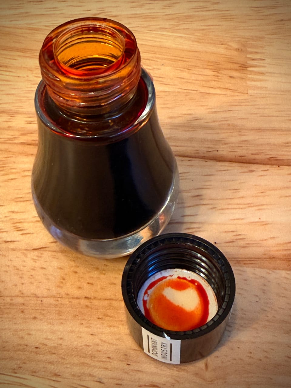
A few weeks ago I received my first order from Birmingham Pen Company of three different inks: Ploughman's Pebble, Saltmarsh, Kraken's Wake. Two of them are sandy, beigey, brown shades, and the other is a medium dark blurple. Given my multi-month obsession with brown inks, it was inevitable that I got sucked in by the two browns I ordered. 😅
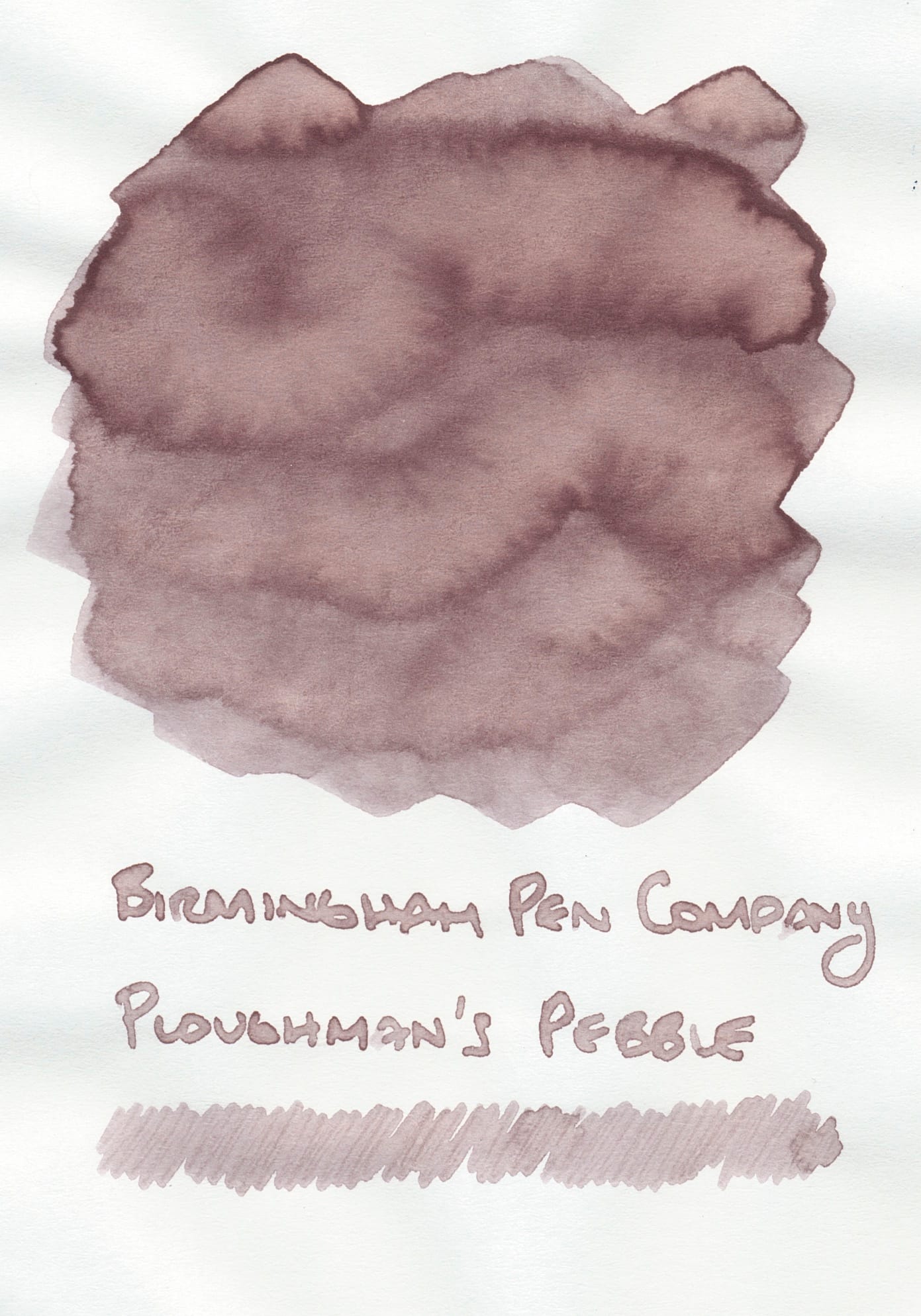
Birmingham Pen Company Ploughman's Pebble ink swatches on Tomoe River, Iroful, and Rhodia (left to right)
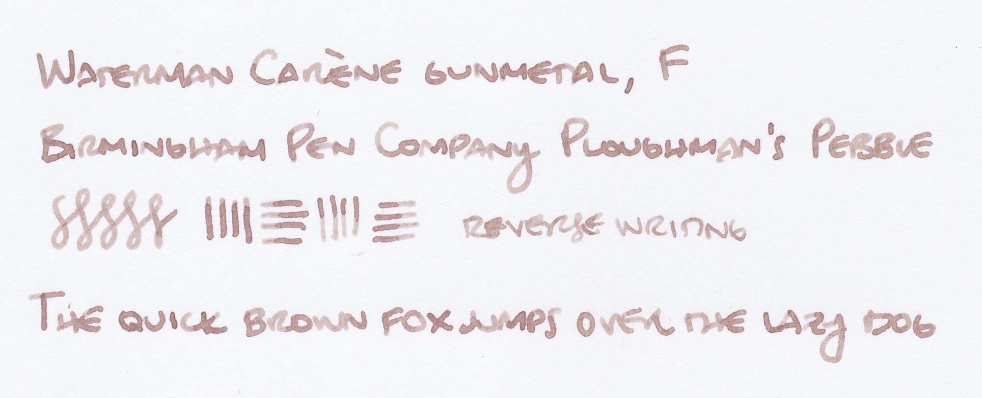
Ploughman's Pebble is an interesting beigey brown with some pinky tones visible depending on the paper. My gut reaction was that it seemed similar to Ferris Wheel Press Oyster Hour/Lennon Tool Bar Sesame Oil (two inks that look very similar to me), but it has warmer tones than that ink. You'll see comparisons in a moment. I have it in my Waterman Carène gunmetal and am happy with its performance flowing out of the pen's fine nib.
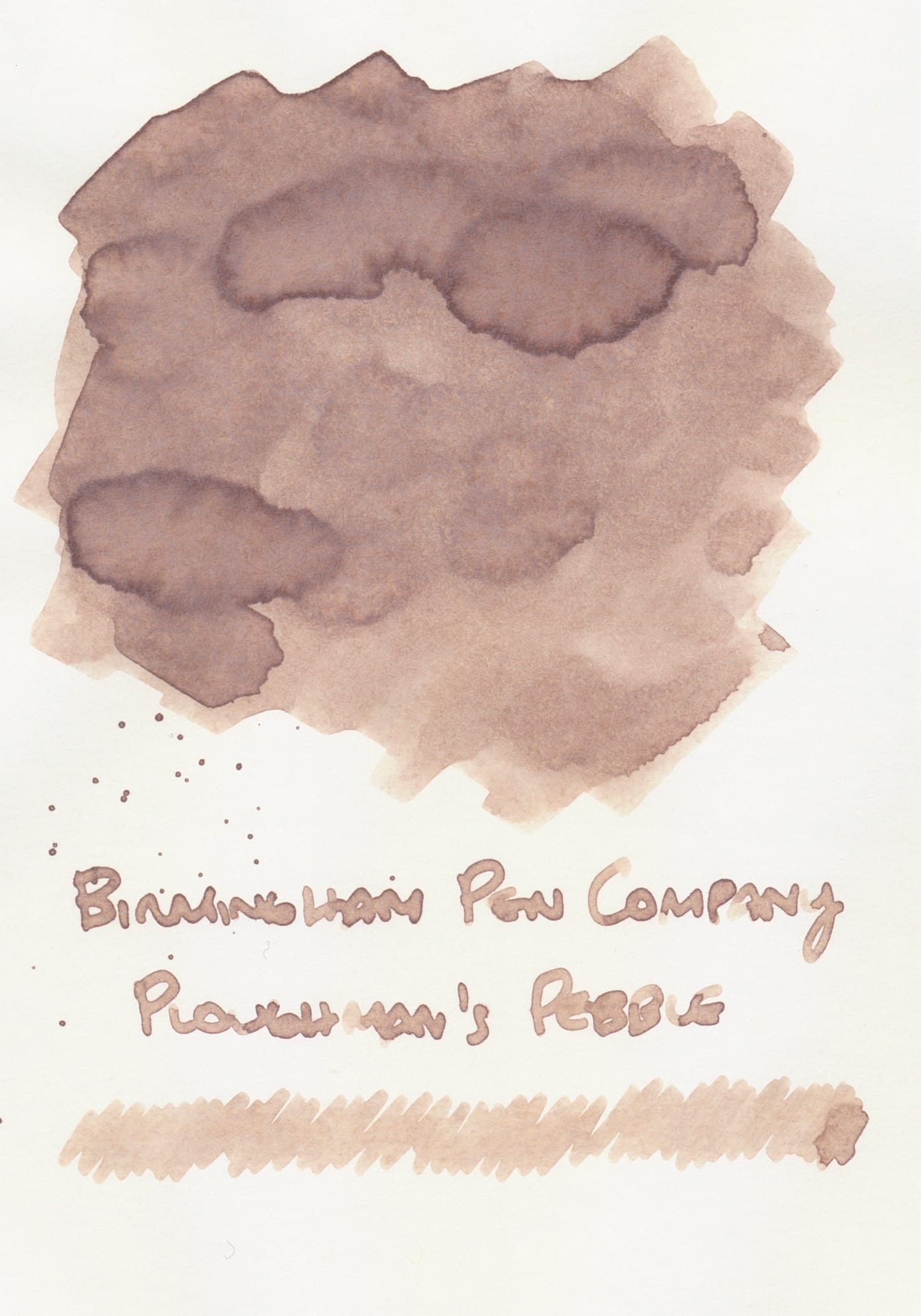
Saltmarsh is very close to Ploughman's Pebble, but a tad cooler, and without the pink tones.
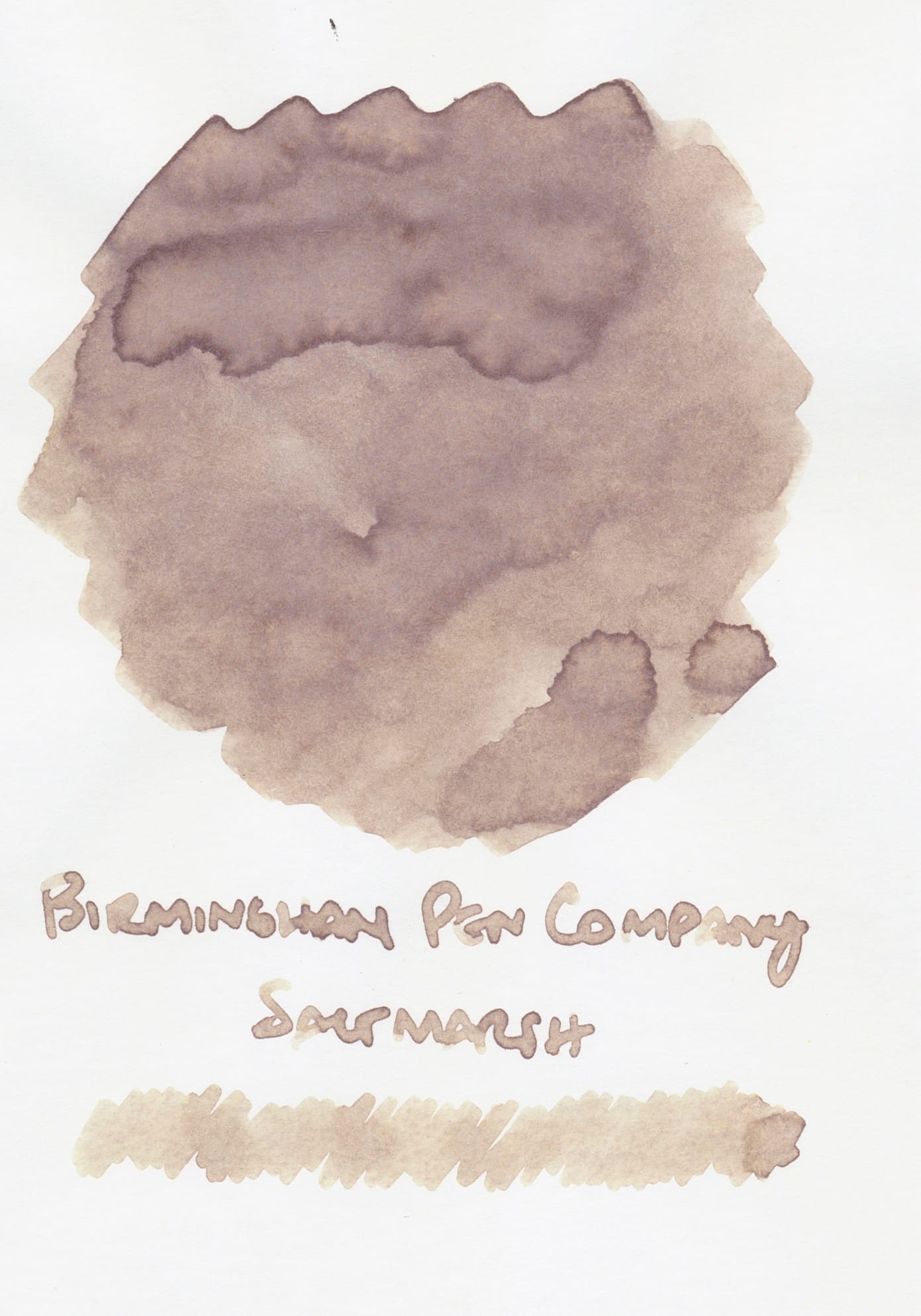
Birmingham Pen Company Saltmarsh ink swatches on Tomoe River, Iroful, and Rhodia (left to right)
I don't know if I just didn't recognize this when I bought the inks, but now that I have the two 60 mL bottles, I really didn't need both. It'll be a long time before I can finish either of these, so if y'all want samples, let me know. 🤦♀️
Saltmarsh is probably closer to FWP Oyster Hour and LTB Sesame Oil, depending on the paper, but still I don't think they're exact matches.
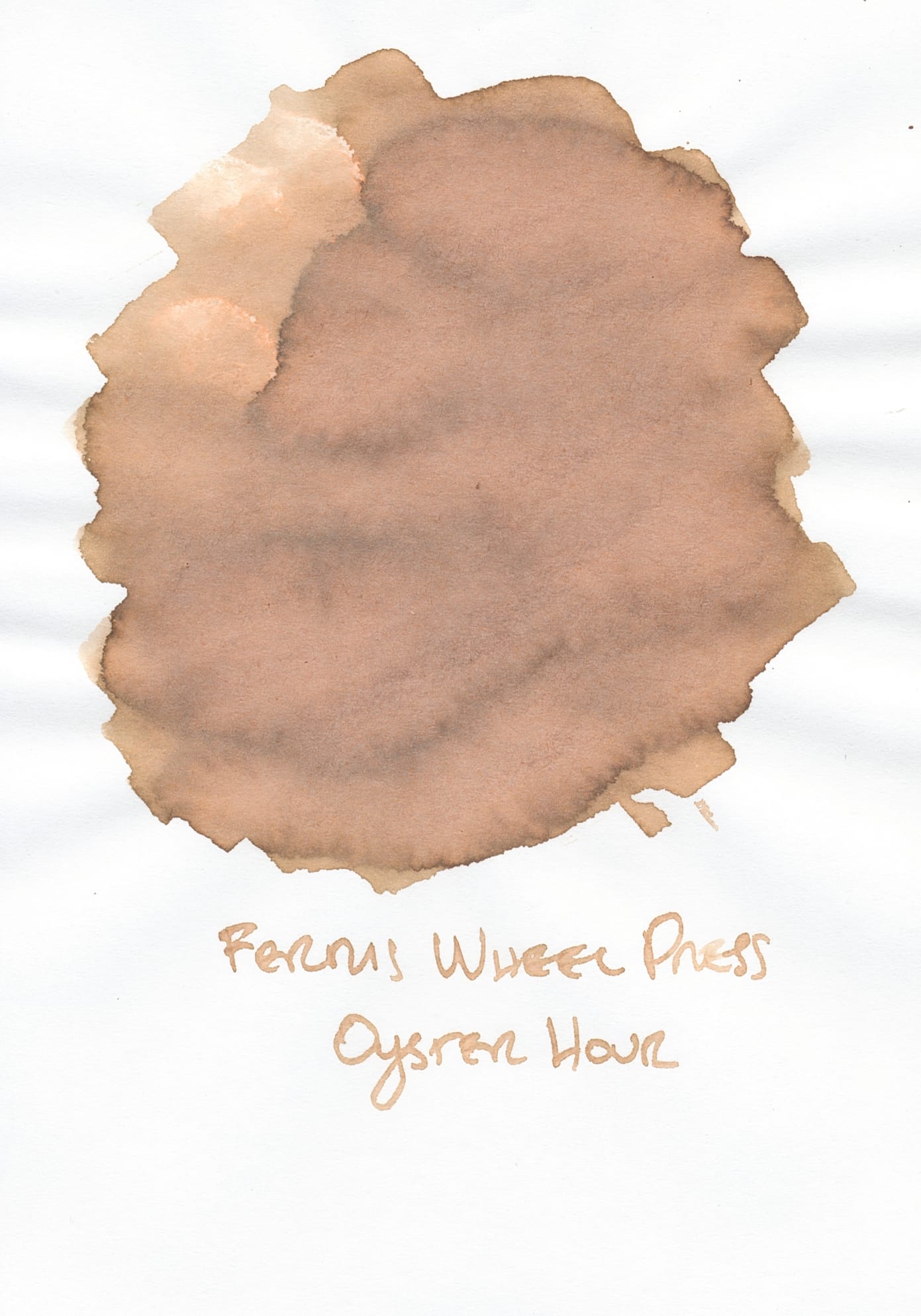
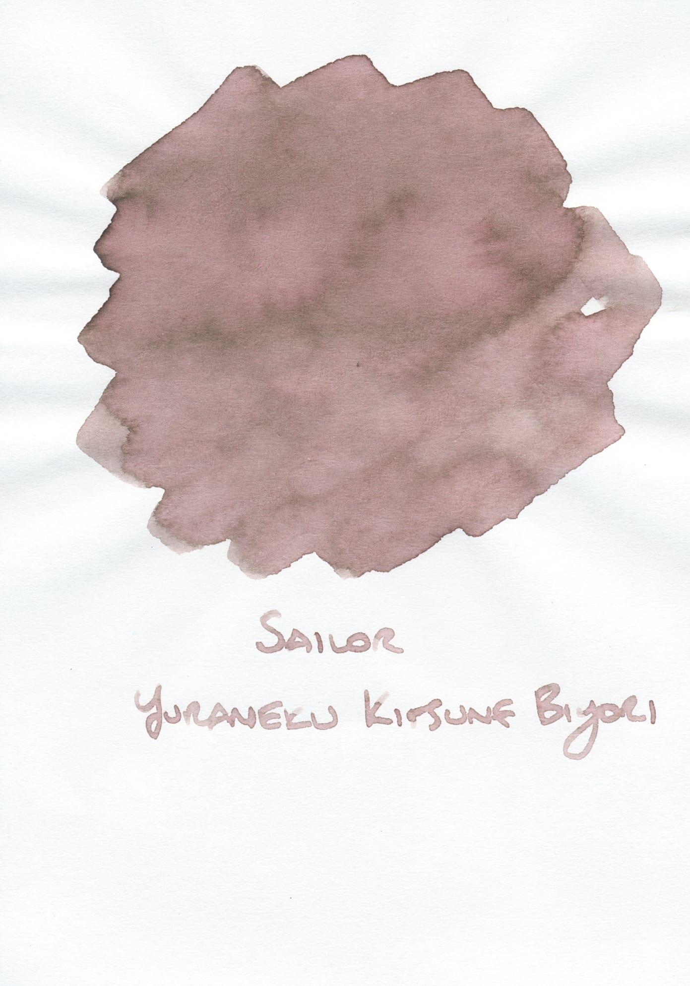
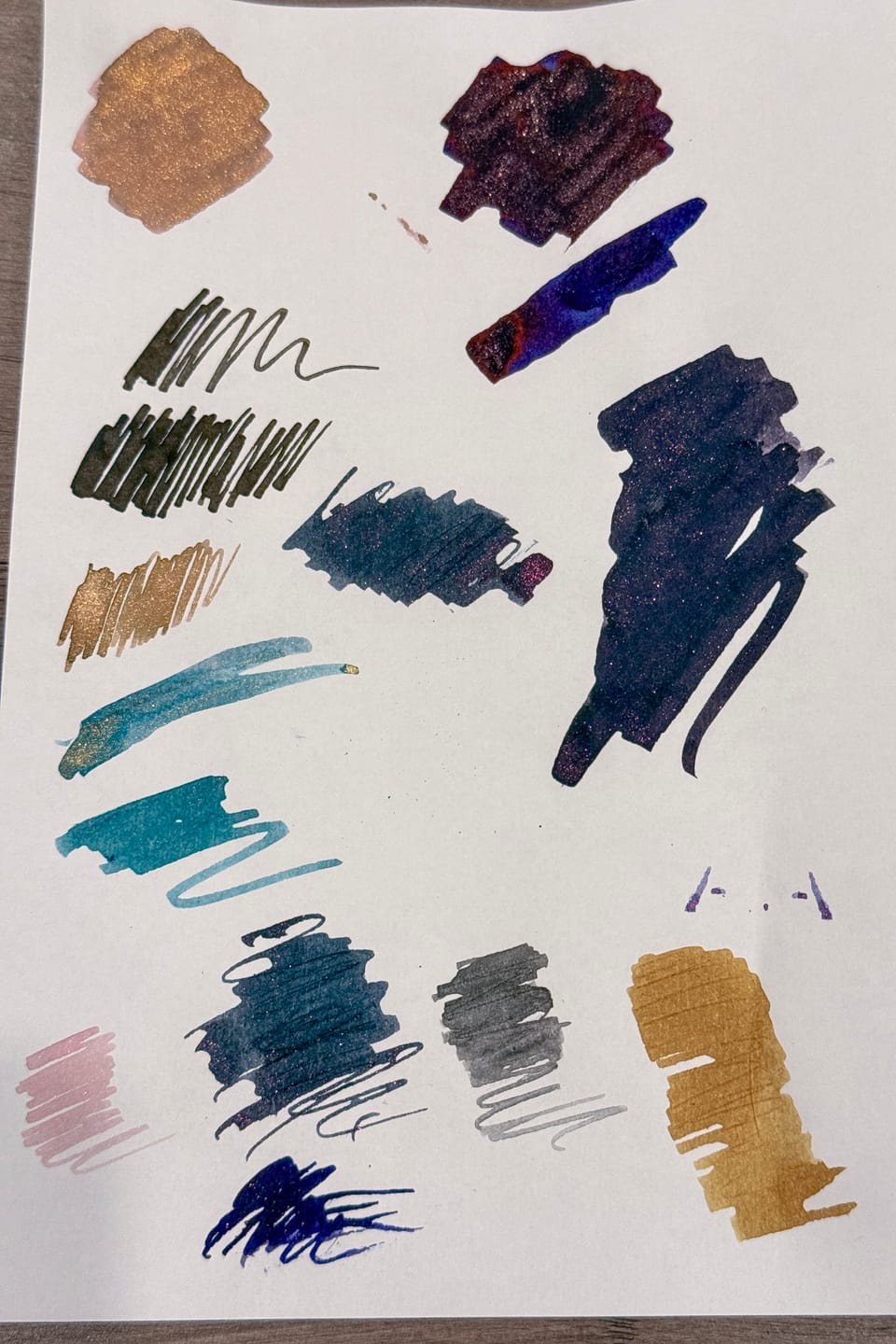
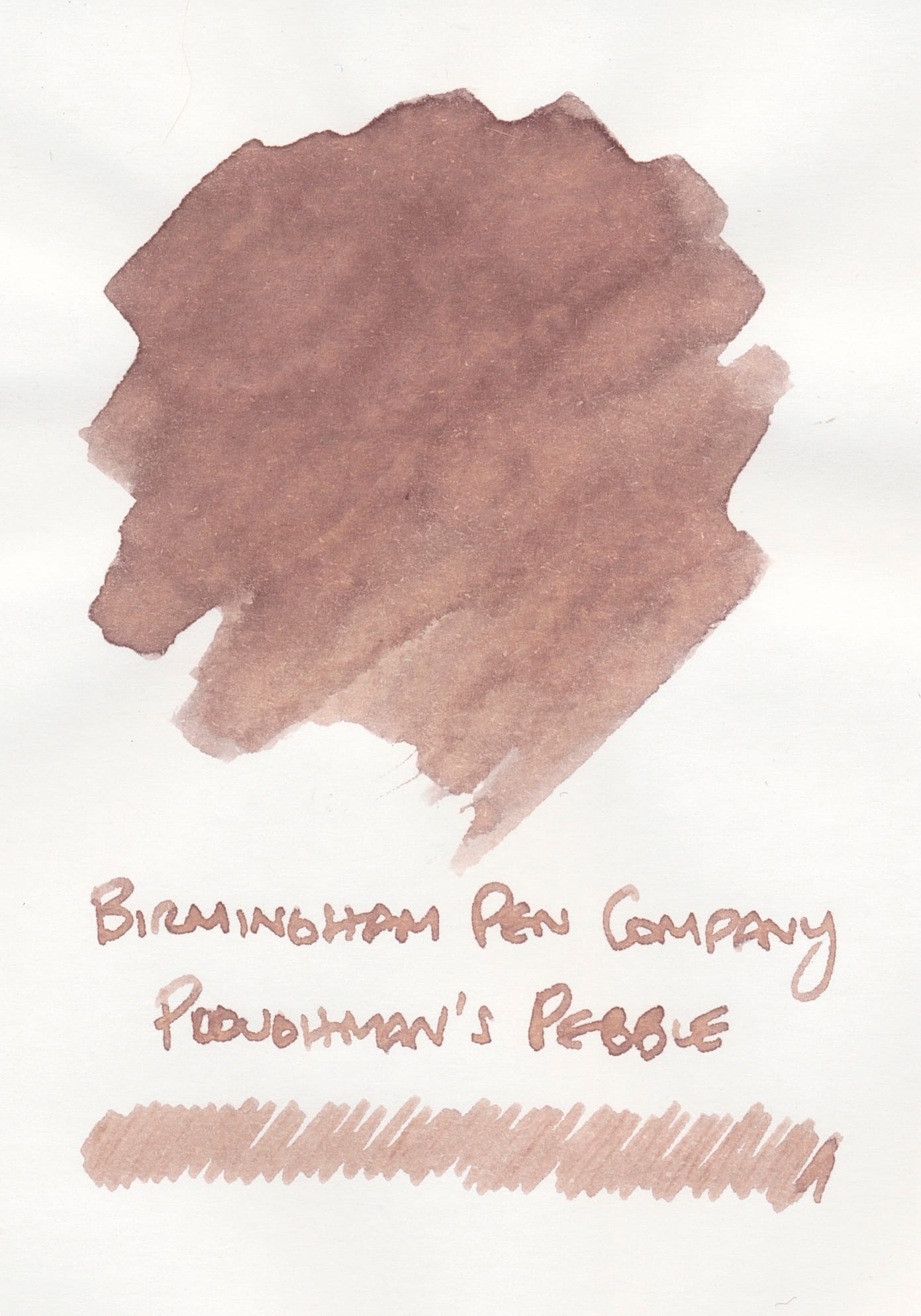
Ink swatches for Ferris Wheel Press Oyster Hour, Sailor Yurameku Kitsune Biyori, and Diamine Dusted Truffle (no shimmer) on Tomoe River paper
These are the three inks from my swatch collection that looked most similar to both Ploughman's Pebble and Saltmarsh. Weirdly my swatch of Oyster Hour makes it look more opaque and kind of cosmetic foundation-like than it actually is flowing out of a pen. Kitsune Biyori is closer to Ploughman's Pebble on TRP, and Dusted Truffle without the silver shimmer is a darker more saturated version of Saltmarsh, especially when compared to the swatch on Rhodia.
The lone colorful blurple ink, Kraken's Wake:
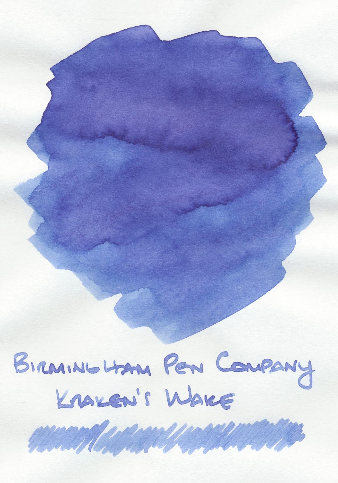
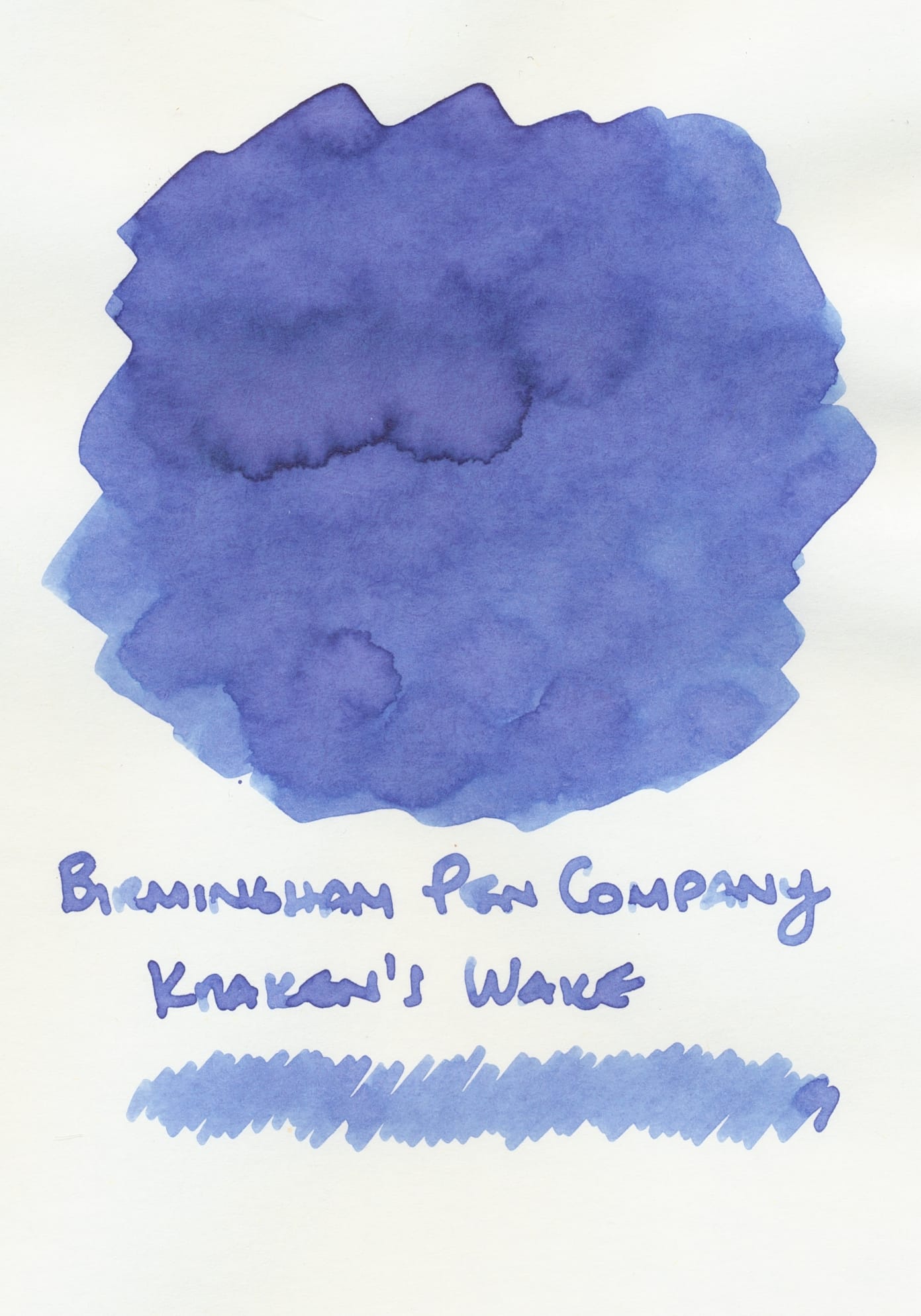
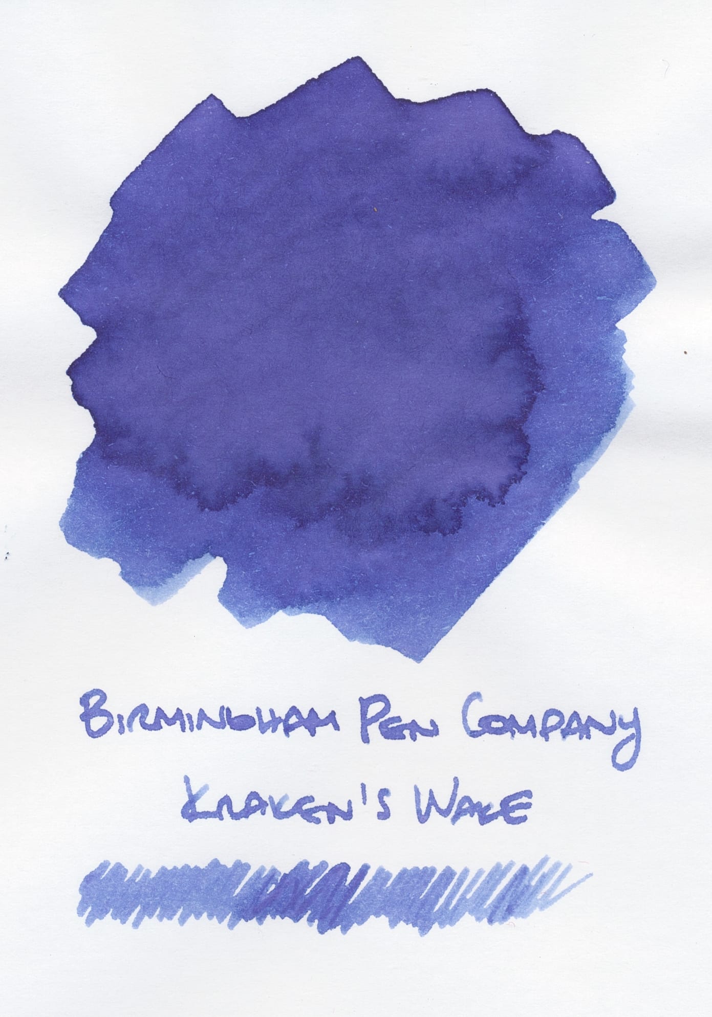
Birmingham Pen Company Kraken's Wake ink swatches on Tomoe River, Iroful, and Rhodia (left to right)
Notably Kraken's Wake doesn't change much across papers, except for looking more opaque on Rhodia (far right swatch). There's a smidge of pink tones that pushes this medium blue to a blurple which makes it more interesting to me. I have a fair number of blue inks, and the trend is toward blue-blacks, blue-greens, lighter chromoshaders, shimmers with sheen, or blurples. My current preferences aren't for lighter, clearer "true" blues like a Pilot Iroshizuku Kon-Peki, Ama-Iro, or Asa-Gao. I guess I like most of my blues to look duskier, muddier, a bit more "rebellious". 😄
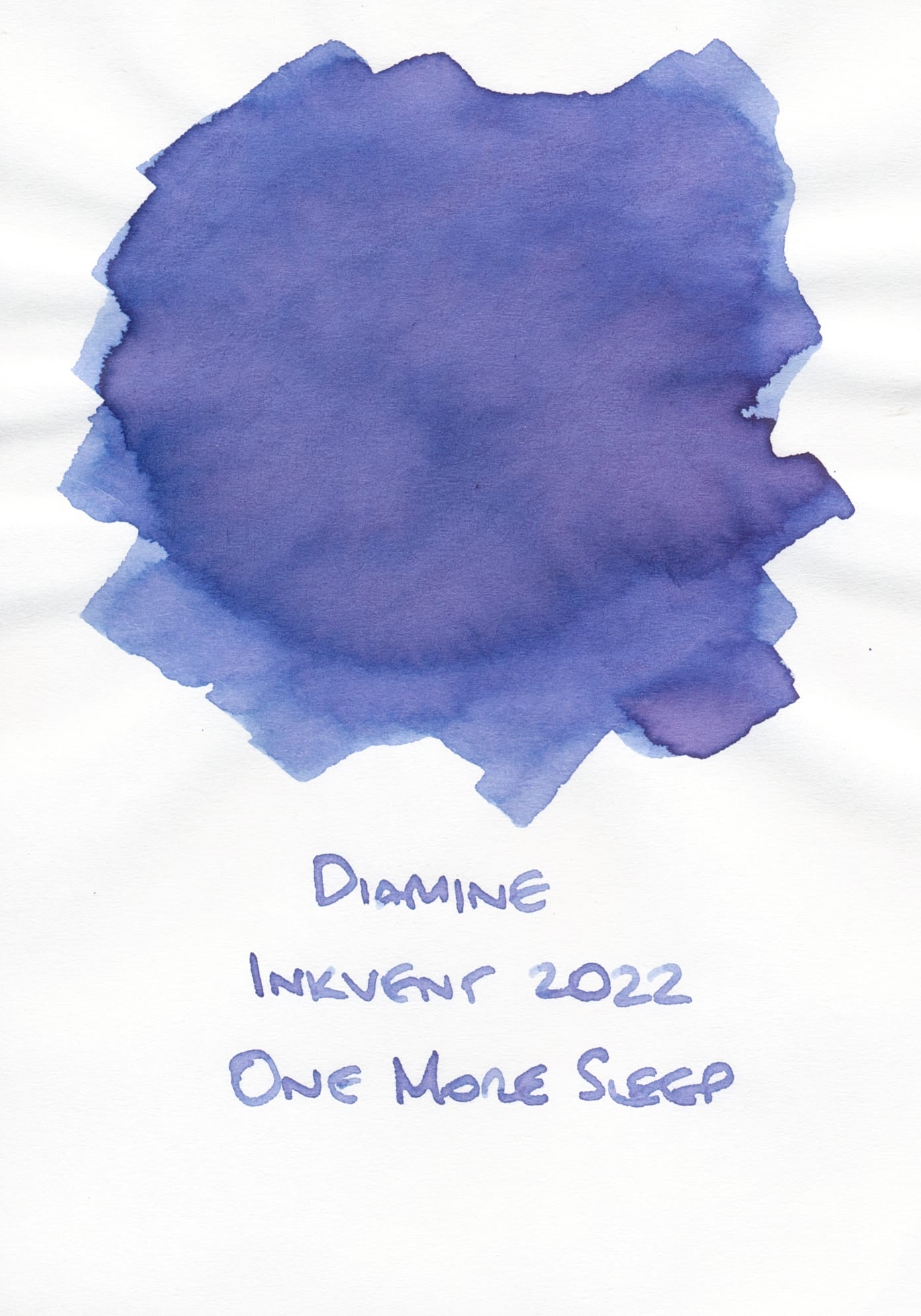
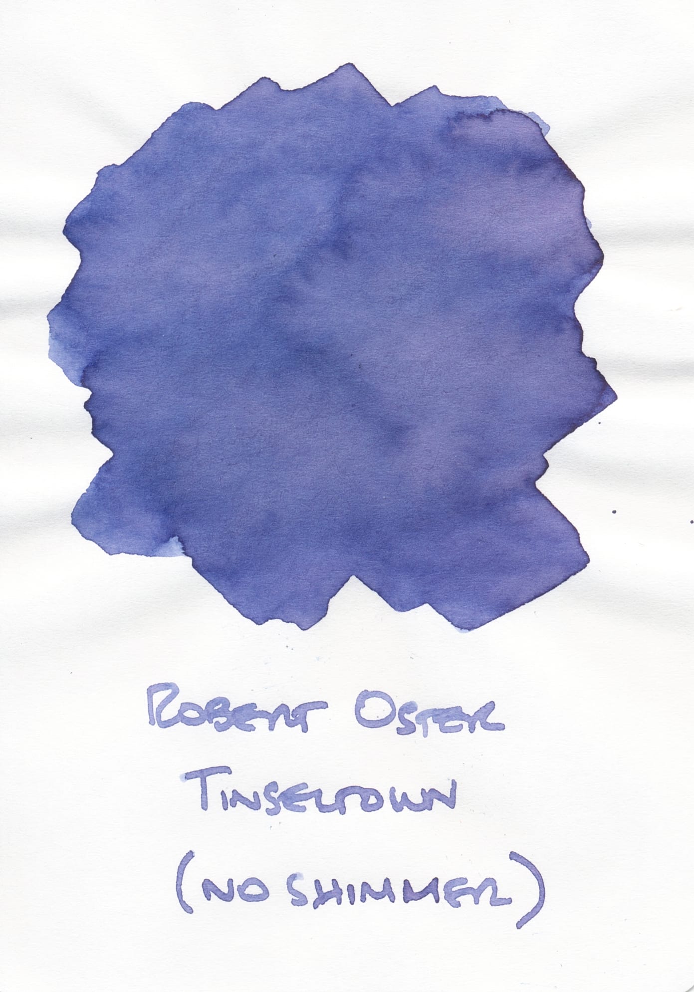
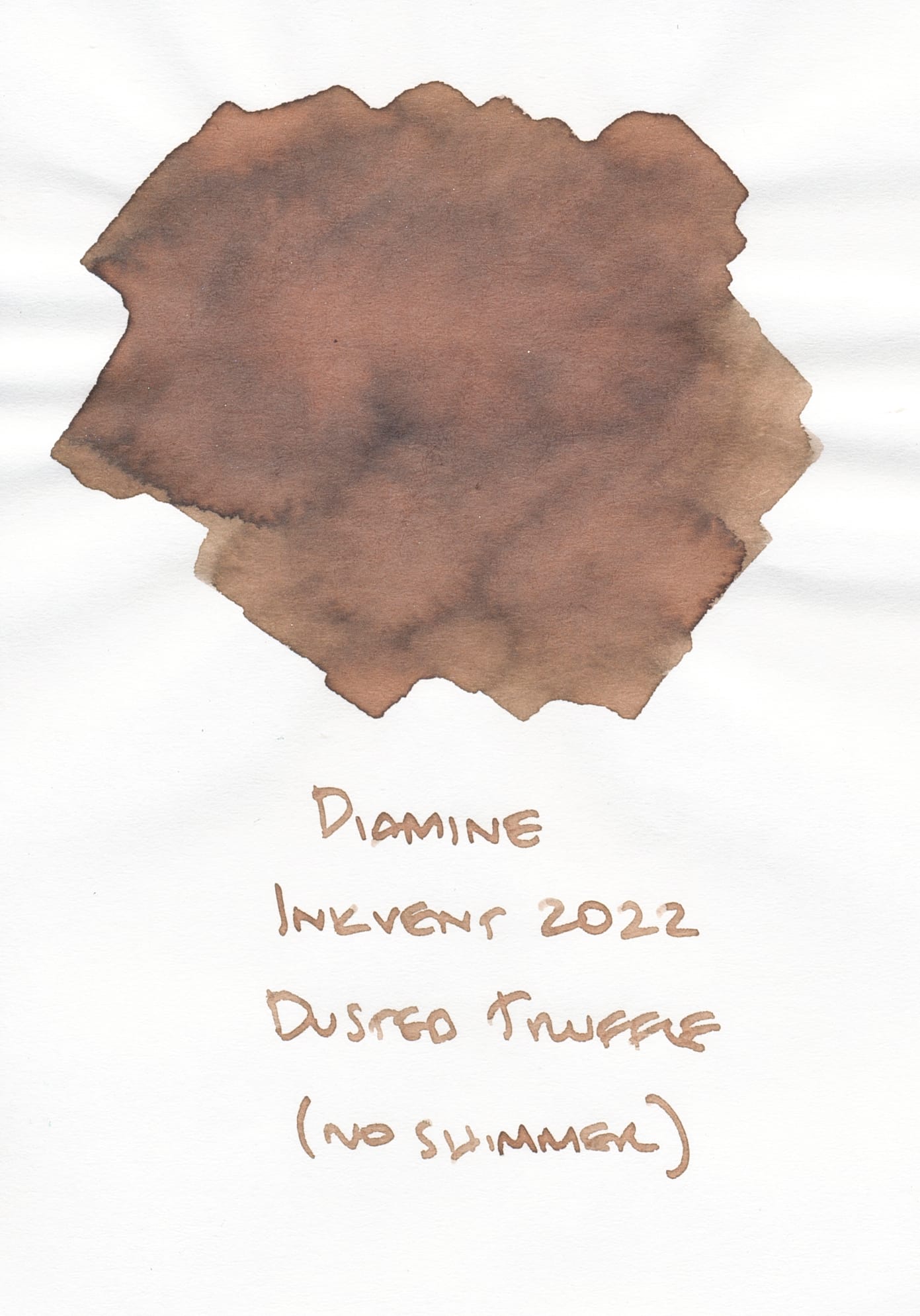
Ink swatches for Diamine One More Sleep and Robert Oster Tinseltown (no shimmer) on Tomoe River Paper
That being said, I only found a couple swatches that match closely to Kraken's Wake – Diamine's One More Sleep from 2022's Inkvent collection, or Robert Oster's Tinseltown without the overbearing antique-y gold shimmer. Funnily I had refilled a pen that used to have Troublemaker Foxglove in it that had darkened significantly due sitting in the pen for a long time, and the shade was too similar that I cleaned out Kraken's Wake and put something else in, so I guess "darkened/condensed Troublemaker Foxglove" could be another match. 😜
Birmingham Pen Company continues to make pretty interesting inks, though because they are small batches and they rotate their catalog a lot, I've found that there are a lot of older inks of theirs that I wish I could try but aren't available anymore. I wish they offered smaller bottles and ink samples, as I tend to sample inks before committing to a large bottle, particularly larger 60mL ones. But I realize they're a very small company and logistically can't provide the same conveniences that larger retailers can. Regardless, I'm sure this won't be my only order from them. But I do think that I'll want to share my purchases as ink samples with others as continuing to buy from them is going to make my ink library even more out-of-control! Reach out if you'd like to do some sample swaps. ✌️