Ink Swatch Wednesday: Birmingham Pen Co Cold Snap II
I wasn't trying to continually buy ink from Birmingham Pen Company, but their Cold Snap ink really caught my eye, because the swatch looked like a strange blue-brown chromoshading ink which reminded me of one of my favorite recent inks, Sailor Shikiori Yuki-Usagi.
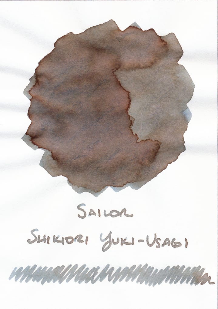
On left, my swatch of Sailor Shikiori Yuki-Usagi; on the right, BPC's product image for Cold Snap
Ultimately, it didn't end up being as interesting. 😕
But First
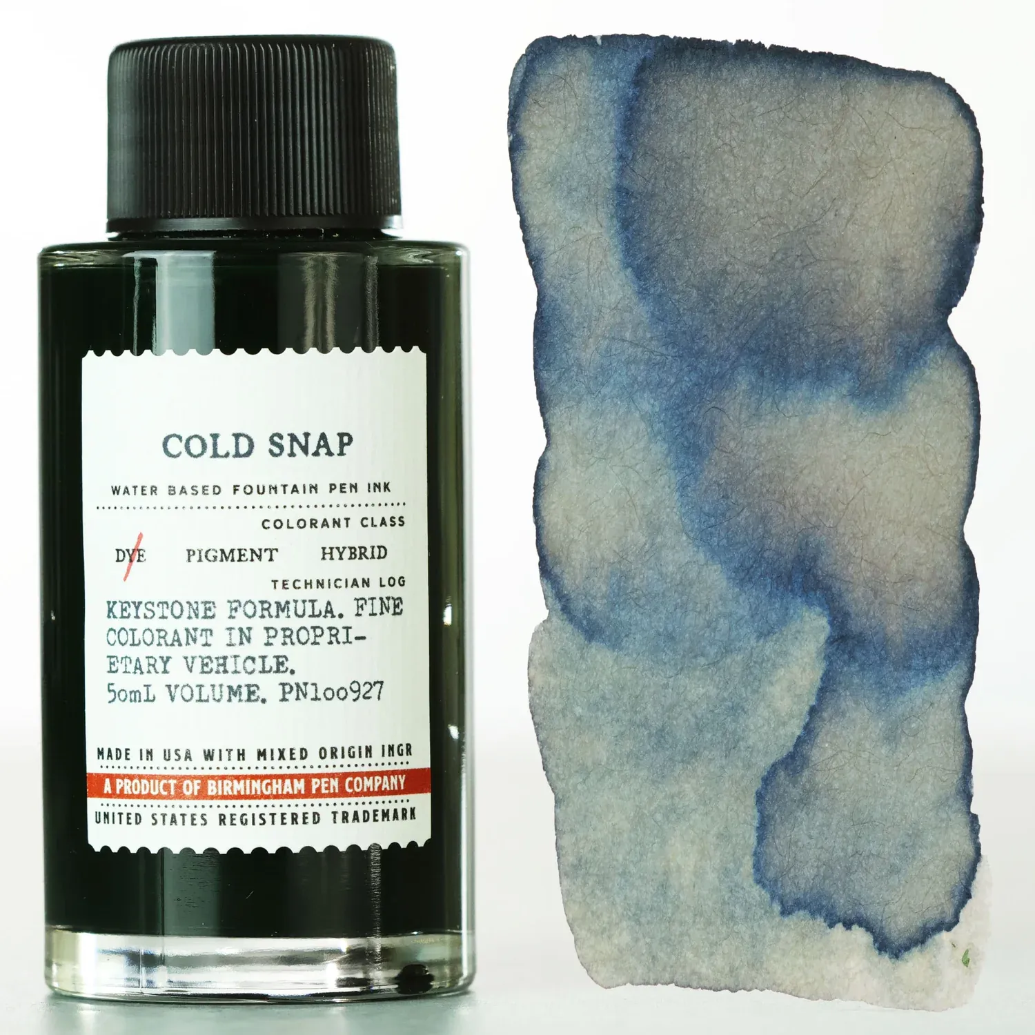
Weirdly, before I even got my bottle of Cold Snap, I saw rumblings that the initial bottles that got shipped out were not the right color, a green instead of a cool-temperature blue/blue-green. I didn't get the customer service e-mail right away from BPC, but hearing the news and hearing that they would send out fixed replacement bottles definitely tempered my response to the ink when I got my bottle in the mail.
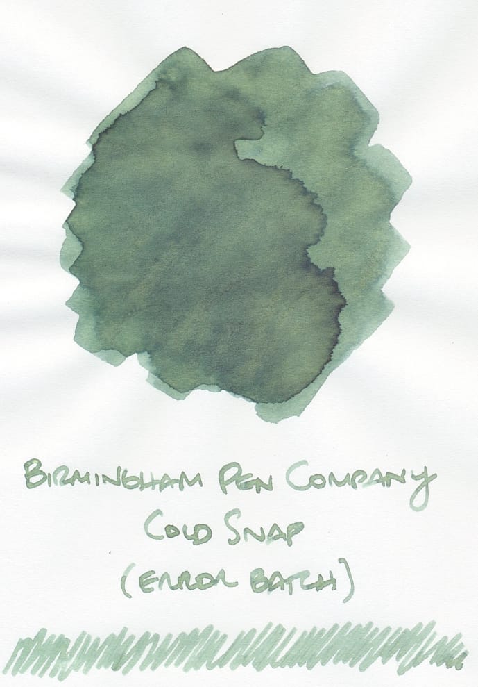
The incorrect ink isn't a bad color; on the contrary, for green inks, I prefer this shade to the typical bright "Crayola" green shade. So in the end, I got a bonus ink. 🙂 🤷♀️ 👍 Props to BPC for being on top of fixing the problem and communicating transparently.
Cold Snap II
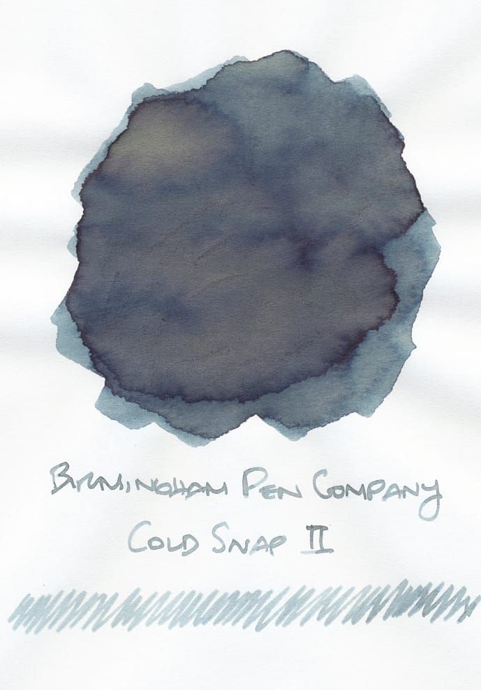
I started to see swatches from other people who got their corrected inks before I did, and I was disappointed. The swatches didn't exhibit any interesting chromoshading at all. It's a nice medium, dusky blue (blue-green, as I would realize, comparing it to my swatch library), but not what I was expecting. I was hoping for a sibling ink to Yuki-Usagi, since I was so enamored of its weird combination of gray-blue and brown. Instead, it ended up being a medium blue-green, perhaps a less saturated, blue-leaning teal (teal is one of those colors that often trips me up considering the literal spectrum of colors that could be considered teal)?
![Writing sample using Cold Snap II: "Skogsy Pens Cholla, Monty Winnfield Utility; Birmingham Pen Co Cold Snap II; [figure-8 doodles, vertical and horizontal lines], 'forward writing'; The quick brown fox jumps over the lazy dog"](https://storage.ghost.io/c/7e/22/7e223c87-282a-44af-a0cc-50a23d71b039/content/images/2025/07/2025-07-30-08.jpg)
Compared to my more straightforward medium-to-dark blue inks, it was clear that Cold Snap had a noticeable green undertone, so it ended up matching more of the blue-green section of my library:
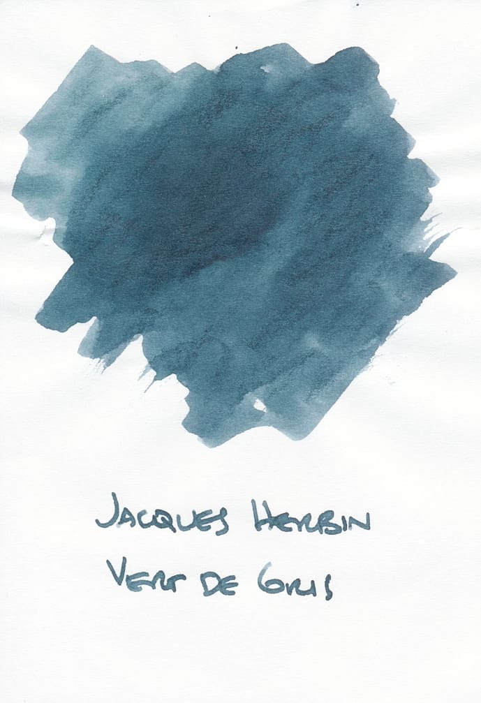

Out of this first batch of inks, I think Cold Snap II looks closest to Jacques Herbin Vert de Gris, which makes sense. Cold Snap II in writing is less saturated. In the swatch, the green undertones do appear slightly tannish, but it's not visible at all as chromoshading in writing.
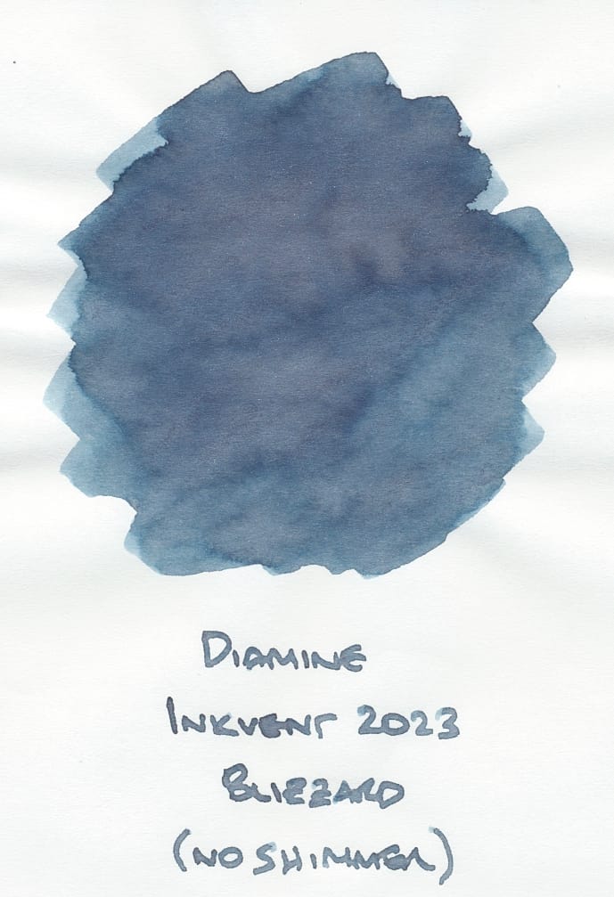
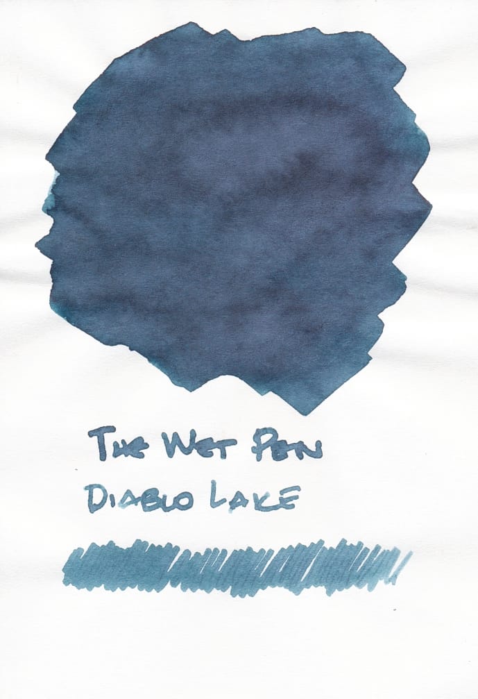
Diamine Inkvent Blizzard (particularly when sampled without its silver shimmer) and The Wet Pen Diablo Lake are close runners-up but they seem to lean even more blue.
Some other comparisons that aren't as close as the above:

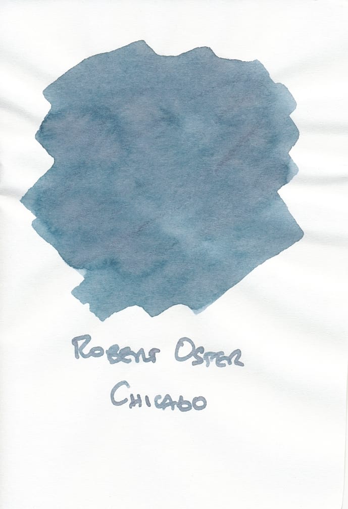
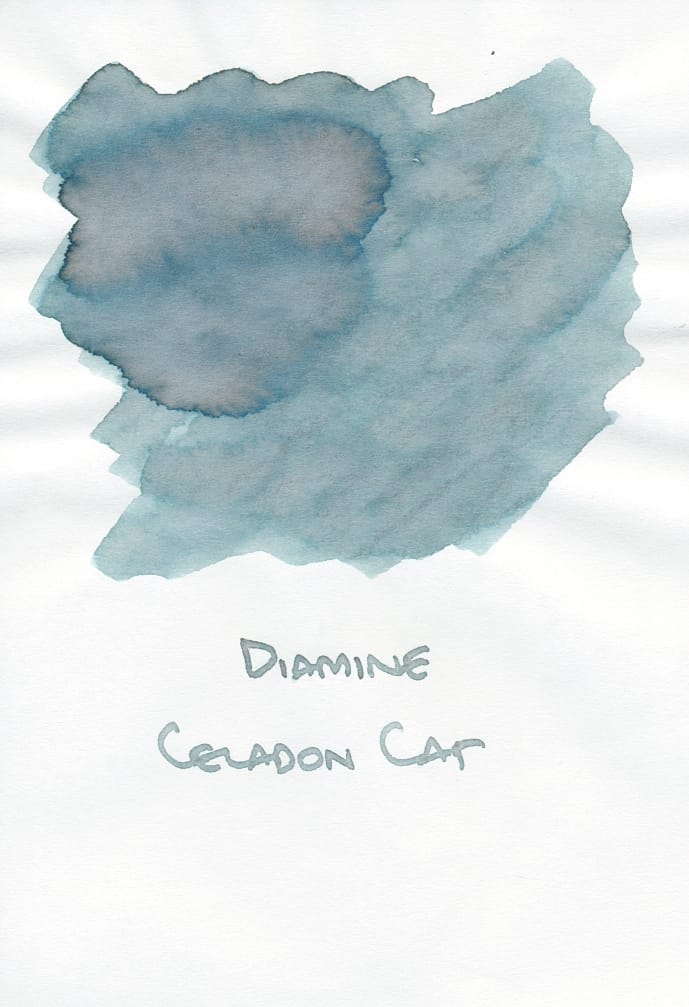
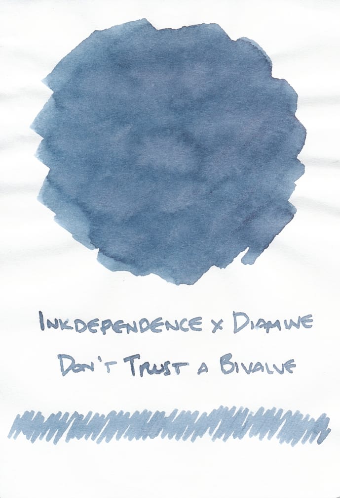
Robert Oster Chicago looks similar, but is more saturated and less dulled by green undertones. Celadon Cat looks more translucent in the swatch and has more green. And Diamine Don't Trust a Bivalve is more what I think Cold Snap II would look like without the green tones.
I guess what would be helpful is to see ink swatches include writing samples, since a lot of the time, broad swatches can look much different from writing. It's why I started squiggling at the bottom of my ink swatches in addition to the label text. I like the videos on YouTube where the presenter swatches inks and writes using different pen types – dip pens and fountain pens with different nib sizes – to show the full range of what the ink will look like, often on different papers. I know this is a non-trivial thing to do for every ink retailers sell, but it would help out consumers so much, especially since some retailers don't have a physical presence where buyers can test the inks personally. I so appreciate the retailers who go through the extra effort in presenting swatches.
While Cold Snap II is a nice dusky blue with hints of green, I probably wouldn't have bought it had I known what its true shade would be in reality. I'm not disappointed enough to want to return it or anything, but I'll probably be generous in sharing ink samples, since BPC bottles (50 mL) are huge anyway. So if you want a sample, let me know!

Thanks for reading! If you like what I write and want to support me, you can "buy me a coffee". I'd appreciate it.