Ink Swatch Wednesday: A Hodgepodge
Over the last couple days I acquired more inks for the library – 5 from an ink swap and a couple bottles that I bought separately. Today I thought I'd post all of them and give my first impressions from swatching them earlier today.
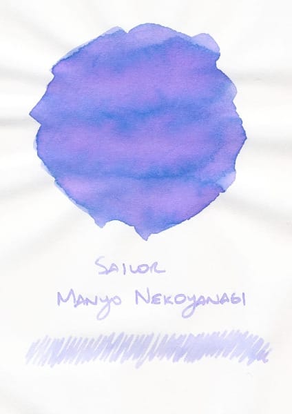
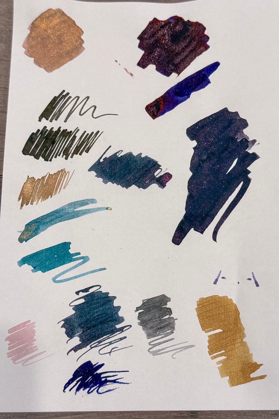
This was the ink that started the ink swap, since I'd posted about Sailor Manyo Hinoki, and someone mentioned it reminded them of Sailor Manyo Nekoyanagi. I think Hinoki is bluer, while Nekoyanagi leans more purple/violet, though they both have chromoshading of purple, blue, and pink tones. I also think that Nekoyanagi may write lighter than Hinoki does, but I'll have to verify that when I put it in a pen.
I was also able to get samples of 4 Birmingham Pen Company inks – Phytoplankton, Eucalyptus Stem, Shower Scum, and Lampshade – in this swap, which is nice, since Birmingham Pen Company doesn't offer samples themselves, and sells their inks in huge bottles, so I kind of want to know if I'll like the inks before buying.
Phytoplankton is kind of the odd ink out, because the other three are currently offered in a bundle of four "Around the House" inks. I skipped on asking for a sample of Suncatcher, the fourth ink in the bundle, a bright blue, since it wasn't really my preference.
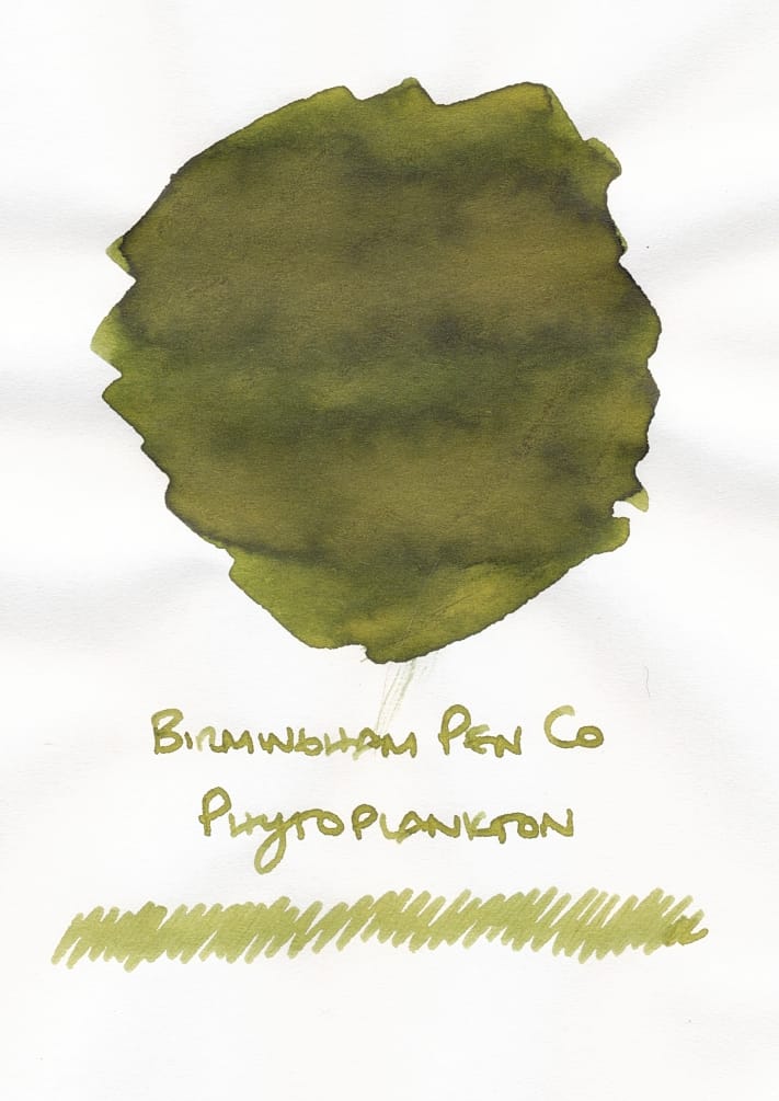
Phytoplankton looked like a grassy green with this bright yellow undertone lightening up the green shade. Interestingly when I swished my folded pen (swatch tool of choice) in the little jar of water, the water turned highlighter yellow. This green looks nice for the spring/summer seasons.
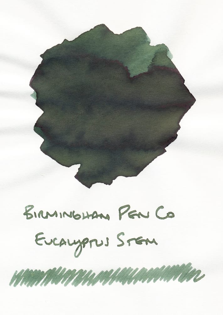
Eucalyptus Stem is a cooler, pine green to my eye. I think it'll be better for the fall and winter seasons. Kind of looks like a nice color for painting a Christmas tree on a handmade card. 🎄
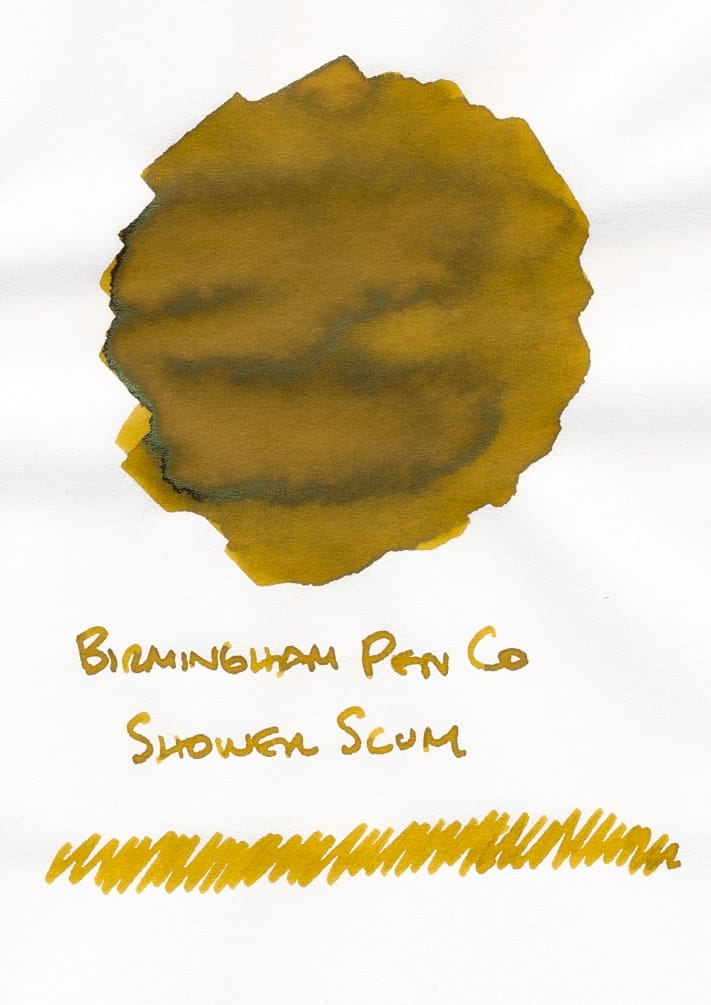
Shower Scum, which seems to have grabbed people's attention, first thanks to its name, and secondly its color, is maybe not for me. The combination of yellow, brown, and green (?) shades makes it look too gross. And after I cleaned off my folded pen in my jar of water, the water became a bright, neon yellow highlighter color that almost overpowered the cool green shade from Eucalyptus Stem.
I have this other ink sample from Troublemaker called Tuslob Buwa, which reminded me of the swatches of Shower Scum from BPC's site, but now that I have seen Shower Scum in person, Tuslob Buwa seems a tamer, possibly more usable ink for me because it leans more brown/khaki than this sickly yellow/green/brown. 😝 But, I'll try Shower Scum in a pen at least once, because swatches aren't necessarily the most accurate representation.
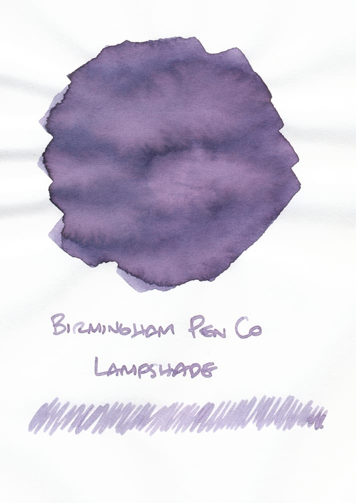
Finally, Lampshade is my favorite out of the 4 BPC samples so far, and not just because it's a pretty shade of a cooler purple. It's very gray when first swatching it on Tomoe River S paper, almost disappointingly, boringly gray. But as it dries it really evolves, with these pink undertones showing themselves first, and then when fully dried, the ink looks straight up purple. It's a cool thing to watch. Despite the several purple inks I have, since this one is cooler toned, I'm not sure if I have any in my collection which compare.
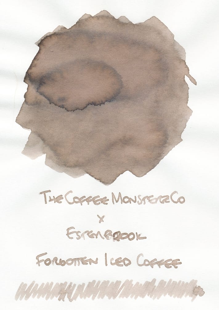
The last couple inks are bottles I picked up from Goldspot, because I'd signed up for a restock notification for the Forgotten Iced Coffee ink. Unfortunately I didn't pick up the limited edition Estie by TheCoffeeMonsterzCo, but I figured I'd get the ink, at least. 😅
This is an odd ink because it goes on quite light and looks very gray, like, "hmmm, how is this a coffee-related shade?" But then as it dries, the gray turns into a cool taupe, which I guess is the shade of an iced coffee after the ice has melted quite a bit. 🙂 This color doesn't quite match the brown tones in the LE Estie fountain pen, which is interesting. I wonder why they went this taupe route? I kind of like that it's an odd, in-between color, though. I'll see how legible it looks when it's in a pen. Probably will need a broader, wetter nib to get it to show up best on the page.
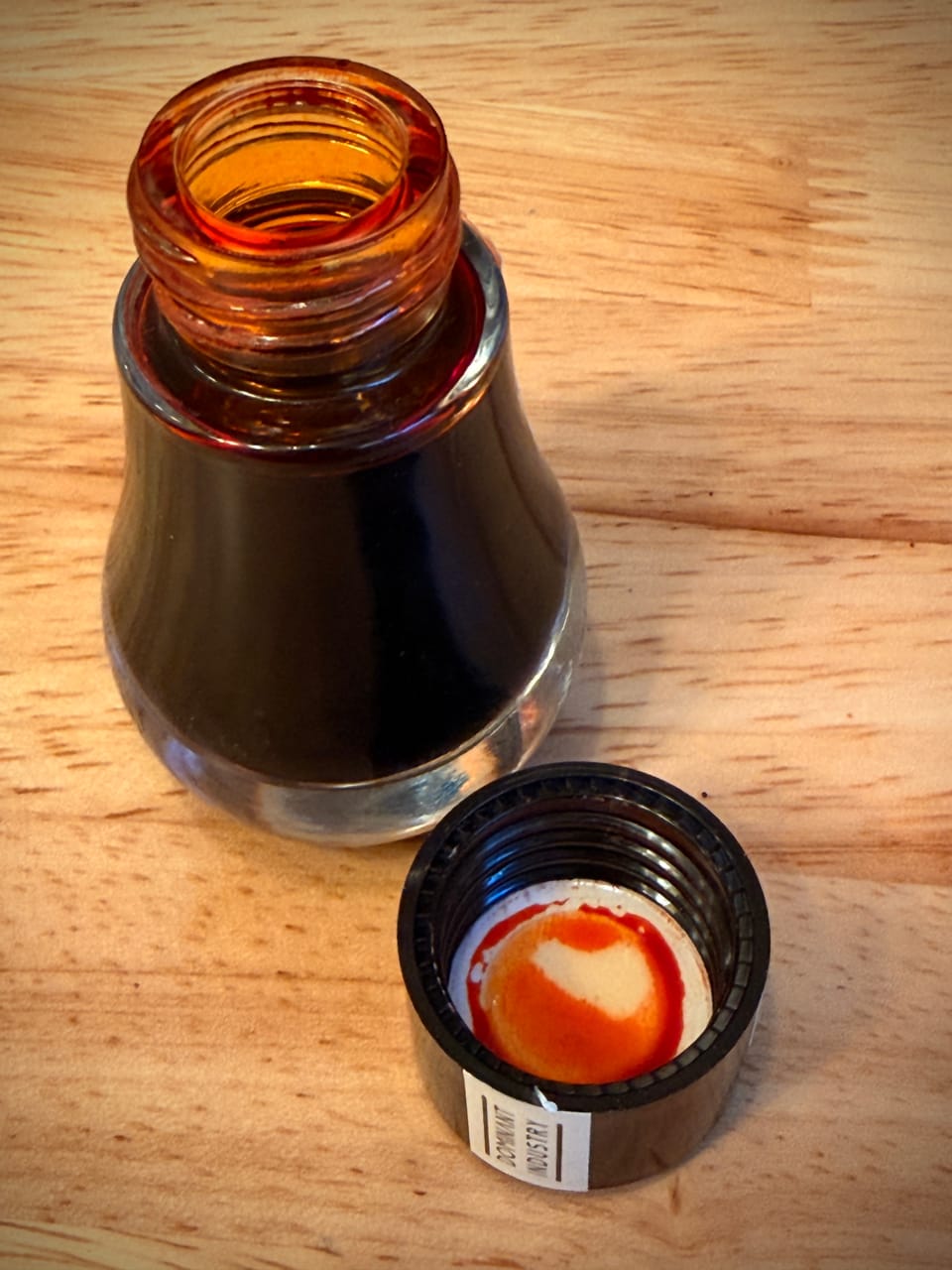
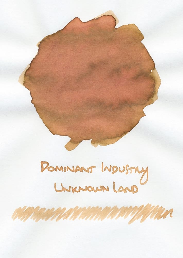
I picked up Unknown Land from Dominant Industry after seeing the interesting shading in the swatch on Goldspot's site. In my swatching experience, this ink appears as kind of a bright mustard yellow with green outlines where the ink is heavily applied. It looked like a cool "fall leaves" representation. But as the ink dried, this peachy shade came out and sort of overpowered the mustard yellow and green, which at first glance I'm not wild about. I mean, it looks kind of like a nice sunset-y color, but I haven't been a fan of peachy, rosy shades previously, so I'm mixed on it. I'll reserve final judgment for after using it in a pen.
Quite a mix of inks in this batch! Any of them stand out to you? I'll probably try Lampshade and Forgotten Iced Coffee in pens first, with maybe Unknown Land and Phytoplankton next. Feel free to send me your ink recommendations. Even though I have too much ink already, it doesn't stop me from trying more. 😄