Ink Swatch Thursday: Skogsy Pens Cholla and 3 Oysters Americano
Originally I wasn't going to post an ink swatch article this week, but I really wanted to write a bit about my latest Skogsy Pens Cholla pen that I bought post-Christmas, since I had just refilled it with 3 Oysters Americano (yes, folks, another brown ink). 🙂
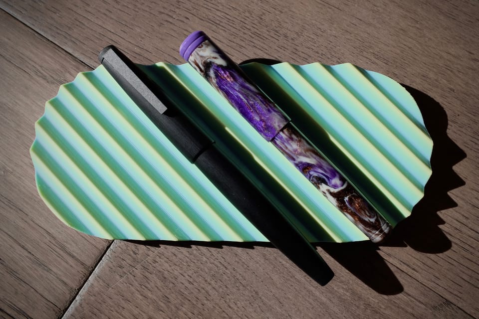
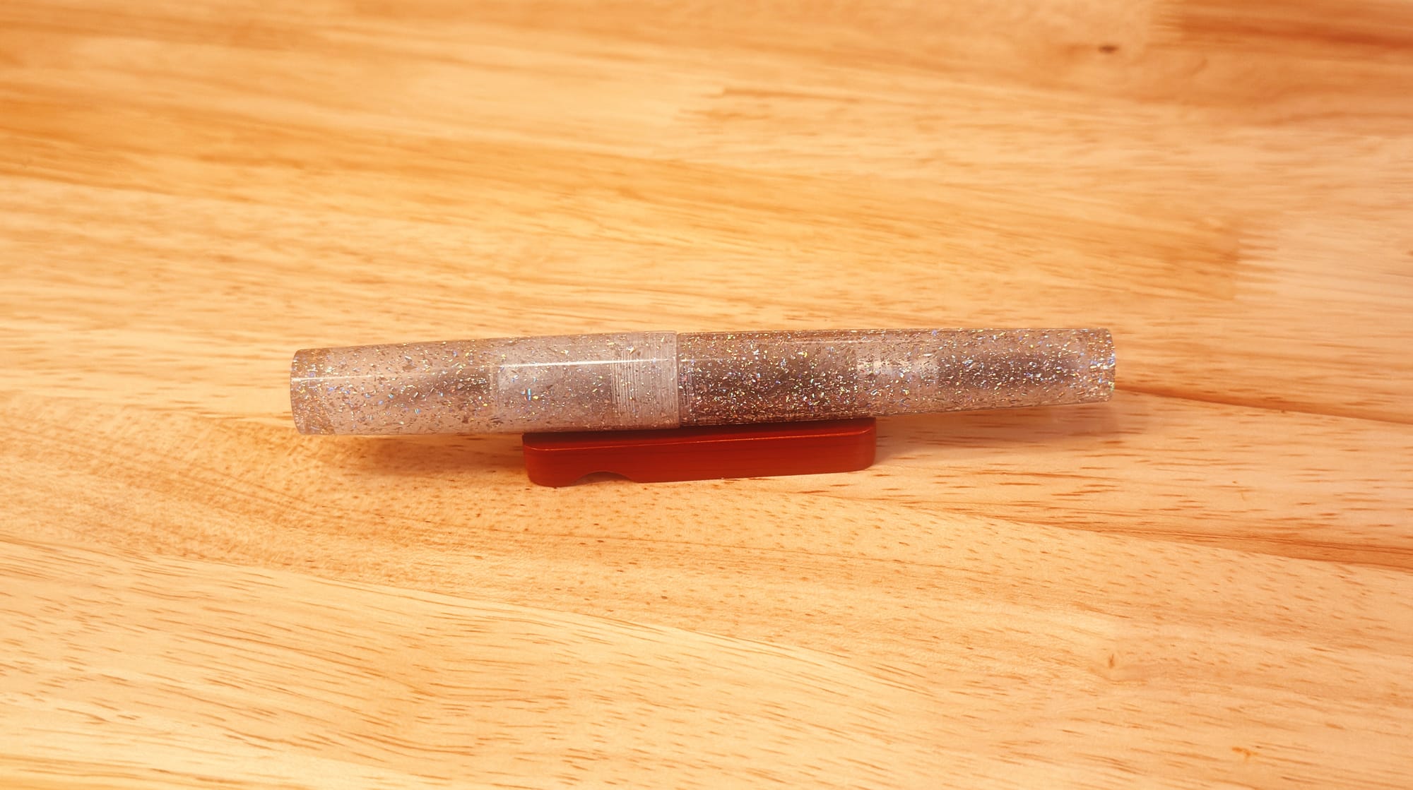
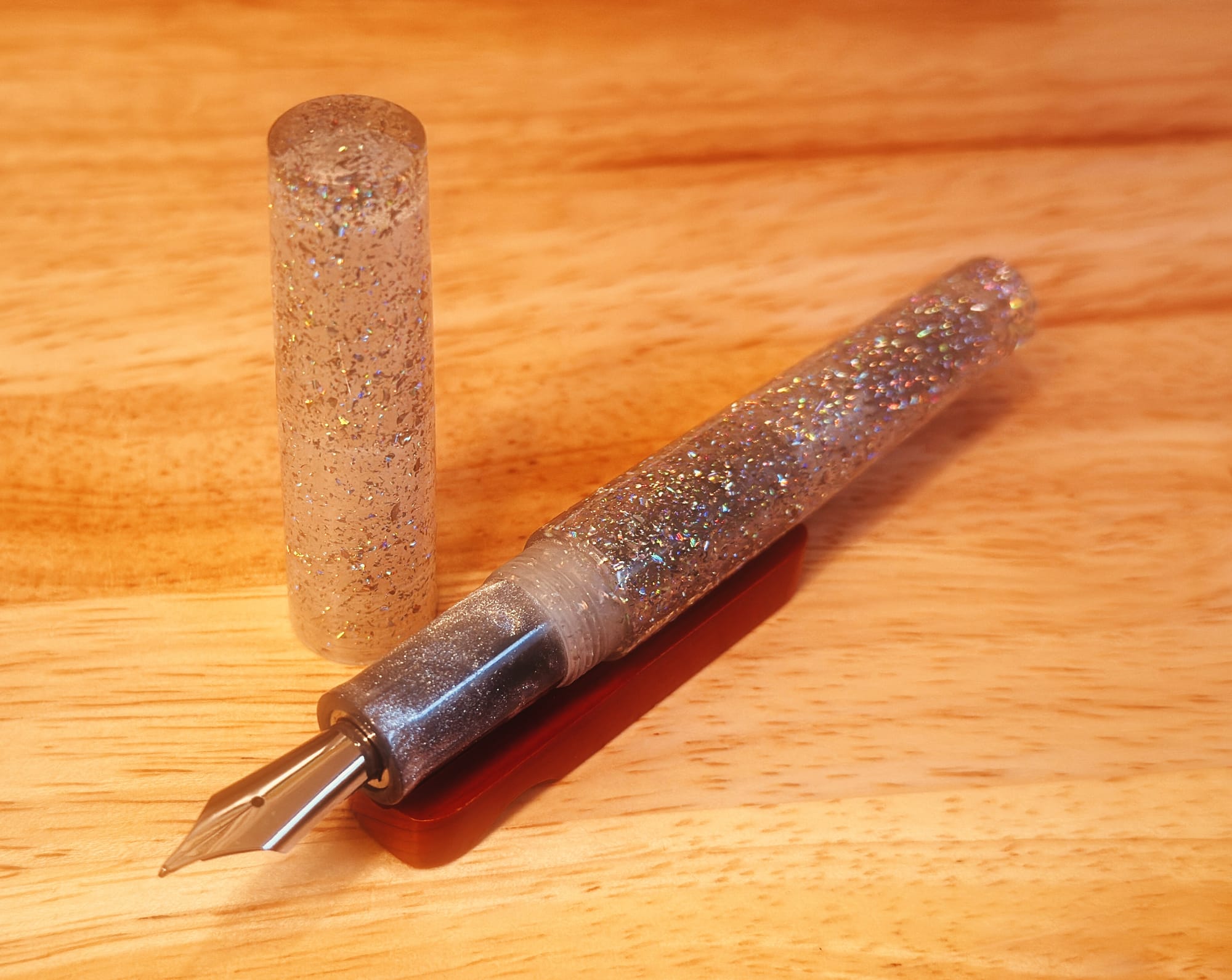
First, let me show off my blingy Skogsy Pens Cholla. Unfortunately, I do not recall the makers of the resins. I will have to follow up on that with Skogsy Pens and post an update. I forgot to note the info on the buy page before I bought it; it promptly disappeared after I ordered the pen. 😅
If you listen with sound on, you'll be treated to purring by my cat Sprite, who insisted on sitting on my lap while I recorded 😺
I was so happy that I caught the announcement for this pen going up for sale, and that I had some Christmas money to put towards it. 😀 Usually stuff like this gets snapped up so fast! For the longest time I have been looking for a pen where it's basically all glitter, and this one fit the bill perfectly.
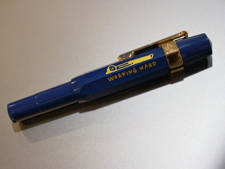
This is my second Skogsy Pens Cholla, the first one made out of a swirly black, purple, and aqua shimmer resin, and a more tapered shape:

It was actually my first purchase at my first pen show, the SF Pen Show 2023! 😀
I would probably have way more pens from Skogsy Pens by now, but I didn't want to lean too much toward one maker or another while I'm still exploring fountain pens. But yeah, these won't be the only pens from this maker in my collection. 👍
Anyway, I snagged the second Cholla and picked it up without a nib, because I knew I'd want to fit it with the Monty Winnfield Utility nib that I had originally put into the first Cholla. The combination is great. I really want to put special nibs into special pens, as sometimes I feel kinda meh about a pen when it has a stock nib, even if it is a decently tuned one.
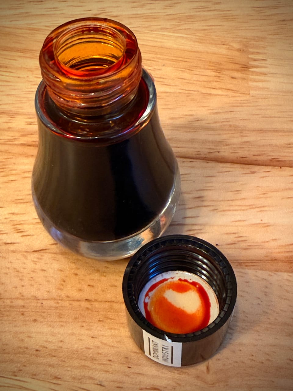
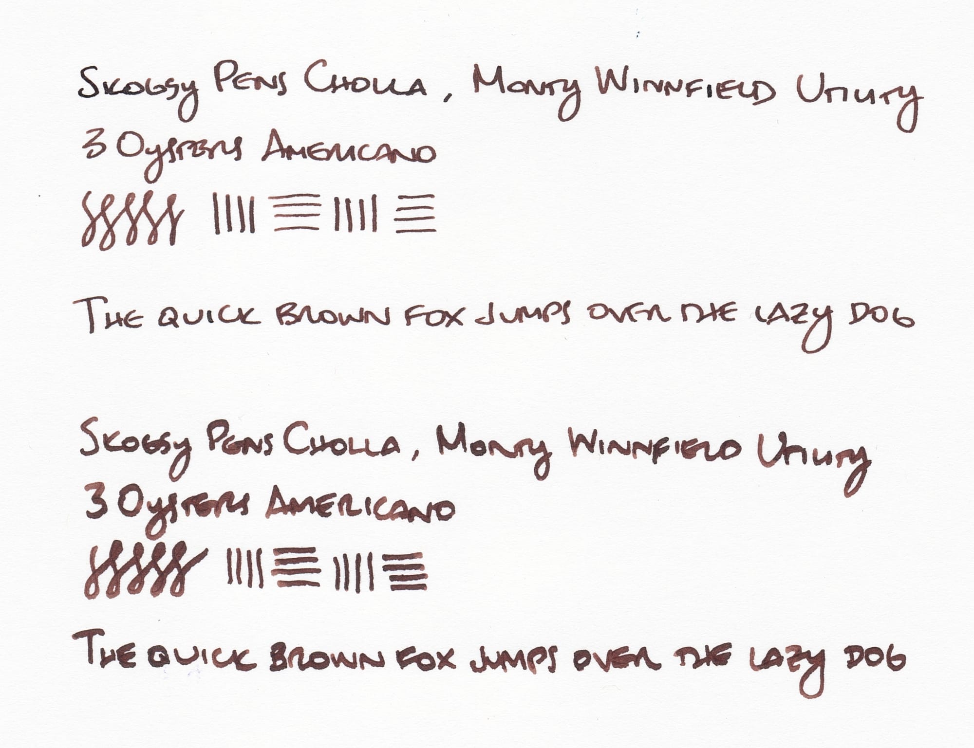
Previously I had a cool, odd ink in the Cholla + MW Utility nib – Troublemaker Rodeo – but I'd recently refilled the pen with one of my newest ink samples, 3 Oysters Americano. Yes, it's a brown ink; and yes, I got it because of its coffee-related name. 😆
This is a nicely wet ink with a rich, dark brown color that generally looks a bit on the cooler side to me, even though it has hints of red undertones.
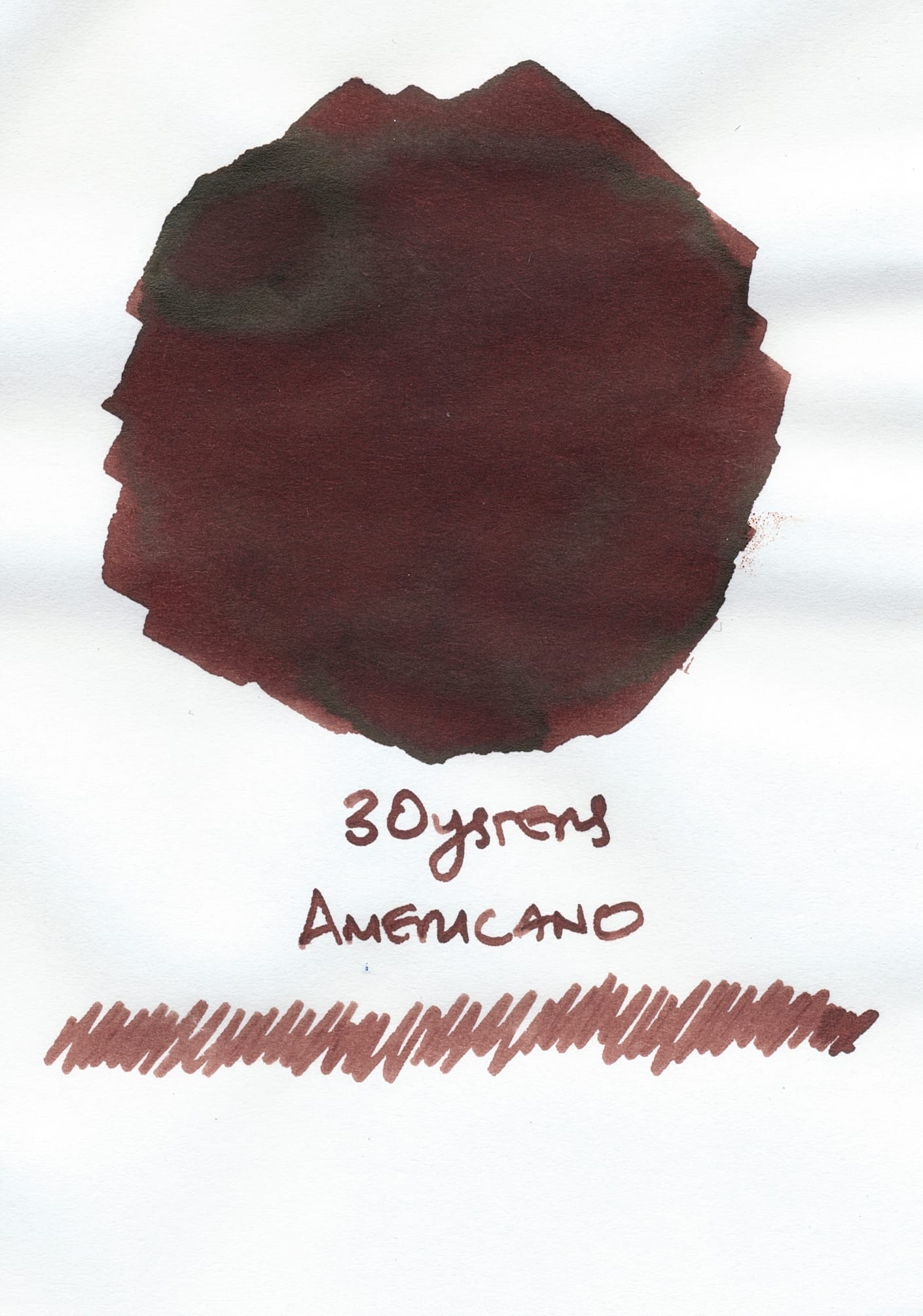
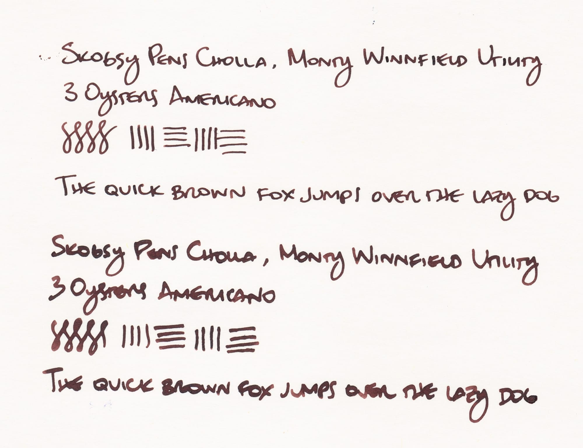
The writing samples show the ink is a dark brown which could look black in some dimmer lighting. My current ink preferences are for lighter, more translucent shading inks, but surprise, surprise, I still like my brown inks, so this gets a "pass". 😅
As an aside, I sort wish the Utility nib were flipped around. It's a reverse broad architect, with an EF italic on the regular side. At first I thought the architect was too broad, so I wrote more with the EF italic, but after a while I learned to write at a higher angle with the reverse architect so that I could thin out the line variation a little more, and now I prefer writing with the reverse side more. But anyway...
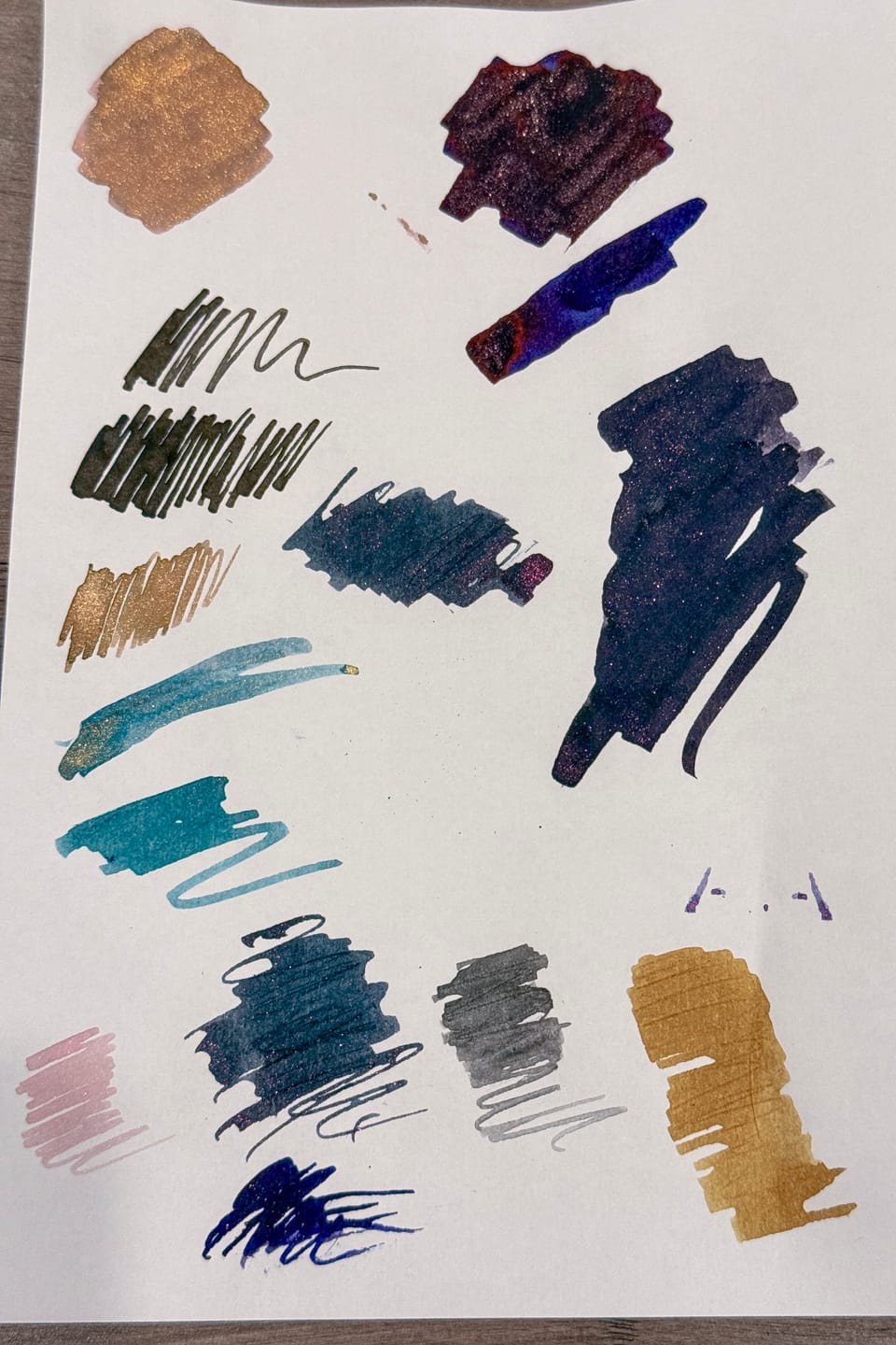
Here are a few inks from my library, including some new samples I haven't tried in a pen yet, that are in a similar vein as 3 Oysters Americano:

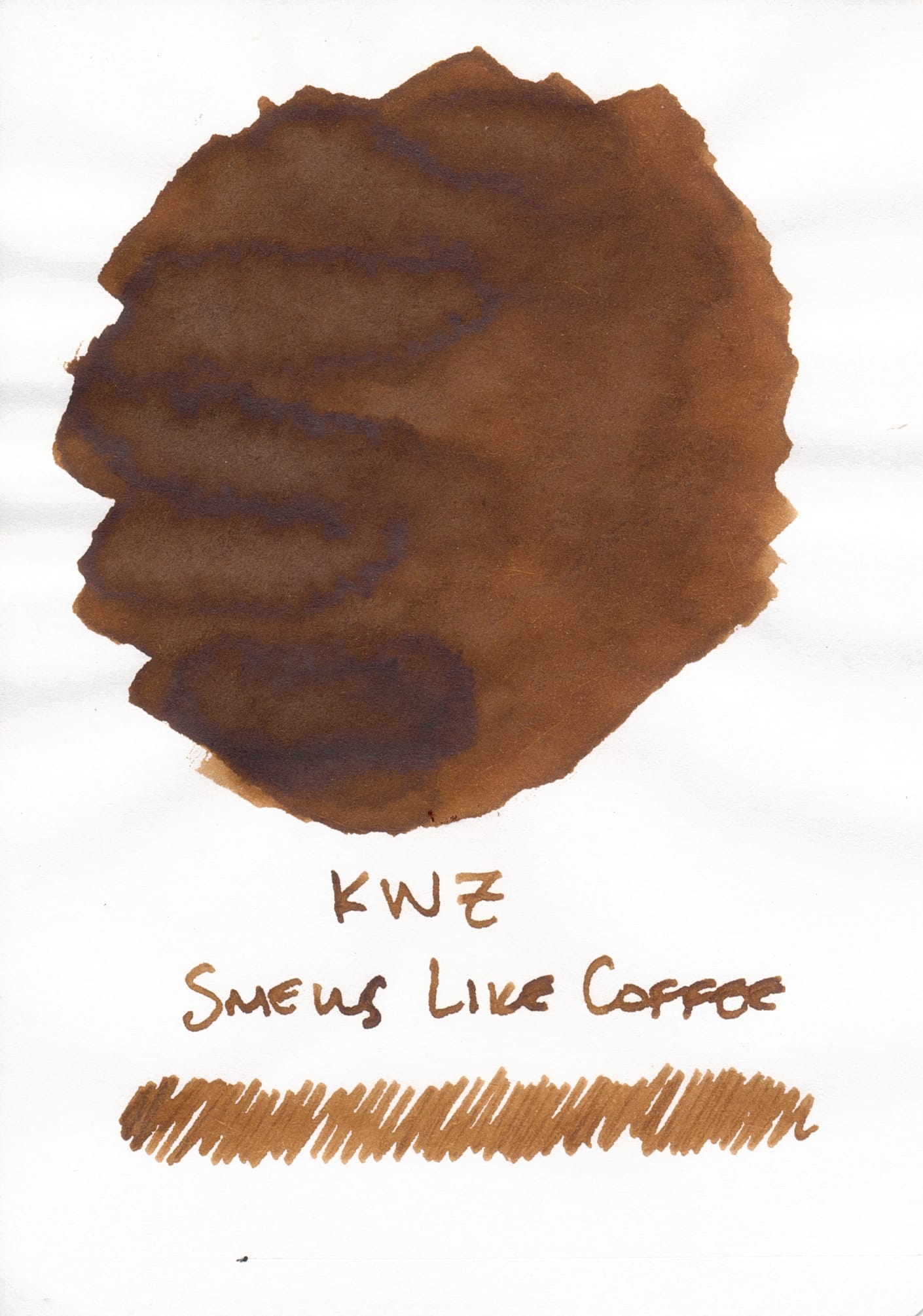
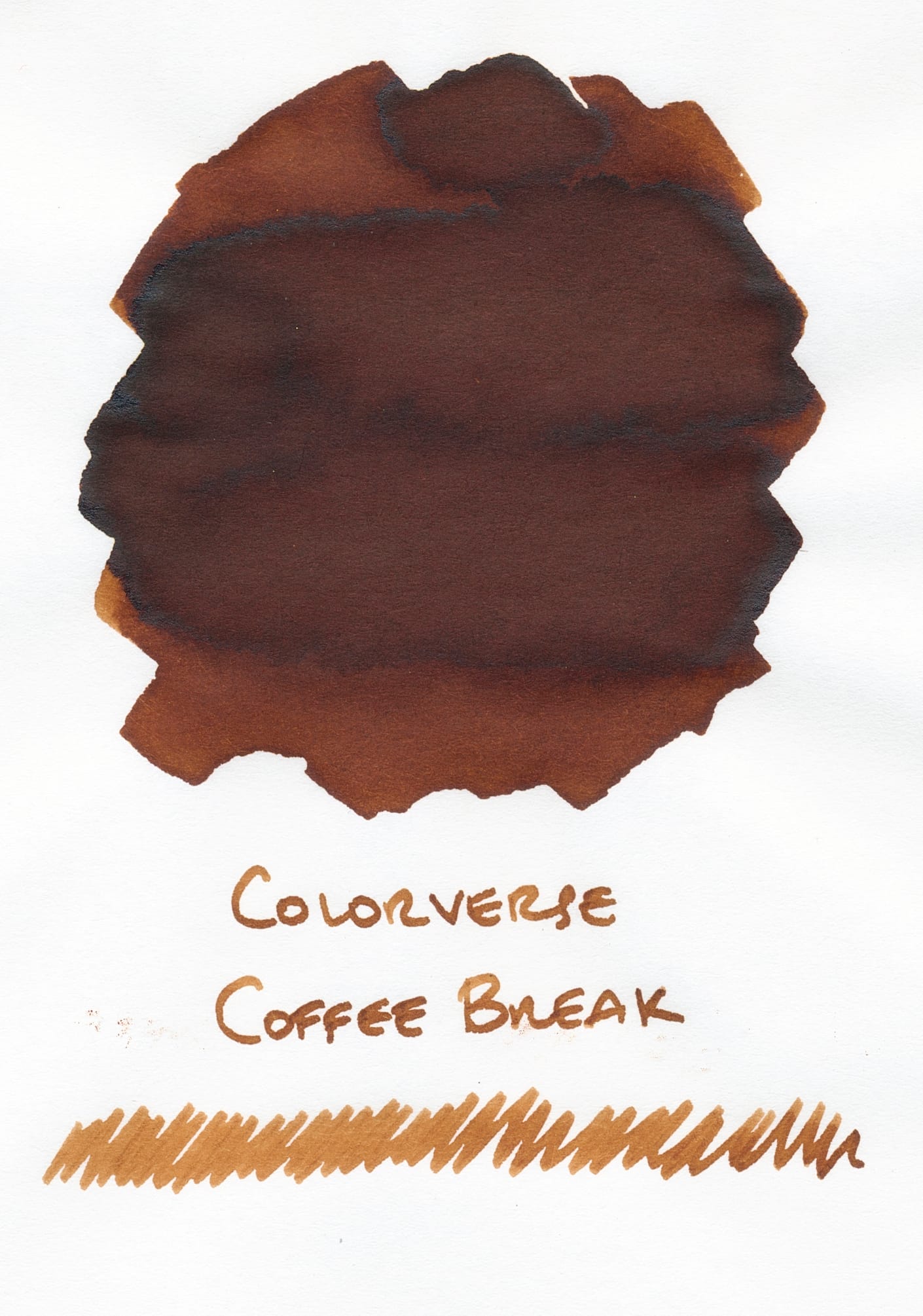
All swatched on Tomoe River S
A few coffee-themed inks: Dominant Industry Lungo, KWZ Smells Like Coffee, and Colorverse Coffee Break. I think Coffee Break may be the closest to Americano, with its reddish undertones. Lungo looks similarly cool as Americano, but it's missing red tones, and Smells Like Coffee seems warmer.
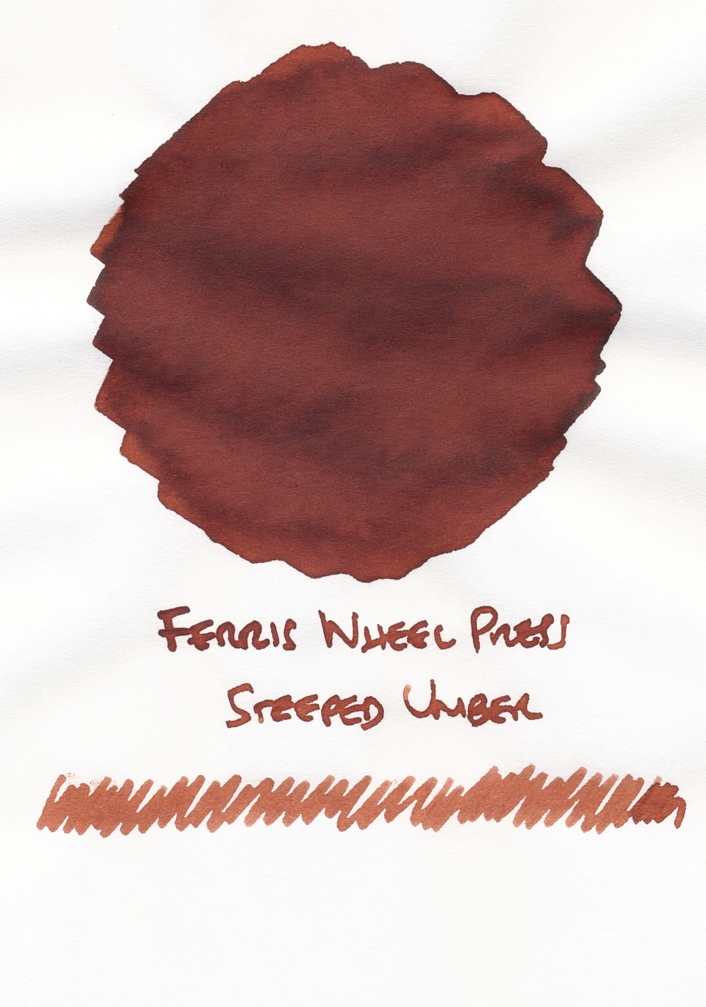
Swatched on Tomoe River S
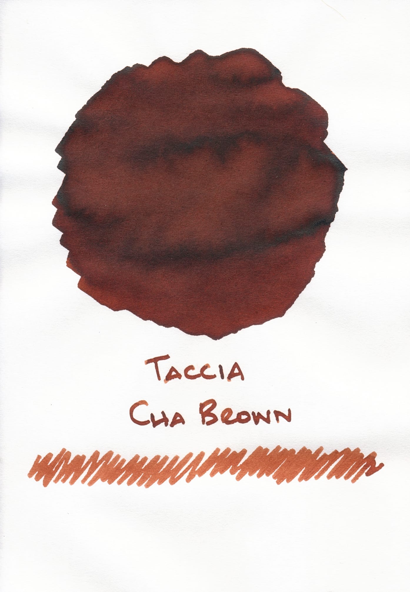
Both of the swatches for Ferris Wheel Press Steeped Umber and Taccia Cha Brown look too warm compared to Americano.
(Seeing all these brown inks together makes me want to put them all into pens right now, but I will refrain...!)
So, what do y'all think about 3 Oysters Americano? I really like the ink and its performance in the Cholla + Utility nib combo. I'll have to check out more from this brand, as it's new to me. Any other ink recommendations? Let's chat here or on the socials (Mastodon, Bluesky). ✌️