Ink Swatch Thursday: Sailor Manyo Uri
I delayed "Ink Swatch Wednesday" by a day because I knew my Goldspot order would arrive soon with a couple interesting inks. It arrived today, w00t!
This is an exciting ink today, y'all (at least IMO). I first saw Sailor Manyo Uri swatched during a recorded Pen Addict livestream (I'm on the west coast so I'm never up when he's streaming, thus I watch the recordings) and was instantly transfixed by this weird, in-between, grayish, taupe-y color. At the time I searched for this limited edition ink, I could only find it on a couple European sites. I thought it was at the end of its run, so I was scheming to get it via someone I knew who was in Japan at the time, but didn't end up going that route. And later on I saw some "coming soon" entries for this ink at US retailers, so I waited for it to become available. Finally ordered it a few days ago, along with Sailor Manyo Aka-Mai, another interesting "muddy pastel" ink, and the Diamine Inkvent Black set which I'd been debating whether to get this year.
I'm very into these odd, swampy, not easily categorized ink colors right now. A lot of them have been in the green, brown, and gray color families and have interesting chromoshading.
(Aka-Mai, which I'll post about separately, is more of a mauve, but it's still a bit of a "limbo" shade. You'll see.)
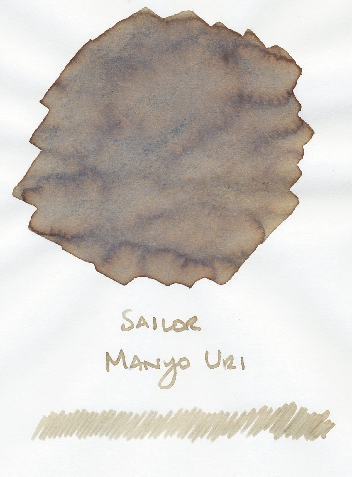
Uri's swatch above is fascinating. Overall it's a taupe, but it has darker brown shading where the ink pools, and this overarching blue-gray shade which isn't as apparent in this scan as it is in reality. You can sort of see a light olive green shade in the mix, too. Ordinarily, this would be a gross mix of colors, maybe signifying something that's gone bad (😅), but for some reason, I'm really digging looking at this swatch. Of course the writing sample isn't going to look as weird, though perhaps in a wide stub or calligraphy nib, you might be able to see a broader range of the component shades in writing. I could maybe test that later.
Comparisons
Because this is a strange mix of cool green, gray, and taupe shades, I don't have anything in my library that matches, but I do have a few a few inks that remind me of certain parts of Sailor Manyo Uri.
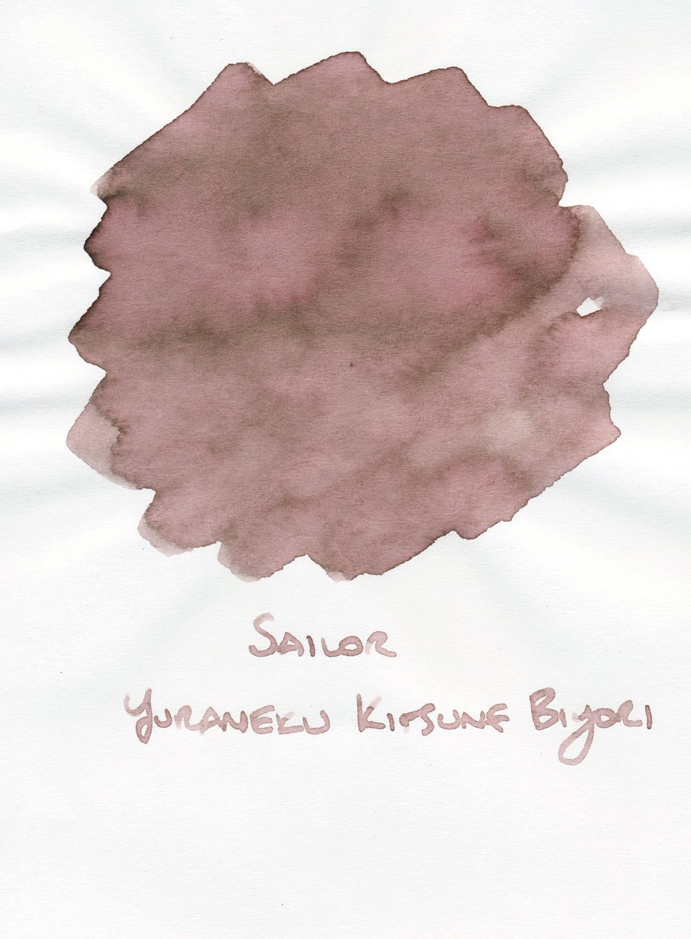

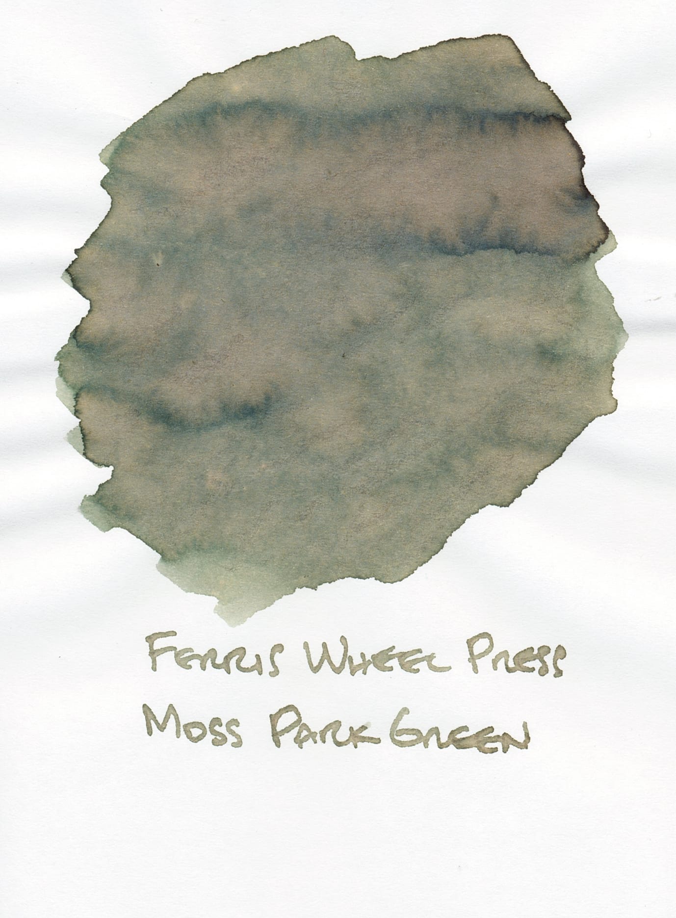
Sailor Yurameku Kitsune Biyori, Sailor Manyo Uri, and Ferris Wheel Press Moss Park Green on Sanzen Tomoe River 52gsm paper
Annoyingly, the Sailor Yurameku Kitsune Biyori scan appears too pink to me on my laptop (and I'm too tired at this point to fix it 😝), so it isn't as representative of the ink in reality. Kitsune Biyori more of a cool beige with a little bit of pink undertone. But it's one of those weird "limbo" colors that mucks with the flatbed scanner's color balance, hence the incorrect scan. Moving on! Imagining Kitsune Biyori as more of a cool, dull beige you could sort of see Manyo Uri as a combination of the two inks flanking it. All inks have similar amounts of shading on Tomoe River. Moss Park Green has the mossy, olive-y green tones and overall cool color temperature, while Kitsune Biyori brings the taupe-y brown tones.
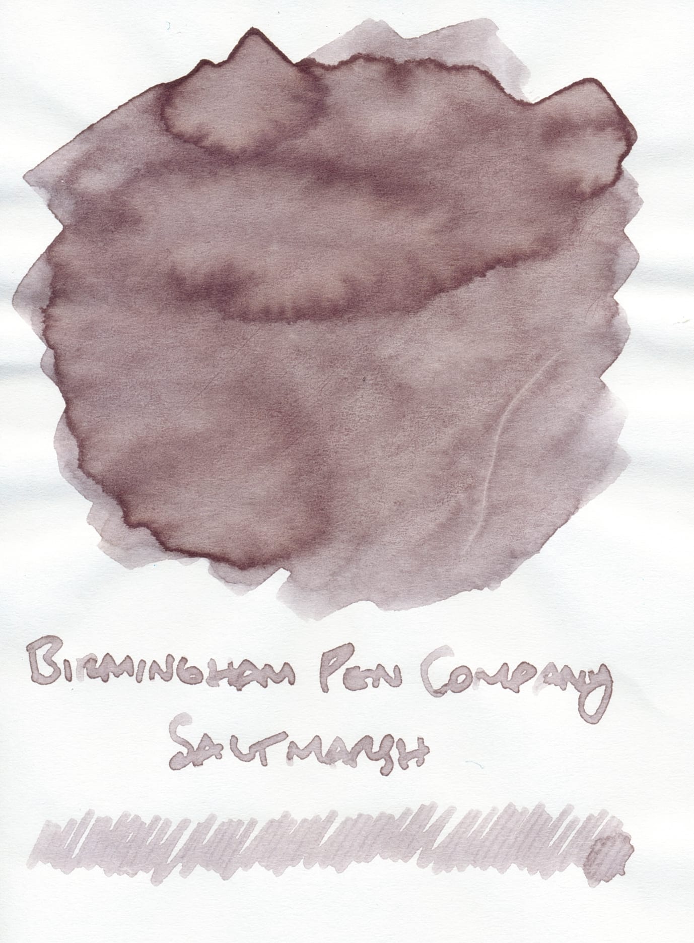

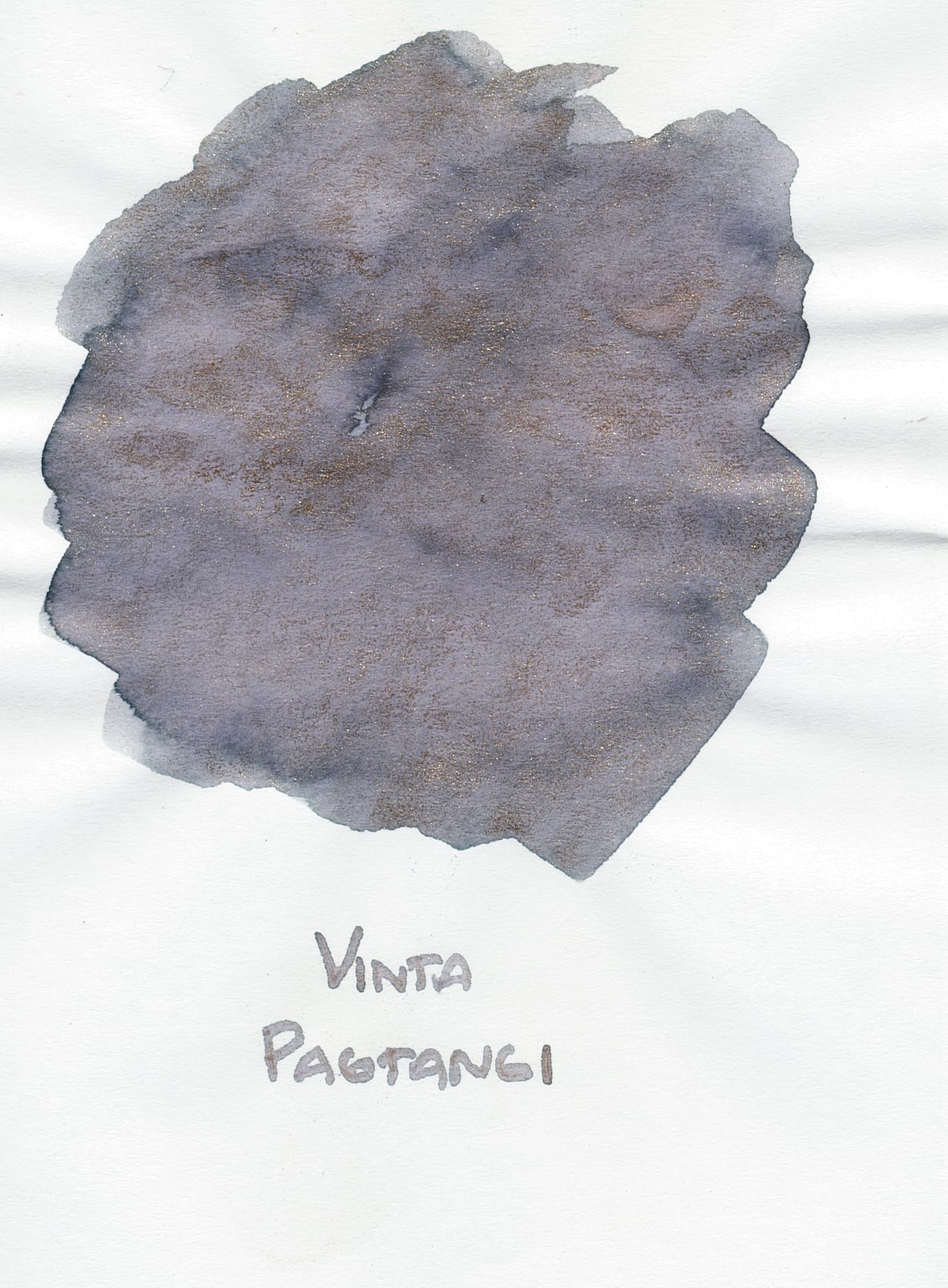
Birmingham Pen Company Saltmarsh, Sailor Manyo Uri, and Vinta Pagtangi swatches on Sanzen Tomoe River 52gsm
Once again, please imagine the Birmingham Pen Company swatch as cooler, and having less reddish undertones. In real life, this swatch also has an overall blue cast that makes the grayish-taupe color look even more odd, which reminds me of the blue-gray shades blanketing Uri's swatch.
Vinta Pagtangi's base color is a blue-gray, but it has a bronzey shimmer mixed in, which sadly isn't as visible in the scan. This combo feels like a reverse of the Uri swatch, a cold base color with a kind of gold/bronze shimmer overlay vs. a taupe with some blue-gray overtones.
Writing Samples
As I previously mentioned, you won't get the full spectrum of Uri's weird color combos in regular writing, but the less complex mix of colors still appeals to me.
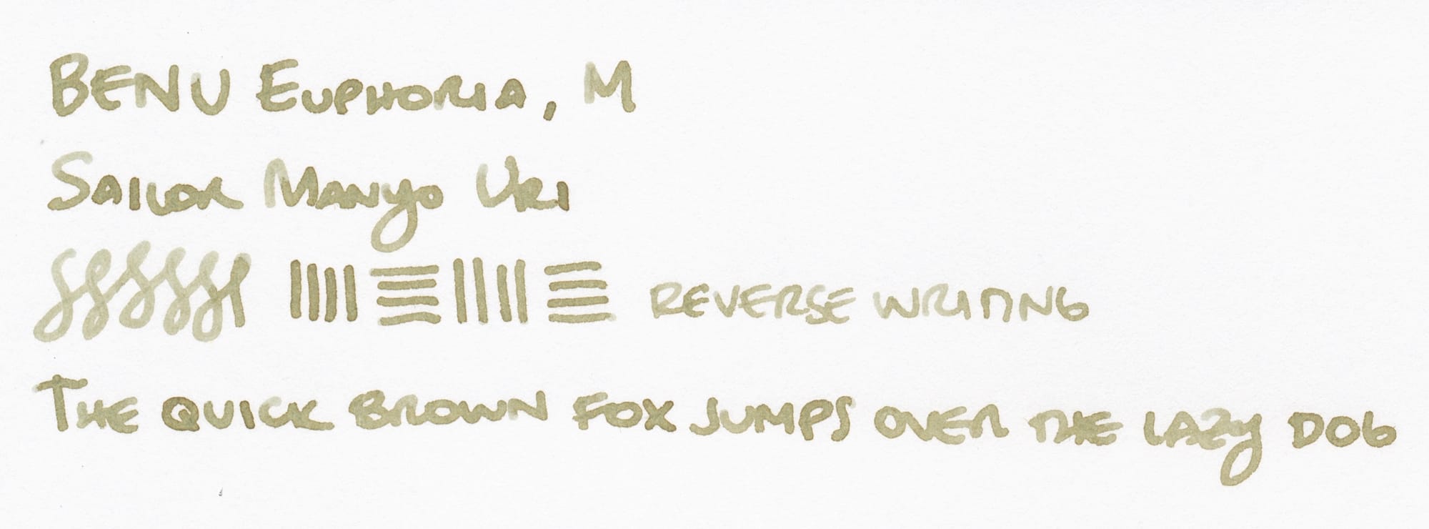
On Kokuyo Business paper, Uri looks like a slightly greenish taupe from this broad-leaning medium nib.
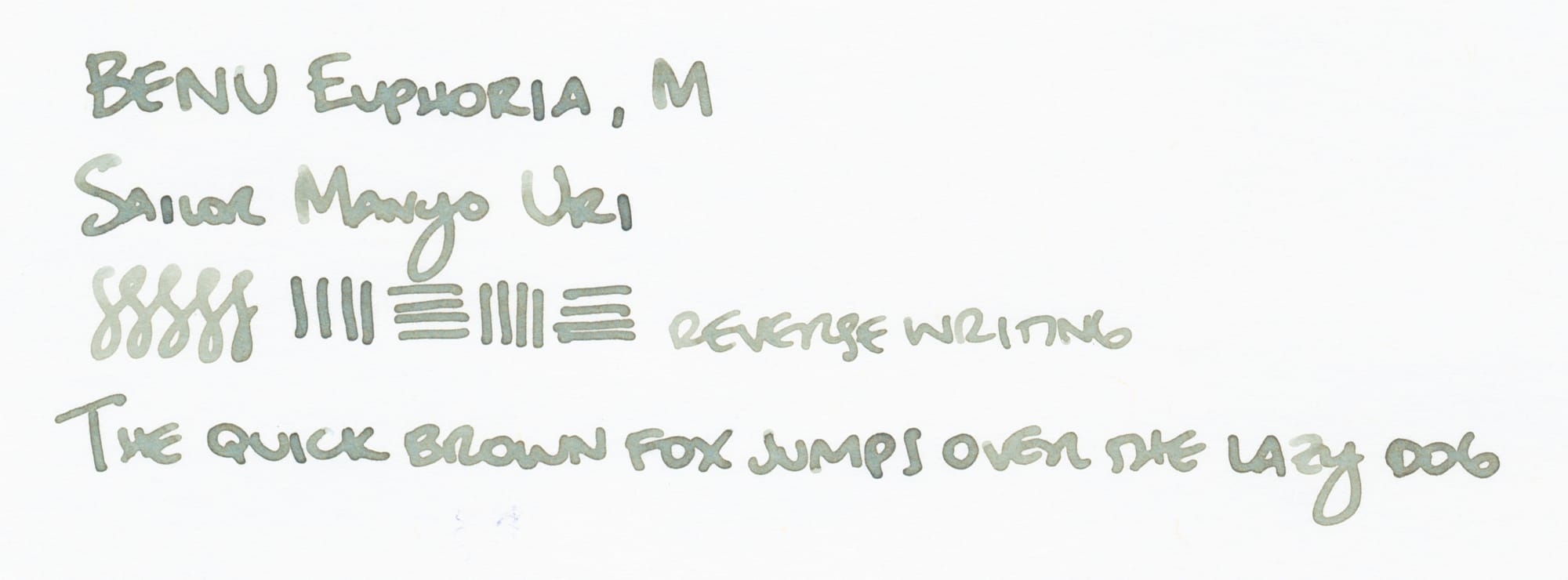
On Iroful paper, the color is completely different, looking like a lighter, cooler khaki green, with no real brown or taupe tones visible. I like the way the ink looks on Iroful because it has a weirder color, but I still appreciate the muddy light tan appearance on Kokuyo Business paper.
So, what do you all think? I'm sure I'm disappointing people who prefer brighter colors and shimmers as we're approaching the holiday season, but my color preferences are really subdued and weird right now. 🙂 Do you have other strange, in-between inks to recommend? I am tempted to pick up Sailor Manyo Kuri, but I'm sure there are lots of other examples of odd inks. Please let me know!
More fountain pen posts can be found here.

