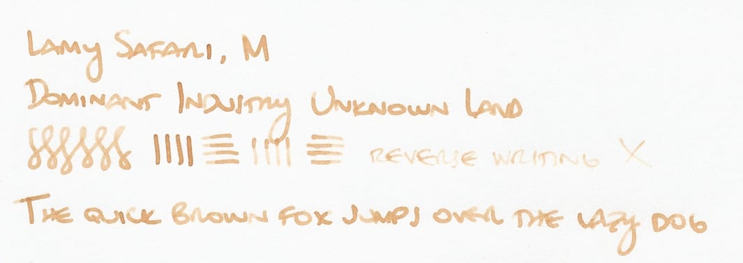
Ink Swatch Thursday: Dominant Industry Unknown Land
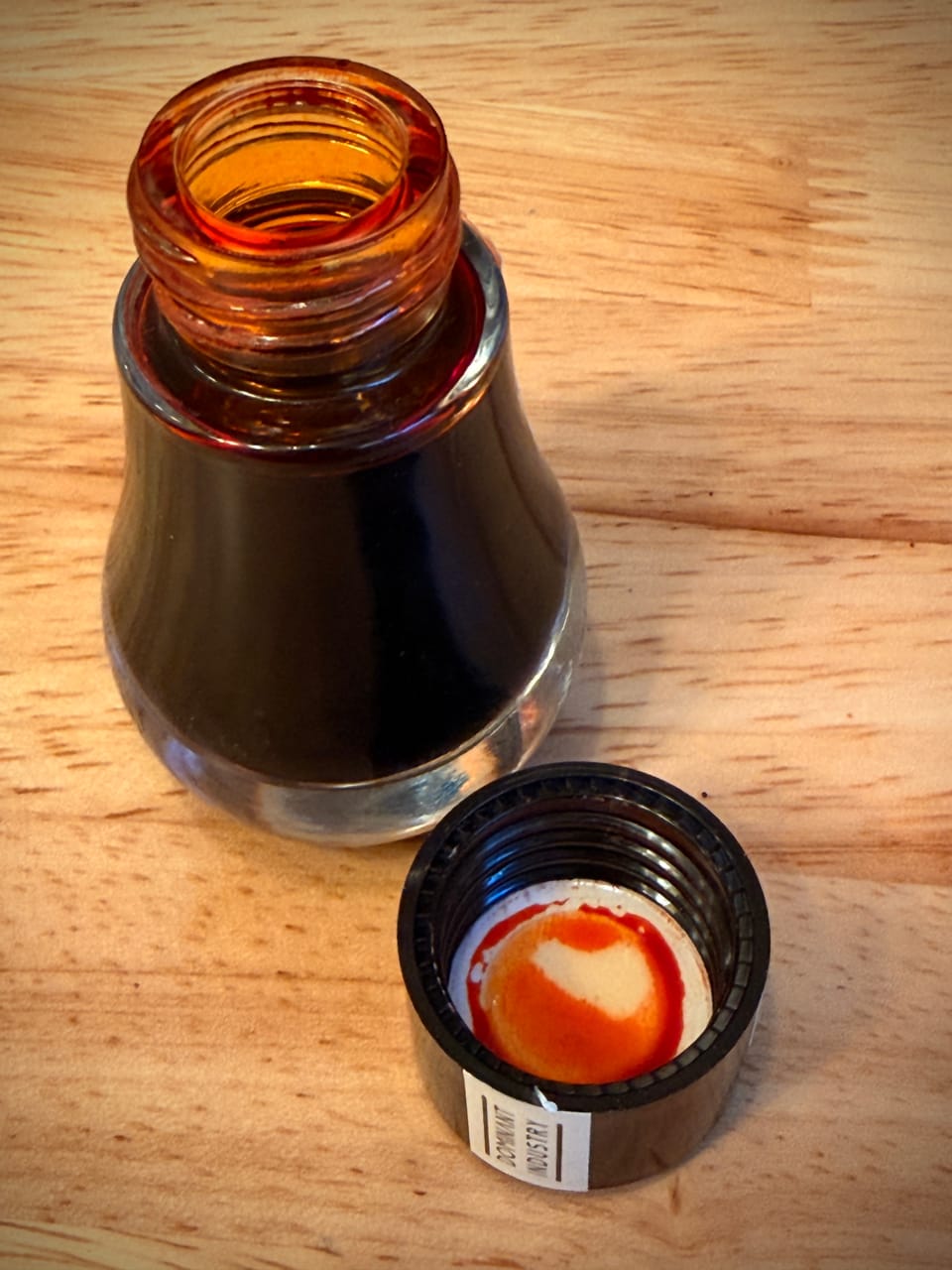
Sometime in the last week or so, I recently got a bottle of Dominant Industry Unknown Land, based only on the ink swatch on Goldspot's website.
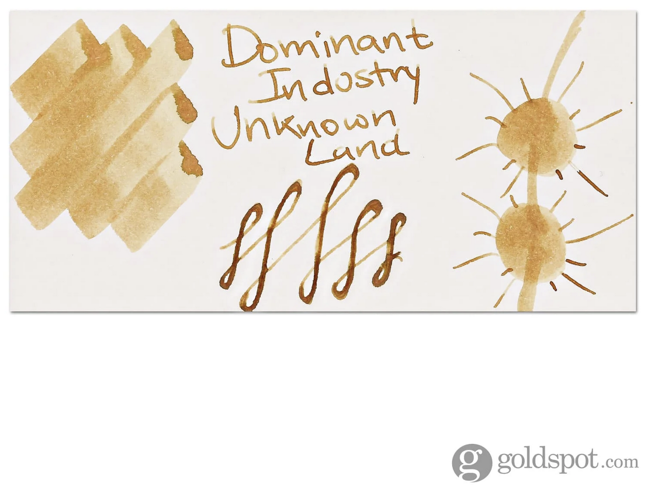
I thought it had an interesting shade, so I bought a bottle without picking up a sample first. (I was adding it to the order with TheCoffeeMonsterzCo x Esterbrook Forgotten Iced Coffee ink that was back in stock.) Luckily, I like the color well enough not to regret the full-bottle purchase, though I'm happy to share samples, as I probably will not finish this bottle (nor a lot of the inks in my collection) on my own.
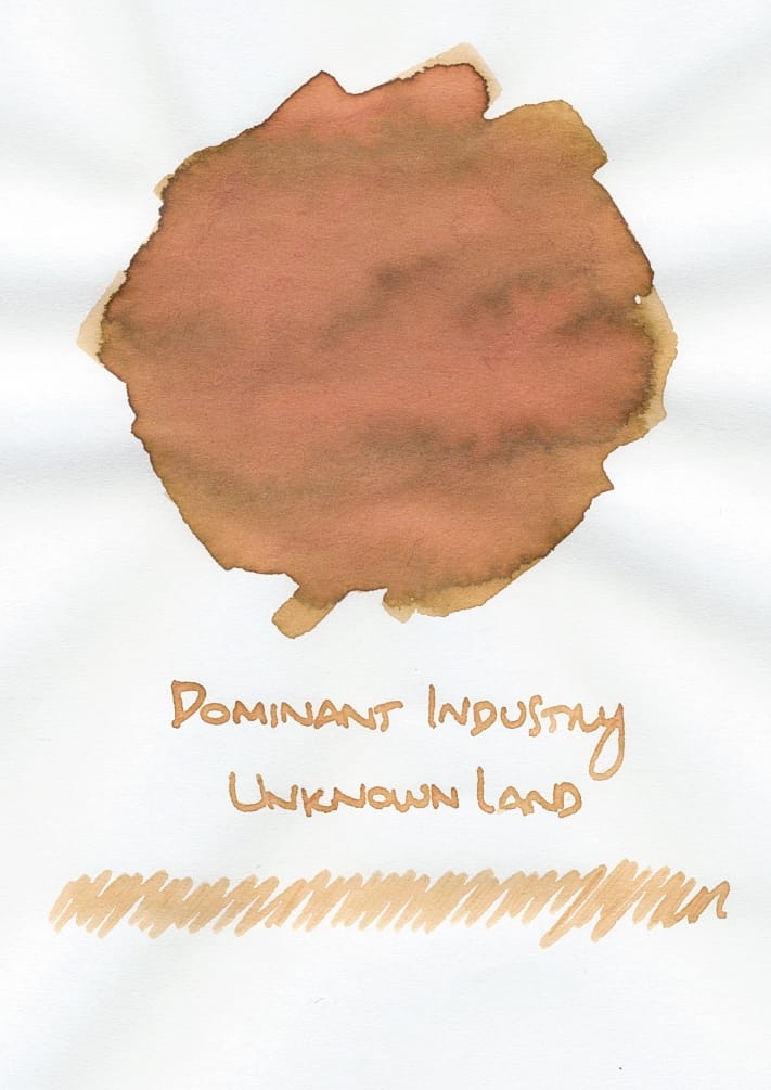
As I mentioned in my previous Ink Swatch post, I mentioned that Unknown Land looked different while the swatch was still wet, more like a brighter yellow-brown with green haloing where the ink was heavier. It reminded me of a fall leaf turning yellow, but still showing green around the edges. But as it dried, the swatch showed a prominent peachy look that almost overwhelmed the yellow-brown base. My initial reaction was mixed on the peachy shade, but in writing, I don't see the peach color as much. The ink ends up looking more like a light, caramelly yellow-brown:
It actually reminds me a bit of my Zebra Sarasa Grand Vintage Color gel pen in Camel Yellow, but Unknown Land isn't as saturated.
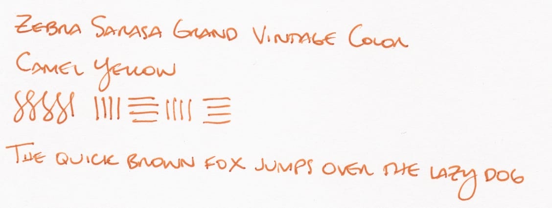
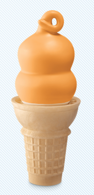
Sarasa Camel Yellow is an ink shade that always makes me crave caramel or butterscotch desserts like this 🤤 :
Anyway, getting back to the Dominant Industry ink, I have a few caramel-browns in my ink library that are comparable at least to the base yellow-brown color.
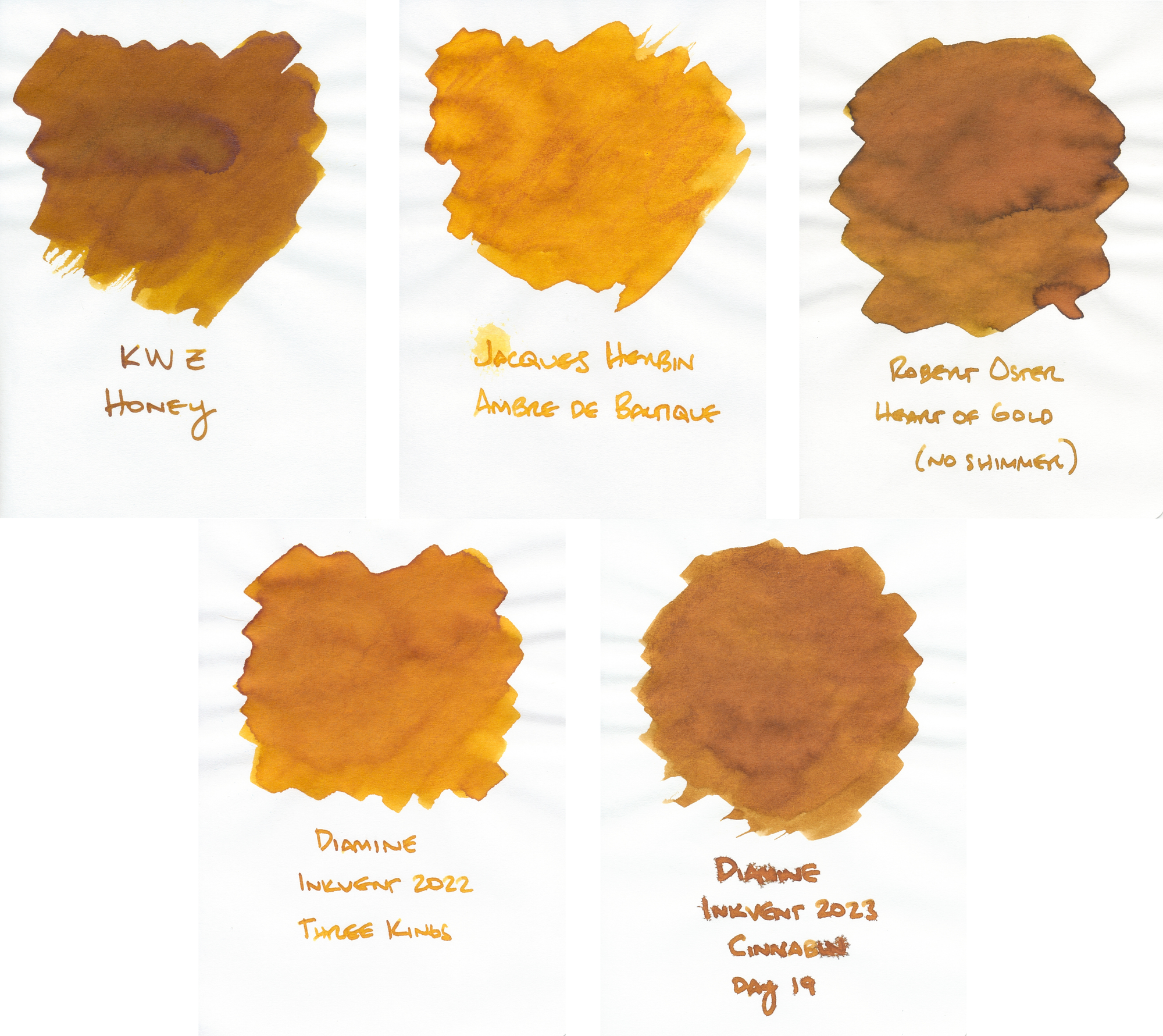
Most of these don't have the significant peachy colors that Unknown Land has, though Robert Oster Heart of Gold kinda looks like it has a hint of a peach color in the swatch. BTW, in case you're wondering why the last swatch has such terrible bleeding in the writing, it's because it's a scented Diamine ink which typically bleeds really bad unless you use a dry-writing fountain pen. Cinnabun looked decent from an EF nib, like the Platinum Preppy or Pilot Kakuno EF nibs.
Finally, I have another Diamine Inkvent ink that reminds me of Unknown Land because it also has a pinky, peachy component that is quite visible in addition to the yellow-green base color, Diamine Weeping Willow.
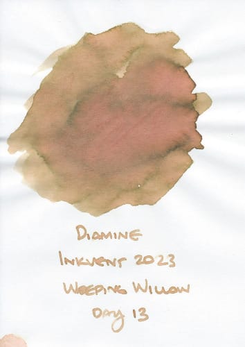
Obviously the overall color of the ink in writing is not a caramel brown, but the combination of yellow-green and pink/peach feels very similar to Unknown Land.
So, what do you think of Dominant Industry's Unknown Land? Wanna do an ink sample swap? Let me know. 🙂
P.S. If you like my fountain pen posts, you can see more here. Also, if you are so moved to "buy me a coffee" in appreciation, you can do so at https://ko-fi.com/CherylLindoJones. Thanks!