Ink Dupes: Platinum Lavender Black and Private Reserve Arabian Rose
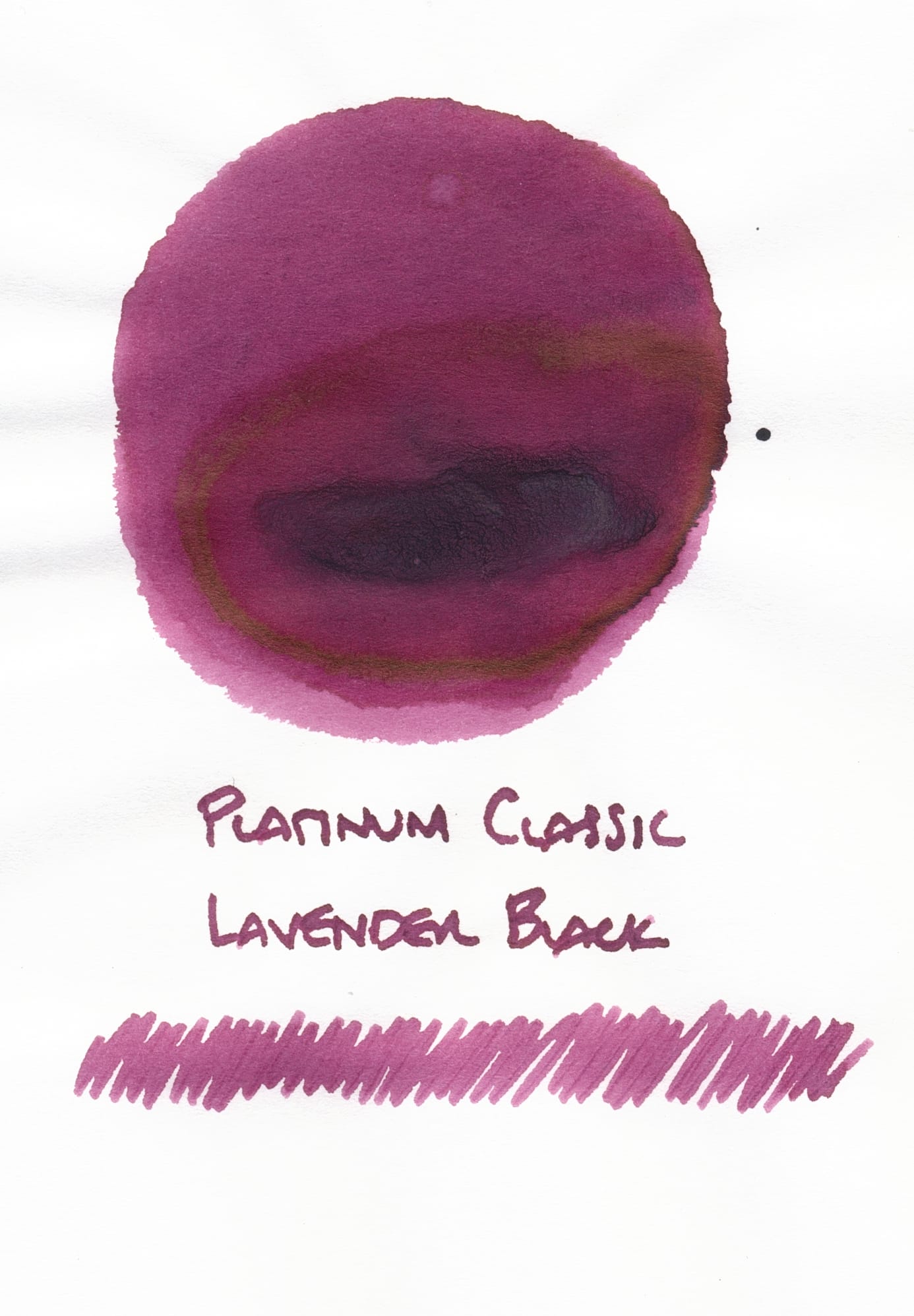
I recently picked up a sample of Platinum Lavender Black, since I enjoyed the sample of Khaki Black I got a long time ago. When I swatched it, I thought perhaps it was a mislabeled sample of Cassis Black because it was kind of a bright magenta-red when wet. But as it dried, it darkened to a kind of dusky, purple-rose color which still isn't what I think of when I think "lavender". But, when I looked up Cassis Black, it was definitely more of a berry red, not the purple-rose Lavender Black looks like.
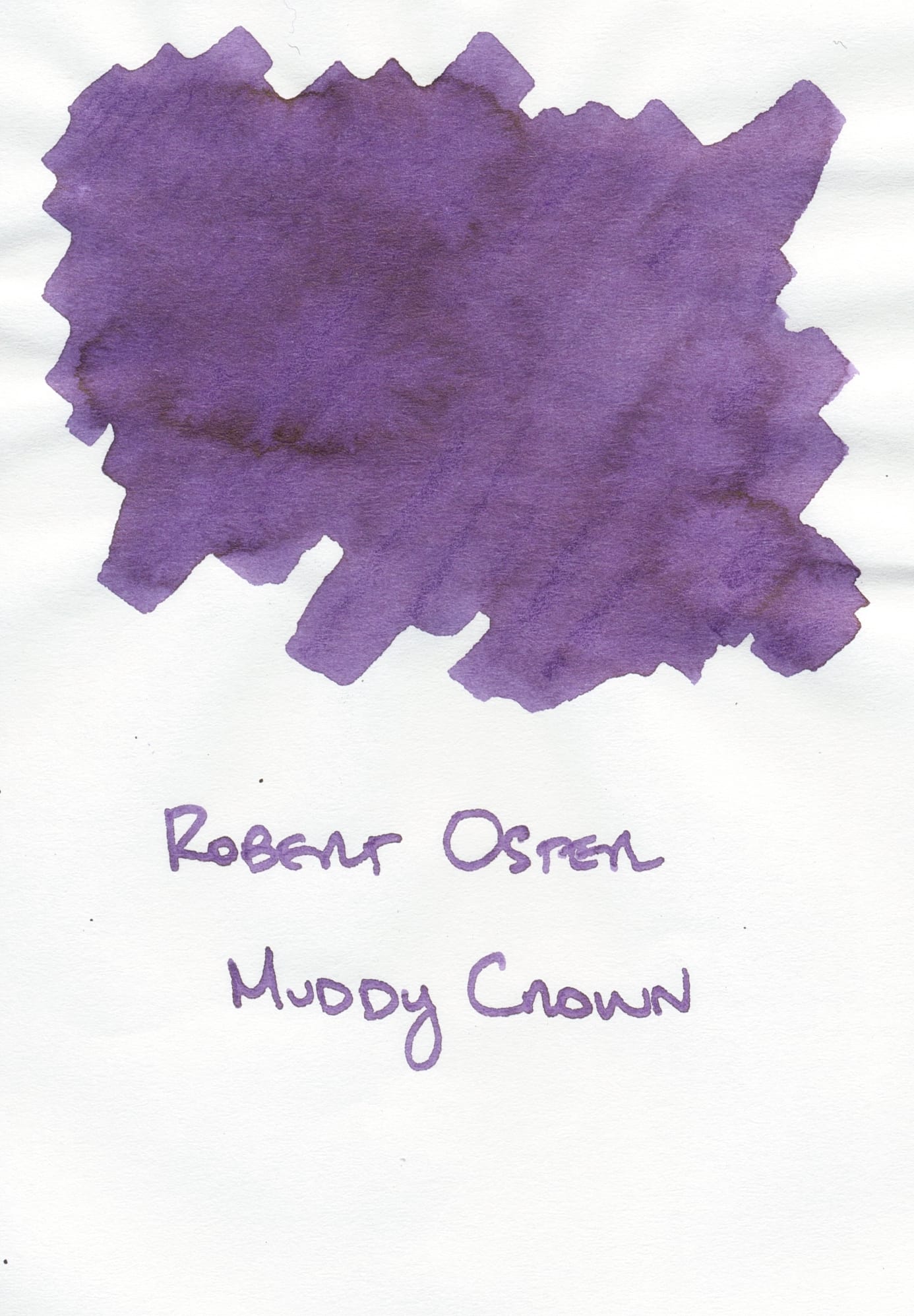
Personally, given that the lavender I think about is more blue-leaning, Robert Oster Muddy Crown looks more like the dusky purple I figured Platinum Lavender Black would be:
Even so, I do like the dusky, dark rose color Lavender Black is in reality. And from the nice EF nib in the Asvine C80, it looks great.
Not too much later, I ended up cleaning out the Krone Think Classic because the Gas Works Park ink in it was getting a bit dried out, and I was ready for another ink. Searching around my library, I decided to try Private Reserve Arabian Rose since I remembered it was a fairly wet ink (the nib on the Krone pen is a very dry writer).
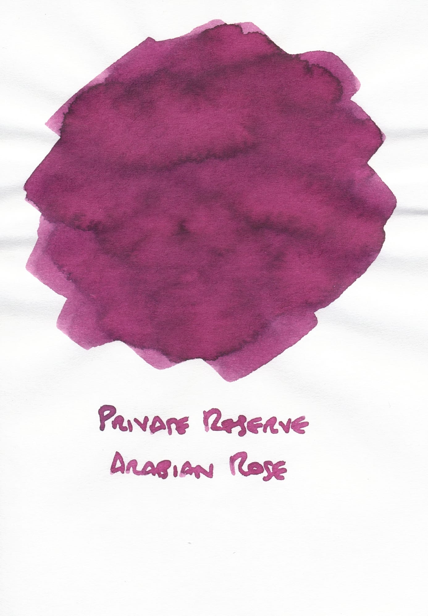
When I did a writing sample, I realized that Arabian Rose looks very close to Lavender Black. It was totally by accident that I ended up using "the same" ink in two different pens; I don't tend to do that, as I prioritize ink variety in my currently inked pens.
Here are writing samples from both pens next to each other, first on Tomoe River S, and then on Iroful paper.
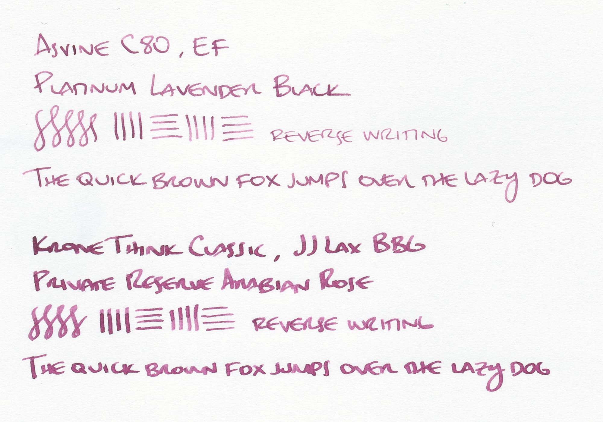
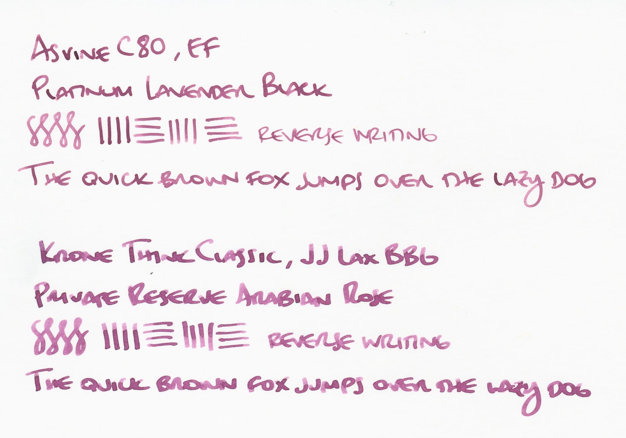
Because the Krone Think Classic has a wide italic grind, you can see the ink shading more, but even with the EF nib, some subtle shading is visible on Tomoe River S, and moreso on Iroful.
If you are trying to decide between the two inks, Platinum has the added bonus of some water-resistance (though not fully waterproof). I'd also mention that Private Reserve ink bottles (they're jars, really) kind of freak me out because the opening is so wide.
Not only would it be a catastrophe if you knocked the bottle over, but the extra wide opening kind of leaves the ink more vulnerable to floating dust, fur, debris, etc. The bottom is wide, too, so it's less likely that you'd knock this jar over, but if you did, 😱! But I digress...
Looking at my ink library, I have a few other dusky roses that, if not exactly the same like these ink twins, are pretty close, like Herbin Larmes de Cassis and Poussière de Lune (darker, and leans more purple). I didn't realize how many dusky rose inks I had, but I guess I'll add one more sometime whenever I get a bottle of Platinum Lavender Black. 😅
Thanks for reading. If you like what I write and want to support me, you can buy me a coffee...or tea! I'd appreciate it.