Franklin-Christoph SIG Nibs
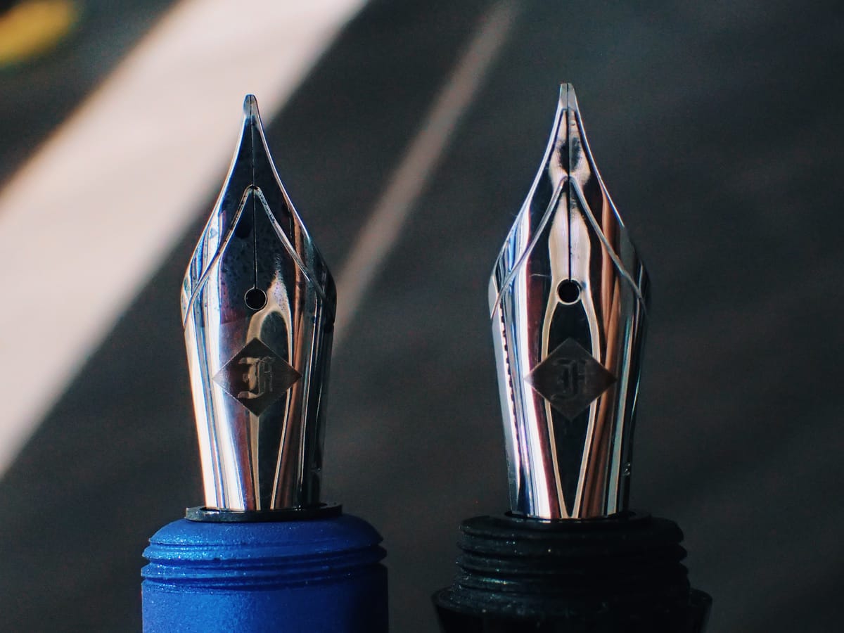
Yesterday I received the two Franklin-Christoph SIG nibs I ordered after getting an e-mail notification that they were available again. These custom ground nibs tend to sell out quickly and aren't always restocked right away, so this time I took the plunge. I bought both a F and M, since I didn't know which would suit my small writing best, though I had a hunch it'd be the F nib.
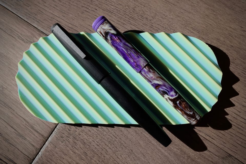
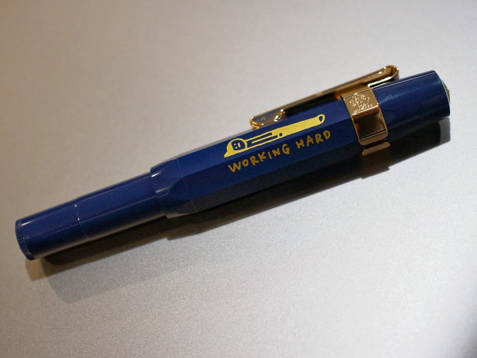
I ended up placing the nibs in my Kasama Una (F) and Mayfair Pens Noldor (M):
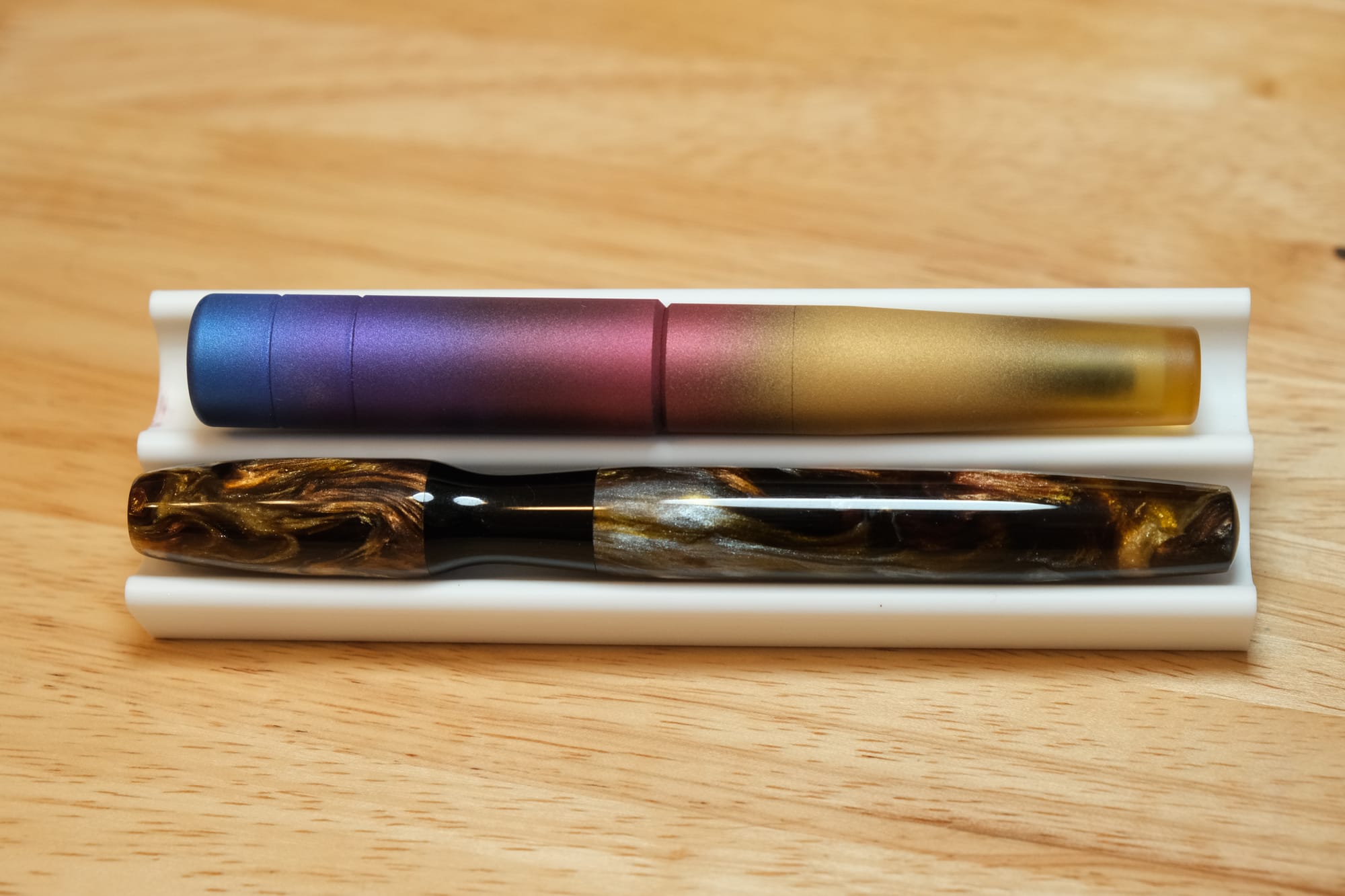
Funnily, both have cinched, hourglass-like grip sections that sort of force your grip into a certain position, which I'll talk more about in a bit.
SIG stands for stub italic gradient, which means that it's a smoother italic nib shape that offers different line thickness depending on the writing angle.
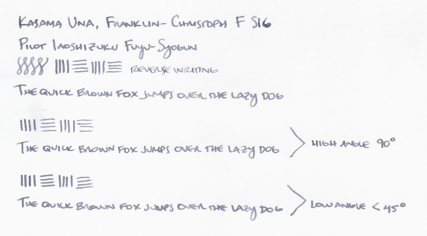
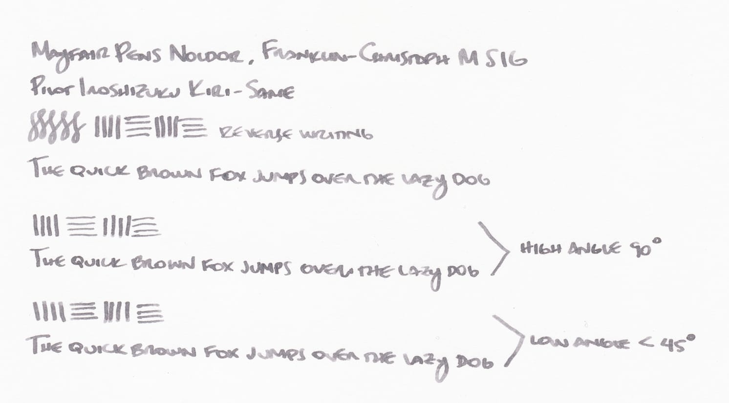
My regular writing angle is probably around 45 degrees, so the line thickness is between the shown samples at the high and low angles.
Remember what I said about the sections for both the Kasama and Mayfair pens? They're really tapered in the middle, so changing your writing angle is more difficult than it would be with a regular grip section. But for me, since my natural writing angle is around 45 degrees, I'm okay with the tapered grips. I don't see myself using different writing angles, which somewhat defeats the purpose of the "gradient" part of these nibs, but it's a nice perk to have in case I do want to use it.
I figured that the F SIG would fit my small writing best, but having the M SIG is nice, too. The M SIG is the max I would want to go, as my small writing already looks a bit sloppier with the M SIG line widths. I tend to smush my letters closer together as it is, and with the wider M SIG, they get less legible. But it'll be nice to see ink shading from the wider nib.
I have a F stub nib ground by All in the Nib that I bought as an option for the Pen Addict 15th Anniversary BENU Euphoria (nib option doesn't seem available anymore, unfortunately). It writes like the F SIG, except for having variable line thickness with writing angle. I really like the F stub, so I'm glad to have another similar-writing nib.
Both nibs are smooth, but offer a small amount of feedback, which is what I prefer. I'm not that big a fan of totally smooth, "glassy" nibs, as they feel less controllable to me. Besides, I prefer EF, F, and architect nibs, all of which often have feedback due to their shapes.
Overall, I'm happy to have these nibs in my collection! I'm tempted to pick up some raven SIGs, and am curious about the 14K gold SIG nibs, though the feel of these steel SIGs is already great. It's hard to imagine that the gold nib version would be that much better...? If you have a 14K gold SIG, please do comment with your experience, though. I'm curious.

Thanks for reading! If you like what I write and want to support me, you can "buy me a coffee". I'd appreciate it.

