
Clicks Case for iPhone 16 Pro Max - First Impressions
TL;DR: My brother picked up a Clicks case for my iPhone 16 Pro Max for my birthday and gave it to me a few days ago. It makes my phone even more ridiculously large, but the keyboard feels good. There are some issues, but none are dealbreakers so far.
A while back, MrMobile, a tech YouTuber, introduced a physical keyboard case for iPhones called Clicks. Having loved physical keyboards on phones in the past, I was pretty interested in this case, but at the time I didn't have an iPhone, and this product wasn't yet available for Android phones. Eventually they did start making some of these cases for some Android phones, including the Motorola RAZR series, which I think is even cooler because of how gadgety it looks, and how the phone isn't automatically chonktastic because of the keyboard attachment.
Fast-forward to today: (Ironically) I use an iPhone 16 Pro Max, and my brother picked up a Clicks case for my birthday.
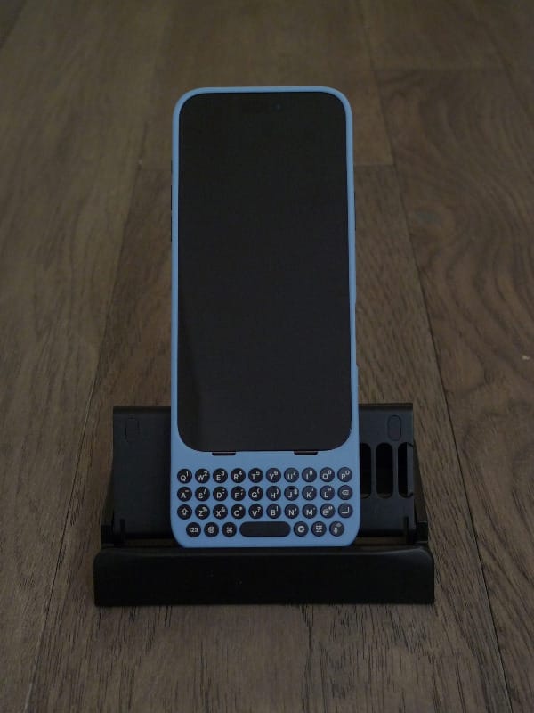
I just got it a few days ago and have been daily driving it since. Here are my initial thoughts.
The Keyboard
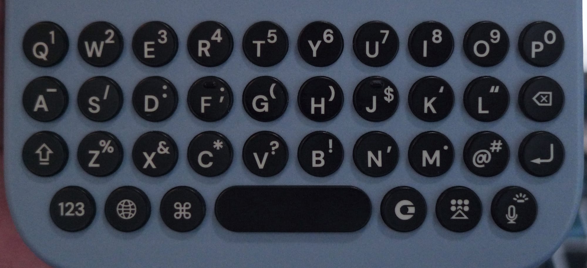
The keyboard feels great. The buttons are spread out enough that while you're typing, even if you don't hit the middle of the buttons exactly, you're still likely going to type what you intended. The buttons have a curved surface, which you can see in the animation below. On the left half, the buttons are angled one way, and angled the opposite way on the right half, for ergonomics.
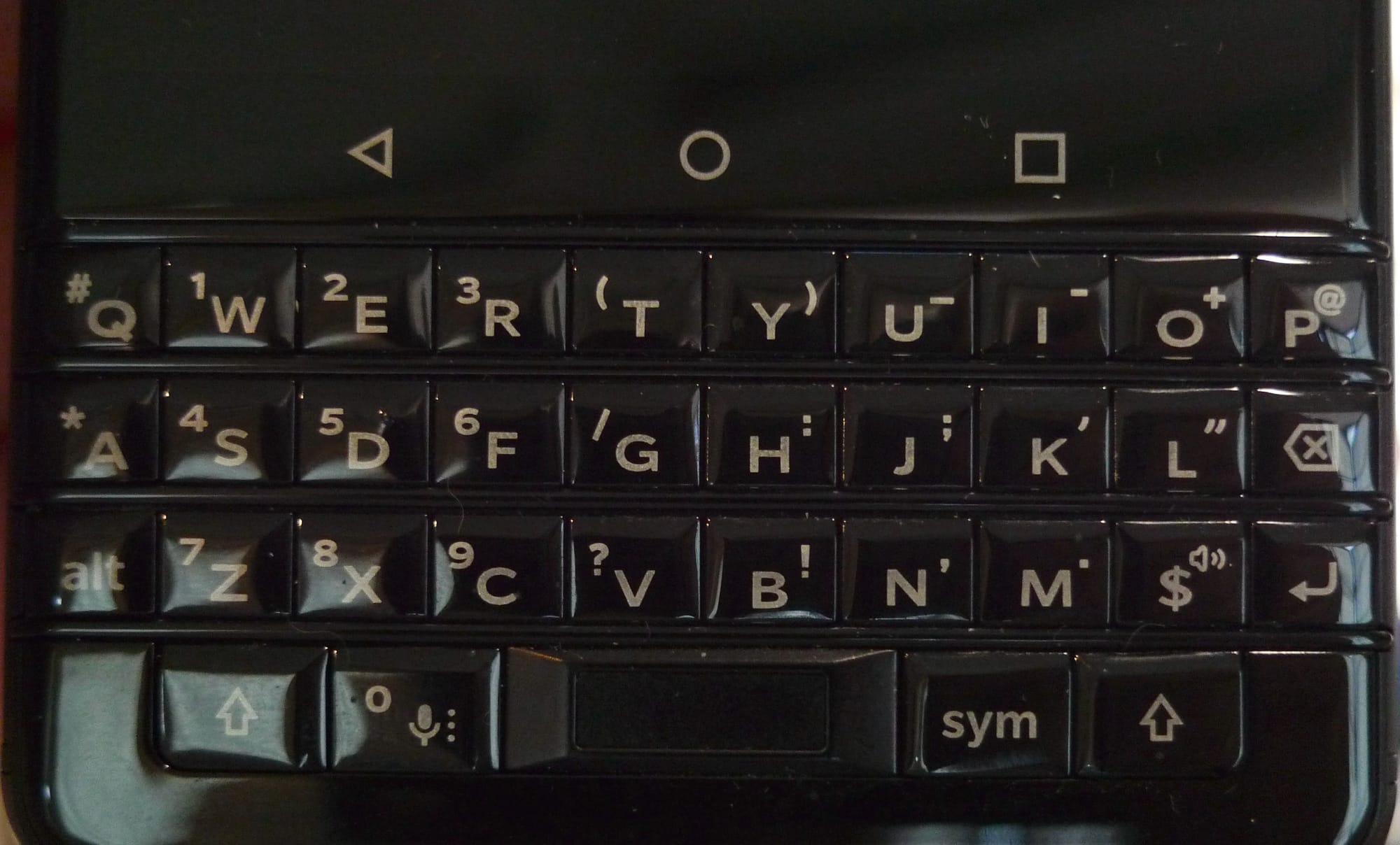
Key travel and tactility is satisfying. Even though the keys are round, it reminds me of the feel of the keys on my BlackBerry KEYOne:
iPhone 16 Pro Max Clicks case on left, BlackBerry KEYOne built-in keyboard on right
The layouts are different, but the tactility feels very similar, and therefore pretty nice.
The shift and "alt" or "number/symbol" keys are basically swapped on the Clicks board compared to the KEYOne, so I am still getting used to typing stuff that needs those keys. Sometimes muscle memory causes me to pick the shift key when I meant to choose the number key and vice-versa, but that's probably not going to be a problem for people completely new to physical keyboards on phones.
Damn You, Autocorrect
One thing that's been really frustrating me about typing on my iPhone (and Android phones) for a long time now is how poor autocorrect has somehow become. Back in the early iPhone days (think iPhone 4G), I could totally fumble across the tiny virtual keyboard, aiming at the general areas of the letters I wanted, and the autocorrect would still know what I meant to type 80-90% of the time. Now that hit rate is decreased. And we've all had autocorrect completely change what we've typed, instead of just correcting minor typos. I have no idea what they've done to the algorithm to mess it up that much.
But now that I'm typing on a physical keyboard, yes, I'm slower, but my keypresses are intentional and result in fewer typos or "autocorrection" that completely skews what I meant. Essentially I'm back to being my own autocorrect, though sometimes phone autocorrect does come through and fix minor typos before I do. Annoyingly, if I type "i" and hit space, it does not autocorrect to "I" which is what I mean 99% of the time, so that's something I have to watch out for. I may be able to do something in autocorrect settings to fix this, but yeah, using a physical keyboard has made me less irritated at the terrible autocorrect we all have to deal with (so much for machine learning and AI advances... 🙄), because I rely on it much less. 😝
Yay, Physical Buttons!
I've waxed nostalgic in the past about gadgets that had lots of buttons vs. the glass slabs we have now, where many companies seem to be intent on removing as many physical buttons as possible. E-readers used to have physical page turning buttons. PDAs like Sony Cliés had jog dials that you could use for different things like adjusting media volume and turning pages in e-book reader apps.
With Clicks in cursor mode, I can use either WASD or IJKL buttons as arrow keys in the Kindle app for page turning. I can hold my phone in landscape orientation (I prefer the length of lines of text in landscape orientation) with the keyboard to the right of the screen, and tap on I or K to turn pages back or forward. It's great!
I can also use cursor mode in my Mastodon client, Mona, to navigate the feed. I did that a couple times, and found it more natural to scroll regularly via the screen, but it's still cool to know that I could use arrow keys if I wanted. The spacebar works to page down (and shift+spacebar to page up) when reading in the browser or articles in my RSS reader. I haven't experimented much with other apps yet.
Feature Request
I do wish that somehow the spacebar could be used to take a picture in camera apps. Especially when I'm holding the phone in landscape orientation with both hands to take a picture, the spacebar is in a great spot for me to use it as a shutter button. Pressing on it instead of the camera control button would introduce less camera movement since it's easier to press. I would normally just tap on the screen, but now it's a little less convenient to reach with my right thumb or forefinger, since the keyboard adds a little length to my phone's footprint.
Onboarding
Onboarding could be better. There wasn't too much of a walkthrough other than my iPhone prompting me to install the app when I first fitted it into the case, and following a few prompts in the app to demonstrate typing letters, capitalizing a letter, typing a number, and typing an emoji (more on emojis below).
Shortcuts
The app does have a list of iOS Shortcuts users could add, but didn't fully go through the process of actually assigning hotkey combos to them. Once I added a shortcut, the app UI indicated that...something happened (I found out the shortcut was added to the iOS Shortcuts app)...and that was it. 🤨 I actually had to search how to use shortcuts with Clicks, which brought me to one of their support pages that fully described adding shortcuts to the Shortcuts app, then going into the accessibility settings to assign keyboard macros to the shortcuts.
Because it's iOS, and you can't do lower-level stuff like this more directly, the process feels quite kludgy. One of the first steps is to clear out macro assignments for any default accessibility commands that are already assigned so that there isn't any overlap with macros you might want to assign for your own custom shortcuts. On Android, it appears that macros are already assigned to access certain stock apps, and even use shortcuts within apps (though I'm not sure how much customization is available beyond that).
I also don't recall seeing the cmd-key shortcuts in onboarding, like cmd-space for spotlight or app search, similar to MacOS, or cmd-H for going home. I stumbled across another Clicks support page as I was searching for other instructions. 😕 There are a lot of useful key combos listed on this page that should've been more directly introduced during onboarding.
Emojis
As I alluded to above, in the original onboarding, users are prompted to type a certain emoji by using a special key to the right of the Clicks key to open the virtual keyboard. But this doesn't open the emoji virtual keyboard directly. You have to tap on the emoji button first. I found this extra step really annoying since I frequently use emojis and searched for quicker alternatives. It's not a big deal when you're using the virtual keyboard because emojis are one tap away. But with Clicks it's a button press to bring up the on-screen keyboard, and then a screen tap. This led me to another Clicks support page that had the answer, though annoyingly it was the third listed option: set up the emoji keyboard as a "language" that is selectable via the globe key on the Clicks keyboard. When I followed the steps on the support page, the emoji keyboard was already in the list of language options, so I'm not sure what happened there. Regardless, I'm happy I figured out the globe key option, as it's more streamlined. Sometimes other languages in the list are highlighted by accident and you have to tap the globe button to cycle through the list, but at least you're keeping your fingers on the Clicks keyboard vs. tapping on the keyboard and tapping on the screen.
I would encourage the Clicks team to make the onboarding more robust in introducing users to major features. Or at least, incorporate all of the getting started guides into the app and tell users that the information is available there, referable if they need it.
If the Clicks team doesn't want to overload users when they first start using the keyboard, they could do some follow-up prompting via app notifications to alert users to this information as part of a progressive education flow over time. I wouldn't have known that the Clicks team wrote all of these useful support articles without doing web searches on how to do certain things that I knew the Clicks keyboard could do, but wasn't initially told how. 😕 Other users might never come across this information, get frustrated by "missing functionality", and stop using the case.
Battery Drain
Near the end of my first day using the Clicks case, my iPhone alerted me that it was at 20% battery, which was a first. In the whole time I've had this phone, I haven't run the battery down that much, even though there were many days when I used a lot of power-hungry features like the camera. I went back into the Clicks app and found the Battery Saving option:
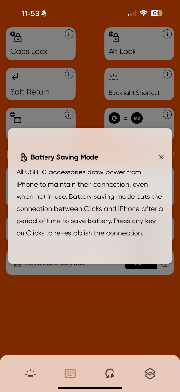
It sure would've been nice to have known about the constant battery drain on the phone if this option isn't turned on (it's off by default). It's slightly annoying that I have to press a key to wake the keyboard, but that's just a limitation of connecting via USB-C and not having its own power source. 🤷♀️ After I switched on this battery saving setting, my phone battery drain went back to normal. This is another thing that probably should be mentioned during initial setup.
Other Thoughts
- Size: Of course, the biggest downside to this case is how ridiculously huge my phone's footprint is now. If I put it in my back jeans pocket like I usually do when I'm out, it sticks out so much... I ran an errand yesterday and made sure to keep my t-shirt pulled down so that no one could see the phone sticking way out of my pocket, even though people could likely see the outline of the whole thing anyway... 😅 🤦♀️ I may need to just pop my phone into my purse next time I'm out.
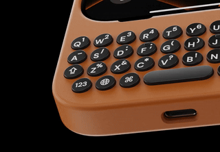
On the flip side, the extra bulk did make talking on the phone a little bit easier, reminiscent of how it used to feel talking on a landline phone handset. 😆 The case didn't extend where the phone mic was, but it was comfortable to hold the case around the bottom while the rest of the phone rested against my face. - Color: The color selection for the iPhone Pro Max is limited, and this blue is kinda meh. I just didn't want black, or the orangey-brown options. I would've liked having a case color to match my phone (Desert Titanium), or maybe even a clear/translucent frost case that lets the phone color kind of show through. That would've been cool, if they couldn't do more eclectic color choices.
There's a bright yellow case with purple accents on the site for Google Pixels which I would've gone for, had it been an option (and now it appears unavailable even for Pixels). I'm also really not a pink person, but the pink case with light blue keys and accents has a nice '90s (or '80s) vibe to it, but that was only available for iPhone 15s. 😐 - A Small Weak Spot: There's a thin part of the case around the camera control button that bends quite a lot when I happen to grab my phone around that spot. On my previous Spigen case, the edge around the screen is thicker for protection, so that same spot wiggles a bit, but doesn't feel as thin and fragile.
When I hold my phone with two hands, letting the bottom corners of the phone rest in my palm by the base of my thumbs, my right thumb naturally rests on that weak part of the case, so that's why I notice it so often. Not sure there's much to be done, other than making the edge around the screen thicker or more reinforced, but that'd likely make it harder to slip the phone into the case, which already kind of concerns me, regarding the USB-C connector and sliding the phone in at an angle, as slight as it may be.
We're Almost at the End
Ultimately, I really like having a physical keyboard for my phone. I know this is a niche product, but I am squarely in this niche. And with all the nostalgia I have for older phones and gadgets from the early 2000s, Clicks fits right in, but modernizes the experience.
I hope I can get a Motorola RAZR and corresponding Clicks case to try out that next-level gadgetyness sometime. (Or maybe they'll make one for Samsung Flips?) I think a keyboard case for that foldable form factor would be really fun.
I look forward to seeing updates to this product to address some of the issues I mentioned. But even with these areas for improvement, I applaud the Clicks team for releasing something that works pretty well, is fun, and is satisfying to use out of the box. (Don't even get me started on consumer electronics launched well before they're ready for prime time. 😡 Paying customers are not your alpha/beta testers!)
Thanks again to my brother for the gift. 🙏 😀

If you like what I write and want to support me further, you can "buy me a coffee". I'd appreciate it!