
More Shimmer/No Shimmer Ink Comparisons
Following up on the last Ink Swatch Wednesday post, I wanted to show more clear differences between a shimmer ink's normal appearance and its appearance without agitating the shimmer. I have a mix of Robert Oster, Wearingeul, Pelikan Edelstein, and Dominant Industry inks. Instead of scanning the swatches, I took angled photos in direct sunlight to show the maximum difference between a shimmer and its non-shimmer counterpart. This fun little experiment has me eyeing some inks to use when I next want to fill a pen. 🙂
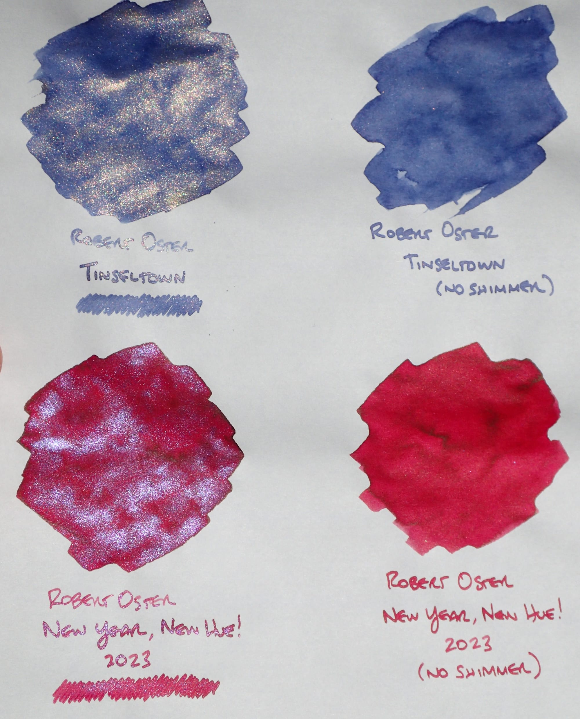
Here are some looks at the full pages (original Tomoe River, 52 gsm paper) of swatches side-by-side:
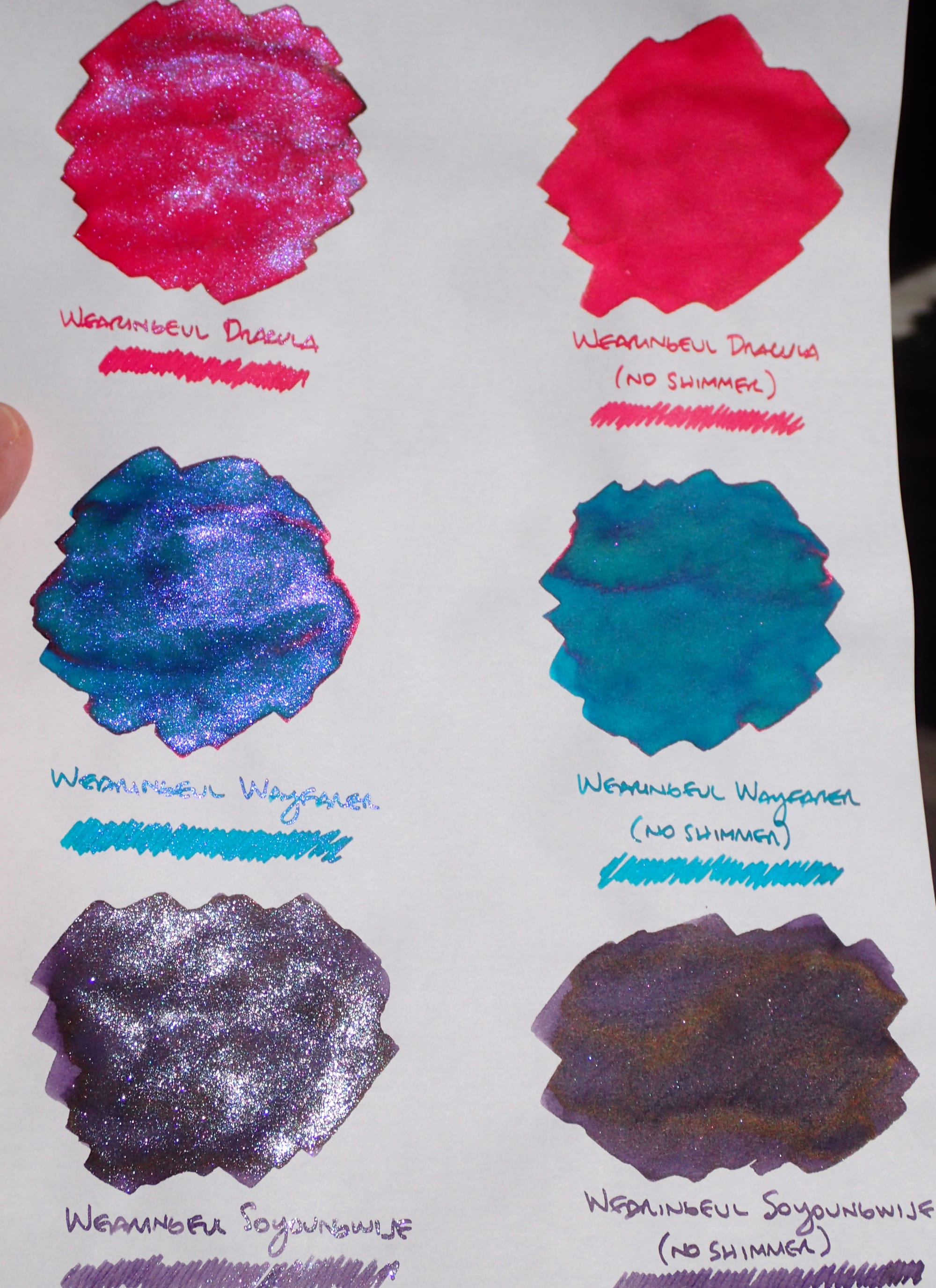
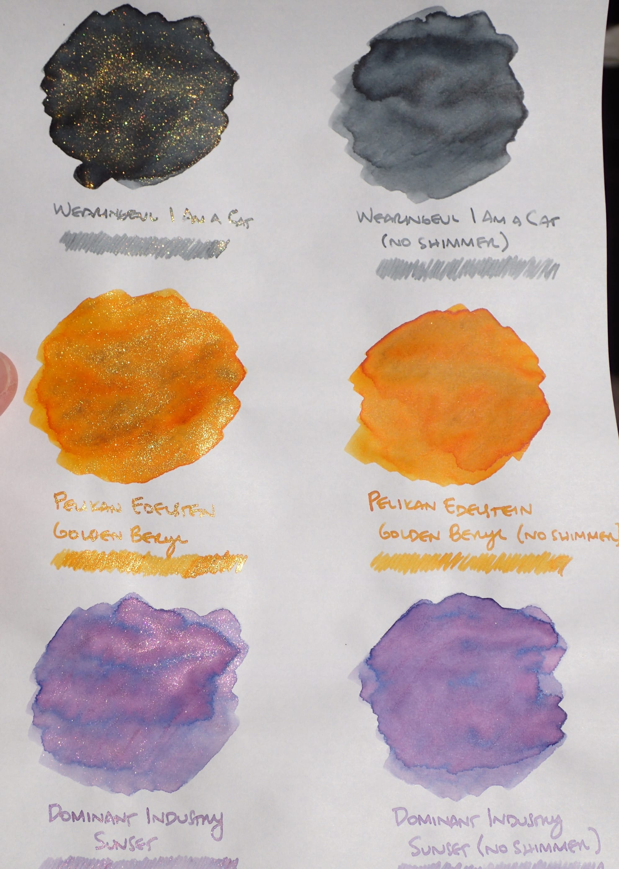
And now the swatches close up, and side-by-side:
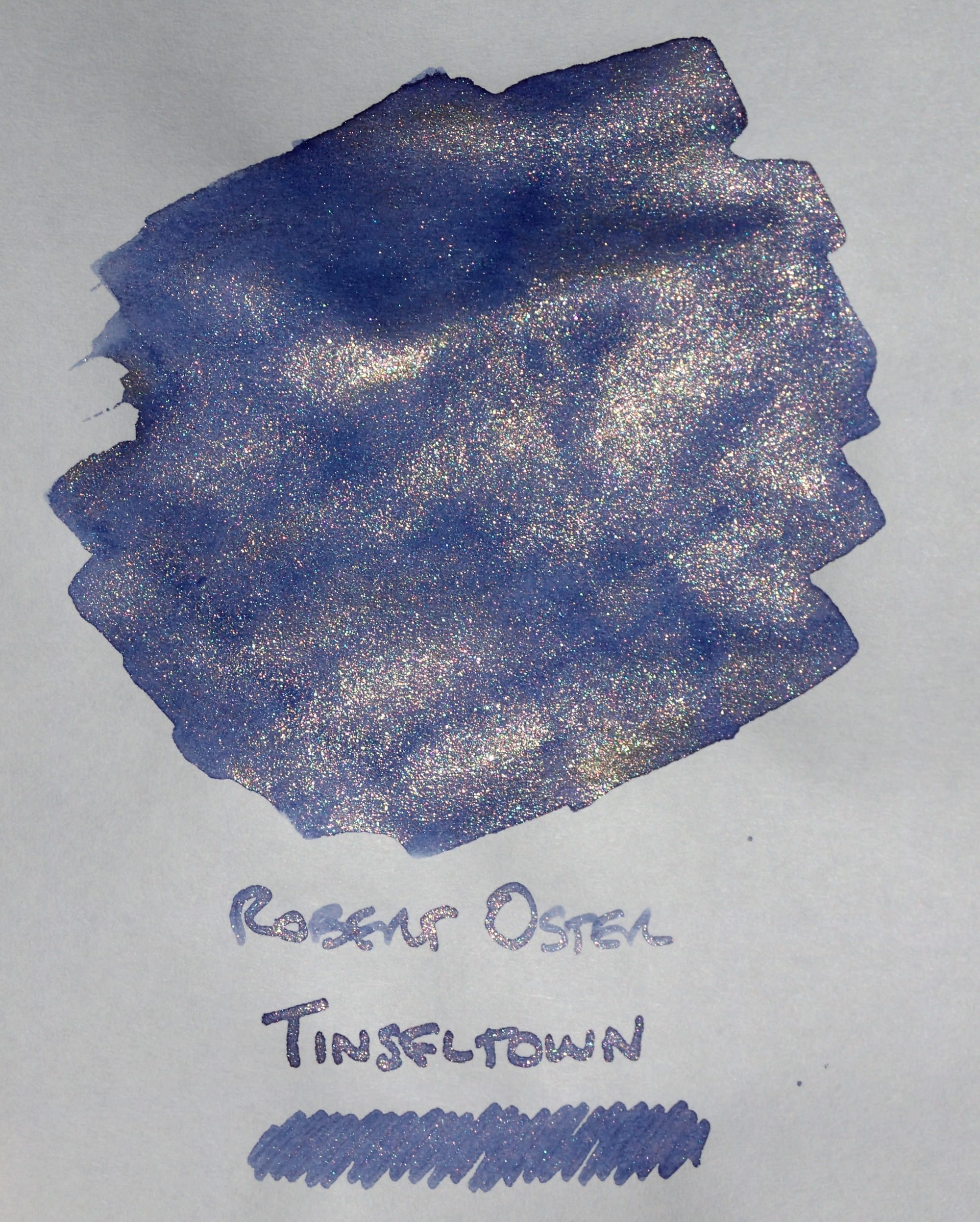
Robert Oster Tinseltown
I much prefer Tinseltown without the "antique gold" shimmer. It looks alright in this direct sunlight picture, but in regular indoor lighting, the shimmer looks muddy/dirty, which muddies the appearance of the base color. I like the medium blurple base color on its own.
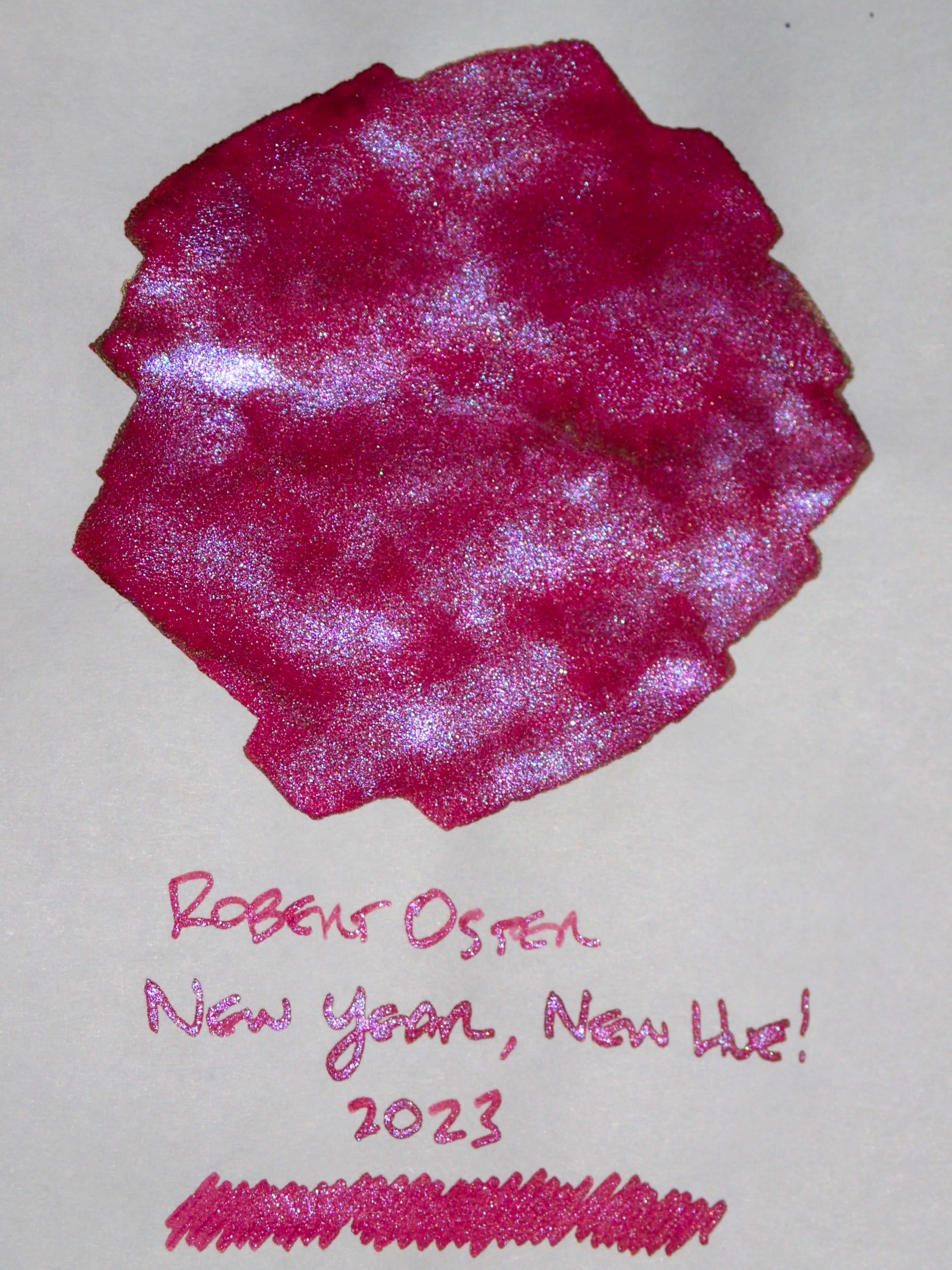
Robert Oster New Year, New Hue! 2023
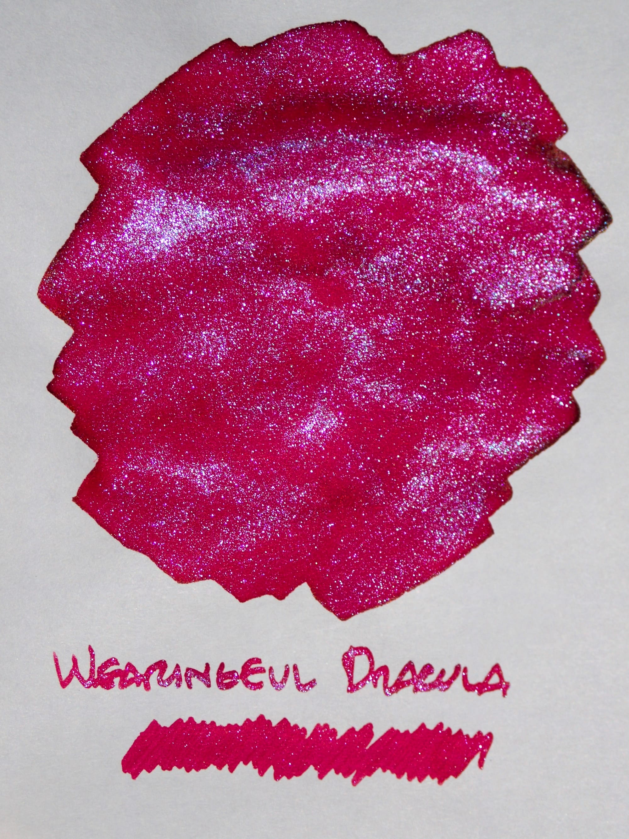
Wearingeul Dracula
For both the Robert Oster and Wearingeul red-magenta inks with their chameleon pink shimmers, I prefer the non-shimmer versions, but neither red ink is my favorite anyway. I may need to sell these off.
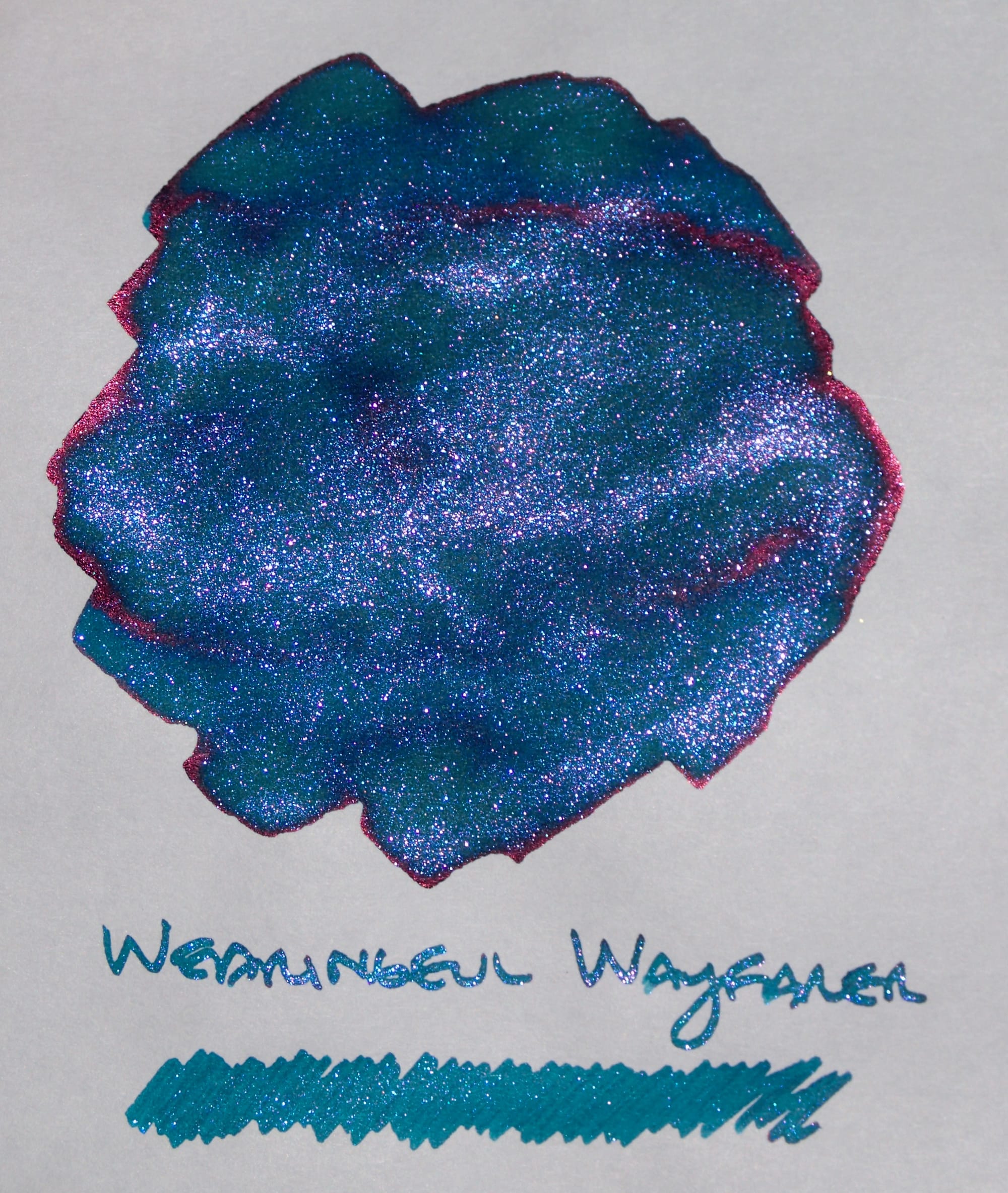
Wearingeul Wayfarer
Wayfarer is a beautiful teal/turquoise, red-sheening ink, with or without the chameleon purple shimmer.
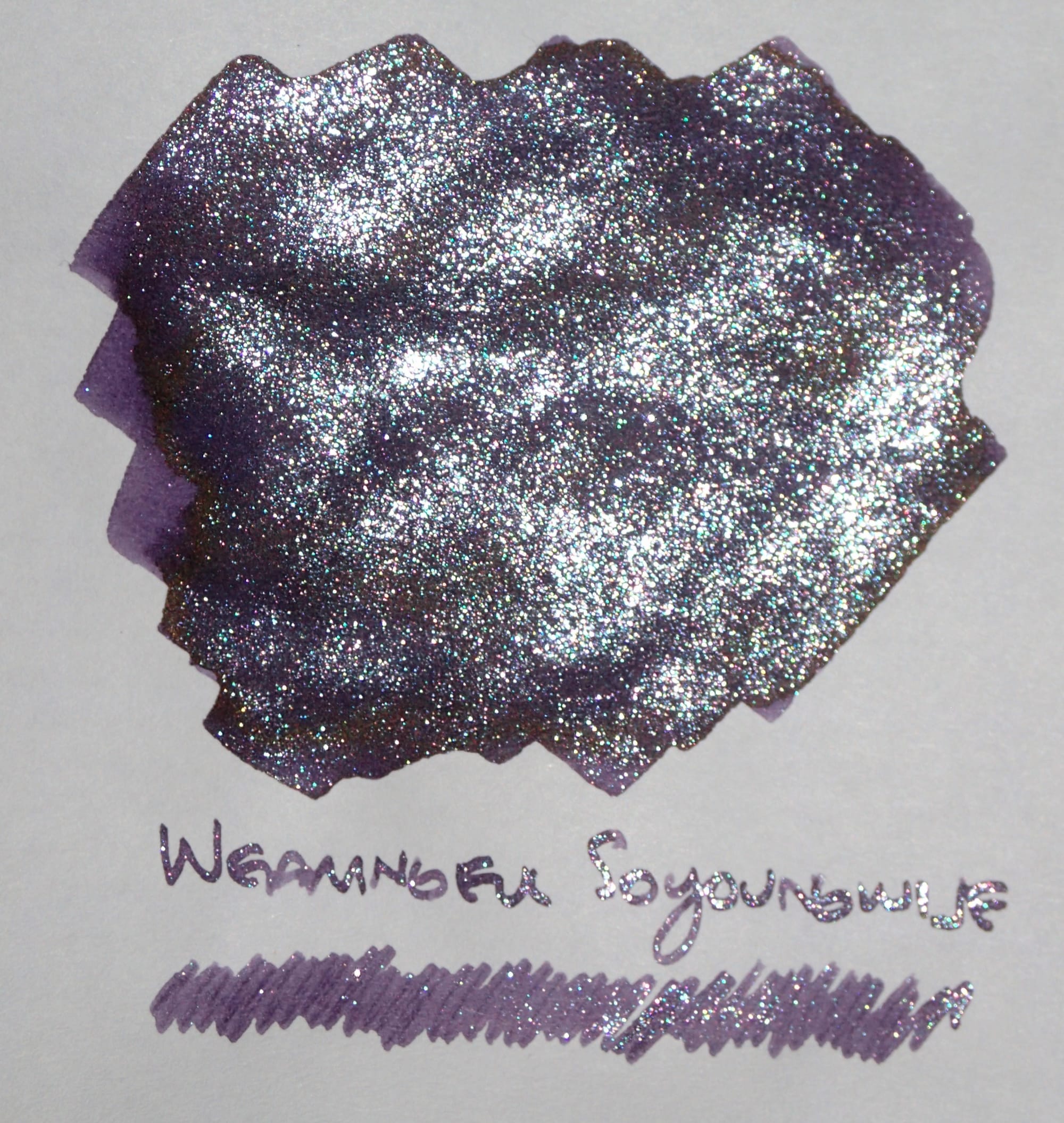
Wearingeul Soyoungwije
Soyoungwije is quite a dark purple which benefits from the lightening and interest the silver shimmer provides. It is my second least favorite Wearingeul ink (surprisingly, given it's purple). I think it's because it's a very cool-toned purple for my preferences.
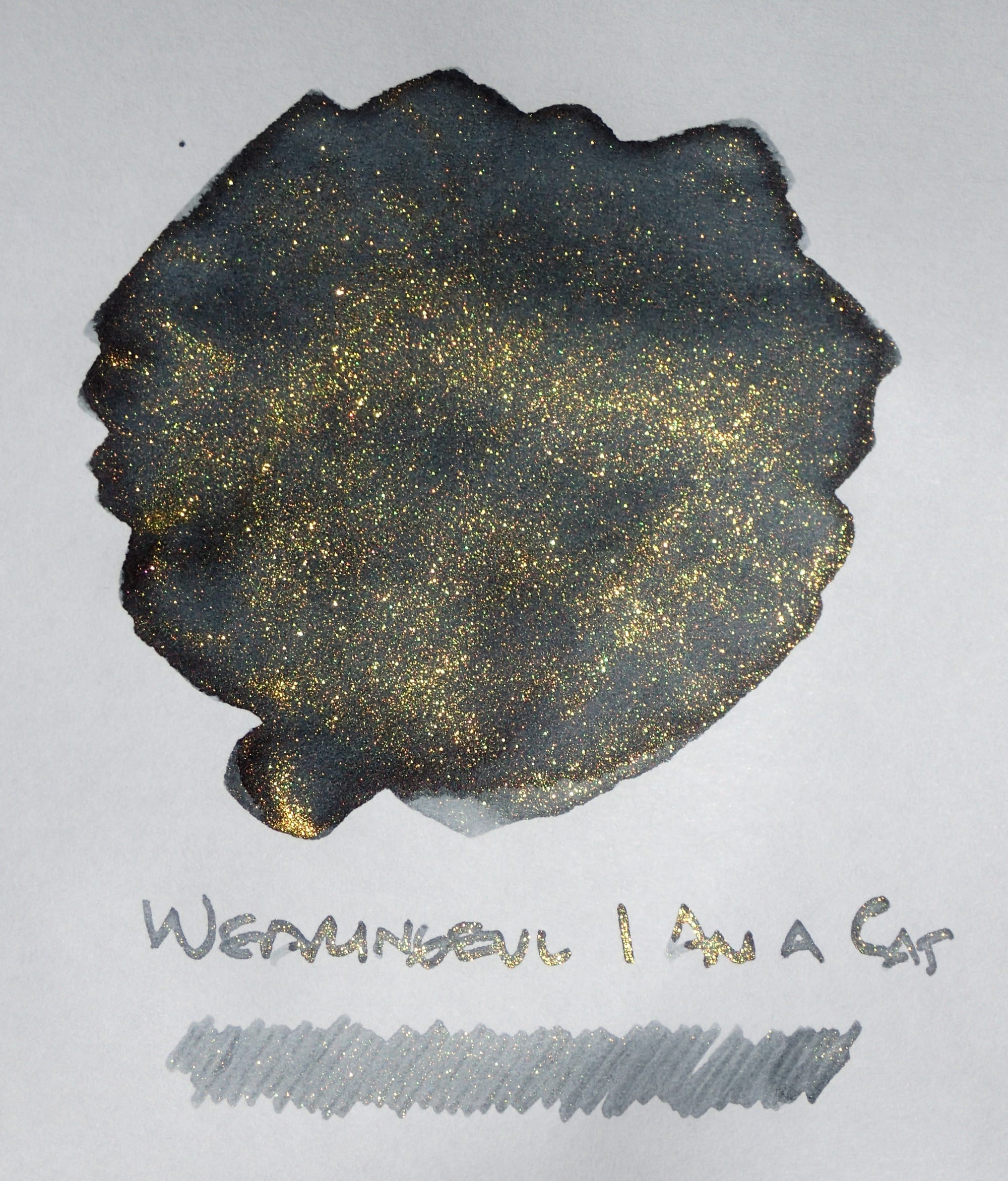
Wearingeul I Am a Cat
I Am a Cat's gold shimmer is so strong, and gets all over facing pages in a notebook. So if you need a break from the shimmer, it remains a decent, shading gray ink.
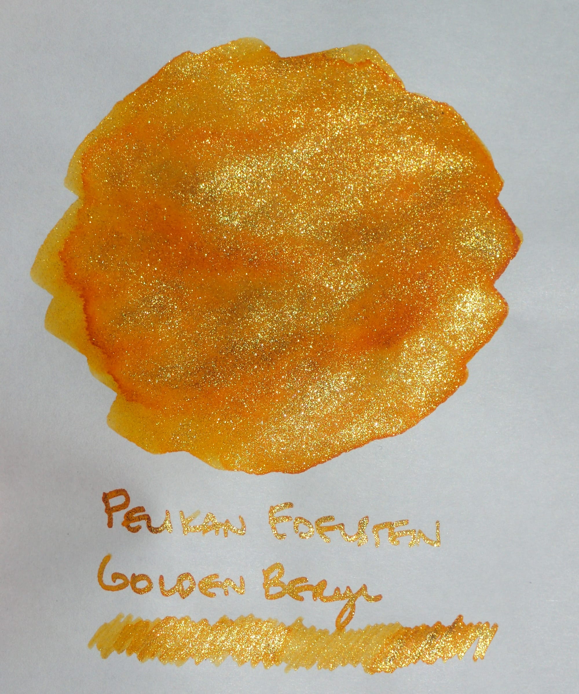
Pelikan Edelstein Golden Beryl
I haven't used this ink very much, for some reason. It's a gorgeous, sunny, orange-yellow with a coordinating sunny gold shimmer. The non-shimmer version would be great for summer, while the original, shimmery version feels very winter holidays to me. I'm not sure if this ink's shimmer gets over everything like Wearingeul's I Am a Cat's shimmer does.
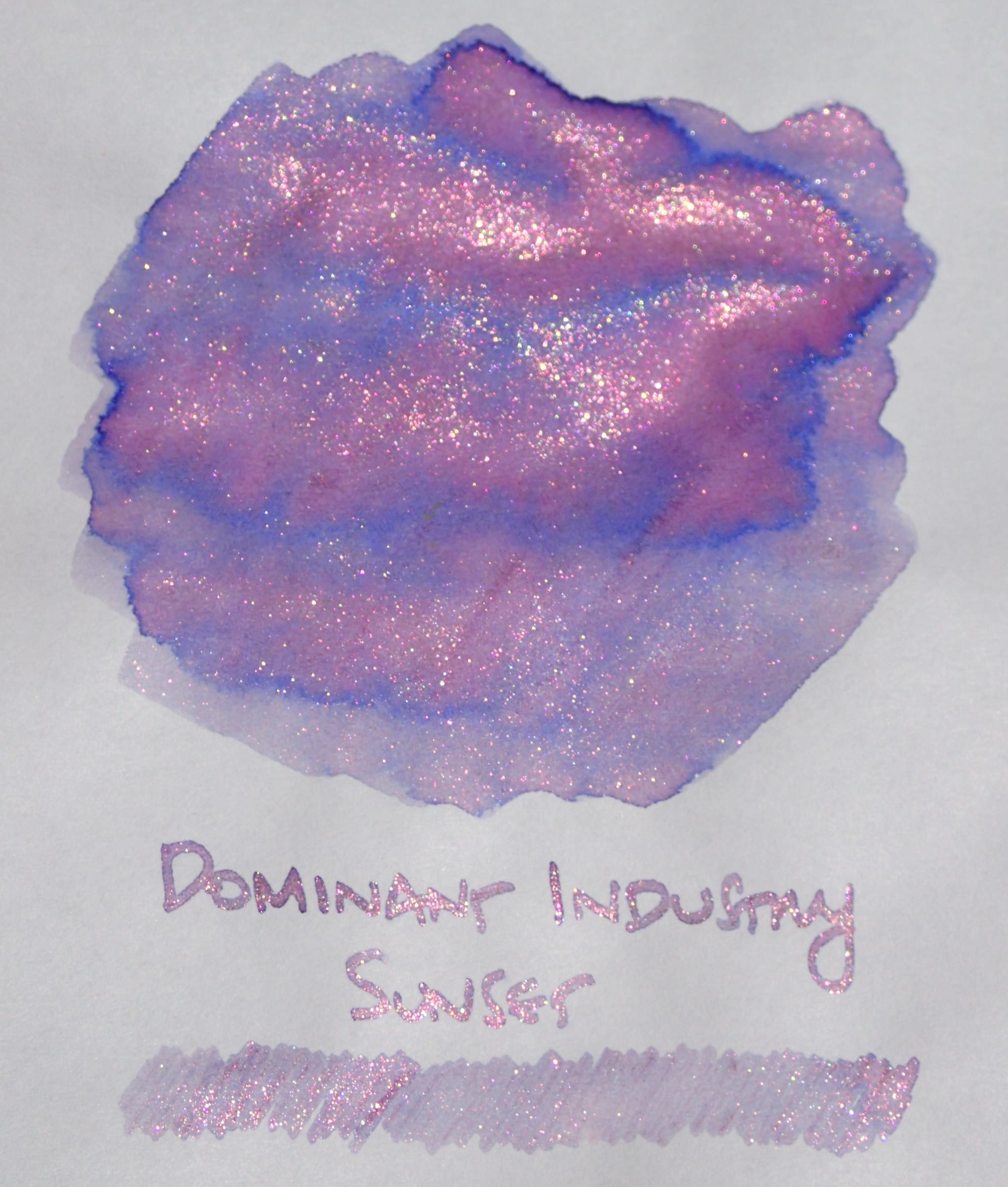
Dominant Industry Sunset
I really like Dominant Industry Sunset, but for some reason it clogged a lot of the pens I tried it in, so I haven't used it much yet. I have some known good shimmer ink pens now, though, so I'm hoping it would work well in those. Seeing the non-shimmer version, it reminds me a lot of Troublemaker Foxglove, or maybe Sailor Ink Studio 123, but it seems lighter/less saturated than both of those, and therefore harder to read. I'll have to check it out again in different pens.
I hope you liked this shimmer/no-shimmer ink follow-up. I find it enlightening to swatch my shimmer inks this way, especially for those that didn't initially meet my expectations. Have fun experimenting with your library of shimmer inks! Comment below or on Mastodon if you have your own swatches to share. ✌️

