Ink Swatch Wednesday: Currently Inked for May
Cool, a collision between #InkSwatchWednesday and the first of the month when I update my currently inked list! 🙂 I decided to do something different for my showing my currently inked batch – I grouped like colors together and I made swatch pages for them on sheets of original 52 gsm Tomoe River paper. And instead of using my folded nib pen like I usually do, I used a paintbrush so I could see more shading and differences where the ink pools. It was pretty meditative to make the swatch pages.
First, the brown inks. I don't know what possessed me to use so many different brown inks last month and continuing into this month, but I did. The cool thing about placing them all together is being able to see that even though there are many of them, they're all different enough that there isn't a lot of overlap. Nifty!
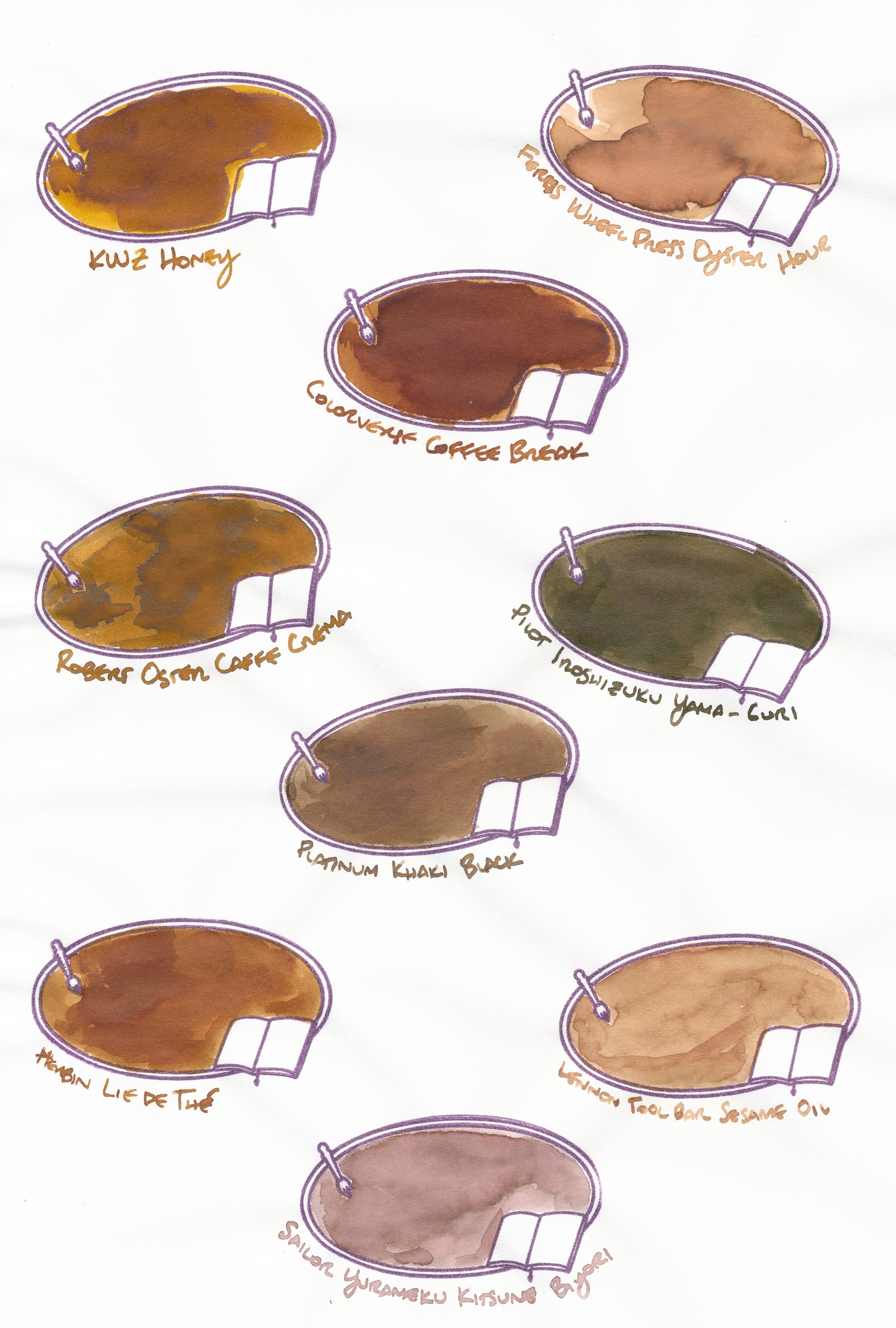
Even Ferris Wheel Press Oyster Hour and Lennon Tool Bar Sesame Oil, which I previously blogged as being pretty similar, still show the slight difference in warmth. Sesame Oil looks a little bit cooler than Oyster Hour. I used to have a pen inked with Sailor Shikiori Rikyucha, which is somewhat similar to Pilot Iroshizuku Yama-Guri, but I ended up adding Platinum Khaki Black to the mix as a replacement for May.
The next highest number of inks goes to the blues.

I also greatly enjoy the variation in blue inks here. I really like Tsuki-Yo's shade of blue compared to Iroshizuku Shin-Kai. I like them both, just like Tsuki-Yo more. I'm not that into sheening inks usually, but Troublemaker Simoun is a very chill version. It hasn't been problematic and dries very quickly. Van Dieman's Azure Kingfisher is my favorite for its awesome mix of base color, sheen, and shimmer. It is a very shimmery ink but has been pretty well-behaved in the pen I've inked. I think it has been in that pen at least a month, perhaps closer to 1.5. The shimmer stays very well-distributed even without constant agitating and is so bright and cool-looking when the ink has dried. It also doesn't migrate all over the page, either (I'm looking at you, Wearingeul I Am a Cat!). Hana Gokoro is a very interesting chromoshader/"chameleon" ink, as it initially appears as a medium dark blue-black ink, but then dries to this reddish-brownish shade, as you can see in the swatch.
Next, I grouped together purples/burgundies/roses and grays.
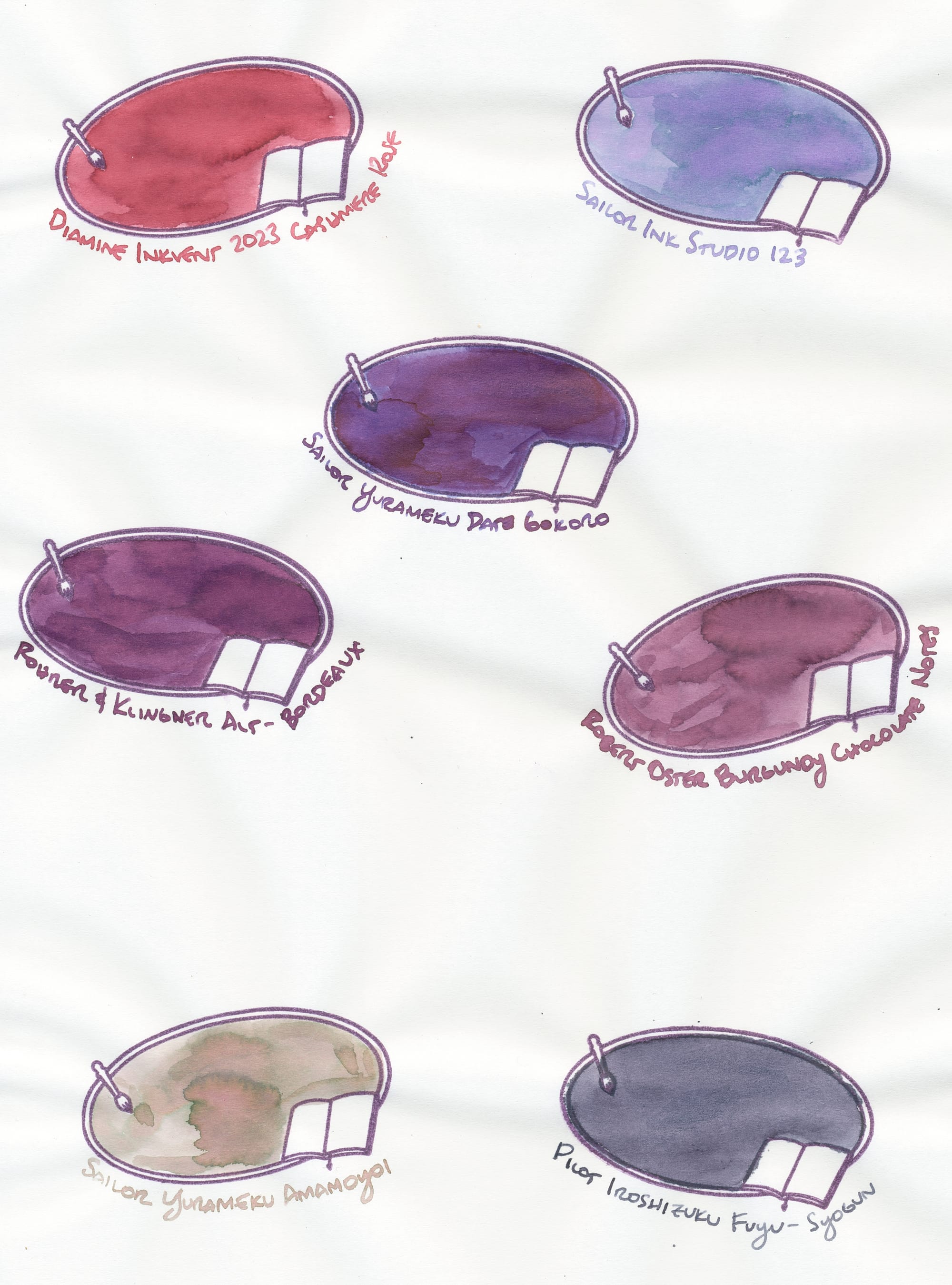
I love how all of these (except maybe the Fuyu-Syogun) are so watercolor-like in how they presented on the paper. The Fuyu-Syogun might've exhibited more shading but I accidentally put too much on the page and had to mop up the extra. My favorite ink here is Sailor Yurameku Date Gokoro. It is another chameleon ink with a more subtle transformation – it goes on as this lovely purple, but then dries in some places a brownish or golden brownish color. Pink is really not my thing, but Cashmere Rose really is a rosy shade with some other undertone I can't put my finger on that helps to veer it away from bubblegum pink (no). Sailor Ink Studio looks so lovely and magical in this swatch, but in the currently inked pen (Waterman Carène), it appears more like a cloudy purple, which is still very cool. Robert Oster Burgundy Chocolate Notes is a quirky ink. It goes on pretty brown, but then dries to a different shade depending on the nib it came out of (and probably the paper) – a pink-brown, a grape-ish color like in this swab, or a dark burgundy, as it appears coming out of the Pilot Capless Fermo that's inked with it. Admittedly, the ink has been in the Fermo a little while now, so it likely has concentrated a bit, and the nib on the pen is a wet stacked architect, so that all contributes to the final appearance. Fuyu-Syogun is my favorite gray so far. It really looks storm cloud-y.
The final batch of inks is a group of greens.
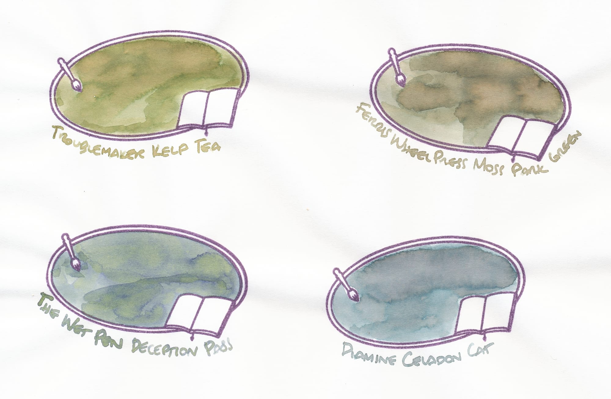
Once again, they all look very watercolor-y here, which is so satisfying. As you can tell, they're all nice shaders. I was not a huge fan of any green inks at all, but my outlook turned around when a pen friend sent me a sample of Troublemaker Kelp Tea. It opened up a world of greens that are more "swampy", dusky, green-browns and/or green-grays, eclectic shades compared to a more typical "Crayola" kind of bright, simple green. I'm impressed that Ferris Wheel Press's Moss Park Green is as legible as it is. 😛 In the past I've had trouble with FWP inks being too light, but Moss Park Green is very nice. I also particularly like Celadon Cat in the pen it's in now, because it looks like a sea glass color, so serene. The Wet Pen's Deception Pass is a quirky ink that goes on medium blue and dries as a mix of the blue and a yellow-green, as the swatch shows. It's such a wet ink I have to put it in very fine nibs or dry nibs.
There are a lot of inks here. Yes, it does mean that I have all of these inks in a pen, resulting in 27 pens inked. 😅 I will be cleaning at least one of them out, though because I discovered a problem with the ink (that blog post is coming next!). 😠
Thoughts on my current batch of inks? Recommendations? Let's chat in the comments here, or on Mastodon.